Use modern themes in canvas apps
Modern themes are pre-established style sets that can transform the look of your app. These themes, based on Microsoft's Fluent design language, modify various style aspects such as color, typography, borders, and shadows, ensuring a visually pleasing interface.
Modern themes streamline the customization process and enable creators to effortlessly design an app with a unified and consistent visual appeal.
Prerequisites
Enable the modern themes feature in the settings of Power Apps app:
- Open your app or create a new app.
- From your app, open Settings from the app authoring menu or modern command bar.
- Go to Updates > New > Modern controls and themes.
- Set the Modern controls and themes toggle to On.
- Close the Settings popup.
For more information, see Enable modern controls and themes for your app.
Note
When modern controls and themes is enabled, you can't select classic themes from the command bar. To use retired classic themes, go to Keep classic themes on the Retired tab of Updates in Settings and toggle it to On.
Create a theme
There are several out-of-the-box themes available to style your app. You can also design your own theme for a more personalized visual aesthetic.
On the app authoring menu, select
 Themes.
On the Themes pane, select Add a theme.

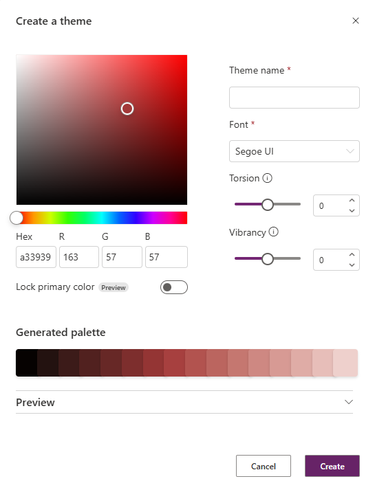
The Create a theme dialog appears.

In the Create a theme dialog, choose or enter the following information:
Feature Action or description Primary (seed) color Choose a color from the color picker. You can, alternatively, enter the hexadecimal or RGB manually. Lock primary color (preview) The 16-slot theme palette is generated using the seed color.
- Toggled off: The 16-slot palette is optimized for accessibility. Toggled off is the default option.
- Toggled on: The seed color is placed in the primary (middle) slot of the palette. The remaining colors are generated by making the colors incrementally lighter on one side and darker on the other side. The generated palette might not meet contrast ratio accessibility requirements.Theme name Enter a unique theme name. Font Choose your default font used by the controls in the app. Torsion Impacts the tint, shade, or tone of the palette. Torsion isn't applicable if you choose Lock primary color. Vibrancy Impacts the muteness or brightness of the palette. Vibrancy isn't applicable if you choose Lock primary color. Preview Optionally, look at the static preview of your new theme. You can interact with the sample controls to see how your theme is applied to the rest state and various interaction states. 
Select Create.
Your new theme is created and applied to your app.
Apply modern theme
- On the app authoring menu, select
 Themes.
 - On the Themes pane, select one of the default themes.
- If you have classic controls in your app, you're prompted to apply the modern theme to these controls. You can always select Undo from the command bar if you don't like the theme.
Note
When you choose to apply modern themes to classic controls, Power Fx formulas are set on properties of the impacted controls that reference variables from the modern theme. Visually, classic controls might not align exactly with their modern control counterparts, as the classic controls are not based on Fluent v9.
When a modern theme is selected, the style of the theme is automatically applied to the controls in your app. This action sets the App.Theme property.
Edit a theme
You can edit the theme and change one or more parameters of the custom theme.
On the app authoring menu, select
 Themes.
On the Themes pane, find the tile of the theme you want to edit and select the overflow menu and then Edit.

On the Edit theme pane, adjust the theme as needed.
Select Save or cancel out of the dialog.
Note
You can't edit out-of-the-box themes.
Delete a theme
If you decide you no longer need a custom theme in your app, you can delete it.
- On the app authoring menu, select
 Themes.
 - On the Themes pane, find theme that you want to edit, select the overflow menu, then select Delete.
- On the confirmation dialog box, select Delete theme.
If you have any Power Fx formulas that reference this theme in your app, you need to manually update the formula.
Note
You can't delete out-of-the-box themes.
Use themes with Power Fx
Modern theme objects are available for makers to use through Power Fx. The currently active theme object can be referenced by App.Theme. Any theme loaded into the app can be referenced by its instance name such as RedTheme. We recommend that you reference the theme object using App.Theme to ensure that the color selections adapt to theme changes.
Each theme object includes the following information:
- Name of the theme
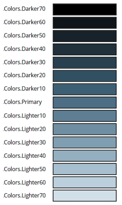
- Colors, a 16-color brand ramp collection individually accessible by name; Primary foreground color is the default text color, for example the color of text on a background
- Font used in the theme
The image shows the slot variables inside the Colors collection and, as an example, the corresponding colors for the Steel theme.

Using the theme brand ramp, you can manually style a classic control based on the current modern theme, for example Button.Fill = App.Theme.Colors.Primary.
Note
To provide feedback, see: Provide your feedback to Microsoft.