The format pane in Power BI custom visuals
Starting from API version 5.1, developers can create visuals that use the new Power format pane. Developers can define the cards and their categories for any property in their custom visual, making it easier for report creators to use these visuals.
The new API uses the FormattingModel method to customize parts of the format and analytics panes.
Tip
The getFormattingModel method replaces the enumerateObjectInstances method in earlier API versions.
The getFormattingModel returns a FormattingModel that defines how the visual's formatting and analytics pane look.
In addition to all the old formatting pane capabilities, the new formatting model supports new format pane capabilities, new properties, and new hierarchies.

Create a visual that supports the new format pane
General steps to add the new format pane support to a custom visual:
Set the
apiVersionin your pbiviz.json file to5.1or later.Define all the customizable
objectsin your capabilities.json file. These objects are then mapped to the properties of the formatting pane. The following properties are required for each object:- object name
- property name
- property type
All other properties, including
DisplayNameanddescription, are now optional.Build the custom visual FormattingModel by doing one of the following:
- Use formattingmodel util. (Recommended)
- Without this util, use only APIs.
Define the properties of your custom visual formatting model and build it using code (not JSON).
- Implement the
getFormattingModelAPI in the custom visual class that returns custom visual formatting model. (This API replaces theenumerateObjectInstancesthat was used in previous versions).
Example of formatting model implementation
- Formatting model using formattingmodel util example. (Recommended)
- Formatting model using only APIs example.
Map formatting properties
If you have a custom visual created with an older API and you want to migrate to the new format pane, or if you're creating a new custom visual:
Set the
apiVersionin your pbiviz.json file to5.1or later.For each object name and property name in capabilities.json, create a matching formatting property. The formatting property should have a descriptor that contains an
objectNameandpropertyNamethat matches the object name and property name in capabilities.json.
The objects properties in the capabilities file still have the same format and don't need to be changed.
For example, if the circle object in your capabilities.json file is defined like this:
"objects": {
    "circle": {
        "properties": {
            "circleColor": {
                "type": {
                    "fill": {
                        "solid": {
                            "color": true
                        }
                    }
                }
            },
        }
    }
}
The formatting property in your model should be of type ColorPicker and look like this:
control: {
    type: "ColorPicker",
    properties: {
        descriptor: {
            objectName: "circle",
            propertyName: "circleColor"
        },
        value: {
            value: this.visualSettings.circle.circleColor
        }
    }
}
You get an error if one of the following conditions is true:
- The object or property name in the capabilities file doesn’t match the one in the formatting model
- The property type in the capabilities file doesn’t match the type in formatting model
Formatting model
The formatting model is where you describe and customize all the properties of your format pane.
Formatting model components
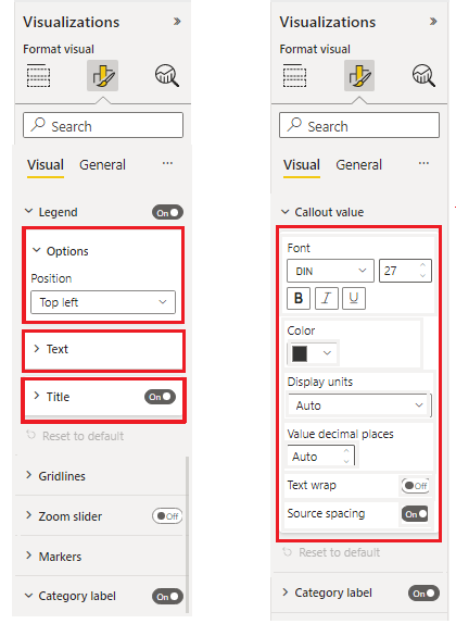
In the new formatting model, property components are grouped together in logical categories and subcategories. These groups make the model easier to scan. There are the five basic components, from largest to smallest:
Formatting model The largest pane container, used for formatting the pane's frontal interface. It contains a list of formatting cards.
Formatting card The top level properties grouping container for formatting properties. Each card consists of one or more formatting groups, as shown here.

Formatting group
The secondary-level properties grouping container. The formatting group is displayed as a grouping container for formatting slices.
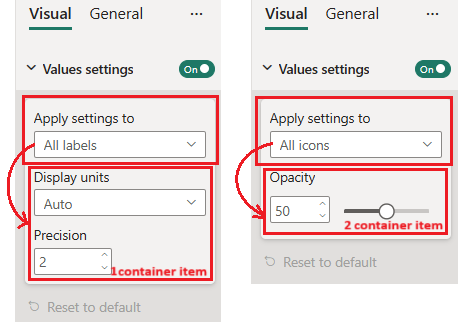
Formatting container
The secondary-level properties grouping container. The formatting container groups formatting slices into separate container items and allows to switch between them using a drop-down list.
Formatting slice
Property container. There are two types of slices:- Simple slice: Individual property container
- Composite slice: Multiple related property containers grouped into one formatting slice
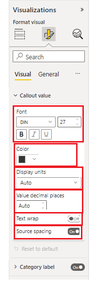
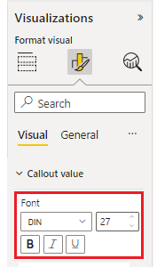
The following image shows the different types of slices. "Font" is a composite slice consisting of font family, size, and bold, italics, and underline switches. "Color", "display units", and the other slices are simple slices with one component each.

Visualization pane formatting properties
Every property in the formatting model should match and object type in the capabilities.json file.
The following table shows the formatting property types in capabilities.json file and their matching type class in modern formatting model properties:
| Type | Capabilities Value Type | Formatting Property |
|---|---|---|
| Boolean | Bool | ToggleSwitch |
| Number | ||
| Enumeration list | enumeration:[] | |
| Color | Fill | ColorPicker |
| Gradient | FillRule | GradientBar: property value should be string consisting of: minValue[,midValue],maxValue |
| Text | Text |
Capabilities Formatting Objects
| Type | Capabilities Value Type | Formatting Property |
|---|---|---|
| Font size | FontSize | NumUpDown |
| Font family | FontFamily | FontPicker |
| Line Alignment | Alignment | AlignmentGroup |
| Label Display Units | LabelDisplayUnits | AutoDropDown |
* The enumeration list formatting property is different in the formatting model and in the capabilities file.
Declare the following properties in the formatting settings class, including the list of enumeration items:
- ItemDropdown
- ItemFlagsSelection
Declare the following properties in the formatting settings class, without the list of enumeration items. Declare their enumeration items list in capabilities.json under the appropriate object. (These types are the same as in the previous API versions):
- AutoDropdown
- AutoFlagSelection
Composite slice properties
A formatting composite slice is a formatting slice that contains multiple related properties all together.
For now we have two composite slice types:
FontControl
This keeps all font related properties together. It consists of the following properties:- Font Family
- Font Size
- Bold [optional]
- Italic [optional]
- Underline [optional]

Each of these properties should have a corresponding object in capabilities file:
Property Capabilities Type Formatting Type Font Family Formatting: { fontFamily} FontPicker Font Size Formatting: {fontSize} NumUpDown Bold Bool ToggleSwitch Italic Bool ToggleSwitch Underline Bool ToggleSwitch MarginPadding Margin padding determines the alignment of the text in the visual. It consists of the following properties:
- Left
- Right
- Top
- Bottom
Each of these properties should have a corresponding object in capabilities file:
Property Capabilities Type Formatting Type Left Numeric NumUpDown Right Numeric NumUpDown Top Numeric NumUpDown Bottom Numeric NumUpDown
GitHub resources
All formatting model interfaces can be found in GitHub - microsoft/powerbi-visuals-api: Power BI custom visuals API in “formatting-model-api.d.ts”
We recommend using the new formatting model utils at GitHub - microsoft/powerbi-visuals-utils-formattingmodel: Power BI visuals formatting model helper utils
You can find an example of a custom visual SampleBarChart that uses API version 5.1.0 and implements
getFormattingModelusing the new formatting model utils at GitHub - microsoft/PowerBI-visuals-sampleBarChart: Bar Chart Custom Visual for tutorial.
Related content
More questions? Ask the Power BI Community