إشعار
يتطلب الوصول إلى هذه الصفحة تخويلاً. يمكنك محاولة تسجيل الدخول أو تغيير الدلائل.
يتطلب الوصول إلى هذه الصفحة تخويلاً. يمكنك محاولة تغيير الدلائل.
APPLIES TO: ![]() Power BI Desktop
Power BI Desktop ![]() Power BI service
Power BI service
Pie and donut charts in Power BI are powerful visualization tools for representing parts of a whole in an intuitive, visually appealing way. This article provides a step-by-step walkthrough for creating pie and donut chart visuals in both Power BI Desktop and Power BI Service platforms.
A Pie chart ![]() displays data as slices of a circle, where each slice represents a category's proportion of the total. This format is ideal for showing percentage or proportional relationships in a dataset. A Donut chart
displays data as slices of a circle, where each slice represents a category's proportion of the total. This format is ideal for showing percentage or proportional relationships in a dataset. A Donut chart ![]() is a variation of the pie chart with a hollow center, creating a ring-like appearance.
is a variation of the pie chart with a hollow center, creating a ring-like appearance.
Prerequisites
In the following guide, you use the Retail Analysis Sample PBIX file. Use the steps for your environment:
Important
Always make sure you have the latest version of Power BI Desktop installed before proceeding.
For the purposes of this guide, in Power BI Desktop's Global options, under the Preview features section, the On-object interaction feature is not enabled.
- Launch Power BI Desktop.
- From the left-side navigation pane, select Open, or select File > Open from the menu.
- Locate and select your copy of the Retail Analysis Sample PBIX. The file opens in report view.
- Select the + icon at the bottom of the window to add a new page to the report.
Note
Sharing your report with a Power BI colleague requires that you both have an individual Power BI Pro license or that you save the report in Premium capacity.
Create a pie or donut chart
For this example, create a Pie chart from the Visualizations pane. You can use these steps to create a Donut chart.
From the Visualizations pane, select the Pie chart icon. The visual placeholder is immediately added to the canvas.
To add data to your line chart, open the Data pane to access the desired fields or measures.
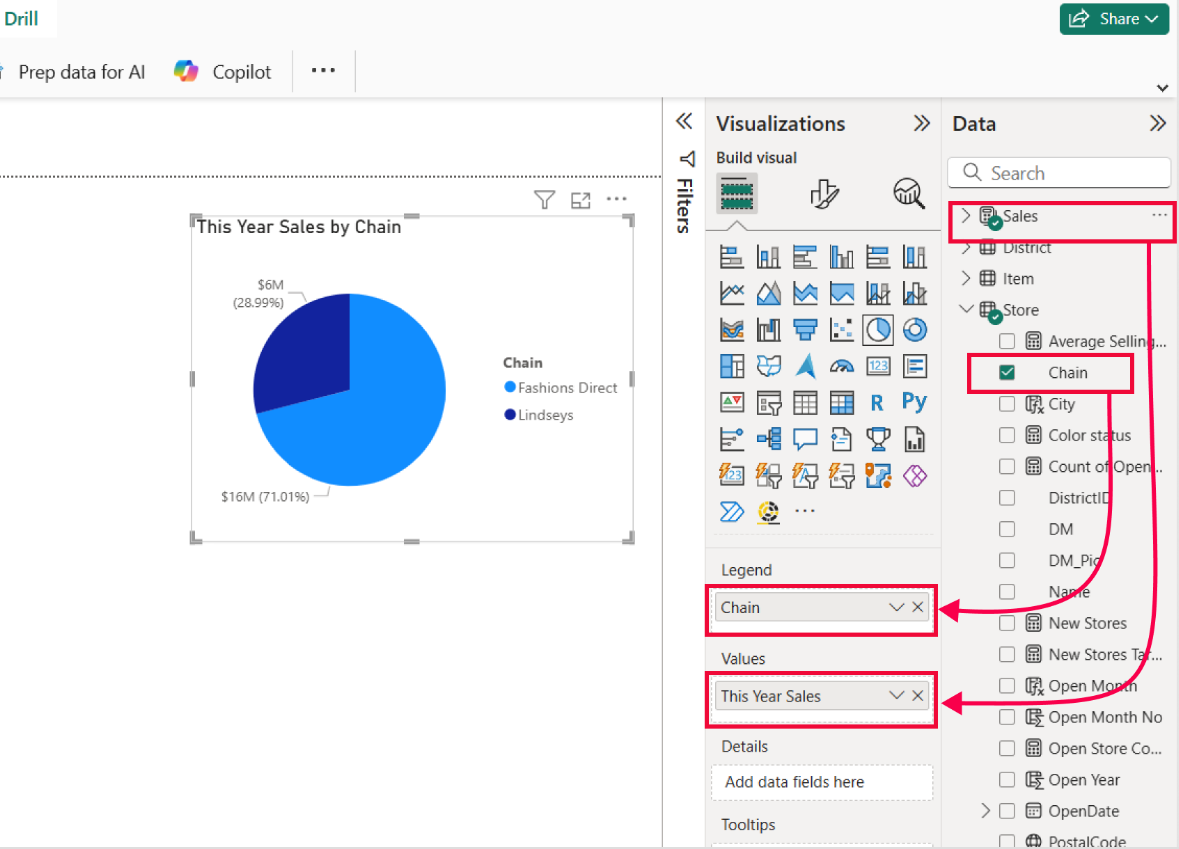
In the example shown, first select the Value measure under the This Years Sales group, or drag it to the Values field well. Then, under the Store group, select the Chain field, or drag it to the Legend field well.
To customize your line chart, select the Format icon in the Visualizations Pane. The Format pane grants you access to all available formatting options under the Visual tab and the General tab. This step allows you to tailor the chart's appearance and functionality to your specific requirements.
Drill into pie and donut charts
Power BI's Pie chart and Donut chart visuals offer more than just a static view of proportions. They're designed for interactive exploration. With drill functionality, you can move seamlessly between high-level summaries and detailed breakdowns, uncovering insights slice by slice. Whether you're analyzing sales contributions by product category or comparing revenue share across regions, drilling into your data helps you spot patterns, identify outliers, and make informed decisions.
In this section, you learn how to set up a pie chart with a category hierarchy and use the four drill actions to explore your data interactively. This step-by-step guide walks you through each drill option and shows how they reveal deeper levels of information within your chart. You can also use these exact same steps to set up a donut chart with a category hierarchy.
To enable drill functionality, prepare the pie chart with a hierarchy.
With the Pie chart selected on your report canvas, go to the Visualizations pane and find the legend field well on the Build visual section. Then, from the Data pane, locate Store > DM (District Manager), and drag the DM field to place it below the Chain field in the Legend field well.
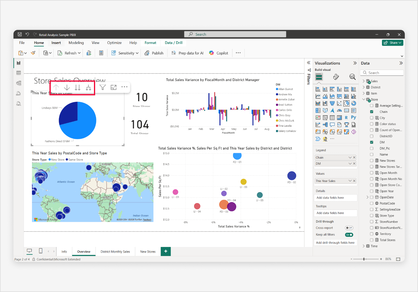
After updating the Pie chart, you see four drill icons, either above the top-left corner or below the bottom-right corner of the pie chart visual, depending on where the visual is located on the report canvas and what space is available around the visual.
- Drill up (go up to a higher level in the hierarchy)
- Click to turn on Drill down (enables drill mode)
- Go to the next level in the hierarchy (expands all data points to the next level)
- Expand all down one level in the hierarchy (shows next lower-level data grouped under each top-level category)
To begin, activate the Drill down mode by selecting the downward arrow icon labeled Click to turn on drill down. Once selected, a message appears indicating Drill mode is on: Click a data point to drill. This mode allows you to select individual slices in the visual to drill into more detailed data.
Drilling down into a data point is done by selecting a slice. Once selected, the chart updates to show the next level in the hierarchy for that specific data point. For example, selecting Lindseys reveals its district managers.
Before the next step, select the upward arrow icon to drill back up to the next higher level in the hierarchy. Now, use Go to the next level in the hierarchy by selecting the double downward arrow icon to expand all data points to the next level in the hierarchy. This action shows the next level (for example, all district managers) without needing to select each slice individually.
Finally, select the upward arrow icon again to drill back up to the next higher level in the hierarchy. Now, to use Expand all down one level in the hierarchy, select the fourth icon to expand next lower-level data grouped under each top-level category. This view maintains grouping while showing the next level of detail.
Unlock deeper insights with drill functionality in Power BI's pie charts. By moving between summary and detailed views, drill actions turn static visuals into interactive tools that reveal trends, highlight anomalies, and support smarter decisions. Whether you're analyzing sales share or operational metrics, using drill features in pie charts gives you the flexibility to explore your data with clarity and precision.
Use cross-filter and cross-highlight
Power BI makes pie charts interactive through cross-filtering and cross-highlighting. These features let you select a slice in a pie chart and instantly see its effect on other visuals on the report page. This interaction helps reveal relationships, trends, and outliers across your data.
- Cross-filtering temporarily filters connected visuals to show only related data, making it easier to focus without applying permanent filters.
- Cross-highlighting emphasizes related data by dimming nonmatching values, so you can compare contributions while keeping full context visible.
These tools turn static pie charts into dynamic exploration visuals, helping you uncover insights quickly and intuitively. In this section, you learn how to enable and use cross-filter and cross-highlight features in Power BI.
Using a pie chart and a column chart as examples, this guide walks you through how visuals respond to user selections and how to configure interaction settings to control this behavior. You can also use these exact same steps with a Donut chart.
To use and understand the difference between cross-filter and cross-highlight features, you use the pie chart visual to trigger interactions with other visuals. Let's prepare for this step-by-step guide, enable interactions, and learn how everything works.
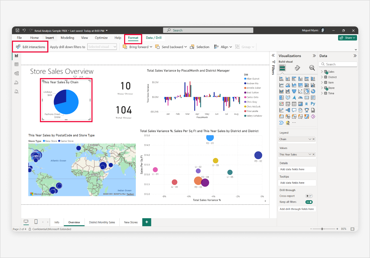
Begin by selecting the pie chart. Then on the Power BI menu bar, select the Format ribbon, and then Enable interactions. Interaction icons (Filter, Highlight, and None) appear on your visual, allowing you to control how each visual responds to selections.
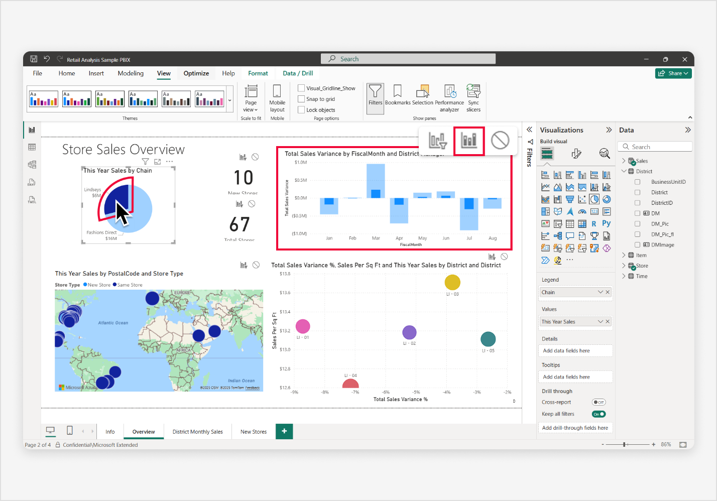
With the pie chart selected, select the Filter icon on the column chart visual to ensure it responds only to the selected slice in the pie chart.
Now, select a slice in the pie chart. This action immediately filters all other visuals, including the column chart, to show only data related to that slice. Unselected slices remain visible but dimmed, making it easy to see what's included and excluded.
Try clicking different slices to observe how visuals update dynamically. To reset, deselect the slice or select an empty space within the pie chart before moving to the next interaction mode.
With the pie chart selected, select the Highlight icon on the column chart visual to enable highlighting instead of filtering. Now, select a slice in the pie chart—the column chart highlights the relevant portion within each column while dimming the rest, rather than hiding unrelated data. This approach helps you compare proportions without losing overall context.
Try selecting different slices to see how visuals update dynamically. To reset, deselect the slice or select an empty space in the pie chart before moving to the next interaction mode.
Now, try cross-filtering and cross-highlighting again, but begin by selecting the column chart visual this time.
With the column chart visual selected, demonstrate the Cross-filter feature by selecting the Filter icon on the pie chart visual to ensure it only shows data related to the selected column in the column chart. Then, select a column in the column chart to immediately filter all other visuals, including the pie chart, showing only data related to the selected column. Notice the unselected column remains visible but is dimmed.
When ready, deselect the column or select an empty space within the column chart to prepare for the next interaction mode.
Once again, with the column chart visual selected, demonstrate the Cross-highlight feature by selecting the Highlight icon on the pie chart visual to ensure it highlights the data related to the selected column in the column chart.
Then, select a column in the column chart to immediately highlight the data in the pie chart to show the data related to the selected column, while the pie chart remains visible but is dimmed similar the unselected columns that remain visible but are also dimmed.
By enabling cross-filtering and cross-highlighting, you turn a static report into a dynamic, interactive experience with exploration tools. These features help you make connections across visuals, compare data points, and dive deeper into the story behind the numbers, all without leaving the page or applying permanent filters. Users can uncover patterns, compare performance, and make data-driven decisions with clarity.
Considerations and limitations
As a Power BI user, being aware of any pie and donut chart considerations and limitations helps you create effective and visually appealing data visualizations.
Understanding the considerations and limitations allows you to make informed decisions and use the full potential of Power BI column charts. Whether you're a novice or an experienced user, this section aims to enhance your chart-building experience by keeping you up to date with practical insights and tips for any known issues.
This section provides an updated list of known pie and donut chart considerations and limitations. It helps you navigate the nuances of pie and donut charts in both Power BI Desktop and the Power BI service.
- Maximum number of slices:
- While there are no hard caps, performance and readability degrade with excessive series. Limit line charts to 3–6 slices for optimal clarity and responsiveness.
- Conditional formatting:
- Conditional formatting isn't officially supported for pie and donut charts. However, some users discovered a workaround: by applying conditional formatting rules to a column chart and then converting it to a pie or donut chart, the slices retain the formatting. This behavior is unofficial and might not be consistent across all scenarios.
- Style considerations:
- Increasing the slice border thickness excessively can make it difficult to distinguish individual slices, especially when color contrast is low. Use borders judiciously to enhance separation between slices. When applied properly, borders can significantly improve accessibility and visual clarity.