إشعار
يتطلب الوصول إلى هذه الصفحة تخويلاً. يمكنك محاولة تسجيل الدخول أو تغيير الدلائل.
يتطلب الوصول إلى هذه الصفحة تخويلاً. يمكنك محاولة تغيير الدلائل.
APPLIES TO: ![]() Power BI Desktop
Power BI Desktop ![]() Power BI service
Power BI service
Waterfall charts show a running total as Power BI adds and subtracts values. These charts are useful for understanding how an initial value (like net income) is affected by a series of positive and negative changes.
Each measure of change is a column on the chart. The columns are color coded so you can quickly notice increases and decreases across the data.
The initial and final value columns often start from the horizontal axis, while the intermediate values are floating columns. A starting point for an intermediate column can be on the horizontal axis or on another axis parallel to the main axis.
The position of the intermediate columns can fluctuate between the initial and final values. The resulting view creates a picture similar to a concave or convex wave or a random waterfall cascade. Waterfall charts are also called bridge charts.
When to use waterfall charts
Waterfall charts are a great choice for many scenarios:
- Representing changes for a measure across time, a series, or different categories.
- Auditing major changes that contribute to a total value.
- Plotting your company's annual profit by showing various sources of revenue and arriving at the total profit (or loss).
- Illustrating the beginning and ending headcount for your company in a year.
- Visualizing the steps and relationships of business processes.
- Monitoring and controlling data quality.
- Visualizing and tracking the progress of project steps.
- Analyzing data defects and identifying their causes.
- Understanding the workings of the organization and the connections between departments.
- Visualizing how much money you earn and spend each month and the running balance for your account.
Note
To share content (or for a colleague without edit rights to view content outside your personal My workspace) both users need either a Power BI Pro or Premium Per User (PPU) license, OR the content must reside in a workspace on a capacity (Fabric F64+ or Power BI Premium (P)). PPU workspaces behave like capacity for feature availability. Free users can only consume content that lives on a capacity.
Prerequisites
Review the following prerequisites for using waterfall charts in Power BI Desktop or the Power BI service.
This tutorial uses the Retail Analysis Sample PBIX file.
Download the Retail Analysis Sample PBIX file to your desktop.
In Power BI Desktop, select File > Open report.
Browse to and select the Retail Analysis Sample PBIX file, and then select Open.
The Retail Analysis Sample PBIX file opens in report view.

At the bottom, select the green plus symbol
 to add a new page to the report.


Create a waterfall chart
The following steps create a waterfall chart to display sales variance (estimated sales versus actual sales) by month.
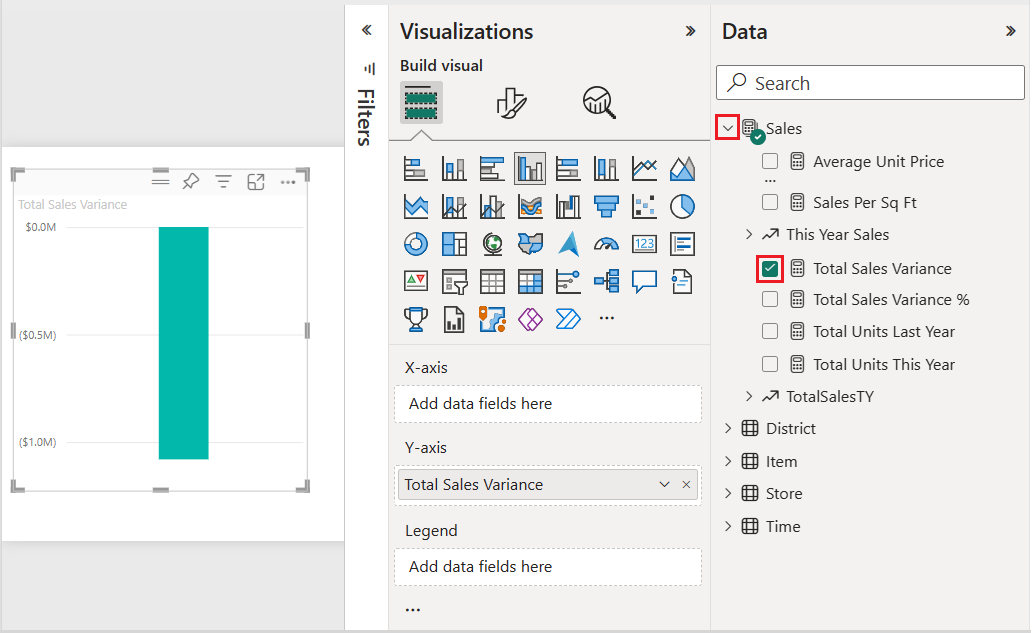
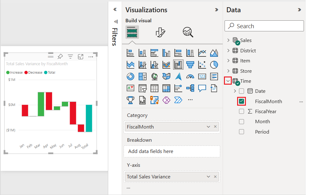
On the Data pane, expand Sales and select the Total Sales Variance checkbox. By default, Power BI presents the data as a clustered column chart.
This action configures the Total Sales Variance data as the Y-axis for the chart on the Visualizations pane.
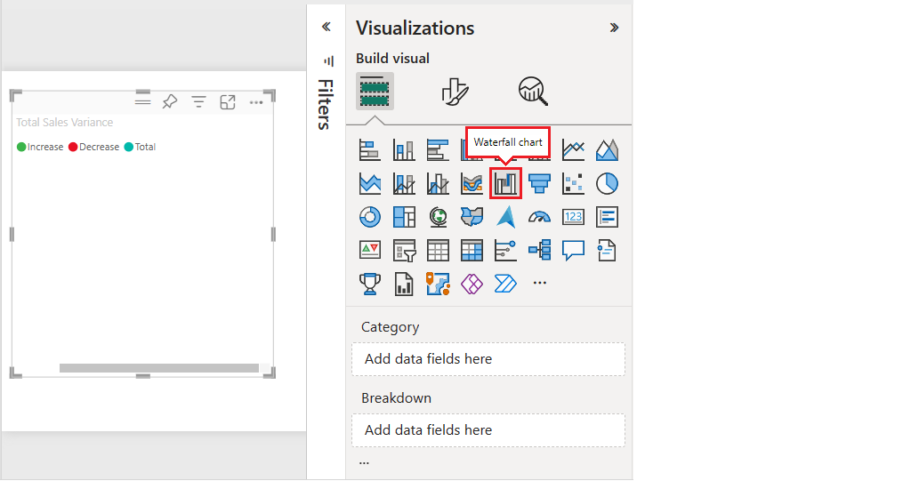
To convert the visualization into a waterfall chart, select Waterfall chart on the Visualizations pane.
This action exposes the Category and Breakdown sections on the Visualizations pane.
On the Data pane, expand Time and select the FiscalMonth checkbox.
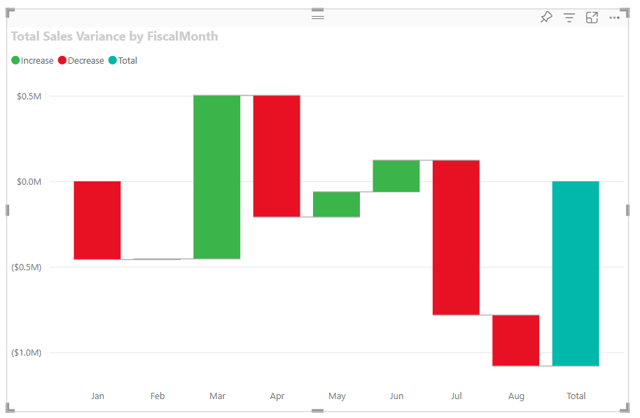
Power BI updates the waterfall chart with the data in the FiscalMonth category. The initial view of the category data shows the values in ascending order.
Sort the waterfall chart
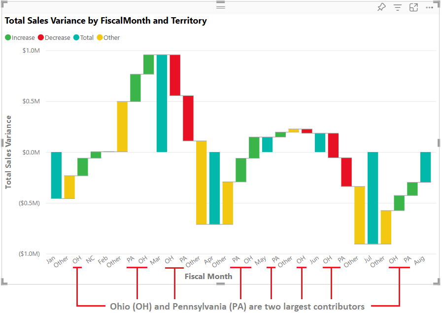
When Power BI creates the waterfall chart, the data is displayed in ascending or chronological order for the category. In our example, the data is sorted by month in ascending order, January to August, for the FiscalMonth category.
You can change the sort order to view different perspectives of the data.
On the Total Sales Variance chart, select More options (...) > Sort axis > FiscalMonth.
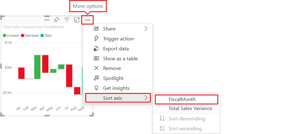
This action changes the sort order of the FiscalMonth category to descending by month. Notice that August has the largest variance and January has the smallest variance.

Open the More options (...) > Sort axis menu.
Notice the checkmark next to FiscalMonth and Sort descending. A checkmark appears next to options represented in the chart visualization.
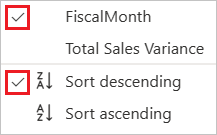
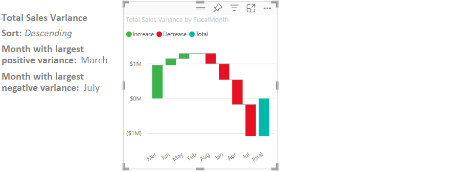
On the More options (...) > Sort axis menu, select Total Sales Variance.
This action changes the sort from the FiscalMonth category to the Total Sales Variance. The chart updates to show the Total Sales Variance data in descending order. In this view, the month of March has the largest positive variance and July has the largest negative variance.
On the More options (...) > Sort axis menu, change the sort back to FiscalMonth and Sort ascending.

Explore the waterfall chart
Let's take a closer look at the data to see what's contributing most to the changes from month to month.
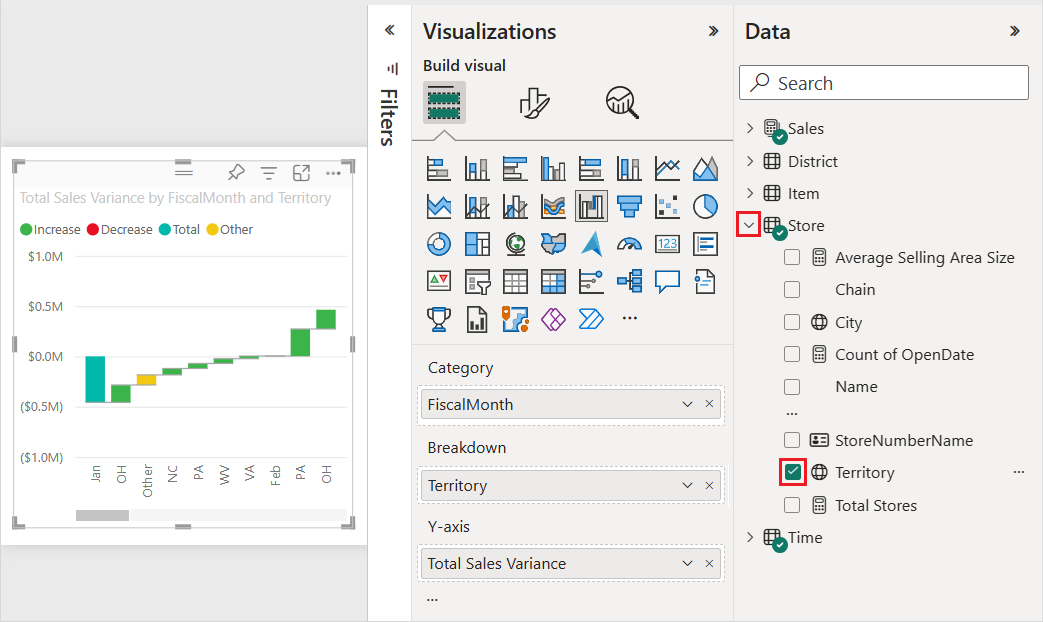
On the Data pane, expand Store and select the Territory checkbox.
This action adds a corresponding Breakdown field on the Visualizations pane.
Expand the waterfall chart's width to see more of the data.
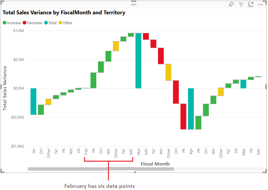
Power BI uses the Territory value in the Breakdown section to add more data to the visualization. The breakdown feature splits each monthly total into separate segments showing contributions from different territories. The chart now includes the top five contributors to increases or decreases for each fiscal month. Notice the month of February now has six data points instead of only one.
Let's say you're only interested in the top two contributors. You can configure the chart to highlight that information.
On the Visualizations > Format your visual pane, select Breakdown, and set the Maximum breakdowns value to 2.
The Maximum breakdowns setting controls how many breakdown categories are displayed for each data point in the waterfall chart. By setting this value to 2, Power BI shows only the top two contributors (based on absolute value) for each fiscal month, grouping all other territories into an "Other" category.
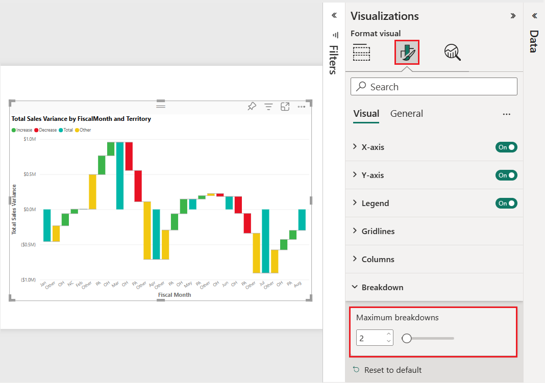
The updated chart reveals Ohio (OH) and Pennsylvania (PA) as the top two territories that are the largest contributors to increases and decreases.