Part 5. From Data Bindings to MVVM
The Model-View-ViewModel (MVVM) architectural pattern was invented with XAML in mind. The pattern enforces a separation between three software layers — the XAML user interface, called the View; the underlying data, called the Model; and an intermediary between the View and the Model, called the ViewModel. The View and the ViewModel are often connected through data bindings defined in the XAML file. The BindingContext for the View is usually an instance of the ViewModel.
A Simple ViewModel
As an introduction to ViewModels, let’s first look at a program without one.
Earlier you saw how to define a new XML namespace declaration to allow a XAML file to reference classes in other assemblies. Here’s a program that defines an XML namespace declaration for the System namespace:
xmlns:sys="clr-namespace:System;assembly=netstandard"
The program can use x:Static to obtain the current date and time from the static DateTime.Now property and set that DateTime value to the BindingContext on a StackLayout:
<StackLayout BindingContext="{x:Static sys:DateTime.Now}" …>
BindingContext is a special property: When you set the BindingContext on an element, it is inherited by all the children of that element. This means that all the children of the StackLayout have this same BindingContext, and they can contain simple bindings to properties of that object.
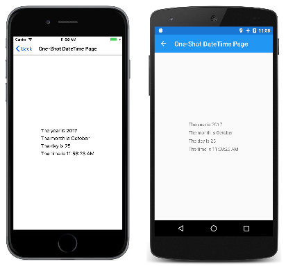
In the One-Shot DateTime program, two of the children contain bindings to properties of that DateTime value, but two other children contain bindings that seem to be missing a binding path. This means that the DateTime value itself is used for the StringFormat:
<ContentPage xmlns="http://xamarin.com/schemas/2014/forms"
             xmlns:x="http://schemas.microsoft.com/winfx/2009/xaml"
             xmlns:sys="clr-namespace:System;assembly=netstandard"
             x:Class="XamlSamples.OneShotDateTimePage"
             Title="One-Shot DateTime Page">

    <StackLayout BindingContext="{x:Static sys:DateTime.Now}"
                 HorizontalOptions="Center"
                 VerticalOptions="Center">

        <Label Text="{Binding Year, StringFormat='The year is {0}'}" />
        <Label Text="{Binding StringFormat='The month is {0:MMMM}'}" />
        <Label Text="{Binding Day, StringFormat='The day is {0}'}" />
        <Label Text="{Binding StringFormat='The time is {0:T}'}" />

    </StackLayout>
</ContentPage>
The problem is that the date and time are set once when the page is first built, and never change:
A XAML file can display a clock that always shows the current time, but it needs some code to help out. When thinking in terms of MVVM, the Model and ViewModel are classes written entirely in code. The View is often a XAML file that references properties defined in the ViewModel through data bindings.
A proper Model is ignorant of the ViewModel, and a proper ViewModel is ignorant of the View. However, often a programmer tailors the data types exposed by the ViewModel to the data types associated with particular user interfaces. For example, if a Model accesses a database that contains 8-bit character ASCII strings, the ViewModel would need to convert between those strings to Unicode strings to accommodate the exclusive use of Unicode in the user interface.
In simple examples of MVVM (such as those shown here), often there is no Model at all, and the pattern involves just a View and ViewModel linked with data bindings.
Here’s a ViewModel for a clock with just a single property named DateTime, which updates that DateTime property every second:
using System;
using System.ComponentModel;
using Xamarin.Forms;

namespace XamlSamples
{
    class ClockViewModel : INotifyPropertyChanged
    {
        DateTime dateTime;

        public event PropertyChangedEventHandler PropertyChanged;

        public ClockViewModel()
        {
            this.DateTime = DateTime.Now;

            Device.StartTimer(TimeSpan.FromSeconds(1), () =>
                {
                    this.DateTime = DateTime.Now;
                    return true;
                });
        }

        public DateTime DateTime
        {
            set
            {
                if (dateTime != value)
                {
                    dateTime = value;

                    if (PropertyChanged != null)
                    {
                        PropertyChanged(this, new PropertyChangedEventArgs("DateTime"));
                    }
                }
            }
            get
            {
                return dateTime;
            }
        }
    }
}
ViewModels generally implement the INotifyPropertyChanged interface, which means that the class fires a PropertyChanged event whenever one of its properties changes. The data binding mechanism in Xamarin.Forms attaches a handler to this PropertyChanged event so it can be notified when a property changes and keep the target updated with the new value.
A clock based on this ViewModel can be as simple as this:
<ContentPage xmlns="http://xamarin.com/schemas/2014/forms"
             xmlns:x="http://schemas.microsoft.com/winfx/2009/xaml"
             xmlns:local="clr-namespace:XamlSamples;assembly=XamlSamples"
             x:Class="XamlSamples.ClockPage"
             Title="Clock Page">

    <Label Text="{Binding DateTime, StringFormat='{0:T}'}"
           FontSize="Large"
           HorizontalOptions="Center"
           VerticalOptions="Center">
        <Label.BindingContext>
            <local:ClockViewModel />
        </Label.BindingContext>
    </Label>
</ContentPage>
Notice how the ClockViewModel is set to the BindingContext of the Label using property element tags. Alternatively, you can instantiate the ClockViewModel in a Resources collection and set it to the BindingContext via a StaticResource markup extension. Or, the code-behind file can instantiate the ViewModel.
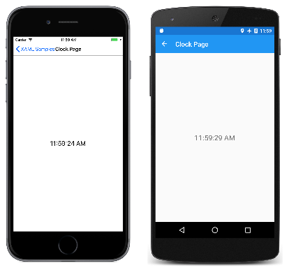
The Binding markup extension on the Text property of the Label formats the DateTime property. Here’s the display:
It’s also possible to access individual properties of the DateTime property of the ViewModel by separating the properties with periods:
<Label Text="{Binding DateTime.Second, StringFormat='{0}'}" … >
Interactive MVVM
MVVM is often used with two-way data bindings for an interactive view based on an underlying data model.
Here’s a class named HslViewModel that converts a Color value into Hue, Saturation, and Luminosity values, and vice versa:
using System;
using System.ComponentModel;
using Xamarin.Forms;

namespace XamlSamples
{
    public class HslViewModel : INotifyPropertyChanged
    {
        double hue, saturation, luminosity;
        Color color;

        public event PropertyChangedEventHandler PropertyChanged;

        public double Hue
        {
            set
            {
                if (hue != value)
                {
                    hue = value;
                    OnPropertyChanged("Hue");
                    SetNewColor();
                }
            }
            get
            {
                return hue;
            }
        }

        public double Saturation
        {
            set
            {
                if (saturation != value)
                {
                    saturation = value;
                    OnPropertyChanged("Saturation");
                    SetNewColor();
                }
            }
            get
            {
                return saturation;
            }
        }

        public double Luminosity
        {
            set
            {
                if (luminosity != value)
                {
                    luminosity = value;
                    OnPropertyChanged("Luminosity");
                    SetNewColor();
                }
            }
            get
            {
                return luminosity;
            }
        }

        public Color Color
        {
            set
            {
                if (color != value)
                {
                    color = value;
                    OnPropertyChanged("Color");

                    Hue = value.Hue;
                    Saturation = value.Saturation;
                    Luminosity = value.Luminosity;
                }
            }
            get
            {
                return color;
            }
        }

        void SetNewColor()
        {
            Color = Color.FromHsla(Hue, Saturation, Luminosity);
        }

        protected virtual void OnPropertyChanged(string propertyName)
        {
            PropertyChanged?.Invoke(this, new PropertyChangedEventArgs(propertyName));
        }
    }
}
Changes to the Hue, Saturation, and Luminosity properties cause the Color property to change, and changes to Color causes the other three properties to change. This might seem like an infinite loop, except that the class doesn't invoke the PropertyChanged event unless the property has changed. This puts an end to the otherwise uncontrollable feedback loop.
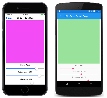
The following XAML file contains a BoxView whose Color property is bound to the Color property of the ViewModel, and three Slider and three Label views bound to the Hue, Saturation, and Luminosity properties:
<ContentPage xmlns="http://xamarin.com/schemas/2014/forms"
             xmlns:x="http://schemas.microsoft.com/winfx/2009/xaml"
             xmlns:local="clr-namespace:XamlSamples;assembly=XamlSamples"
             x:Class="XamlSamples.HslColorScrollPage"
             Title="HSL Color Scroll Page">
    <ContentPage.BindingContext>
        <local:HslViewModel Color="Aqua" />
    </ContentPage.BindingContext>

    <StackLayout Padding="10, 0">
        <BoxView Color="{Binding Color}"
                 VerticalOptions="FillAndExpand" />

        <Label Text="{Binding Hue, StringFormat='Hue = {0:F2}'}"
               HorizontalOptions="Center" />

        <Slider Value="{Binding Hue, Mode=TwoWay}" />

        <Label Text="{Binding Saturation, StringFormat='Saturation = {0:F2}'}"
               HorizontalOptions="Center" />

        <Slider Value="{Binding Saturation, Mode=TwoWay}" />

        <Label Text="{Binding Luminosity, StringFormat='Luminosity = {0:F2}'}"
               HorizontalOptions="Center" />

        <Slider Value="{Binding Luminosity, Mode=TwoWay}" />
    </StackLayout>
</ContentPage>
The binding on each Label is the default OneWay. It only needs to display the value. But the binding on each Slider is TwoWay. This allows the Slider to be initialized from the ViewModel. Notice that the Color property is set to Aqua when the ViewModel is instantiated. But a change in the Slider also needs to set a new value for the property in the ViewModel, which then calculates a new color.
Commanding with ViewModels
In many cases, the MVVM pattern is restricted to the manipulation of data items: User-interface objects in the View parallel data objects in the ViewModel.
However, sometimes the View needs to contain buttons that trigger various actions in the ViewModel. But the ViewModel must not contain Clicked handlers for the buttons because that would tie the ViewModel to a particular user-interface paradigm.
To allow ViewModels to be more independent of particular user interface objects but still allow methods to be called within the ViewModel, a command interface exists. This command interface is supported by the following elements in Xamarin.Forms:
ButtonMenuItemToolbarItemSearchBarTextCell(and hence alsoImageCell)ListViewTapGestureRecognizer
With the exception of the SearchBar and ListView element, these elements define two properties:
Commandof typeSystem.Windows.Input.ICommandCommandParameterof typeObject
The SearchBar defines SearchCommand and SearchCommandParameter properties, while the ListView defines a RefreshCommand property of type ICommand.
The ICommand interface defines two methods and one event:
void Execute(object arg)bool CanExecute(object arg)event EventHandler CanExecuteChanged
The ViewModel can define properties of type ICommand. You can then bind these properties to the Command property of each Button or other element, or perhaps a custom view that implements this interface. You can optionally set the CommandParameter property to identify individual Button objects (or other elements) that are bound to this ViewModel property. Internally, the Button calls the Execute method whenever the user taps the Button, passing to the Execute method its CommandParameter.
The CanExecute method and CanExecuteChanged event are used for cases where a Button tap might be currently invalid, in which case the Button should disable itself. The Button calls CanExecute when the Command property is first set and whenever the CanExecuteChanged event is fired. If CanExecute returns false, the Button disables itself and doesn’t generate Execute calls.
For help with adding commanding to your ViewModels, Xamarin.Forms defines two classes that implement ICommand: Command and Command<T> where T is the type of the arguments to Execute and CanExecute. These two classes define several constructors plus a ChangeCanExecute method that the ViewModel can call to force the Command object to fire the CanExecuteChanged event.
Here is a ViewModel for a simple keypad that is intended for entering telephone numbers. Notice that the Execute and CanExecute method are defined as lambda functions right in the constructor:
using System;
using System.ComponentModel;
using System.Windows.Input;
using Xamarin.Forms;

namespace XamlSamples
{
    class KeypadViewModel : INotifyPropertyChanged
    {
        string inputString = "";
        string displayText = "";
        char[] specialChars = { '*', '#' };

        public event PropertyChangedEventHandler PropertyChanged;

        // Constructor
        public KeypadViewModel()
        {
            AddCharCommand = new Command<string>((key) =>
                {
                    // Add the key to the input string.
                    InputString += key;
                });

            DeleteCharCommand = new Command(() =>
                {
                    // Strip a character from the input string.
                    InputString = InputString.Substring(0, InputString.Length - 1);
                },
                () =>
                {
                    // Return true if there's something to delete.
                    return InputString.Length > 0;
                });
        }

        // Public properties
        public string InputString
        {
            protected set
            {
                if (inputString != value)
                {
                    inputString = value;
                    OnPropertyChanged("InputString");
                    DisplayText = FormatText(inputString);

                    // Perhaps the delete button must be enabled/disabled.
                    ((Command)DeleteCharCommand).ChangeCanExecute();
                }
            }

            get { return inputString; }
        }

        public string DisplayText
        {
            protected set
            {
                if (displayText != value)
                {
                    displayText = value;
                    OnPropertyChanged("DisplayText");
                }
            }
            get { return displayText; }
        }

        // ICommand implementations
        public ICommand AddCharCommand { protected set; get; }

        public ICommand DeleteCharCommand { protected set; get; }

        string FormatText(string str)
        {
            bool hasNonNumbers = str.IndexOfAny(specialChars) != -1;
            string formatted = str;

            if (hasNonNumbers || str.Length < 4 || str.Length > 10)
            {
            }
            else if (str.Length < 8)
            {
                formatted = String.Format("{0}-{1}",
                                          str.Substring(0, 3),
                                          str.Substring(3));
            }
            else
            {
                formatted = String.Format("({0}) {1}-{2}",
                                          str.Substring(0, 3),
                                          str.Substring(3, 3),
                                          str.Substring(6));
            }
            return formatted;
        }

        protected void OnPropertyChanged(string propertyName)
        {
            PropertyChanged?.Invoke(this, new PropertyChangedEventArgs(propertyName));
        }
    }
}
This ViewModel assumes that the AddCharCommand property is bound to the Command property of several buttons (or anything else that has a command interface), each of which is identified by the CommandParameter. These buttons add characters to an InputString property, which is then formatted as a phone number for the DisplayText property.
There is also a second property of type ICommand named DeleteCharCommand. This is bound to a back-spacing button, but the button should be disabled if there are no characters to delete.
The following keypad is not as visually sophisticated as it could be. Instead, the markup has been reduced to a minimum to demonstrate more clearly the use of the command interface:
<ContentPage xmlns="http://xamarin.com/schemas/2014/forms"
xmlns:x="http://schemas.microsoft.com/winfx/2009/xaml"
xmlns:local="clr-namespace:XamlSamples;assembly=XamlSamples"
x:Class="XamlSamples.KeypadPage"
Title="Keypad Page">
<Grid HorizontalOptions="Center"
VerticalOptions="Center">
<Grid.BindingContext>
<local:KeypadViewModel />
</Grid.BindingContext>
<Grid.RowDefinitions>
<RowDefinition Height="Auto" />
<RowDefinition Height="Auto" />
<RowDefinition Height="Auto" />
<RowDefinition Height="Auto" />
<RowDefinition Height="Auto" />
</Grid.RowDefinitions>
<Grid.ColumnDefinitions>
<ColumnDefinition Width="80" />
<ColumnDefinition Width="80" />
<ColumnDefinition Width="80" />
</Grid.ColumnDefinitions>
<!-- Internal Grid for top row of items -->
<Grid Grid.Row="0" Grid.Column="0" Grid.ColumnSpan="3">
<Grid.ColumnDefinitions>
<ColumnDefinition Width="*" />
<ColumnDefinition Width="Auto" />
</Grid.ColumnDefinitions>
<Frame Grid.Column="0"
OutlineColor="Accent">
<Label Text="{Binding DisplayText}" />
</Frame>
<Button Text="⇦"
Command="{Binding DeleteCharCommand}"
Grid.Column="1"
BorderWidth="0" />
</Grid>
<Button Text="1"
Command="{Binding AddCharCommand}"
CommandParameter="1"
Grid.Row="1" Grid.Column="0" />
<Button Text="2"
Command="{Binding AddCharCommand}"
CommandParameter="2"
Grid.Row="1" Grid.Column="1" />
<Button Text="3"
Command="{Binding AddCharCommand}"
CommandParameter="3"
Grid.Row="1" Grid.Column="2" />
<Button Text="4"
Command="{Binding AddCharCommand}"
CommandParameter="4"
Grid.Row="2" Grid.Column="0" />
<Button Text="5"
Command="{Binding AddCharCommand}"
CommandParameter="5"
Grid.Row="2" Grid.Column="1" />
<Button Text="6"
Command="{Binding AddCharCommand}"
CommandParameter="6"
Grid.Row="2" Grid.Column="2" />
<Button Text="7"
Command="{Binding AddCharCommand}"
CommandParameter="7"
Grid.Row="3" Grid.Column="0" />
<Button Text="8"
Command="{Binding AddCharCommand}"
CommandParameter="8"
Grid.Row="3" Grid.Column="1" />
<Button Text="9"
Command="{Binding AddCharCommand}"
CommandParameter="9"
Grid.Row="3" Grid.Column="2" />
<Button Text="*"
Command="{Binding AddCharCommand}"
CommandParameter="*"
Grid.Row="4" Grid.Column="0" />
<Button Text="0"
Command="{Binding AddCharCommand}"
CommandParameter="0"
Grid.Row="4" Grid.Column="1" />
<Button Text="#"
Command="{Binding AddCharCommand}"
CommandParameter="#"
Grid.Row="4" Grid.Column="2" />
</Grid>
</ContentPage>
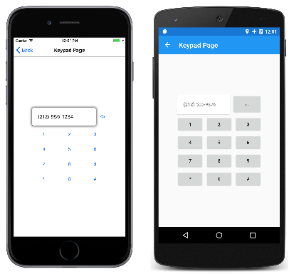
The Command property of the first Button that appears in this markup is bound to the DeleteCharCommand; the rest are bound to the AddCharCommand with a CommandParameter that is the same as the character that appears on the Button face. Here’s the program in action:
Invoking Asynchronous Methods
Commands can also invoke asynchronous methods. This is achieved by using the async and await keywords when specifying the Execute method:
DownloadCommand = new Command (async () => await DownloadAsync ());
This indicates that the DownloadAsync method is a Task and should be awaited:
async Task DownloadAsync ()
{
    await Task.Run (() => Download ());
}

void Download ()
{
    ...
}
Implementing a Navigation Menu
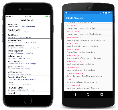
The sample program that contains all the source code in this series of articles uses a ViewModel for its home page. This ViewModel is a definition of a short class with three properties named Type, Title, and Description that contain the type of each of the sample pages, a title, and a short description. In addition, the ViewModel defines a static property named All that is a collection of all the pages in the program:
public class PageDataViewModel
{
    public PageDataViewModel(Type type, string title, string description)
    {
        Type = type;
        Title = title;
        Description = description;
    }

    public Type Type { private set; get; }

    public string Title { private set; get; }

    public string Description { private set; get; }

    static PageDataViewModel()
    {
        All = new List<PageDataViewModel>
        {
            // Part 1. Getting Started with XAML
            new PageDataViewModel(typeof(HelloXamlPage), "Hello, XAML",
                                  "Display a Label with many properties set"),

            new PageDataViewModel(typeof(XamlPlusCodePage), "XAML + Code",
                                  "Interact with a Slider and Button"),

            // Part 2. Essential XAML Syntax
            new PageDataViewModel(typeof(GridDemoPage), "Grid Demo",
                                  "Explore XAML syntax with the Grid"),

            new PageDataViewModel(typeof(AbsoluteDemoPage), "Absolute Demo",
                                  "Explore XAML syntax with AbsoluteLayout"),

            // Part 3. XAML Markup Extensions
            new PageDataViewModel(typeof(SharedResourcesPage), "Shared Resources",
                                  "Using resource dictionaries to share resources"),

            new PageDataViewModel(typeof(StaticConstantsPage), "Static Constants",
                                  "Using the x:Static markup extensions"),

            new PageDataViewModel(typeof(RelativeLayoutPage), "Relative Layout",
                                  "Explore XAML markup extensions"),

            // Part 4. Data Binding Basics
            new PageDataViewModel(typeof(SliderBindingsPage), "Slider Bindings",
                                  "Bind properties of two views on the page"),

            new PageDataViewModel(typeof(SliderTransformsPage), "Slider Transforms",
                                  "Use Sliders with reverse bindings"),

            new PageDataViewModel(typeof(ListViewDemoPage), "ListView Demo",
                                  "Use a ListView with data bindings"),

            // Part 5. From Data Bindings to MVVM
            new PageDataViewModel(typeof(OneShotDateTimePage), "One-Shot DateTime",
                                  "Obtain the current DateTime and display it"),

            new PageDataViewModel(typeof(ClockPage), "Clock",
                                  "Dynamically display the current time"),

            new PageDataViewModel(typeof(HslColorScrollPage), "HSL Color Scroll",
                                  "Use a view model to select HSL colors"),

            new PageDataViewModel(typeof(KeypadPage), "Keypad",
                                  "Use a view model for numeric keypad logic")
        };
    }

    public static IList<PageDataViewModel> All { private set; get; }
}
The XAML file for MainPage defines a ListBox whose ItemsSource property is set to that All property and which contains a TextCell for displaying the Title and Description properties of each page:
<ContentPage xmlns="http://xamarin.com/schemas/2014/forms"
             xmlns:x="http://schemas.microsoft.com/winfx/2009/xaml"
             xmlns:local="clr-namespace:XamlSamples"
             x:Class="XamlSamples.MainPage"
             Padding="5, 0"
             Title="XAML Samples">

    <ListView ItemsSource="{x:Static local:PageDataViewModel.All}"
              ItemSelected="OnListViewItemSelected">
        <ListView.ItemTemplate>
            <DataTemplate>
                <TextCell Text="{Binding Title}"
                          Detail="{Binding Description}" />
            </DataTemplate>
        </ListView.ItemTemplate>
    </ListView>
</ContentPage>
The pages are shown in a scrollable list:
The handler in the code-behind file is triggered when the user selects an item. The handler sets the SelectedItem property of the ListBox back to null and then instantiates the selected page and navigates to it:
private async void OnListViewItemSelected(object sender, SelectedItemChangedEventArgs args)
{
    (sender as ListView).SelectedItem = null;

    if (args.SelectedItem != null)
    {
        PageDataViewModel pageData = args.SelectedItem as PageDataViewModel;
        Page page = (Page)Activator.CreateInstance(pageData.Type);
        await Navigation.PushAsync(page);
    }
}
Video
Xamarin Evolve 2016: MVVM Made Simple with Xamarin.Forms and Prism
Summary
XAML is a powerful tool for defining user interfaces in Xamarin.Forms applications, particularly when data-binding and MVVM are used. The result is a clean, elegant, and potentially toolable representation of a user interface with all the background support in code.
Related Links
- Part 1. Getting Started with XAML
- Part 2. Essential XAML Syntax
- Part 3. XAML Markup Extensions
- Part 4. Data Binding Basics
