Tutorial: Verwenden Sie R zum Vorhersagen des Avocadopreises
Dieses Tutorial stellt ein umfassendes Beispiel für einen Synapse Data Science-Workflow in Microsoft Fabric vor. Anhand von R werden die Avocadopreise in den USA analysiert und visualisiert, um ein Machine Learning-Modell zu erstellen, das zukünftige Avocadopreise vorhersagt.
Dieses Tutorial umfasst die folgenden Schritte:
- Laden Sie Standardbibliotheken
- Laden der Daten
- Anpassen der Daten
- Hinzufügen neuer Pakete zur Sitzung
- Analysieren und Visualisieren der Daten
- Modelltraining

Voraussetzungen
Erwerben Sie ein Microsoft Fabric-Abonnement. Registrieren Sie sich alternativ für eine kostenlose Microsoft Fabric-Testversion.
Melden Sie sich bei Microsoft Fabric an.
Wechseln Sie mithilfe des Umschalters für die Benutzeroberfläche auf der linken Seite Ihrer Startseite zur Synapse Data Science-Umgebung.
Öffnen oder erstellen Sie ein Notebook. Informationen dazu finden Sie unter Verwenden von Microsoft Fabric-Notebooks.
Legen Sie zum Ändern der primären Sprache die Sprachoption auf SparkR (R) fest.
Fügen Sie Ihr Notebook an ein Lakehouse an. Wählen Sie auf der linken Seite Hinzufügen aus, um ein vorhandenes Lakehouse hinzuzufügen oder ein Lakehouse zu erstellen.
Laden von Bibliotheken
Verwenden Sie die Bibliotheken aus der R-Standardruntime:
library(tidyverse)
library(lubridate)
library(hms)
Laden der Daten
Lesen Sie die Avocadopreise aus einer aus dem Internet heruntergeladenen CSV-Datei:
df <- read.csv('https://synapseaisolutionsa.blob.core.windows.net/public/AvocadoPrice/avocado.csv', header = TRUE)
head(df,5)
Manipulation der Daten
Geben Sie den Spalten zuerst einmal benutzerfreundlichere Namen.
# To use lowercase
names(df) <- tolower(names(df))

# To use snake case
avocado <- df %>%
  rename("av_index" = "x",
         "average_price" = "averageprice",
         "total_volume" = "total.volume",
         "total_bags" = "total.bags",
         "amount_from_small_bags" = "small.bags",
         "amount_from_large_bags" = "large.bags",
         "amount_from_xlarge_bags" = "xlarge.bags")

# Rename codes
avocado2 <- avocado %>%
  rename("PLU4046" = "x4046",
         "PLU4225" = "x4225",
         "PLU4770" = "x4770")

head(avocado2,5)
Ändern Sie die Datentypen, entfernen Sie unerwünschte Spalten, und fügen Sie den Gesamtverbrauch hinzu:
# Convert data
avocado2$year = as.factor(avocado2$year)
avocado2$date = as.Date(avocado2$date)
avocado2$month  = factor(months(avocado2$date), levels = month.name)
avocado2$average_price =as.numeric(avocado2$average_price)
avocado2$PLU4046 = as.double(avocado2$PLU4046)
avocado2$PLU4225 = as.double(avocado2$PLU4225)
avocado2$PLU4770 = as.double(avocado2$PLU4770)
avocado2$amount_from_small_bags = as.numeric(avocado2$amount_from_small_bags)
avocado2$amount_from_large_bags = as.numeric(avocado2$amount_from_large_bags)
avocado2$amount_from_xlarge_bags = as.numeric(avocado2$amount_from_xlarge_bags)


# Remove unwanted columns
avocado2 <- avocado2 %>%
  select(-av_index,-total_volume, -total_bags)

# Calculate total consumption
avocado2 <- avocado2 %>%
  mutate(total_consumption = PLU4046 + PLU4225 + PLU4770 + amount_from_small_bags + amount_from_large_bags + amount_from_xlarge_bags)
Installieren neuer Pakete
Verwenden Sie die Inlinepaketinstallation, um der Sitzung neue Pakete hinzuzufügen:
install.packages(c("repr","gridExtra","fpp2"))
Laden Sie die benötigten Bibliotheken.
library(tidyverse)
library(knitr)
library(repr)
library(gridExtra)
library(data.table)
Analysieren und Visualisieren der Daten
Vergleichen Sie konventionelle Avocadopreise (d. h. keine Bioqualität) nach Region:
options(repr.plot.width = 10, repr.plot.height =10)
# filter(mydata, gear %in% c(4,5))
avocado2 %>%
  filter(region %in% c("PhoenixTucson","Houston","WestTexNewMexico","DallasFtWorth","LosAngeles","Denver","Roanoke","Seattle","Spokane","NewYork")) %>%
  filter(type == "conventional") %>%
  select(date, region, average_price) %>%
  ggplot(aes(x = reorder(region, -average_price, na.rm = T), y = average_price)) +
  geom_jitter(aes(colour = region, alpha = 0.5)) +
  geom_violin(outlier.shape = NA, alpha = 0.5, size = 1) +
  geom_hline(yintercept = 1.5, linetype = 2) +
  geom_hline(yintercept = 1, linetype = 2) +
  annotate("rect", xmin = "LosAngeles", xmax = "PhoenixTucson", ymin = -Inf, ymax = Inf, alpha = 0.2) +
  geom_text(x = "WestTexNewMexico", y = 2.5, label = "My top 5 cities!", hjust = 0.5) +
  stat_summary(fun = "mean") +
  labs(x = "US city",
       y = "Avocado prices",
       title = "Figure 1. Violin plot of nonorganic avocado prices",
       subtitle = "Visual aids: \n(1) Black dots are average prices of individual avocados by city \n     between January 2015 and March 2018. \n(2) The plot is ordered descendingly.\n(3) The body of the violin becomes fatter when data points increase.") +
  theme_classic() +
  theme(legend.position = "none",
        axis.text.x = element_text(angle = 25, vjust = 0.65),
        plot.title = element_text(face = "bold", size = 15)) +
  scale_y_continuous(lim = c(0, 3), breaks = seq(0, 3, 0.5))

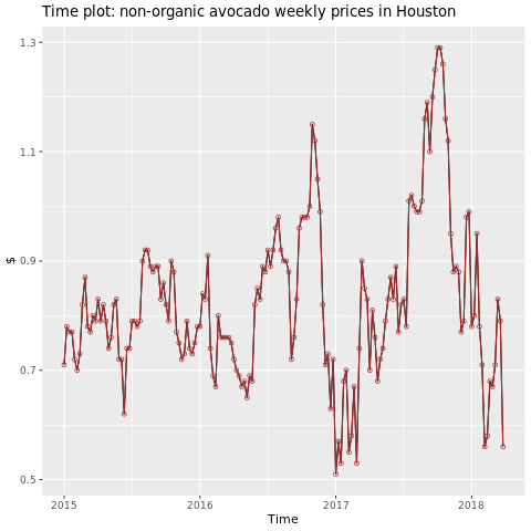
Konzentrieren Sie sich auf die Region Houston.
library(fpp2)
conv_houston <- avocado2 %>%
  filter(region == "Houston",
         type == "conventional") %>%
  group_by(date) %>%
  summarise(average_price = mean(average_price))

# Set up ts

conv_houston_ts <- ts(conv_houston$average_price,
                 start = c(2015, 1),
                 frequency = 52)
# Plot

autoplot(conv_houston_ts) +
  labs(title = "Time plot: nonorganic avocado weekly prices in Houston",
       y = "$") +
  geom_point(colour = "brown", shape = 21) +
  geom_path(colour = "brown")
Trainieren eines Machine Learning-Modells
Erstellen Sie ein Preisvorhersagemodell für die Region Houston, basierend auf dem autoregressiven integrierten gleitenden Mittelwert (ARIMA):
conv_houston_ts_arima <- auto.arima(conv_houston_ts,
                                    d = 1,
                                    approximation = F,
                                    stepwise = F,
                                    trace = T)
checkresiduals(conv_houston_ts_arima)

Erstellen Sie einen Graphen mit Prognosen aus dem Houston-Modell:
conv_houston_ts_arima_fc <- forecast(conv_houston_ts_arima, h = 208)

autoplot(conv_houston_ts_arima_fc) + labs(subtitle = "Prediction of weekly prices of nonorganic avocados in Houston",
       y = "$") +
  geom_hline(yintercept = 2.5, linetype = 2, colour = "blue")

Zugehöriger Inhalt
Feedback
Bald verfügbar: Im Laufe des Jahres 2024 werden wir GitHub-Tickets als Feedbackmechanismus für Inhalte auslaufen lassen und es durch ein neues Feedbacksystem ersetzen. Weitere Informationen finden Sie unter: https://aka.ms/ContentUserFeedback.
Einreichen und Feedback anzeigen für