Hinweis
Für den Zugriff auf diese Seite ist eine Autorisierung erforderlich. Sie können versuchen, sich anzumelden oder das Verzeichnis zu wechseln.
Für den Zugriff auf diese Seite ist eine Autorisierung erforderlich. Sie können versuchen, das Verzeichnis zu wechseln.
Ziel
Das Ziel dieser Richtlinie zur Barrierefreiheit von Xbox (XAG) besteht darin, sicherzustellen, dass Spieler über genügend Kontext verfügen, um die Benutzeroberfläche eines Spiels zu bedienen und ihre UI-Komponenten und ihre Funktionen zu verstehen. Dies kann besonders für Spieler hilfreich sein, die zusätzliche Zeit zum Lesen von Bildschirminhalten benötigen, für Spieler mit begrenztem kurzzeitigem Arbeitsspeicher und Spielern, die noch nicht mit dem Spiel vertraut sind.
Übersicht
Die Benutzeroberfläche sollte einen angemessenen Kontext bereitstellen, um sicherzustellen, dass Spieler den Zweck jedes UI-Bildschirms und der zugehörigen Elemente leicht verstehen können, wie sie erfolgreich mit jedem UI-Element interagieren und was sie von jeder Interaktion erwarten können. Bevor Sie beispielsweise eine Schaltfläche aktivieren, sollte ein Spieler bereits wissen, dass die Interaktion sie in eine aktive Spielerfahrung versetzen wird, sie zu einem externen Link außerhalb der Spiele-App oder -Seite bringt, auf der sie sich gerade befinden, oder einen bestimmten Aspekt ihrer Einstellungen ändern. Wenn Aspekte einer Benutzeroberfläche für einen Spieler nicht eindeutig bezeichnet oder offensichtlich sind, können unbeabsichtigte Aktionen problemlos auftreten. Darüber hinaus können Spieler hängen bleiben oder daran gehindert werden, durch eine Benutzeroberfläche zu navigieren, wenn der richtige Kontext nicht sofort verfügbar ist, z. B. ein Beispiel, in dem der Typ der Daten angezeigt wird, die voraussichtlich in ein Formularfeld eingegeben werden.
Abgrenzungsfragen
Überlegen Sie sich die Menünavigationsoberfläche in der Benutzeroberfläche Ihres Spiels.
Enthält Ihr Spiel mehrere Menübildschirme?
Folgen Menüs in Ihrem Spiel einer hierarchischen Reihenfolge (Einstellungen werden kategorisiert, und der Spieler muss durch die Menühierarchien navigieren, um eine bestimmte Einstellung zu finden, z. B. Hauptmenüeinstellungen >> Audio-NPC-Lautstärkesteuerung > )?
Enthält Ihr Spiel Eingabeformulare (z. B. "Kennwort eingeben" oder "Teamnamen eingeben")?
Enthält Ihr Spiel beim Auswählen schaltflächen oder Links, die eine völlig andere Anwendung oder ein völlig anderes Fenster öffnen?
Implementierungsrichtlinien
Alle Bildschirme und Elemente auf diesen Bildschirmen sollten ausreichend Kontext bereitstellen, damit ein Spieler erkennen kann, wo er sich in der UI-Hierarchie zu einem bestimmten Zeitpunkt befindet.
Der Benutzeroberflächenkontext sollte sich nicht ändern, ohne zuerst vom Spieler initiiert zu werden. Wenn eine Änderung im Kontext nicht vom Spieler initiiert wird, sollte eine Benachrichtigung bereitgestellt werden.
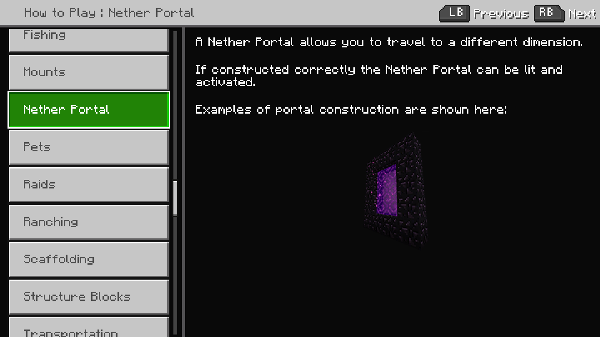
Beispiel (erweiterbar)
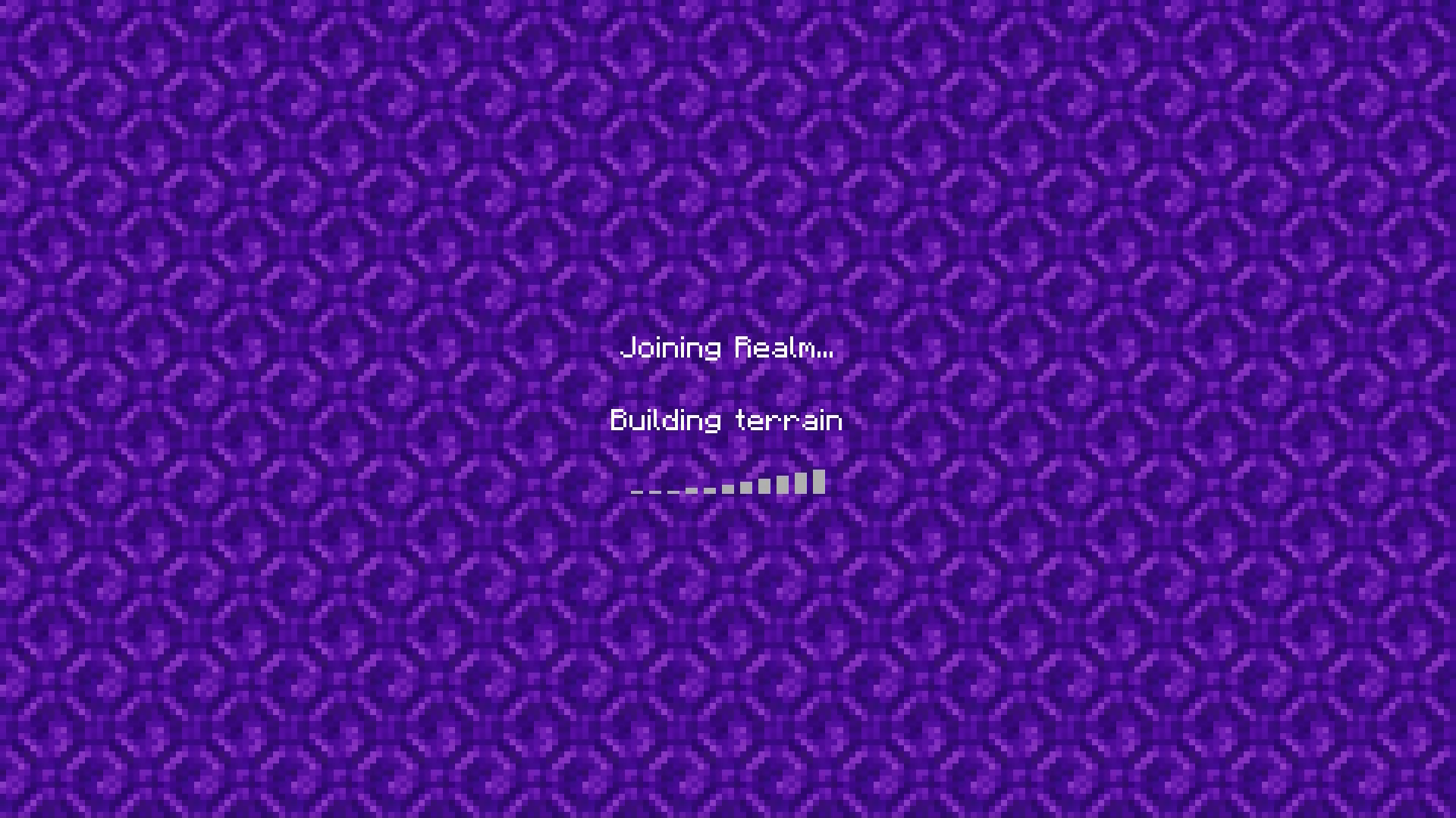
Änderungen des Bildschirmkontexts, die nicht vom Spieler initiiert werden, können in bestimmten Spielszenarien unvermeidbar sein. Sie umfassen in der Regel bestimmte Ladebildschirmerfahrungen und Multiplayer-Lobbies. In diesem Beispiel aus Minecraft initiierte der Spieler die ursprüngliche Aktion, einem Bereich beizutreten. Die Änderung des Kontexts vom Ladebildschirm in die Spielumgebung wurde jedoch nicht vom Spieler initiiert. Es trat auf, nachdem der Ladevorgang des Realm abgeschlossen war. Spieler, die diese Änderung im Kontext auf dem Bildschirm nicht sehen können, wissen möglicherweise nicht, dass das Laden abgeschlossen ist und dass sich ihr Charakter in der aktiven Spielumgebung befindet. In Minecraft liest das Spiel für einen Spieler mit aktiviertem Bildschirmkommentar folgendes vor: "Reich beitreten" und "fertig", nachdem die In-Game-Erfahrung begonnen hat. Am Ende dieses Videobeispiels initiiert der Player das Öffnen des Chatfensters.
Jede Interaktion, die dazu führt, dass der Fokus auf eine andere Anwendung verschoben wird, sollte eindeutig angegeben werden.
Beispiel (erweiterbar)
In Gears POP! auf mobilen Geräten haben Schaltflächen, die als Links zu einem Webbrowser fungieren, Textbeschriftungen zugeordnet. Sie informieren Spieler darüber, dass beim Auswählen einer Schaltfläche ein Webbrowser "in einer neuen Browserseite geöffnet wird". Jedes Steuerelement, das eine zusätzliche Anwendung oder ein anderes Fenster als das Spiel selbst öffnet, sollte über einen Signifizierer verfügen, der Spieler vorab darüber informiert, dass sie bei der Aktivierung an einen neuen Ort umgeleitet werden.
Stellen Sie sicher, dass Textalternativen (z. B. Kommentare und QuickInfos) den Zweck und den Betrieb der UI-Komponenten vermitteln.
Beispiel (erweiterbar)
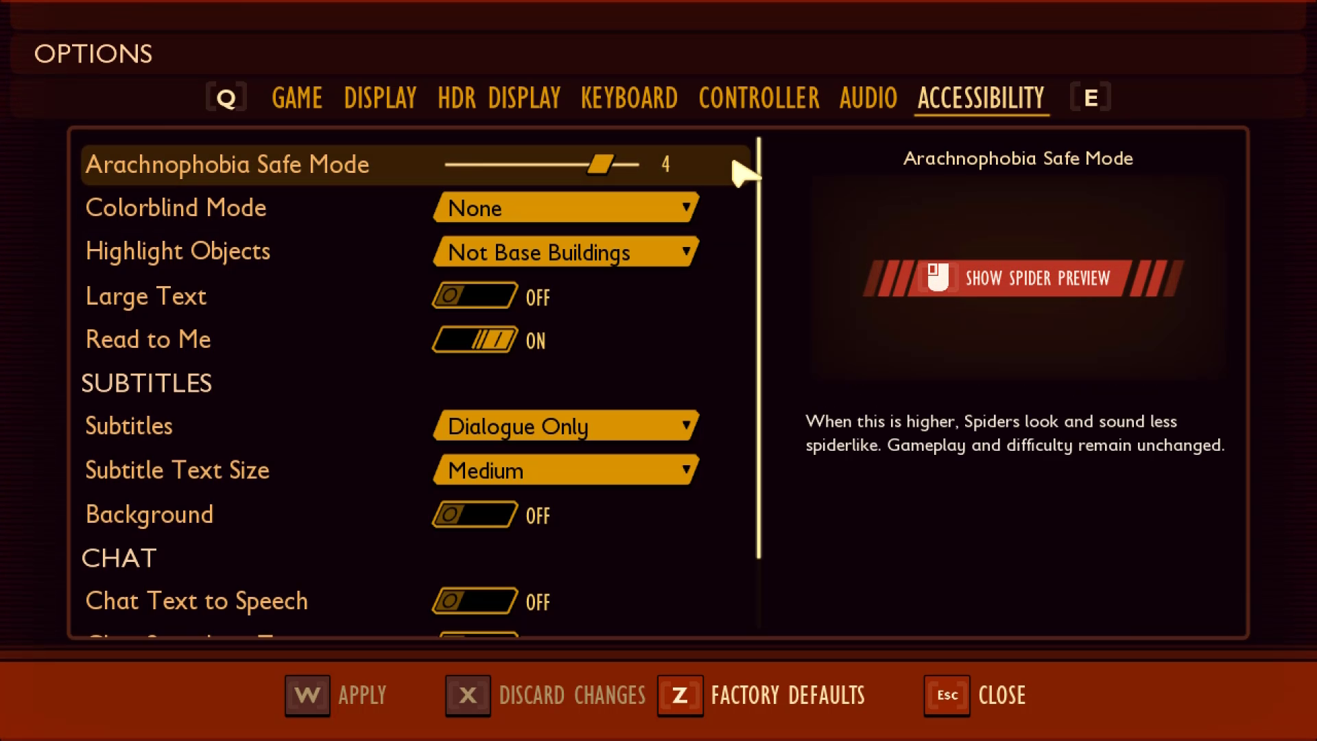
In Geerdet wird die QuickInfo, die für das "Arachnophobia Safe Mode" Spinnvorschaufenster erzählt wird, von der Bildschirmkommentarsoftware als "Linke Maustaste für die Anzeige der Spinnvorschau" gelesen. Durch die Einbeziehung dieser Informationen in die Erläuterung wird den Benutzern der erforderliche Kontext über den Zweck der QuickInfo sowie die Mittel zur Bedienung des Steuerelements bereitgestellt.
Beschriftungen sollten visuell in der Nähe des zugeordneten Elements positioniert werden, damit der Spieler Kontext ableiten kann.
Beispiel (erweiterbar)
Im Minecraft-Menü befinden sich die Bezeichnungen für jede Einstellung direkt neben dem zugeordneten Ein-/Aus-Mechanismus. Dadurch wird sichergestellt, dass Spieler den Zweck und die daraus resultierenden Aktionen der Interaktion mit jedem Umschaltmechanismus sehr einfach ableiten können.
In The Outer Worlds sind die Menütextbeschriftungen nicht so nah am Schiebereglermechanismus wie in Minecraft. Die Beschriftung und der zugehörige Schieberegler sind jedoch beide innerhalb der Fokusanzeige enthalten. Es ist eine weitere lebensfähige Methode zum Einrichten des erforderlichen Kontexts innerhalb der Benutzeroberfläche.
Hinweis
Die visuelle Zuordnung zwischen Bezeichnung und Element sollte auch programmatisch für Screenreader-Nutzer berücksichtigt werden. Ausführliche Informationen zu diesem Thema finden Sie unter XAG 106: Bildschirmkommentare .
Die Features und Funktionen der Spielererfahrung sollten für jeden gleich sein, unabhängig von ihrer Verwendung von Hilfstechnologien.
Beispiel (erweiterbar)
Videolink: Feature-/Funktionalitätsparität
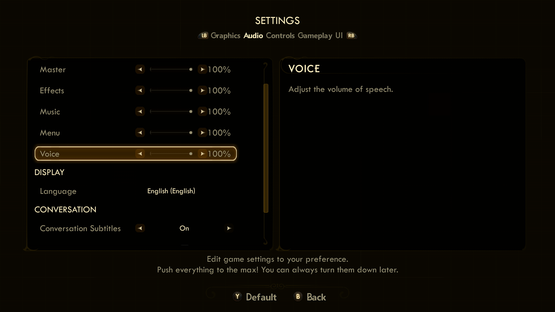
Unabhängig davon, ob ein Spieler hardwarebasierte Hilfstechnologien wie adaptive Joysticks oder andere Eingabemechanismen oder softwarebasierte Hilfstechnologien wie Bildschirmleseprogramme verwendet, sollte er in der Lage sein, alle Funktionen und Merkmale wahrzunehmen, darauf zuzugreifen und sie genauso zu nutzen wie Spieler ohne Hilfstechnologien.
In diesem Beispiel von Forza Horizon 4 hat der Spieler die Bildschirmlesefunktion aktiviert. Das Spiel erzählt eine Geschichte, während der Spieler durch die Nachrichtenzentrale navigiert – ein Feature, mit dem die Spieler Autos "geschenkt" vom Forza-Team herunterladen können. Der Prozess der Navigation zu den und dem Ändern der "Quick Chat" vorab ausgewählten Nachrichten wird ebenfalls vollständig kommentiert. Obwohl dies nur einige der vielen Funktionen im Spiel sind, zeigt dieses Beispiel, dass, wenn Hilfstechnologien in allen Bereichen des Spiels über die Menünavigation oder andere Grundlagen hinaus unterstützt werden, Spieler auf die gleichen Funktionen zugreifen können, wie andere, anstatt auf eine begrenzte Teilmenge beschränkt zu sein.Spieler sollten verstehen, welche Daten in ein Formular oder Steuerelement eingegeben werden sollen, ohne dass zusätzliche Navigation erforderlich ist, um diese Informationen zu ermitteln.
Beispiel (erweiterbar)
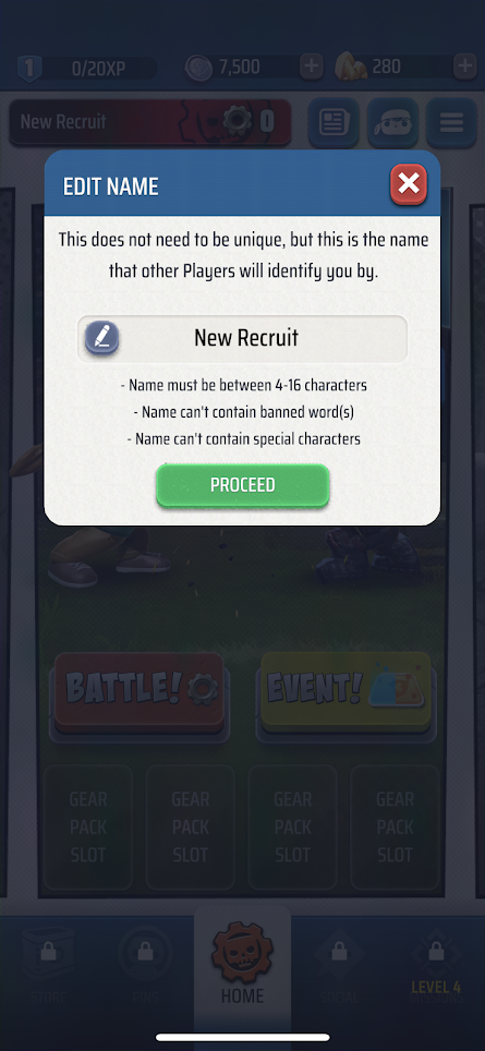
In diesem Beispiel von Gears POP! auf mobilen Geräten bietet das Spiel detaillierte kontextbezogene Hinweise, mit denen sichergestellt wird, dass Spieler wissen, was in das Formularfeld eingegeben werden soll, sowie bestimmte Richtlinien dazu, welche Zeichentypen oder Wörter nicht im Formularfeld angezeigt werden können. Das Spiel bietet auch wichtige kontextbezogene Hinweise wie die Parameter für die Zeichenanzahl (zwischen 4 bis 16 Zeichen), die Aussage, dass der Name "nicht eindeutig sein muss", und erinnert spieler daran, dass "dieser Name ist, was andere Spieler im Spiel Sie identifizieren werden."
Komponenten, die in verschiedenen Bereichen wiederverwendet werden, die dieselbe Funktionalität aufweisen, werden durch konsistente Symbolographie, Bezeichnungen oder Text identifiziert.
Beispiel (erweiterbar)
Videolink: einheitliche Beschriftung, Symbolografie und Text
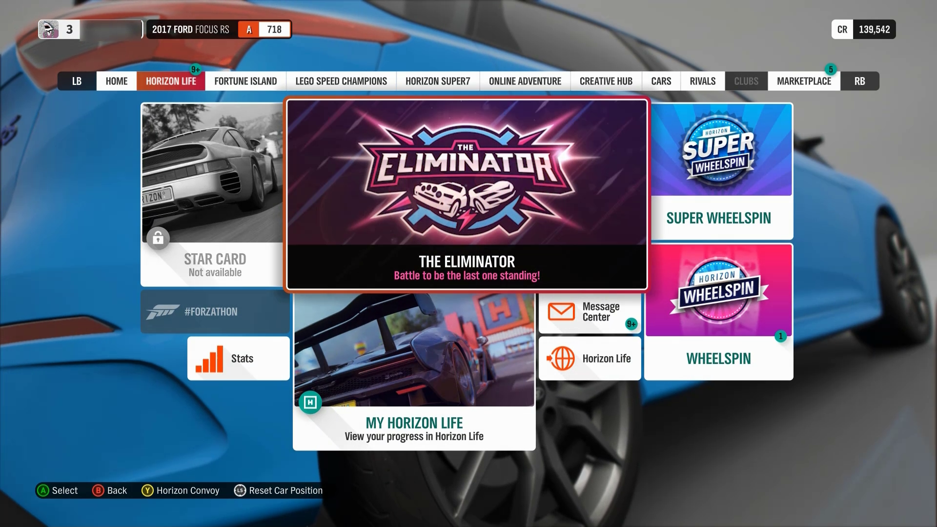
In Forza Horizon 4 ist die Verwendung der Tasten "LB" und "RB" zum Verschieben nach links beziehungsweise rechts zwischen den Menüregisterkarten in verschiedenen Bereichen der Benutzeroberfläche konsistent. Die Verwendung des Sperrsymbols, einer abgeblendeten Darstellung und des Texts "Nicht verfügbar" sind andere Komponenten, die auf der Benutzeroberfläche konsistent verwendet werden, um eingeschränkte Funktionen darzustellen.
Der Text eines Links allein, unabhängig vom umgebenden Text, sollte beschreibend genug sein, damit der Nutzer verstehen kann, wohin der Link führt.
Beispiel (erweiterbar)
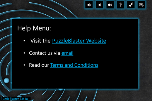
In diesem Beispiel beschreibt der sichtbare Text für jeden Link, wo der Link den Spieler nimmt, unabhängig davon, welcher Text vor dem Link angezeigt wird. Wenn ein Spieler nur "PuzzleBlaster Website" sehen würde oder seinen Bildschirmkommentar "Puzzle Blaster Website – Link" lesen würde, wäre dies ausreichend Kontext. Im Gegensatz dazu wäre ein schlechtes Beispiel für diese Richtlinie, wenn der erste Aufzählungspunkt als "Um unsere Website anzuzeigen, klicken Sie hier" angezeigt wird , oder wenn das Wort "hier" durch die tatsächliche URL der Website ersetzt wurde. Keine dieser Ansätze würde genügend Kontext bieten, um Spieler darüber zu informieren, wo der Link sie bringt, ohne den vorhergehenden Text lesen zu müssen.
Hinweis
Bildschirmsprachausgaben ermöglichen Benutzern häufig, durch Links einzeln zu navigieren, ohne den umgebenden Text zu lesen. Deshalb ist es wichtig, sicherzustellen, dass der Text des Links allein beschreibend ist.
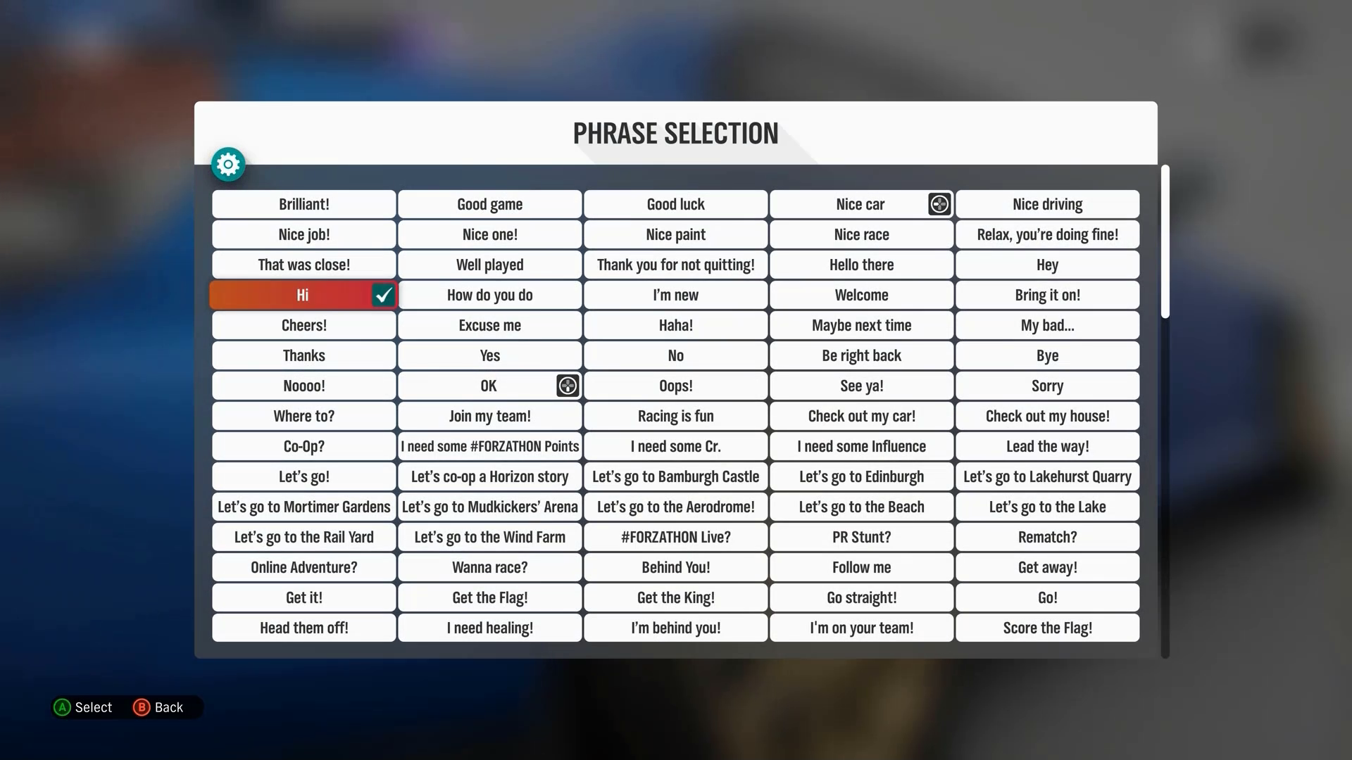
Für Informationsgruppen sollten die Gruppen sinnvoll und eindeutig bezeichnet werden, damit der Spieler den Kontext verstehen und zwischen den Gruppen unterscheiden kann.
Beispiel (erweiterbar)
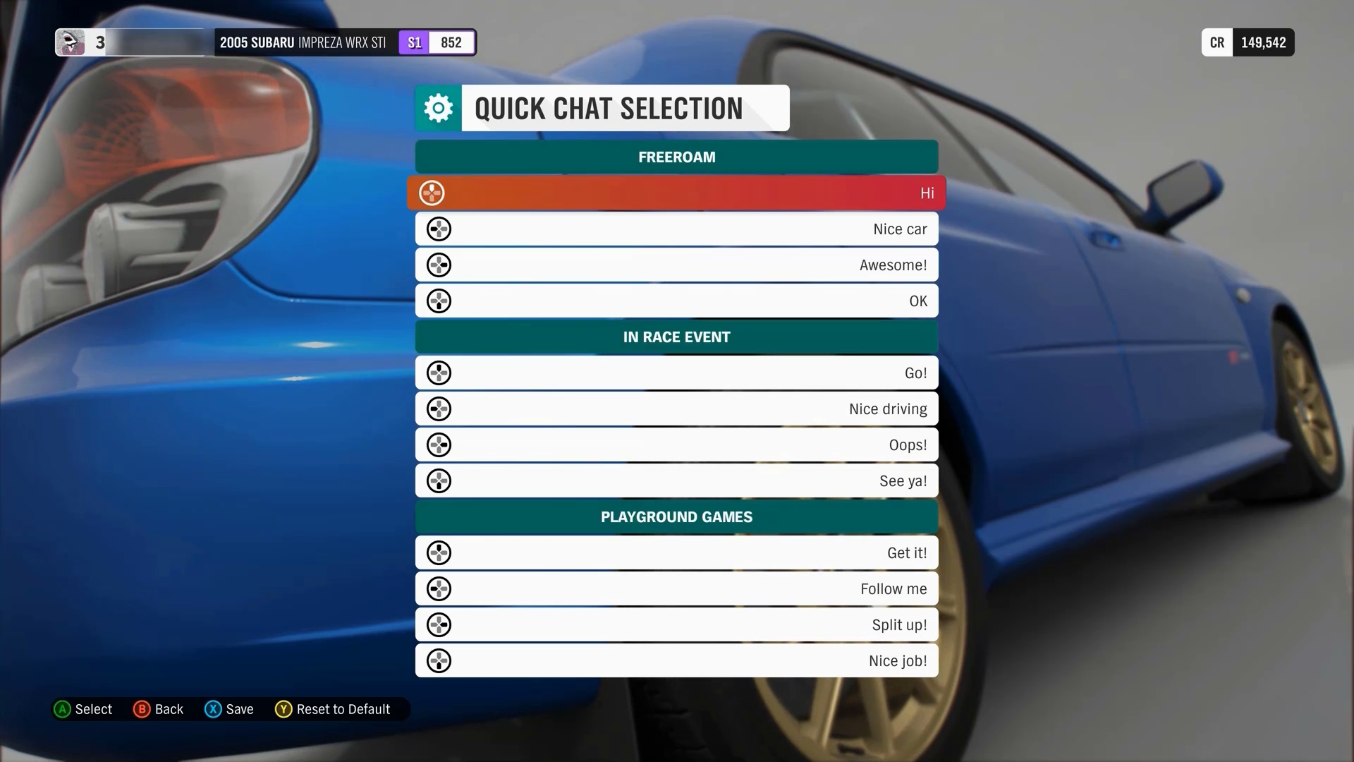
In diesem Forza Horizon 4-Beispiel werden die Optionen für den Schnellchat in drei Gruppen angezeigt, die jeweils beschriftet sind, um anzugeben, auf welchen Modus sie angewendet werden ("Freeroam", "In Race Event" oder "Playground Games"). Der Bildschirmkommentar beschreibt auch entsprechend die Gruppierungen für Spieler, die den visuellen Hinweis auf dem Bildschirm möglicherweise nicht sehen können, der bereitgestellt wird, um jede Gruppe zu kennzeichnen (z. B. der Titel der Gruppe, die auf dunkelgrünen Kacheln vor jedem Optionssatz geschrieben ist).
Stellen Sie bei Bedarf kontextbezogene Hilfe für jedes Element auf dem Bildschirm bereit.
Beispiel (erweiterbar)
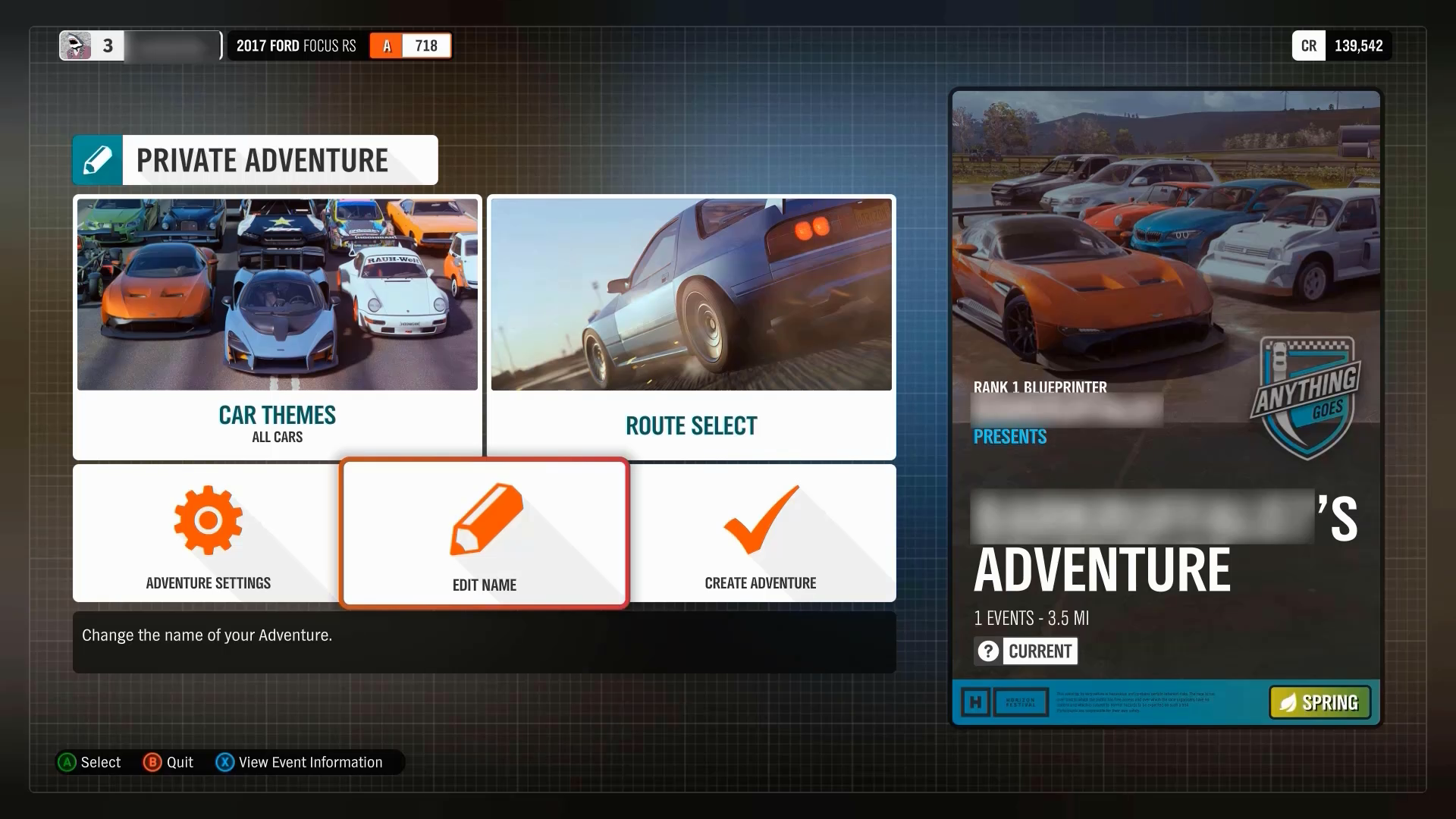
In Forza Horizon 4 wird in der Benutzeroberfläche zusätzlicher Kontext bereitgestellt, um sicherzustellen, dass Spieler leicht zwischen Menüfunktionen unterscheiden können. In diesem Beispiel erstellt der Spieler ein privates Abenteuer. Das Spiel beschriftet die Schaltfläche mit klarem Fokus als "Name bearbeiten" und stellt die kontextbezogene Hilfe darunter bereit, in der erläutert wird, dass dieses Element „den Namen Ihres Abenteuers ändert“.
Stellen Sie Methoden bereit, um die Fähigkeit eines Spielers zu beschleunigen, Eingaben für ein Formular bereitzustellen.
- Geben Sie beispielsweise für eine Liste von Staaten (z. B. "Kalifornien" oder "Nevada") dem Spieler ein paar Buchstaben ein, um den Staat aufzurufen. Dadurch wird verhindert, dass sie durch eine lange Liste scrollen oder den vollständigen Namen des Staates eingeben müssen.
Große Textblöcke sollten in redaktionelle geeignete Abschnitte aufgeteilt werden und beschreibende Überschriften aufweisen.
Beispiel (erweiterbar)
Screenshot von Assassin's Creed Valhalla mit Text aus der Update-Historie. "Update-Historie" oben ist der größte Schriftgrad und ein anderer Schriftschnitt als der restliche Text darunter, der ihn visuell als Überschrift markiert. Darunter befinden sich zwei Überschriften mit zugeordnetem Text: "Expansion 3 - Dawn of Ragnarok" und "BUG FIXES & IMPROVEMENTS", sie sind sowohl gelb als auch in Großbuchstaben, die sie visuell als Überschriften derselben Ebene markieren. Unter "BUG FIXES & IMPROVEMENTS" befindet sich eine Unterüberschrift: "STEALTH FIXES", die visuell in Grün und Großbuchstaben markiert ist. Unter den gelben Überschriften befindet sich weißer Text, der die Aktualisierung enthält. Der Text verwendet reguläre Sätze, Aufzählungszeichen sowie Gedankenstriche als Unterpunkte. In Assassin es Creed Valhalla werden die großen Textblöcke in der Updateverlaufs-UI nach Updatetyp kategorisiert. Jede Kategorie enthält beschreibende Überschriften und Unterüberschriften für jeden neuen Absatz, der die Art des folgenden Inhalts beschreibt. Darüber hinaus werden Aufzählungszeichen und Einzüge verwendet, um den Text optisch in kürzere Abschnitte zu gliedern.
Ein Mechanismus steht zum Anzeigen bestimmter Definitionen von Wörtern oder Ausdrücken zur Verfügung, die spielspezifisch oder auf ungewöhnliche oder eingeschränkte Weise verwendet werden, einschließlich Idiome, Jargon, Akronyme und Abkürzungen.
Beispiel (erweiterbar)
In Minecraft können Spieler auf einen Index zugreifen, der verschiedene Begriffe, Elemente oder Aktionen im Spiel auflistet. Beim Auswählen eines Elements werden Spieler mit einer Beschreibung von Aspekten wie einer Definition des Elements oder Ausdrucks versehen, wie sich die Interaktion mit oder die Verwendung dieses Elements auf das Spiel auswirkt, und in einigen Fällen visuelle Beispiele dafür, wie das Element im Spiel aussieht.
Benutzeroberflächentext, der für das Verständnis des Gameplays oder die Verwaltung von Spieleinstellungen (Text in Menü-UIs, Lernprogrammen, Anweisungen usw.) wichtig ist, sollte keine Lesefähigkeit erfordern, die fortgeschrittener ist als eine Sekundarstufe (sieben bis neun Schuljahre).
- Narrativer Text, der zur Storyline des Spiels beiträgt, z. B. Journale, Charakterdialog, andere Inhalte im Spielverlauf und Eigennamen oder Titel unterliegen dieser Richtlinie nicht.
Eine visuelle Simulation, die zeigt, wie eine bestimmte Einstellung oder Option die Benutzeroberfläche des Spielers ändert, sollte bereitgestellt werden.
Wenn möglich, sollte diese Vorschau in einem realistischen Kontext der Spielumgebung angezeigt werden.
Beispiel (erweiterbar)
Videolink: einheitliche Beschriftung, Symbolografie und Text
In Fenyx Immortals Rising wird beim Navigieren zu bestimmten Optionen im Einstellungsmenü eine In-Game-Vorschau angezeigt, wie sich jede Optionsauswahl auf die Benutzeroberfläche des Spielers in der Spielumgebung auswirkt.
Potenzielle Auswirkungen des Spielers
Die Richtlinien in dieser XAG können dazu beitragen, Barrieren für die folgenden Spieler zu reduzieren.
| Spieler | Betroffen |
|---|---|
| Spieler ohne Vision | X |
| Spieler mit kognitiven oder Lernbehinderungen | X |
| Andere: Casual Spieler, jüngere Spieler, diejenigen, die neu beim Spielen sind | X |
Ressourcen und Tools
| Ressourcentyp | Link zur Quelle |
|---|---|
| Artikel | Kontextbezogene Hilfe/Anleitungen/Tipps im Spiel (extern) einschließen |