Leads Module References
This guide contains a description of the content featured in all components and recommended sizes for various layouts.
Below you will find descriptions of the main functionality for a given component. For all components, if a strong match is not found for a given set of query parameters, the user will land on a search results page (the matching page) where they can further refine their search or enter new search terms. After a match is selected, the UI will display the component requested.
Note
Due to limitations of the content width displayed here, some recommended sizes are wider than the width allowed on this page. Screenshots larger than the allowed width are presented but scaled down in size, though the aspect ratio remains consistent.
Recommended Sizes
Inline Mode
| Module | 1-Column Thumbnail | 2-Column Thumbnail | 1-Column Small | 2-Column Small | 1-Column Medium |
|---|---|---|---|---|---|
| Top Card | 300 x 336 px | 625 x 390 px | 300 x 528 px | ||
| Get Introduced | 300 x 336 px | 625 x 336 px | |||
| Messaging | 300 x 336 px | 625 x 390 px | 300 x 528 px | ||
| Connect | 300 x 336 px | 625 x 390 px | 300 x 528 px | ||
| Recent Activity | 300 x 155 px | 625 x 155 px | |||
| Highlights | 300 x 155 px | 625 x 155 px | |||
| Related Leads | 300 x 230 px | 625 x 230 px |
Classic Mode
Modules presented in classic mode are responsive and can be best viewed at the following sizes:
1-Column Small
- Min width: 320px
- Max width: 480px
- Height: 405px
1-Column Medium
- Min width: 320px
- Max width: 640px
- Height: 515px
1-Column Large
- Min width: 320px
- Max width: 640px
- Height: 820px
2-Column Medium
- Min width: 640px
- Max width: 944px
- Height: 515px
3-Column Medium
- Min width: 944px
- Max width: dynamic
- Height: 515px
Top Card
The Top Card displays user profile data for a lead, including name, headline, and role. From this component, users can save, message, or view the lead in Sales Navigator.
Important
Screenshots below were rendered using the TopCard2 query parameter, which should be used in all new implementations.
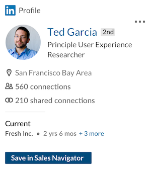
Top Card, 1-Column Small, Inline
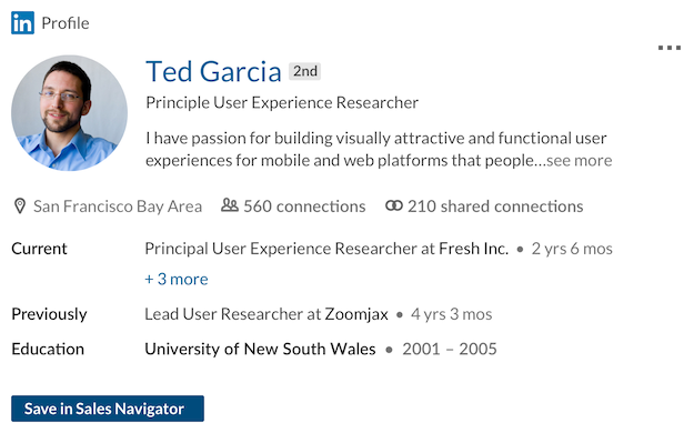
Top Card, 2-Column Small, Inline
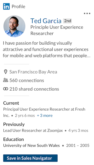
Top Card, 1-Column Medium, Inline
Get Introduced
With the Get Introduced component, sales professionals can ask for an introduction to the lead from anyone within their network who may be connected to the lead. If the Sales Navigator instance has licensed TeamLink, users will be able to see anyone in their organization who is connected to the lead who can make the introduction.
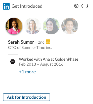
Get Introduced, 1-Column Small, Inline
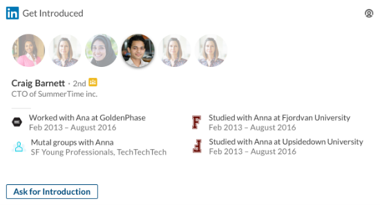
Get Introduced, 2-Column Small, Inline
Messaging
The Messaging component enables sales professionals to send private messages to their connections and InMail to new leads.
Important
If the recipient is not a 1st or 2nd degree connection, an InMail will be sent to the recipient when using this module. For 1st and 2nd degree connections, a normal message will be sent.
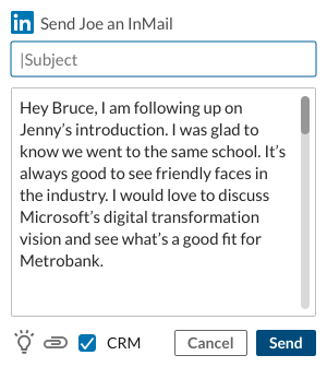
Messaging, 1-Column Small, Inline
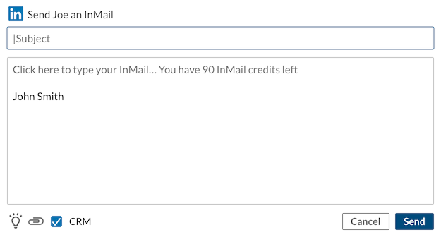
Messaging, 2-Column Small, Inline
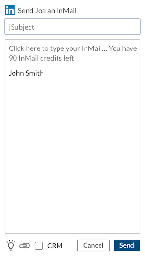
Messaging, 1-Column Medium, Inline
Connect
With the Connect component, sales professionals can send connection invites along with personal messages, to solidify leads and add them to their network.
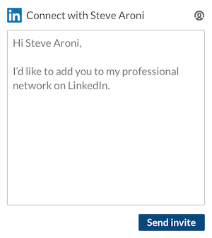
Connect, 1-Column Small, Inline
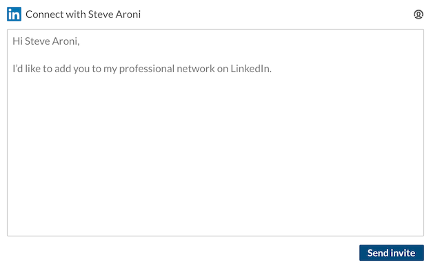
Connect, 2-Column Small, Inline
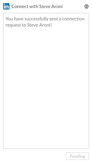
Connect, 1-Column Medium, Inline
Icebreakers
Ice Breakers informs sales professionals on a leads' key activities and interests, and commonalities shared with a sales professional. If a user taps on the light bulb button in Messaging module, the Icebreakers component will load and contain the Recent Activity and Highlights modules. Recent Activity and Highlights can also be loaded individually.
Important
The Icebreakers module is not supported as a standalone module in Inline Mode.
Recent Activity
The Recent Activity component displays updates for a lead, including job updates, news about their company, and shares they have created, liked or commented on.

Recent Activity, 1-Column Thumbnail, Inline

Recent Activity, 2-Column Thumbnail, Inline
Highlights
The Highlights component identifies commonalities in background between the Sales Navigator user and the lead. This information can be leveraged to engage with a potential lead and establish a personal connection.
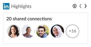
Highlights, 1-Column Thumbnail, Inline

Highlights, 2-Column Thumbnail, Inline
Related Leads
Related Leads shows the potential leads similar to the target lead, to enable sales professionals to connect with the target lead’s network.

Related Leads, 1-Column Thumbnail, Inline
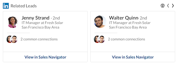
Related Leads, 2-Column Thumbnail, Inline
Classic Mode with All Modules
The classic mode with all modules will allows you to embed just one iframe with all modules sales professionals might need.
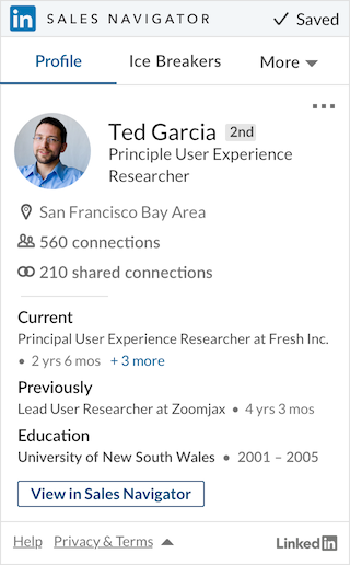
All Modules, 1-Column Medium, Classic
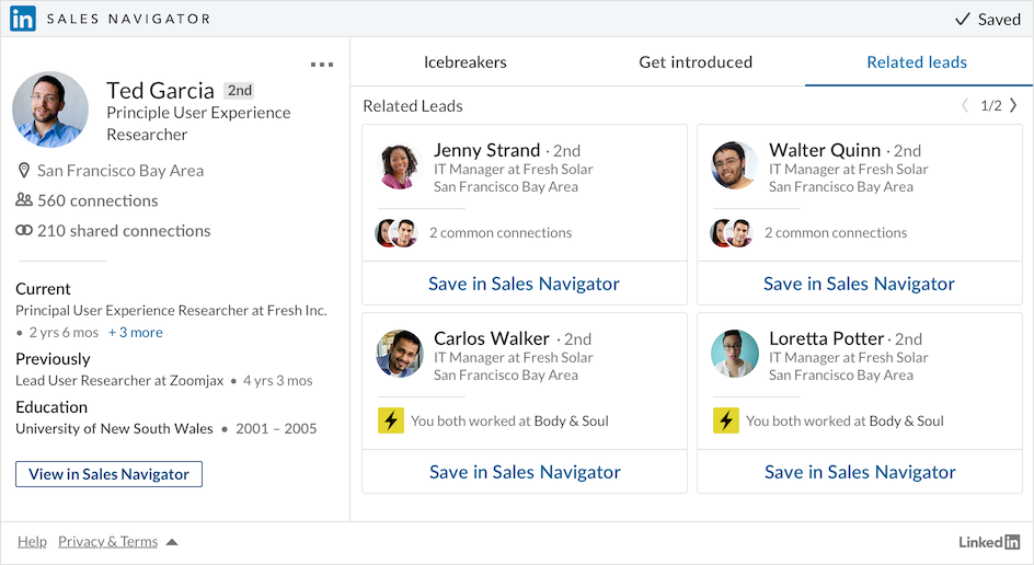
All Modules, 3-Column Medium, Classic