Hinweis
Für den Zugriff auf diese Seite ist eine Autorisierung erforderlich. Sie können versuchen, sich anzumelden oder das Verzeichnis zu wechseln.
Für den Zugriff auf diese Seite ist eine Autorisierung erforderlich. Sie können versuchen, das Verzeichnis zu wechseln.
Advance width rule
All glyphs in proportionally spaced typefaces have advance widths that are dependent on their proportional design.
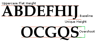
Vertical alignment rule
This is the value of uppercase flat heights such as the top of the B,D,E,F,H, I,J,K,L,M,N,P,R,T,U,V,W,X,Y and Z in most typefaces.
All other uppercase flat characters that have the same top feature should be at the same value exactly in most text fonts.
Note : On the diagonal strokes of the characters A, V or W, the alignment of the top or bottom varies depending on the horizontal thickness of where the diagonal strokes join. A very pointed A, V or W should have the top or bottom exceeding the value of the flat height so it does not appear short. A wide top or bottom junction design may reside on the baseline or align to the uppercase flat height as the 'A' in the illustration below.
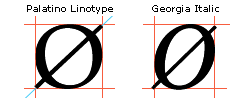
Round overshoot values rule
This is the value of uppercase round heights such as the C,G,O,Q,S,J and U.
All other uppercase round characters that have the same top and bottom feature should be at the same value exactly in most text fonts. They should overshoot the baseline of the flat characters the same amount as the top overshoots the uppercase flat characters.
Note : It is far more important the tops and bottoms of round characters are visually more than mathematically equal. It is common for designers to make some round characters, such as the uppercase S and C slightly smaller than the uppercase O.
'I'm very unsystematic about things like the relative sizes of round characters, I judge them purely by eye. It's my impression that S and C often need to be a bit smaller than the fully-enclosed O because the openings in their forms make them look bigger. This applies equally to the lowercase.'
Comments on visual character heights by Matthew Carter, Carter and Cone Type, Inc.
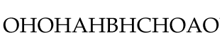
Spacing rule
The two most important characters with regard to spacing in the uppercase are the H and the O. These two are the model characters most type designers use to space the rest of the group. They are used in chains to test how the current character spaces between other straight or round stems. When spacing outlines, glyphs should be visually centered as opposed to mathematically. It is helpful in upright modern geometric designs to use mathematical logic in spacing. In such a case the sidebearing values of round featured characters are mathematically the same and usually less than the flat characters values.
All characters should position in their cell in a similar way so when placed in text they space evenly. This does not mean the center of its advance width. It is common for some typefaces (italics) to position the black (black width) of the glyph to the right of the mathematical center of the advance width. The H and O are used to test how the current character centers in the font, not in its advance width.
Specific character standards
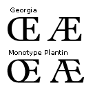
Uppercase OE diphthong
Unicode: U+0152Uppercase AE diphthong
Unicode: U+00C6Design : There are two common design styles for the uppercase OE and AE diphthongs. The most common style is one where the uppercase E is the main or dominant character as in Matthew Carter's Georgia. A less common design is one where the first component the O or A is the dominant character as in Monotype Plantin. The bar of the uppercase A does not necessarily have to be at the same vertical height as the bar of the uppercase E.
Advance width rule : The advance width is proportional to the design. The left sidebearing is commonly the same as in the uppercase O or A and the right sidebearing is commonly the same as in the uppercase E.
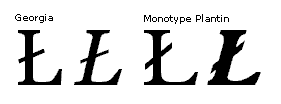
Uppercase L slash
Unicode: U+0141Design : This letter is used in Polish and many languages including some native American languages. The bar length should be longer on the right than the left and large enough to be clearly visible at all sizes. The bar angle should be approximately 30 degrees. The bar angle in Palatino Linotype regular is 29.8 degrees from horizontal and the Palatino Linotype italic is 28.03 degrees from horizontal.
For help on the design, bar length and angle for the Polish language see the suggestions for Polish diacritics byAdam Twardoch.
Advance width rule : The advance width is commonly the same as the uppercase L.
Uppercase O slash
Unicode: U+00D8Design : This letter is used in Danish and Norwegian languages. The bar length is commonly equal too or greater than the leftmost and rightmost portions of the uppercase O and equal to or greater than the top and bottom. Its angle should evenly divide the counter. Some very bold and display designs the bar does not extend through the center counter of the uppercase O instead it only extends from the outer portions of the letter.
Advance width rule : The advance width is commonly the same as the uppercase O.
Uppercase Eth
Unicode: U+00D0
Design : This character's design is based on the uppercase D with a bar. The bar should be the same thickness as other uppercase characters with bars in the font. Bar should be positioned vertically to visually center. This is usually slightly north of the mathematical center. Horizontally the bar should extend more to the right of the stem of the D and be approximately half the length of the D counter. The left side should extend sufficiently to be visible at smaller point sizes. This is the same glyph shape as Unicode character D with stroke U+0110.
For more help on designing the Eth and Thorn see the tutorial by Icelandic type designer Gunnlaugur SE Briem.
Advance width rule : It is often necessary for the advance width of this character to be greater than that of the uppercase D to visually compensate for the bar.
Uppercase D with stroke - Dyet
Unicode: U+0110Design : This is the same glyph shape and design as Unicode character Eth U+00D0. This character is used in the Croatian, Vietnamese, Macedonian and Serbian languages.
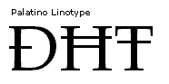
Uppercase T with stroke
Unicode: U+0166Design : This character's design is based on the uppercase T with a bar. The bar should be the same thickness as other uppercase characters with bars in the font. Bar is positioned commonly slightly north of the mathematical center. Horizontally the bar should extend equally to the left and right of the stem in roman designs and visually equal in italic designs.
Advance width rule : The advance width should be equal to the uppercase T character's advance width.
Uppercase H with stroke
Unicode: U+0126Design : This character's design is based on the uppercase H with a bar. The bar should be the same thickness as other uppercase characters with bars in the font. The bar should be positioned vertically in the upper portion above the center crossbar of the H, visually centered. Horizontally the bar commonly extends equally to the left and right of the stem in roman designs and visually equal in italic designs. In some designs the bar does not extend through the stems of the H.
Advance width rule : When the bar extends through the H it is often necessary for the advance width to be greater than that of the uppercase H to visually compensate for the bar.
Uppercase Thorn
Unicode: U+00DEDesign : This character's design is based on the uppercase P. The common practice is to move the round bowl of the uppercase P down so the bowl is vertically positioned slightly north of the mathematical center. In serif designs the top of the main straight stroke's serif is usually equal to the lower inner serif on this main stroke.

Advance width rule : The advance width should be equal to the uppercase P character's advance width.
For more help on designing the eth and thorn see the tutorial by Icelandic type designer Gunnlaugur SE Briem.
Uppercase Eng
Unicode: U+014aDesign : The preferred design of the uppercase Eng for the Sami language is one based on the uppercase N. The design form that resembles a lowercase n is an equivalent form of the uppercase Eng.
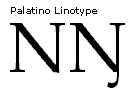
The uppercase and lowercase Eng are also used in the western African language of Hausa. In this African language the preferred design for the uppercase Eng is one that has a rounded top similar to a lowercase n.

Advance width rule: The advance width should be equal to the uppercase N character's advance width or proportional to the design.
Small caps
Design : These characters are smaller versions of the uppercase characters. Their weight relates to the lowercase and the stroke distances are often slightly heavier than the round and straight strokes of the lowercase. Mathematical scaling should only be used as a basis for the final designs. The vertical height is created commonly by using a larger scale than the horizontal direction. Common scales are 65..80% of the uppercase height. It is always necessary to adjust the weight of the scaled letterforms. These smaller characters need to have proportionally heavier stems than the scaling provides. Example: The small caps characters for Tahoma are vertically 78.5% and horizontally 82% of the uppercase height. The small cap characters in Palatino Linotype are 65% vertically and 66% horizontally less than the uppercase height.
There are no Unicode numbers for these characters. The Unicode Consortium sees these characters as glyph variants and not unique characters. These glyphs can be accessed in OpenType fonts by glyph substitution.
Vertical alignment : The small cap flat height is commonly greater than or equal to the lowercase x-height. Its actual height is dependent on the design.