Configure unified patient view
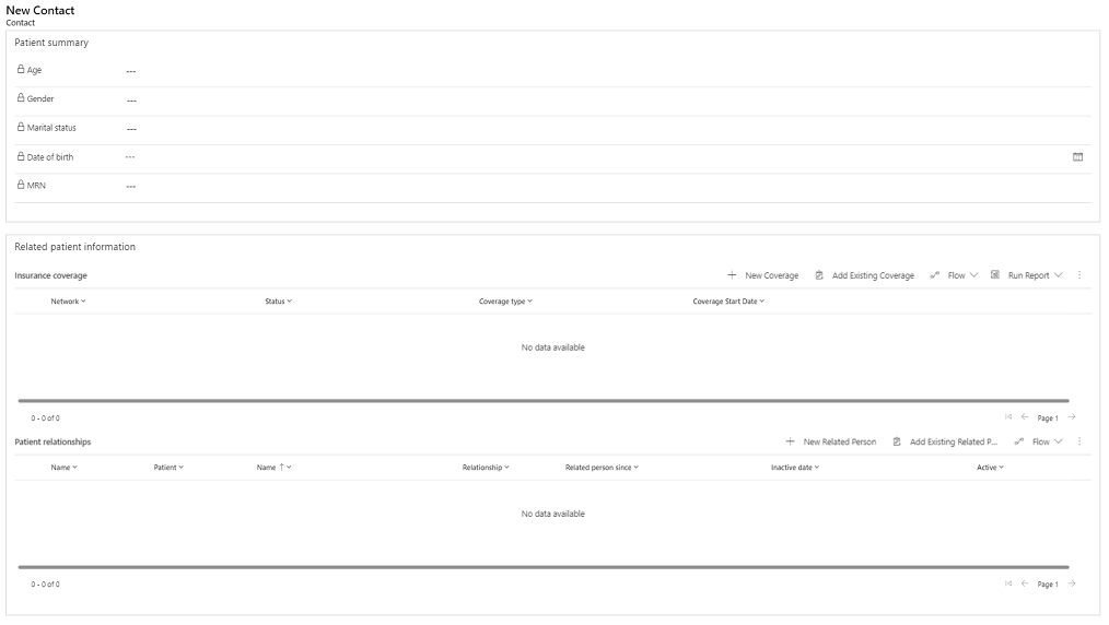
Unified patient view displays patient data in Dynamics model-driven apps, including demographic information and clinical data. It also includes the clinical timeline and care teams controls. You can install it with Microsoft Cloud Solution Center.
The unified patient view is the form included with Microsoft Cloud for Healthcare model-driven applications (like care management). You can also use it independently. If you download it independently of the model-driven applications, you get the Healthcare Administration application with the unified patient view, and you get the ability to add the unified patient view to any model-driven application that you create.
The unified patient view consists of two forms. One form displays clinical data, Patient - Clinical, while the other only displays nonclinical data, Patient - Administrative. The security roles Healthcare User and Healthcare Non-Clinical User determine the access, respectively.
Extend the clinical timeline control
You can configure the clinical timeline to display custom entities other than those entities configured by default in the msemr_timelinecustomschema.xml web resource file.
Create a copy of the msemr_timelinecustomschema.xml web resource file. The web resource file has the following schema:
Property Description logicalName The logical name of the entity. primaryIdField The primary field of the entity. displayName The display name of the entity on the clinical timeline. titleField The field displayed as the title on the clinical timeline cards. descriptionField The field displayed as the description on the clinical timeline cards. startDateField The field displayed as the start date on the clinical timeline cards. endDateField The field displayed as the end date on the clinical timeline cards. regardingField The lookup field for the Contact entity. modalDialogFormId The ID of the form displayed to view, create and edit a record from the clinical timeline. Edit the XML file by adding the definition for the new entity and removing definitions that the control shouldn't show. Here's an example of the XML file for the Care Plan Activity entity.
{
    "primaryIdField": "msemr_careplanactivityid",
    "logicalName": "msemr_careplanactivity",
    "displayName": "Coaching Plan Activity",
    "titleField": "msemr_description",
    "descriptionField": "msemr_activitydescription",
    "startDateField": "msemr_activitystartdate",
    "endDateField": "msemr_activityenddate",
    "regardingField": "msemr_patient",
    "modalDialogFormId": "02c4cfef-512a-4035-bb56-f2e681831515"
}
Publish this XML file as a web resource.
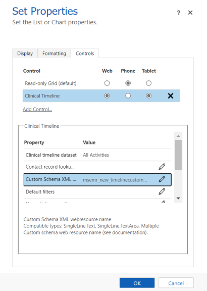
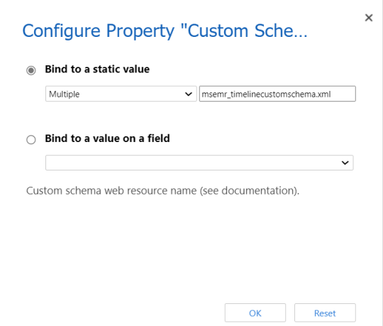
Configure the clinical timeline control to refer to this web resource by setting the control's Custom Schema XML property.
Update and publish the form. The clinical timeline control on the updated form now displays the new entity.
Add the clinical timeline control to another form
The following two options are available to add the clinical timeline control to another form:
Create a new form and add the clinical timeline control.
Copy an existing patient form.
In the following section, we cover the first option of creating a new form and adding the control.
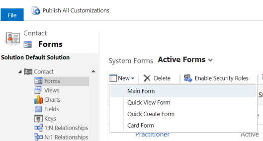
Create a new Main Form, and then set the name of the form.
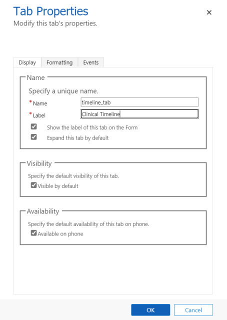
Insert a new single column tab on the form and provide a tab label.
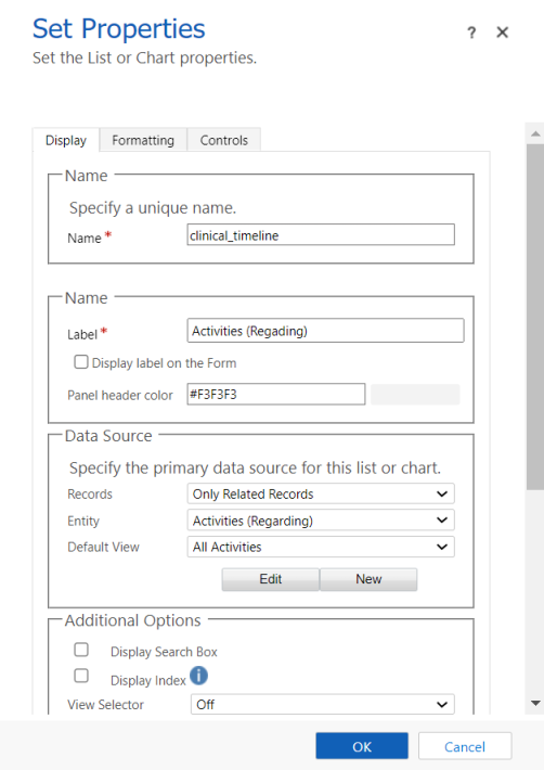
In the tab section, add a subgrid. Configure the subgrid to display the Activities entity and the All Activities view. You can also choose other views because this setting doesn't affect the data displayed on the control.
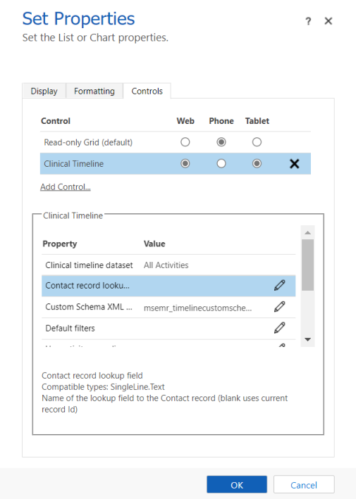
On the Controls tab for the subgrid, select and add the Clinical Timeline control.
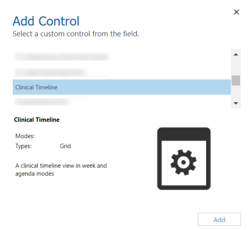
Configure the Custom Schema XML property. Set the value of this property to msemr_timelinecustomschema.xml
Select Web and Tablet for the view modes.
View the clinical timeline on the new form by navigating to the model-driven app, opening a Contact record, and selecting the new form.
Configure patient links
According to the FHIR standard, the Patient.link element links to another patient resource that concerns the same actual patient. In the unified patient view, a record's links are displayed in the Linked records tab on the patient form. You can configure how the end-user visualizes the links and the associated data of linked records.
There are four link types in the FHIR standard:
| Link type | Description |
|---|---|
| See also and Refer to | Links to a valid patient record that contains additional information about the patient. |
| Primary (Replaced By in FHIR) | Links to the primary active record for this patient. |
| Inactive (Replaces in FHIR) | Links to an inactive patient record that shouldn’t be used. |
The latest update for patient links provides an enhanced usage experience and offers the following improved capabilities:
When you remove links of the type Primary (Replaced By in FHIR) or Inactive (Replaces in FHIR), the inactive Patient record is now automatically reactivated in Dataverse. If you update, delete, or deactivate the links, the patient is reactivated in case there are no other links that make this patient inactive. A field that tracks the deactivation reason(s) controls the reactivation.
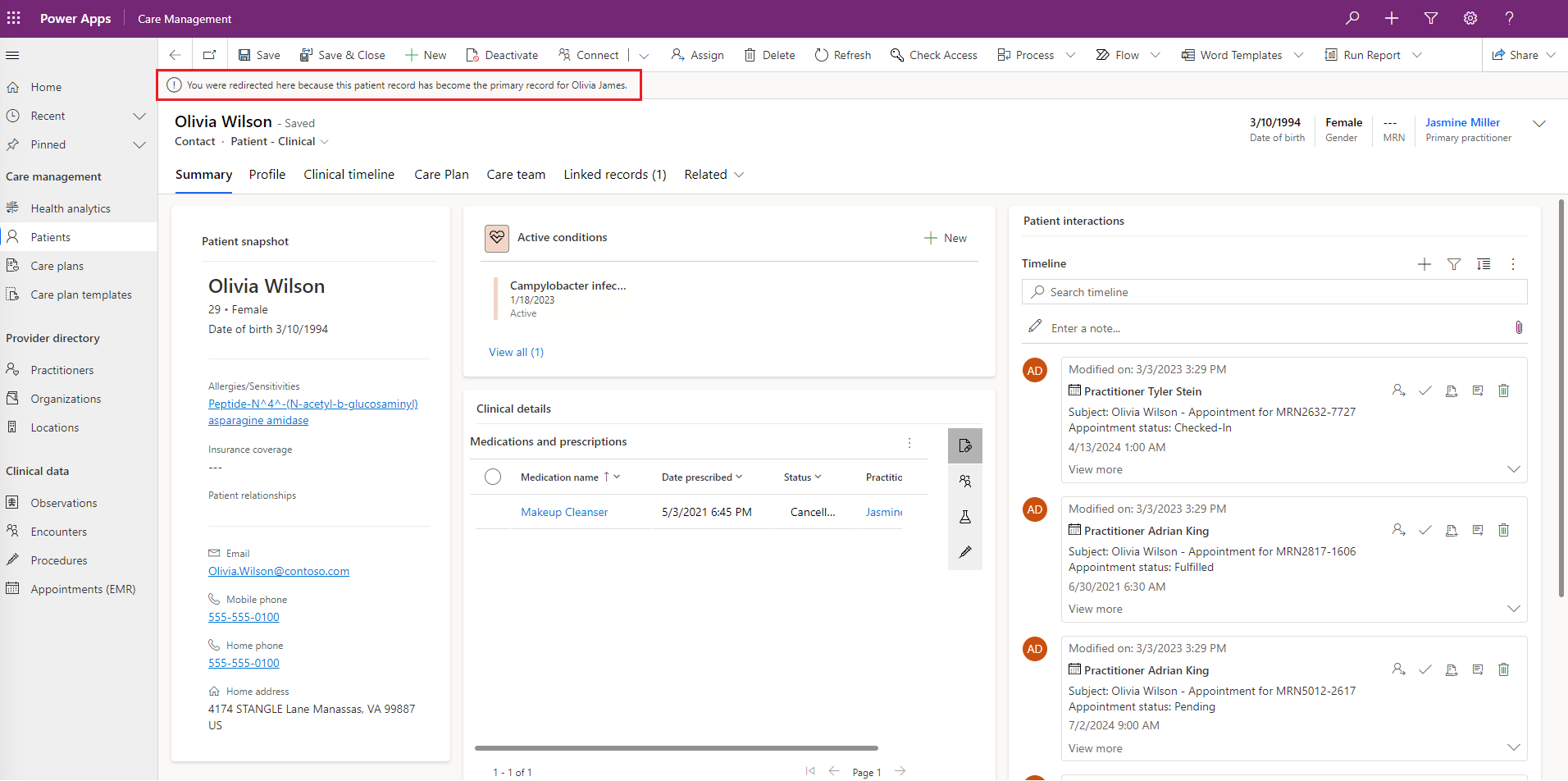
The patient summary tab displays a banner notification if a user selects a linked record in the links table and is redirected to the primary record.
For example, consider a scenario where Olivia Wilson is the primary record and Olivia James is a linked record for this primary record. When a user selects the linked record Olivia James and is redirected to the primary record Olivia Wilson, the user sees the following message - "You were redirected here because this patient record has become the primary record for Olivia James."

Settings page
To configure patient links, navigate to Linked records in the Administration Settings area of the Healthcare Administration app.

The settings page includes the following configuration options for administrators:
Data roll-up mode: Select one of the following two modes for visualizing the links and the associated data of linked patient records:
No roll-up: Data associated with linked records is presented on separate pages, and won't be rolled into the primary record. Redirection from inactive records to the primary record is turned off.
Roll up data from inactive patient records: Selected data from inactive patient records appear in the patient's primary record. For example, consider three records A, B and C for a single patient. Assume that there's a link of the type Inactive from A to B and another from B to C. On A's record, users can view data like appointments or encounters from A, B and C. Redirection from inactive records to the primary record is turned on.
You can also configure the notification behavior in addition to which data types are rolled up in the Roll up data mode.
Maximum link depth: This value refers to the maximum number of links to follow from the primary record when rolling up data from other patient records. Consider the earlier example of records A, B and C. If you set Maximum link depth to 1 and select Roll up data from inactive patient records, then A's record would only display the associated data of A and B. However, if you set Maximum link depth to 2 or greater, then A's record would display the associated data of A, B and C.
Visible links: Use this setting to control link visibility for non-administrators. You can select one of the following values to determine the type of links that non-administrators can see in the Linked records tab:
Value Description All links Non-administrators can see all link types Refer and See also Non-administrators can only see links of the type Refer and See also None Non-administrators can't see any links 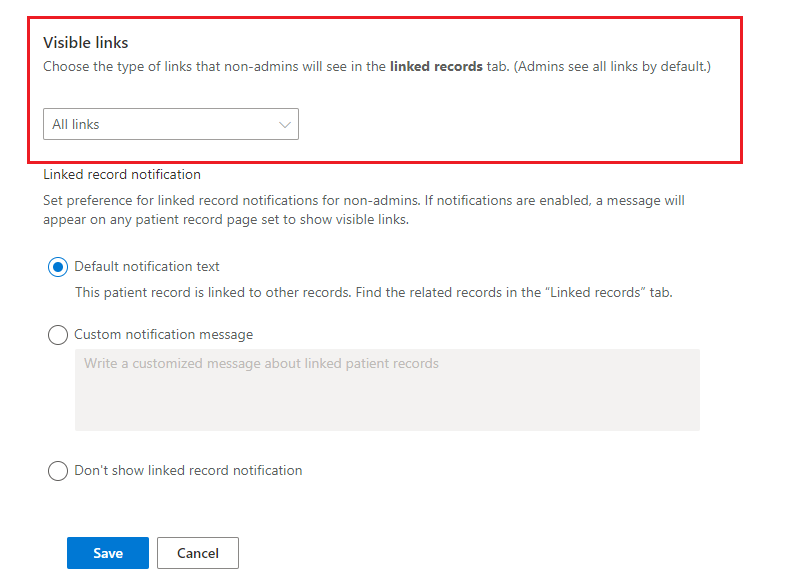
Note
- Admins can see all the links by default.
- By design, the Linked record notification configuration is disabled if you set the link visibility value for non-administrators to None.
Linked record notification: Use this setting to determine the appearance of notifications and set preference for linked record notifications for non-administrators. If you enable notifications, a message appears on any patient record set to show visible links.
You can select one of the following values for displaying linked record notifications:
Value Description Default notification text The default notification text displays the following message to non-administrators - "This patient record is linked to other records. Find the related records in the Linked records tab" and provides a link to the Linked records tab. Custom notification message Use a custom notification message that you want to display to non-administrators. Don't show linked record notification Non-administrators can't see any linked record notifications. 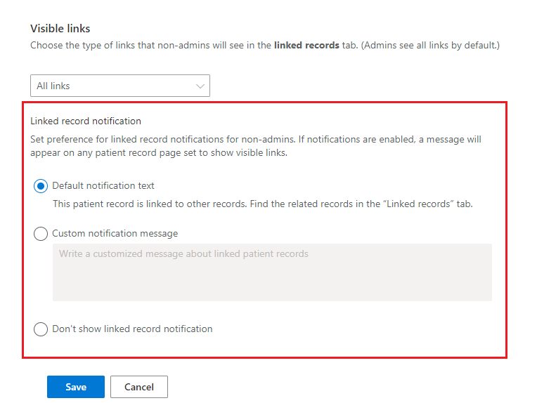


Administrative view
Administrators have a slightly different user experience from other users. Administrators have read permissions to the Audit Summary entity. They see a slightly different view for patient links that includes the link type and contains all the links in a single table.
Note
System administrators won't see or receive linked record notifications.

Administrators can also enable and disable redirection from inactive records through the Disable redirect ribbon button command.

Display name for link types
Administrators can change the display name for link types. This display name is only visible to them.
Navigate to the Codeable Concept form for the link type.
Change the Text field to use the text you want to display.
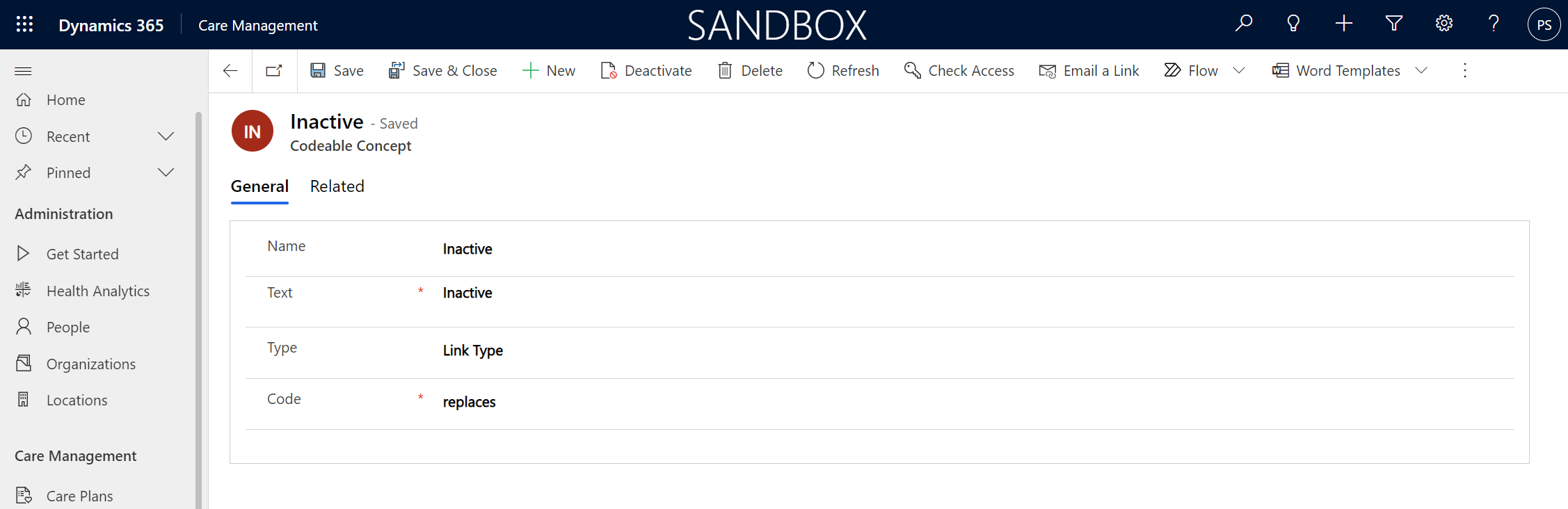

Important
Don’t change the Type or Code fields.
Only administrators can see the tooltips that explain the link types. The display name (Text field) determines the tooltips. The tooltip text appears only for the following names (case-sensitive). Default names are in italics (the others come from the FHIR standard).
| Display name ("Text" field) | Tooltip text |
|---|---|
| See also, Refer to | Links to a valid patient record that contains additional information about the patient |
| Primary, Replaced By | Links to the primary active record for this patient |
| Inactive, Replaces | Links to an inactive patient record that shouldn’t be used |
Configure the card view control
You can add the card view control to a subgrid. The properties of the view associated with the subgrid drive the following characteristics in the card view:
- Title of the control
- Sort order and filter for the records shown
- Fields shown on each card and their order (corresponding to the view's first three columns and their order)

The maximum number of cards shown corresponds to the Number of Rows property for the subgrid.

You can also configure the following properties for the card view control:
- Form Identifier: The unique identifier of the modal form dialog that opens upon the selection of a card.
- Custom color (optional): A hex code for the color of the icon background and the card strips. If blank, the color defaults to the predefined entity color.
- Icon resource URL (relative) (optional): A custom icon for the control header. This value should be the relative path of the SVG web resource to use. If blank, the icon defaults to the predefined entity icon. If there isn't a predefined entity icon, the icon defaults to a generic icon.
- Dialog position (optional): Whether the dialog form opens to the side or the center. If blank, the dialog position defaults to the side.
- Dialog form width (optional) and Dialog width unit (optional): The width of the dialog form and the unit for this width (pixels or percentage of screen width).

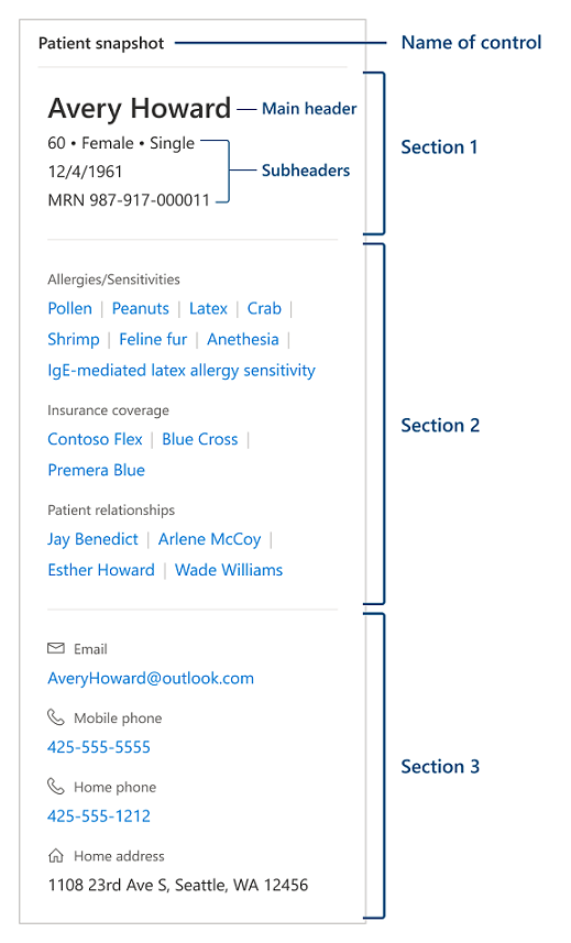
Patient snapshot control for patient form (preview)
Important
- This is a preview feature.
- Preview features aren't meant for production use and may have restricted functionality. These features are available before an official release so that customers can get early access and provide feedback.
The patient snapshot control provides a highly customizable bird's eye view of the patient information. The native Dynamics 365 tools such as quick view forms that serve as a base for the control's data model drive the customization. Patient snapshot currently supports different types of field data types. These data types include phone, email, datetime, lookup, calculated fields, and subgrids for related entities for many-to-one and many-to-many relationships.
Configure patient snapshot control on the patient form
Create a quick view form to configure the patient snapshot control you're going to add to your app. For steps to configure the quick view form, go to Configure patient snapshot quick view form.
Open the contact form where you want to add the patient snapshot.
Create an anchor field that's going to use patient snapshot for its display.
Open the form in classic mode, and set patient snapshot control as the default control for displaying the anchor field for all device form factors.
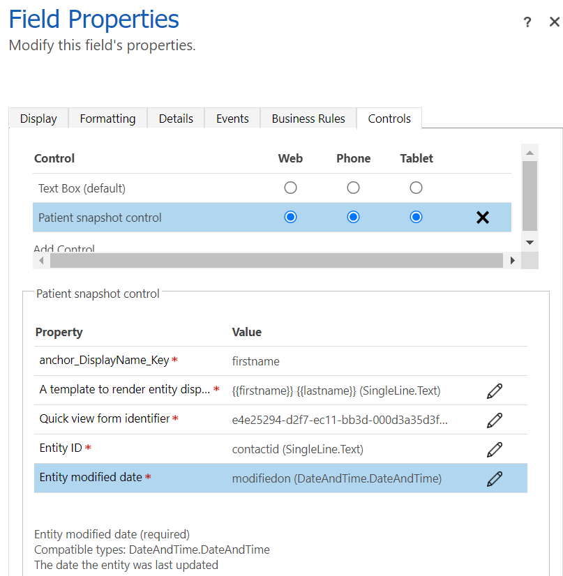
Provide the following inputs for the patient snapshot control:
- A template for the patient snapshot display name. Here, you can use the
{{LOGICAL_FIELD_NAME}}syntax to force the control to fetch respective fields from Dataverse and put those values inside the display name. - The GUID of the quick view form you created to configure the patient snapshot view.
- The GUID of the main entity to populate the patient snapshot control with data.
- The last modification date of the main entity. You can use the system field called modifiedon to identify when would the patient snapshot need to refetch information about the entity even without a full page refresh.
- A template for the patient snapshot display name. Here, you can use the
Save the form.
The following screenshot shows a patient snapshot configuration example:
Configure patient snapshot quick view form
Create a new quick view form or update the existing Patient Clinical Snapshot Configuration quick view form for the Patient - Clinical form (or the Patient Administrative Snapshot Configuration quick view form for the Patient - Administrative form) of the contact entity. Make a note of the form ID of the quick view form.
Set or update the value of the tab Label. This value displays as the name of the control in the form. The default display name of the control is Patient snapshot.
As explained in Configure patient snapshot control on the patient form, you can set the main header of the control in the control configuration. By default configuration, the main header of the control displays the patient's first name & last name.
The first section of the form displays the sub header fields of the control, and the main header displays the first three fields of this section under it. Configure the fields that you want to display as part of the sub header section of the form (for example, fields such as age, gender, and marital status).
You can include two more fields that will be displayed in their own separate rows as part of the header (for example, birth date and medical record number (MRN)).
Note
- Any other field added after the fifth field for this section will not be displayed in the control.
- You can control the label displayed for these fields by enabling or disabling the Hide label property of the field in the quick view form.
The second section in the form contains subgrids of entities associated with the patient. This section is displayed in the control as a list delimited by a pipe symbol (|). Selecting the link displays details of the record on the right panel of the form. Configure the subgrids for the contact-associated entities that you want to display in the form.
Note
The number of rows and the view selected for the subgrid will be used to render in the snapshot control.
The third section in the form displays other patient fields in the snapshot control, with relevant icons. You can configure displaying any extra fields (such as email, phone numbers, and addresses) in the last section of the control.

Limitations of the control
- All records that the patient snapshot control needs to display must have their primary name attribute populated. The control doesn't support custom intersection entities without a prepopulated primary name attribute.
- All subgrid views that the patient snapshot control needs to display must include the primary name attribute control in their fields or columns list.
- If you need to include dynamic information into the display name header of the patient snapshot control, the display name template only supports logical field names directly hosted by the main entity.
- Patient snapshot control doesn't support direct creation of new related entities from the snapshot view. You can see a placeholder for empty values.
- The patient snapshot control is designed to work in a model-driven app. We don't guarantee its operation in canvas apps.
- You can only have a maximum of three sections in a quick view form tab.
- You can only have a maximum of five controls in the first (header) section. Three of these controls form the first row (subtitle) in the patient snapshot.
- You can only have a maximum of 15 controls in other sections.
See also
What is Microsoft Cloud for Healthcare? Use unified patient view