Azure Monitor - Service Bus insights
Azure Service Bus insights provide a view of the overall performance, failures, capacity, and operational health of all your Service Bus resources in a unified interactive experience. This article will help you understand the benefits of this new monitoring experience, and how you can modify and adapt the experience to fit the unique needs of your organization.
Introduction
Before diving into the experience, you should understand how it presents and visualizes information.
It delivers:
At scale perspective of your Service Bus resources across all your subscriptions in a single location, with the ability to selectively scope to only those subscriptions and resources you're interested in evaluating.
Drill down analysis of a particular Service Bus resource to help diagnose issues or perform detailed analysis by category - utilization, failures, capacity, and operations. Selecting any one of those options provides an in-depth view of the relevant information.
Customizable - This experience is built on top of Azure Monitor workbook templates allowing you to change what metrics are displayed, modify or set thresholds that align with your limits, and then save into a custom workbook. Charts in the workbooks can then be pinned to Azure dashboards.
This feature doesn't require you to enable or configure anything, these Service Bus metrics are collected by default.
Note
There is no charge to access this feature and you will only be charged for the Azure Monitor essential features you configure or enable, as described on the Azure Monitor pricing details page.
View utilization and performance metrics for Service Bus
To view the utilization and performance of your Service Bus resources across all of your subscriptions, perform the following steps.
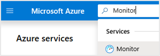
Sign in to the Azure portal.
Search for Monitor and select Monitor.
On the left menu, select Service Bus (preview).


Overview
On Overview, the table displays interactive Service Bus metrics. You can filter the results based on the options you select from the following drop-down lists:
Subscriptions - only subscriptions that have a Service Bus resource are listed.
Service Bus - You can select all, a subset, or single Service Bus resource.
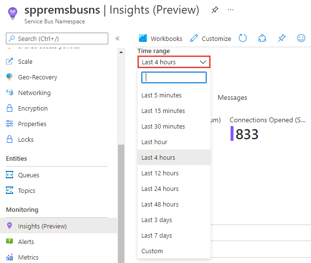
Time Range - by default, displays the last 4 hours of information based on the corresponding selections made.
The counter tile under the drop-down lists rolls-up the total number of Service Bus resources are in the selected subscriptions. There's conditional color-coding or heatmaps for columns in the workbook that report transaction metrics. The deepest color has the highest value and a lighter color is based on the lowest values.
The Overview page shows you the following values and also the timeline for active connections.
| Metric Name | Description |
|---|---|
| Active Connections | The number of active connections on a namespace and on an entity in the namespace. Value for this metric is a point-in-time value. Connections that were active immediately after that point-in-time may not be reflected in the metric. |
| Connections Opened | The number of open connections. |
| Connections Closed | The number of closed connections. |
| Successful Requests | The number of successful requests made to the Service Bus service over a specified period. |
| Throttled Requests | The number of requests that were throttled because the usage was exceeded. |
For more information about these metrics, see Service Bus metrics.
Selecting the Service Bus resource name highlighted in blue will take you to the default Overview for that resource.
Requests
Select Requests at the top of the page and the Requests portion of the workbook template opens.

This page shows you the following values and also the timeline for incoming requests.
| Metric Name | Description |
|---|---|
| Incoming Requests | The number of requests made to the Service Bus service over a specified period. |
| Successful Requests | The number of successful requests made to the Service Bus service over a specified period. |
| Throttled Requests | The number of requests that were throttled because the usage was exceeded. |
| Server Errors | The number of requests not processed because of an error in the Service Bus service over a specified period. |
| User Errors | The number of requests not processed because of user errors over a specified period. |
For more information about these metrics, see Service Bus - request metrics.
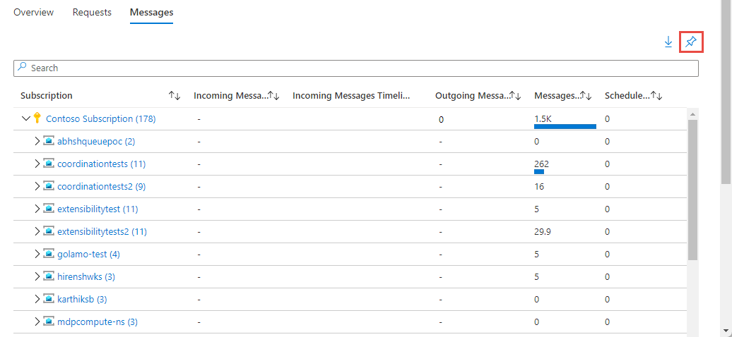
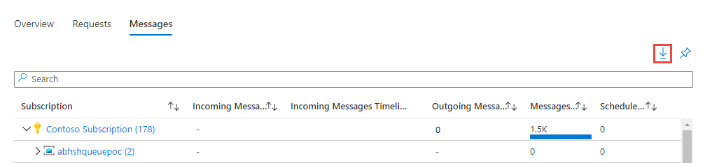
Messages
Select Messages at the top of the page and the Messages portion of the workbook template opens.

This page shows you the following values and also the timeline for incoming messages.
| Metric Name | Description |
|---|---|
| Incoming Messages | The number of messages sent to Service Bus over a specified period. This metric doesn't include messages that are auto forwarded. |
| Outgoing Messages | The number of messages received from Service Bus over a specified period. |
| Messages | Count of messages in a queue/topic. |
| Scheduled messages | Count of scheduled messages in a queue/topic. |
For more information about these metrics, see Service Bus - message metrics.
View from a Service Bus resource
In the Azure portal, search for Service Bus, and select any of your existing Service Bus namespaces.
On the Service Bus Namespace page, in the Monitoring section on the left menu, select Insights (preview) or Workbooks to do further analysis. You see the following page when you select Insights (preview).

You see the same tabs (Overview, Requests, and Messages) on this page, similar to the ones you see on the Azure Monitor - Service Bus (Preview) page. You'll see more information on these tabs compared to the ones on the Azure Monitor page though.
Note
For more information about metrics you see on this page, see Service Bus metrics.
Overview tab
You see the following information for the Service Bus namespace for the selected time range: number of active connections, connections opened, successful requests, throttled requests, and incoming messages.
You also see charts with the following information for the namespace over time in the selected time range: active connections, connections opened and closed, successful requests, throttled requests, and incoming & outgoing messages. For example, the Active Connections chart shows the number of active connections in the last 4 hours (selected time range).

Requests tab
You see the following information for the Service Bus namespace for the selected time range: number of incoming requests, successful requests, server errors, user errors, and throttled requests.
The table that follows this section shows break down of these values for each resource (queue or topic) in the Service Bus namespace.
This page also has charts showing the following information for the namespace over time in the selected time range:
- Incoming, successful, and throttled requests for all queues and topics in the namespace, and for each queue or topic (segment) in the namespace
- Server and user errors for all queues and topics in the namespace, and for each queue or topic (segment) in the namespace.
Messages tab
You see the following information for the Service Bus namespace for the selected time range:
- Number of incoming, outgoing, and dead-lettered messages for all queues and topics in the namespace.
- Average number of messages, active messages, and scheduled messages for all queues and topics in the namespace.
The table that follows this section shows break down of these values for each resource (queue or topic) in the Service Bus namespace.
This page also has charts showing the following information for the namespace over time in the selected time range:
- Incoming, outgoing, all, active, scheduled, and dead-lettered messages for all entities (queues and topics) in the namespace.
- Breakdown of above metrics by segment or entity (queue or topic in the namespace)
Time range
By default, the Time Range field displays data from the Last 4 hours. You can modify the time range to display data anywhere from the last 5 minutes to the last seven days. The time range selector also includes a Custom mode that allows you to type in the start/end dates to view a custom time frame based on available data for the selected account.
Pin and export
You can pin any one of the metric sections to an Azure Dashboard by selecting the pushpin icon at the top right of the section.
To export your data into the Excel format, select the down arrow icon to the left of the pushpin icon.
Customize Service Bus insights
Since this experience is built on top of Azure Monitor workbook templates, you can customize it by selecting Customize on the toolbar.
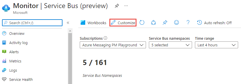
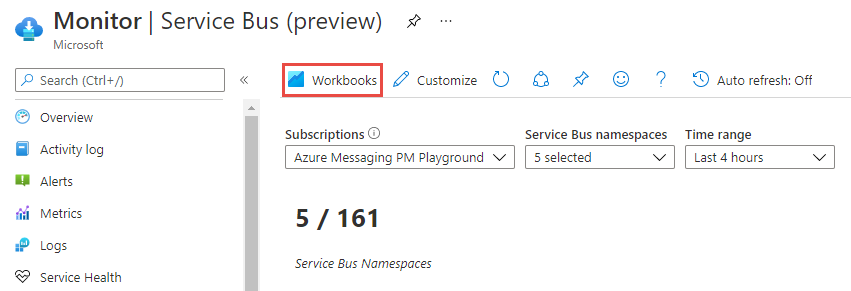
On the Service Bus Overview - Azure Monitor page, select Edit to make modifications, and Save a copy of your modified version into a custom workbook. Select Workbooks on the toolbar to see the gallery of workbooks including the one you saved.
Troubleshooting
For troubleshooting guidance, refer to the dedicated workbook-based insights troubleshooting article.
Next steps
Configure metric alerts and service health notifications to set up automated alerting to aid in detecting issues.
Learn the scenarios workbooks are designed to support, how to author new and customize existing reports, and more by reviewing Create interactive reports with Azure Monitor workbooks.
Feedback
Coming soon: Throughout 2024 we will be phasing out GitHub Issues as the feedback mechanism for content and replacing it with a new feedback system. For more information see: https://aka.ms/ContentUserFeedback.
Submit and view feedback for