Display grouped data in a CollectionView
Large data sets can often become unwieldy when presented in a continually scrolling list. In this scenario, organizing the data into groups can improve the user experience by making it easier to navigate the data.
The .NET Multi-platform App UI (.NET MAUI) CollectionView supports displaying grouped data, and defines the following properties that control how it will be presented:
IsGrouped, of typebool, indicates whether the underlying data should be displayed in groups. The default value of this property isfalse.GroupHeaderTemplate, of type DataTemplate, the template to use for the header of each group.GroupFooterTemplate, of type DataTemplate, the template to use for the footer of each group.
These properties are backed by BindableProperty objects, which means that the properties can be targets of data bindings.
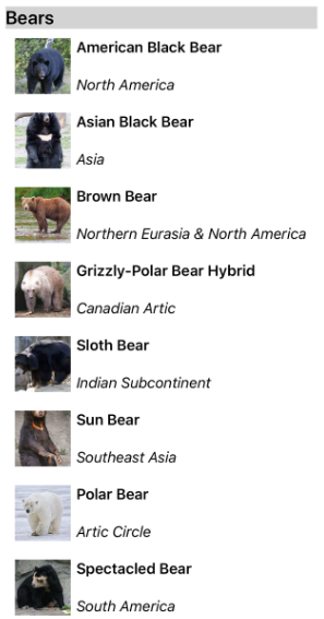
The following screenshot shows a CollectionView displaying grouped data:

For more information about data templates, see Data templates.
Group data
Data must be grouped before it can be displayed. This can be accomplished by creating a list of groups, where each group is a list of items. The list of groups should be an IEnumerable<T> collection, where T defines two pieces of data:
- A group name.
- An
IEnumerablecollection that defines the items belonging to the group.
The process for grouping data, therefore, is to:
- Create a type that models a single item.
- Create a type that models a single group of items.
- Create an
IEnumerable<T>collection, whereTis the type that models a single group of items. This collection is a collection of groups, which stores the grouped data. - Add data to the
IEnumerable<T>collection.
Example
When grouping data, the first step is to create a type that models a single item. The following example shows the Animal class from the sample application:
public class Animal
{
    public string Name { get; set; }
    public string Location { get; set; }
    public string Details { get; set; }
    public string ImageUrl { get; set; }
}
The Animal class models a single item. A type that models a group of items can then be created. The following example shows the AnimalGroup class from the sample application:
public class AnimalGroup : List<Animal>
{
    public string Name { get; private set; }

    public AnimalGroup(string name, List<Animal> animals) : base(animals)
    {
        Name = name;
    }
}
The AnimalGroup class inherits from the List<T> class and adds a Name property that represents the group name.
An IEnumerable<T> collection of groups can then be created:
public List<AnimalGroup> Animals { get; private set; } = new List<AnimalGroup>();
This code defines a collection named Animals, where each item in the collection is an AnimalGroup object. Each AnimalGroup object comprises a name, and a List<Animal> collection that defines the Animal objects in the group.
Grouped data can then be added to the Animals collection:
Animals.Add(new AnimalGroup("Bears", new List<Animal>
{
    new Animal
    {
        Name = "American Black Bear",
        Location = "North America",
        Details = "Details about the bear go here.",
        ImageUrl = "https://upload.wikimedia.org/wikipedia/commons/0/08/01_Schwarzbär.jpg"
    },
    new Animal
    {
        Name = "Asian Black Bear",
        Location = "Asia",
        Details = "Details about the bear go here.",
        ImageUrl = "https://upload.wikimedia.org/wikipedia/commons/thumb/b/b7/Ursus_thibetanus_3_%28Wroclaw_zoo%29.JPG/180px-Ursus_thibetanus_3_%28Wroclaw_zoo%29.JPG"
    },
    // ...
}));

Animals.Add(new AnimalGroup("Monkeys", new List<Animal>
{
    new Animal
    {
        Name = "Baboon",
        Location = "Africa & Asia",
        Details = "Details about the monkey go here.",
        ImageUrl = "https://upload.wikimedia.org/wikipedia/commons/thumb/f/fc/Papio_anubis_%28Serengeti%2C_2009%29.jpg/200px-Papio_anubis_%28Serengeti%2C_2009%29.jpg"
    },
    new Animal
    {
        Name = "Capuchin Monkey",
        Location = "Central & South America",
        Details = "Details about the monkey go here.",
        ImageUrl = "https://upload.wikimedia.org/wikipedia/commons/thumb/4/40/Capuchin_Costa_Rica.jpg/200px-Capuchin_Costa_Rica.jpg"
    },
    new Animal
    {
        Name = "Blue Monkey",
        Location = "Central and East Africa",
        Details = "Details about the monkey go here.",
        ImageUrl = "https://upload.wikimedia.org/wikipedia/commons/thumb/8/83/BlueMonkey.jpg/220px-BlueMonkey.jpg"
    },
    // ...
}));
This code creates two groups in the Animals collection. The first AnimalGroup is named Bears, and contains a List<Animal> collection of bear details. The second AnimalGroup is named Monkeys, and contains a List<Animal> collection of monkey details.
Display grouped data
CollectionView will display grouped data, provided that the data has been grouped correctly, by setting the IsGrouped property to true:
<CollectionView ItemsSource="{Binding Animals}"
                IsGrouped="true">
    <CollectionView.ItemTemplate>
        <DataTemplate>
            <Grid Padding="10">
                ...
                <Image Grid.RowSpan="2"
                       Source="{Binding ImageUrl}"
                       Aspect="AspectFill"
                       HeightRequest="60"
                       WidthRequest="60" />
                <Label Grid.Column="1"
                       Text="{Binding Name}"
                       FontAttributes="Bold" />
                <Label Grid.Row="1"
                       Grid.Column="1"
                       Text="{Binding Location}"
                       FontAttributes="Italic"
                       VerticalOptions="End" />
            </Grid>
        </DataTemplate>
    </CollectionView.ItemTemplate>
</CollectionView>
The equivalent C# code is:
CollectionView collectionView = new CollectionView
{
    IsGrouped = true
};
collectionView.SetBinding(ItemsView.ItemsSourceProperty, "Animals");
// ...
The appearance of each item in the CollectionView is defined by setting the CollectionView.ItemTemplate property to a DataTemplate. For more information, see Define item appearance.
Note
By default, CollectionView will display the group name in the group header and footer. This behavior can be changed by customizing the group header and group footer.
Customize the group header
The appearance of each group header can be customized by setting the CollectionView.GroupHeaderTemplate property to a DataTemplate:
<CollectionView ItemsSource="{Binding Animals}"
                IsGrouped="true">
    ...
    <CollectionView.GroupHeaderTemplate>
        <DataTemplate>
            <Label Text="{Binding Name}"
                   BackgroundColor="LightGray"
                   FontSize="18"
                   FontAttributes="Bold" />
        </DataTemplate>
    </CollectionView.GroupHeaderTemplate>
</CollectionView>
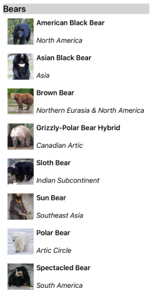
In this example, each group header is set to a Label that displays the group name, and that has other appearance properties set. The following screenshot shows the customized group header:

Customize the group footer
The appearance of each group footer can be customized by setting the CollectionView.GroupFooterTemplate property to a DataTemplate:
<CollectionView ItemsSource="{Binding Animals}"
                IsGrouped="true">
    ...
    <CollectionView.GroupFooterTemplate>
        <DataTemplate>
            <Label Text="{Binding Count, StringFormat='Total animals: {0:D}'}"
                   Margin="0,0,0,10" />
        </DataTemplate>
    </CollectionView.GroupFooterTemplate>
</CollectionView>
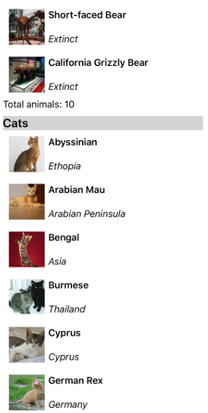
In this example, each group footer is set to a Label that displays the number of items in the group. The following screenshot shows the customized group footer:

Empty groups
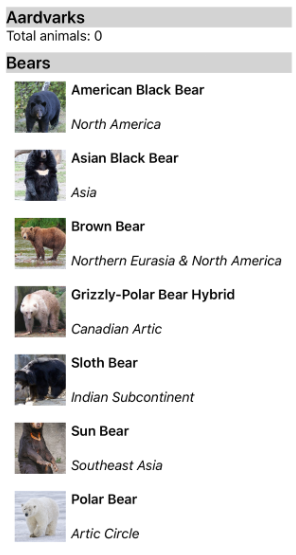
When a CollectionView displays grouped data, it will display any groups that are empty. Such groups will be displayed with a group header and footer, indicating that the group is empty. The following screenshot shows an empty group:

Note
On iOS 10, group headers and footers for empty groups may all be displayed at the top of the CollectionView.
Group without templates
CollectionView can display correctly grouped data without setting the CollectionView.ItemTemplate property to a DataTemplate:
<CollectionView ItemsSource="{Binding Animals}"
                IsGrouped="true" />
In this scenario, meaningful data can be displayed by overriding the ToString method in the type that models a single item, and the type that models a single group of items.
 Browse the sample