Toolbars in Unified Service Desk
Toolbars in Unified Service Desk for Dynamics 365 hold and display a list of buttons with images and text. Clicking or tapping the buttons can execute one or more actions.
Here is the Main toolbar in one of the Unified Service Desk sample applications.

You configure toolbars in the Settings > Unified Service Desk > Toolbars area. Furthermore, each toolbar is attached to a Toolbar Container type of hosted control, which in turn is attached to a display area (panel) in Unified Service Desk. This is done to specify the panel where the toolbar will display in the client application.
The following image shows the existing toolbars in a Unified Service Desk sample application.
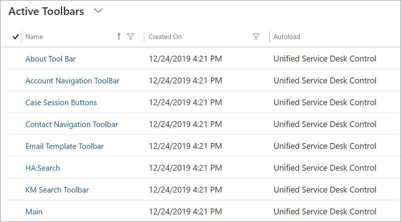
Understanding components in a toolbar
Select any toolbar name under the Name column to view the buttons inside the toolbar, action calls for each button, and the toolbar container that the toolbar is attached to.
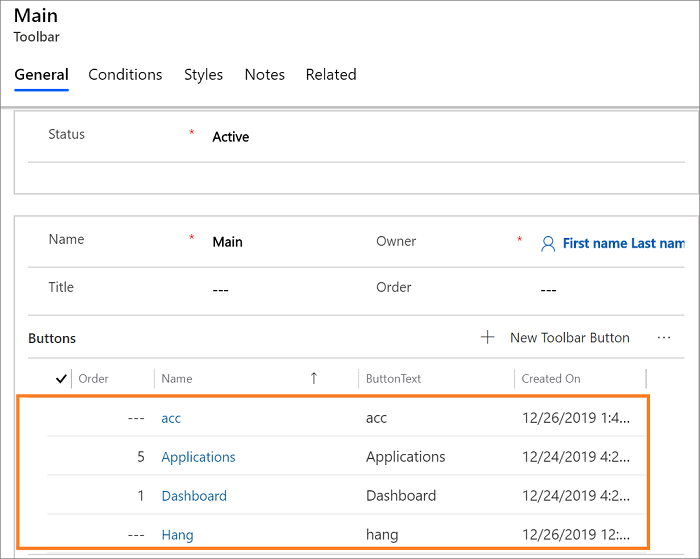
For an example of how to do this, select Main on the toolbars page.
Toolbar buttons: The toolbar page displays the buttons in the Main toolbar. The order of the buttons determines the placement of buttons from left to right in an ascending order. You can add, remove, or edit an existing button.
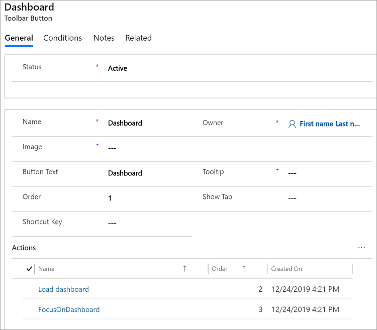
Properties of a toolbar button: To view the properties of a button, such as name, image, button label, tooltip, shortcut key, and action calls associated with a button, select any of the button names. For example, select Dashboard displays the following information for the button.
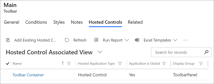
Toolbar Container: To view the toolbar container hosted control associated with the Main toolbar, select the Related tab and then select Hosted Controls.
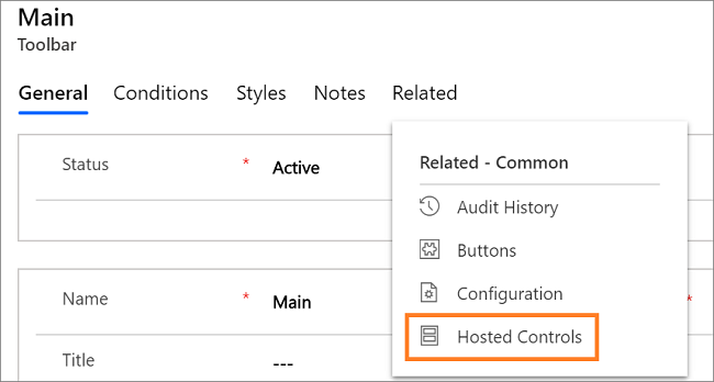
The name of the toolbar container attached to the Main toolbar is displayed.
Custom styles in toolbar: You can now customize the toolbar in Unified Service Desk using the custom styles field in the Toolbar configuration window. The Custom Styles field supports Extensible Application Markup Language (XAML) that defines ResourceDictionary of Style and Brush resources.
The resources in the dictionary refers to other resources that are available on Unified Service Desk client application. Loading and parsing the XAML string is performed at runtime to create ResourceDictionary and merge the resources of the toolbar control with the ResourceDictionary. In addition, the ResourceDictionary can have styles for button types inside a toolbar. Using the styles, you can customize the toolbars and buttons. More information: Styles in toolbar
See also
Configure toolbars in your application
Walkthrough 2: Display an external webpage in your agent application
Feedback
Coming soon: Throughout 2024 we will be phasing out GitHub Issues as the feedback mechanism for content and replacing it with a new feedback system. For more information see: https://aka.ms/ContentUserFeedback.
Submit and view feedback for