Usage dashboard for Virtual Machine (VM) offers in commercial marketplace analytics
This article provides information on the VM Normalized usage and VM Raw usage pages under Usage dashboard. These pages contain following widgets showing insights:
- Usage trend
- Image versions
- Normalized usage by offers
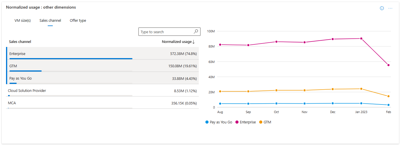
- Normalized usage by other dimensions: VM Size, Sales Channels, and Offer Types
- Geographical spread
- Usage details
Note
These widgets are available in both VM Normalized Usage and VM Raw Usage pages. It will show normalized usage and raw usage in respective pages.
Important
The maximum latency between usage event generation and reporting in Partner Center is 48 hours.
Page level filters
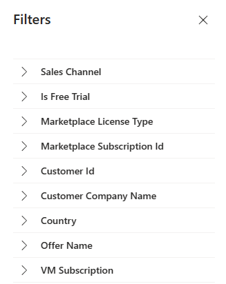
You can apply the following filters on usage page for further analysis. Each filter is expandable with multi select values. Filter options are dynamic and based on the selected range.
- Sales Channel
- Is Free Trial
- Marketplace License Type
- Marketplace Subscription ID
- Customer ID
- Customer Company Name
- Country
- Offer Name
- VM subscription
Usage trend
In this widget, you find total usage hours and trend for your VM offers that are consumed by your customers during the selected computation period. Metrics and growth trends are represented by a line chart. Show the value for each month by hovering over the line on the chart. The percentage value below the usage metrics in the widget represents the amount of growth or decline during the selected computation period.
There are two representations of usage hours: VM normalized usage and VM raw usage.
- Normalized usage hours are defined as the usage hours normalized to account for the number of VM vCPU ([number of VM vCPU] x [hours of raw usage]). VMs designated as "SHAREDCORE" use 1/6 (or 0.1666) as the [number of VM vCPU] multiplier.
- Raw usage hours are defined as the number of time VMs have been running in terms of hours.
VM Image Version
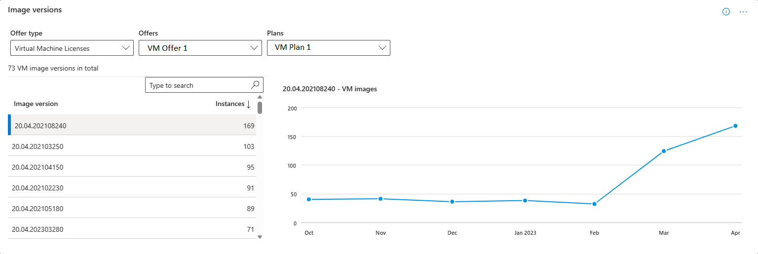
This widget shows the count of active instances and trend for selected VM image version. This helps you to track the usage of different image versions and help you in making decision about deprecation
Note
You can track insights of image versions for both Azure VM and Core VM offers.
You can download the data for this widget by navigating to Downloads page and selecting VM Image Version Detail from Report type drop-down. For more information about fields, see Data dictionary for VM Image version
Offers
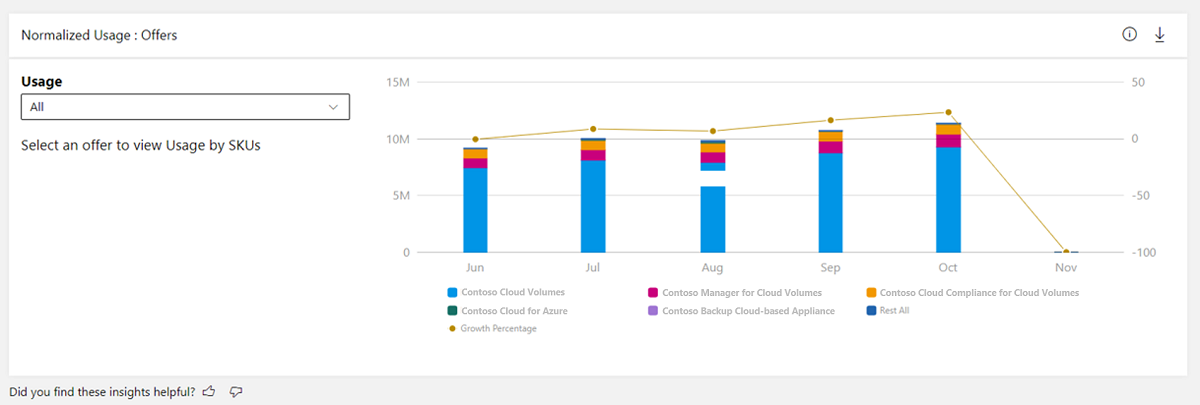
This widget provides the total usage hours and trend for your usage-based offers in commercial Marketplace.
- The Offers stacked column chart displays a breakdown of usage hours for the top five offers according to the selected computation period. The top five offers are displayed in a graph, while the rest are grouped in the Rest All category.
- The stacked column chart depicts a month-by-month growth trend for the selected date range. The month columns represent usage hours from the offers with the highest usage hours for the respective month. The line chart depicts the growth percentage trend plotted on the secondary Y-axis.
- You can select specific offers in the legend to display only those offers in the graph.
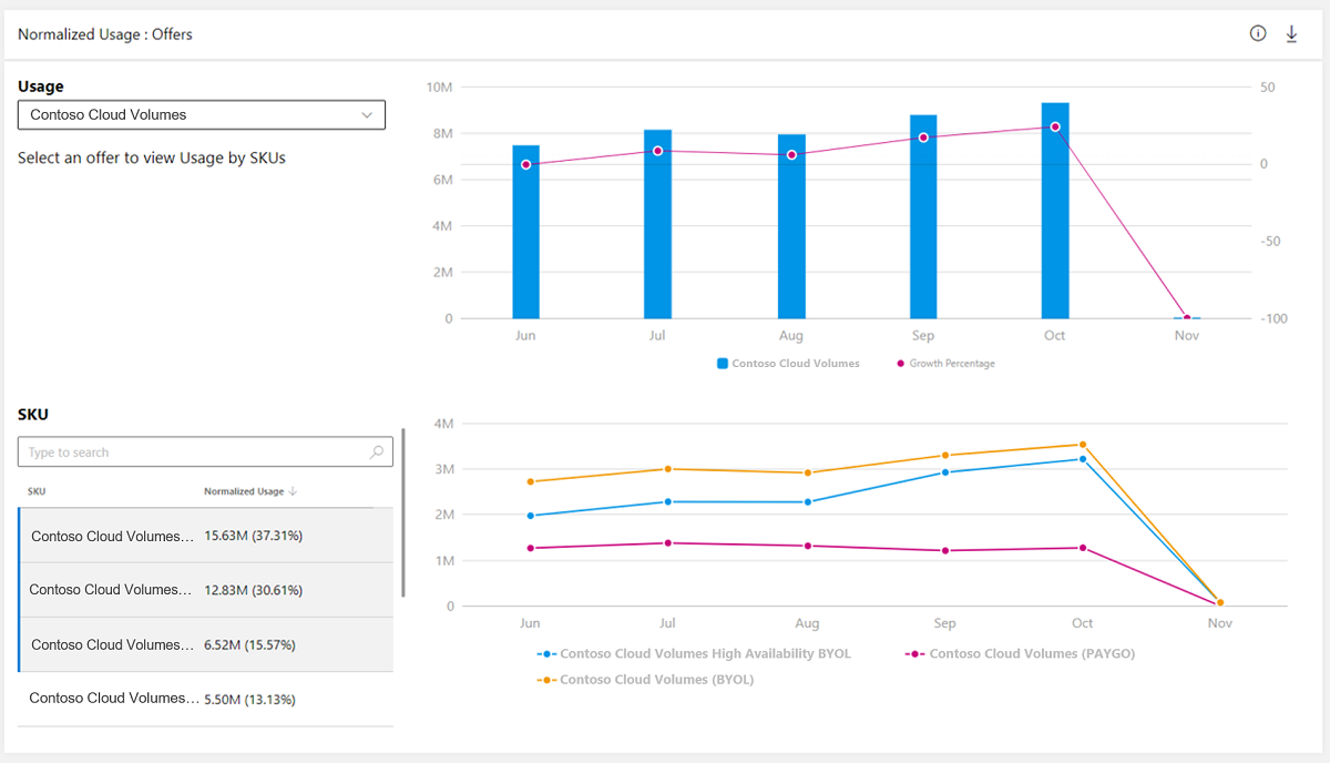
You can select any offer and a maximum of three plans of that offer to view the month-over-month usage trend for the offer and the selected plans.
Usage: Other dimensions
There are three tabs for the dimensions:
- VM size
- Sales channels
- Offer type
You can see the usage metrics and month-over-month trend against each of these dimensions.
Geographical spread
For the selected computation period, the table displays the total usage against geography dimension.
Usage details table
Important
To download the data in CSV, you can use the Download data option, available at the top of the page.
The usage details table displays a numbered list of the top 500 usage records sorted by usage. Note the following:
- Data in this table is displayed based on the page you've selected
- Each column in the grid is sortable.
Select on the ellipsis (three dots '...') to copy the widget image, or download the image as a pdf for sharing purposes.
For more information about fields, see Data dictionary for usage
Related content
- Learn about Usage dashboard, see Usage Dashboard in commercial marketplace analytics
- View insights around usage for your Containers offers, see Usage Dashboard for containers in commercial marketplace analytics
- View insights around metered usage for your offers, see Metered Usage Dashboard in commercial marketplace analytics
- View insights around metered usage anomalies, see Metered Usage anomalies
- For frequently asked questions about commercial marketplace analytics and for a comprehensive dictionary of data terms, see Commercial marketplace analytics terminology and common questions
