Note
Access to this page requires authorization. You can try signing in or changing directories.
Access to this page requires authorization. You can try changing directories.
The Xamarin.Forms ListView class supports user interaction with the data it presents.
Selection and taps
The ListView selection mode is controlled by setting the ListView.SelectionMode property to a value of the ListViewSelectionMode enumeration:
Singleindicates that a single item can be selected, with the selected item being highlighted. This is the default value.Noneindicates that items cannot be selected.
When a user taps an item, two events are fired:
ItemSelectedfires when a new item is selected.ItemTappedfires when an item is tapped.
Tapping the same item twice will fire two ItemTapped events, but will only fire a single ItemSelected event.
Note
The ItemTappedEventArgs class, which contains the event arguments for the ItemTapped event, has Group and Item properties, and an ItemIndex property whose value represents the index in the ListView of the tapped item. Similarly, the SelectedItemChangedEventArgs class, which contains the event arguments for the ItemSelected event, has a SelectedItem property, and a SelectedItemIndex property whose value represents the index in the ListView of the selected item.
When the SelectionMode property is set to Single, items in the ListView can be selected, the ItemSelected and ItemTapped events will be fired, and the SelectedItem property will be set to the value of the selected item.
When the SelectionMode property is set to None, items in the ListView cannot be selected, the ItemSelected event will not be fired, and the SelectedItem property will remain null. However, ItemTapped events will still be fired and the tapped item will be briefly highlighted during the tap.
When an item has been selected and the SelectionMode property is changed from Single to None, the SelectedItem property will be set to null and the ItemSelected event will be fired with a null item.
The following screenshots show a ListView with the default selection mode:

Disable selection
To disable ListView selection set the SelectionMode property to None:
<ListView ... SelectionMode="None" />
var listView = new ListView { ... SelectionMode = ListViewSelectionMode.None };
Context actions
Often, users will want to take action on an item in a ListView. For example, consider a list of emails in the Mail app. On iOS, you can swipe to delete a message:

Context actions can be implemented in C# and XAML. Below you'll find specific guides for both, but first let's take a look at some key implementation details for both.
Context Actions are created using MenuItem elements. Tap events for MenuItems objects are raised by the MenuItem itself, not the ListView. This is different from how tap events are handled for cells, where the ListView raises the event rather than the cell. Because the ListView is raising the event, its event handler is given key information, like which item was selected or tapped.
By default, a MenuItem has no way of knowing which cell it belongs to. The CommandParameter property is available on MenuItem to store objects, such as the object behind the MenuItem's ViewCell. The CommandParameter property can be set in both XAML and C#.
XAML
MenuItem elements can be created in a XAML collection. The XAML below demonstrates a custom cell with two context actions implemented:
<ListView x:Name="ContextDemoList">
  <ListView.ItemTemplate>
    <DataTemplate>
      <ViewCell>
         <ViewCell.ContextActions>
            <MenuItem Clicked="OnMore"
                      CommandParameter="{Binding .}"
                      Text="More" />
            <MenuItem Clicked="OnDelete"
                      CommandParameter="{Binding .}"
                      Text="Delete" IsDestructive="True" />
         </ViewCell.ContextActions>
         <StackLayout Padding="15,0">
              <Label Text="{Binding title}" />
         </StackLayout>
      </ViewCell>
    </DataTemplate>
  </ListView.ItemTemplate>
</ListView>
In the code-behind file, ensure the Clicked methods are implemented:
public void OnMore (object sender, EventArgs e)
{
    var mi = ((MenuItem)sender);
    DisplayAlert("More Context Action", mi.CommandParameter + " more context action", "OK");
}

public void OnDelete (object sender, EventArgs e)
{
    var mi = ((MenuItem)sender);
    DisplayAlert("Delete Context Action", mi.CommandParameter + " delete context action", "OK");
}
Note
The NavigationPageRenderer for Android has an overridable UpdateMenuItemIcon method that can be used to load icons from a custom Drawable. This override makes it possible to use SVG images as icons on MenuItem instances on Android.
Code
Context actions can be implemented in any Cell subclass (as long as it isn't being used as a group header) by creating MenuItem instances and adding them to the ContextActions collection for the cell. You have the following properties can be configured for the context action:
- Text – the string that appears in the menu item.
- Clicked – the event when the item is clicked.
- IsDestructive – (optional) when true the item is rendered differently on iOS.
Multiple context actions can be added to a cell, however only one should have IsDestructive set to true. The following code demonstrates how context actions would be added to a ViewCell:
var moreAction = new MenuItem { Text = "More" };
moreAction.SetBinding (MenuItem.CommandParameterProperty, new Binding ("."));
moreAction.Clicked += async (sender, e) =>
{
    var mi = ((MenuItem)sender);
    Debug.WriteLine("More Context Action clicked: " + mi.CommandParameter);
};

var deleteAction = new MenuItem { Text = "Delete", IsDestructive = true }; // red background
deleteAction.SetBinding (MenuItem.CommandParameterProperty, new Binding ("."));
deleteAction.Clicked += async (sender, e) =>
{
    var mi = ((MenuItem)sender);
    Debug.WriteLine("Delete Context Action clicked: " + mi.CommandParameter);
};
// add to the ViewCell's ContextActions property
ContextActions.Add (moreAction);
ContextActions.Add (deleteAction);
Pull to refresh
Users have come to expect that pulling down on a list of data will refresh that list. The ListView control supports this out-of-the-box. To enable pull-to-refresh functionality, set IsPullToRefreshEnabled to true:
<ListView ...
          IsPullToRefreshEnabled="true" />
The equivalent C# code is:
listView.IsPullToRefreshEnabled = true;
A spinner appears during the refresh, which is black by default. However, the spinner color can be changed on iOS and Android by setting the RefreshControlColor property to a Color:
<ListView ...
          IsPullToRefreshEnabled="true"
          RefreshControlColor="Red" />
The equivalent C# code is:
listView.RefreshControlColor = Color.Red;
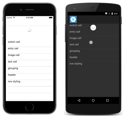
The following screenshots show pull-to-refresh as the user is pulling:

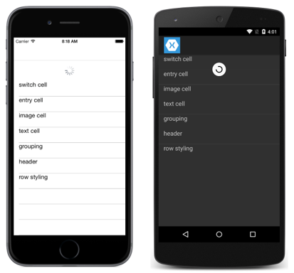
The following screenshots show pull-to-refresh after the user has released the pull, with the spinner being shown while the ListView is updating:

ListView fires the Refreshing event to initiate the refresh, and the IsRefreshing property will be set to true. Whatever code is required to refresh the contents of the ListView should then be executed by the event handler for the Refreshing event, or by the method executed by the RefreshCommand. Once the ListView is refreshed, the IsRefreshing property should be set to false, or the EndRefresh method should be called, to indicate that the refresh is complete.
Note
When defining a RefreshCommand, the CanExecute method of the command can be specified to enable or disable the command.
Detect scrolling
ListView defines a Scrolled event that's fired to indicate that scrolling occurred. The following XAML example shows a ListView that sets an event handler for the Scrolled event:
<ListView Scrolled="OnListViewScrolled">
    ...
</ListView>
The equivalent C# code is:
ListView listView = new ListView();
listView.Scrolled += OnListViewScrolled;
In this code example, the OnListViewScrolled event handler is executed when the Scrolled event fires:
void OnListViewScrolled(object sender, ScrolledEventArgs e)
{
    Debug.WriteLine("ScrollX: " + e.ScrollX);
    Debug.WriteLine("ScrollY: " + e.ScrollY);
}
The OnListViewScrolled event handler outputs the values of the ScrolledEventArgs object that accompanies the event.