Xamarin
A Microsoft open-source app platform for building Android and iOS apps with .NET and C#.
5,357 questions
This browser is no longer supported.
Upgrade to Microsoft Edge to take advantage of the latest features, security updates, and technical support.
' cx='32' cy='32' r='32' /%3E%3Ctext x='50%25' y='55%25' dominant-baseline='middle' text-anchor='middle' fill='%23FFF' %3ERK%3C/text%3E%3C/svg%3E)
I'm trying for submenu in flyout like if i am click any option from flyout then it will automatically open the sub-menu of that particular option. following is my code please help me to get corrected.
if (domestic.IsChecked)
{
        domestic.Items.Add(new ShellContent
        {
            Title = "DomesticSubMenu1",
            Content = new ItemsPage()
        });
        domestic.Items.Add(new ShellContent
        {
            Title = "DomesticSubMenu2",
            Content = new ItemsPage()
        });
        domestic.Items.Add(new ShellContent
        {
            Title = "DomesticSubMenu3",
            Content = new ItemsPage()
        });

        }
' cx='32' cy='32' r='32' /%3E%3Ctext x='50%25' y='55%25' dominant-baseline='middle' text-anchor='middle' fill='%23FFF' %3ELL%3C/text%3E%3C/svg%3E)
Here is all of background code. When tab the Label. sub item will disappear or appear.
   public partial class AppShell : Xamarin.Forms.Shell
       {
           Person person;
           public AppShell()
           {
               InitializeComponent();
               Routing.RegisterRoute(nameof(ItemDetailPage), typeof(ItemDetailPage));
               Routing.RegisterRoute(nameof(NewItemPage), typeof(NewItemPage));
               person =    new Person();
               this.BindingContext = person;
           }

           private async void OnMenuItemClicked(object sender, EventArgs e)
           {
               await Shell.Current.GoToAsync("//LoginPage");
           }

           private void TapGestureRecognizer_Tapped(object sender, EventArgs e)
           {
               person.Changed = !person.Changed;
           }
       }

       public class Person : INotifyPropertyChanged
       {

           bool _changed = false;
           public bool Changed
           {
               get
               {
                   return _changed;
               }

               set
               {
                   if (_changed != value)
                   {
                       _changed = value;
                       OnPropertyChanged("Changed");

                   }
               }

           }


           public event PropertyChangedEventHandler PropertyChanged;

           protected virtual void OnPropertyChanged(string propertyName)
           {
               PropertyChanged?.Invoke(this, new PropertyChangedEventArgs(propertyName));
           }

       }


   }
Here is my xaml code.
<?xml version="1.0" encoding="UTF-8"?>
<Shell xmlns="http://xamarin.com/schemas/2014/forms"
xmlns:x="http://schemas.microsoft.com/winfx/2009/xaml"
xmlns:local="clr-namespace:AppShell.Views" xmlns:controls="clr-namespace:AppShell"
Title="AppShell"
Shell.ItemTemplate="{StaticResource FlyoutTemplateSelector}"
x:Class="AppShell.AppShell">
<Shell.Resources>
<ResourceDictionary>
<Style x:Key="BaseStyle" TargetType="Element">
<Setter Property="Shell.BackgroundColor" Value="{StaticResource Primary}" />
<Setter Property="Shell.ForegroundColor" Value="White" />
<Setter Property="Shell.TitleColor" Value="White" />
<Setter Property="Shell.DisabledColor" Value="#B4FFFFFF" />
<Setter Property="Shell.UnselectedColor" Value="#95FFFFFF" />
<Setter Property="Shell.TabBarBackgroundColor" Value="{StaticResource Primary}" />
<Setter Property="Shell.TabBarForegroundColor" Value="White"/>
<Setter Property="Shell.TabBarUnselectedColor" Value="#95FFFFFF"/>
<Setter Property="Shell.TabBarTitleColor" Value="White"/>
</Style>
<Style TargetType="TabBar" BasedOn="{StaticResource BaseStyle}" />
<Style TargetType="FlyoutItem" BasedOn="{StaticResource BaseStyle}" />
<!--
Default Styles for all Flyout Items
https://learn.microsoft.com/xamarin/xamarin-forms/app-fundamentals/shell/flyout#flyoutitem-and-menuitem-style-classes
-->
<Style Class="FlyoutItemLabelStyle" TargetType="Label">
<Setter Property="TextColor" Value="White"></Setter>
</Style>
<Style Class="FlyoutItemLayoutStyle" TargetType="Layout" ApplyToDerivedTypes="True">
<Setter Property="BackgroundColor" Value="LightBlue"></Setter>
<Setter Property="VisualStateManager.VisualStateGroups">
<VisualStateGroupList>
<VisualStateGroup x:Name="CommonStates">
<VisualState x:Name="Normal">
<VisualState.Setters>
<Setter Property="BackgroundColor" Value="White" />
<Setter TargetName="FlyoutItemLabel" Property="Label.TextColor" Value="{StaticResource Primary}" />
</VisualState.Setters>
</VisualState>
<VisualState x:Name="Selected">
<VisualState.Setters>
<Setter Property="BackgroundColor" Value="{StaticResource Primary}" />
</VisualState.Setters>
</VisualState>
</VisualStateGroup>
</VisualStateGroupList>
</Setter>
</Style>
<!--
Custom Style you can apply to any Flyout Item
-->
<Style Class="MenuItemLayoutStyle" TargetType="Layout" ApplyToDerivedTypes="True">
<Setter Property="VisualStateManager.VisualStateGroups">
<VisualStateGroupList>
<VisualStateGroup x:Name="CommonStates">
<VisualState x:Name="Normal">
<VisualState.Setters>
<Setter TargetName="FlyoutItemLabel" Property="Label.TextColor" Value="{StaticResource Primary}" />
</VisualState.Setters>
</VisualState>
</VisualStateGroup>
</VisualStateGroupList>
</Setter>
</Style>
<DataTemplate x:Key="FlyoutItemTemplate">
<Grid>
<Grid.ColumnDefinitions>
<ColumnDefinition Width="0.25*" />
<ColumnDefinition Width="0.75*" />
</Grid.ColumnDefinitions>
<Label Text="{Binding Icon}"
HeightRequest="45"
Margin="20,0,0,0"
FontSize="30"
TextColor="Black"
VerticalTextAlignment="Center" />
<Label Grid.Column="1"
Text="{Binding Title}"
TextColor="Black"
VerticalTextAlignment="Center" />
</Grid>
</DataTemplate>
<DataTemplate x:Key="FlyoutHeaderTemplate">
<StackLayout Orientation="Vertical">
<Label HeightRequest="35"
Margin="20,0,0,0"
Text="{Binding Title}"
TextColor="Black"
VerticalTextAlignment="Center" >
<Label.GestureRecognizers>
<TapGestureRecognizer Tapped="TapGestureRecognizer_Tapped"></TapGestureRecognizer>
</Label.GestureRecognizers>
</Label>
</StackLayout>
</DataTemplate>
<controls:FlyoutItemTemplateSelector
x:Key="FlyoutTemplateSelector"
NavigationHeaderTemplate="{StaticResource FlyoutHeaderTemplate}"
NavigationItemTemplate="{StaticResource FlyoutItemTemplate}" />
</ResourceDictionary>
</Shell.Resources>
<!--
When the Flyout is visible this defines the content to display in the flyout.
FlyoutDisplayOptions="AsMultipleItems" will create a separate flyout item for each child element
https://learn.microsoft.com/dotnet/api/xamarin.forms.shellgroupitem.flyoutdisplayoptions?view=xamarin-forms
-->
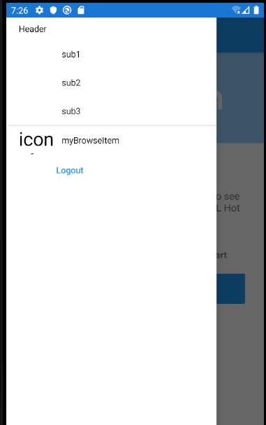
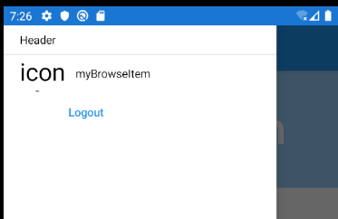
<FlyoutItem Title="Domestic" Shell.TabBarIsVisible="False" FlyoutDisplayOptions="AsMultipleItems" x:Name="domestic" Style="{StaticResource BaseStyle}">
<ShellContent Title="Header" ContentTemplate="{DataTemplate local:AboutPage}" />
<ShellContent Title="sub1" IsVisible="{Binding Changed}" ContentTemplate="{DataTemplate local:AboutPage}" />
<ShellContent Title="sub2" IsVisible="{Binding Changed}" ContentTemplate="{DataTemplate local:AboutPage}" />
<ShellContent Title="sub3" IsVisible="{Binding Changed}" ContentTemplate="{DataTemplate local:AboutPage}" />
</FlyoutItem>
<FlyoutItem x:Name="myBrowseItem" Title="myBrowseItem" Icon="icon_feed.png">
<ShellContent Route="ItemsPage" ContentTemplate="{DataTemplate local:ItemsPage}" />
</FlyoutItem>
<!-- When the Flyout is visible this will be a menu item you can tie a click behavior to -->
<MenuItem Text="Logout" StyleClass="MenuItemLayoutStyle" Clicked="OnMenuItemClicked">
</MenuItem>
<TabBar>
<ShellContent Route="LoginPage" ContentTemplate="{DataTemplate local:LoginPage}" />
</TabBar>
</Shell>
Here is running screenshot.
There was an error
Error XLS0413 The property 'IsVisible' was not found in type 'ShellContent'.
@rasika kale Please update your xamarin.Forms nuget packages version to 4.8.0.1451
Hello,
Welcome to our Microsoft Q&A platform!
I cannot achieve it with your way.I achieve an custom way to achieve it.
First of all, I create an DataTemplateSelector. I judge the Title's name with Header, you can change whatever you want. For details like this thread:
https://stackoverflow.com/questions/59137346/adding-a-shell-flyout-item-header
   public class FlyoutItemTemplateSelector : DataTemplateSelector
       {
           public DataTemplate NavigationHeaderTemplate { get; set; }
           public DataTemplate NavigationItemTemplate { get; set; }

           protected override DataTemplate OnSelectTemplate(object item, BindableObject container)
           {
               if (item is ShellGroupItem && ((ShellGroupItem)item).Title == "Header")
               {
                   // Make sure a header item is not clickable.
                   ((ShellGroupItem)item).IsEnabled = false;
                   return NavigationHeaderTemplate;
               }
               else
                   return NavigationItemTemplate;
           }
       }
Then add DataTemplate to your <ResourceDictionary> of <Shell.Resources>
   <DataTemplate x:Key="FlyoutItemTemplate">
                       <Grid>
                           <Grid.ColumnDefinitions>
                               <ColumnDefinition Width="0.25*" />
                               <ColumnDefinition Width="0.75*" />
                           </Grid.ColumnDefinitions>
                           <Label Text="{Binding Icon}"

                          HeightRequest="45"
                          Margin="20,0,0,0"
                          FontSize="30"
                          TextColor="Black"
                          VerticalTextAlignment="Center" />
                           <Label Grid.Column="1"
                          Text="{Binding Title}"
                          TextColor="Black"
                          VerticalTextAlignment="Center" />
                       </Grid>
                   </DataTemplate>

                   <DataTemplate x:Key="FlyoutHeaderTemplate">
                       <StackLayout Orientation="Vertical">
                       <Label HeightRequest="35"
                          Margin="20,0,0,0"
                          Text="{Binding Title}"
                          TextColor="Black"
                          VerticalTextAlignment="Center" >
                           <Label.GestureRecognizers>
                               <TapGestureRecognizer Tapped="TapGestureRecognizer_Tapped"></TapGestureRecognizer>
                           </Label.GestureRecognizers>

                       </Label>
                   </StackLayout>
                   </DataTemplate>

                   <controls:FlyoutItemTemplateSelector
               x:Key="FlyoutTemplateSelector"
               NavigationHeaderTemplate="{StaticResource FlyoutHeaderTemplate}"
               NavigationItemTemplate="{StaticResource FlyoutItemTemplate}" />
Here is FlyoutItem, all of sub ShellContent are binding an property.
   <FlyoutItem Title="Domestic"  Shell.TabBarIsVisible="False" FlyoutDisplayOptions="AsMultipleItems" x:Name="domestic" Style="{StaticResource BaseStyle}">

           <ShellContent Title="Header"  ContentTemplate="{DataTemplate local:AboutPage}"   />
           <ShellContent Title="sub1" IsVisible="{Binding Changed}" ContentTemplate="{DataTemplate local:AboutPage}"   />
           <ShellContent Title="sub2" IsVisible="{Binding Changed}" ContentTemplate="{DataTemplate local:AboutPage}"   />
           <ShellContent Title="sub3" IsVisible="{Binding Changed}"  ContentTemplate="{DataTemplate local:AboutPage}"   />
       </FlyoutItem>
My code is too long, So I post two answers. please see the next answer.
Best Regards,
Leon Lu
If the response is helpful, please click "Accept Answer" and upvote it.
Note: Please follow the steps in our documentation to enable e-mail notifications if you want to receive the related email notification for this thread.
There was an error
Error XLS0413 The property 'IsVisible' was not found in type 'ShellContent'.