Log Analytics Workspace Insights
Log Analytics Workspace Insights provides comprehensive monitoring of your workspaces through a unified view of your workspace usage, performance, health, agent, queries, and change log. This article helps you understand how to onboard and use Log Analytics Workspace Insights.
Permissions required
- You need
Microsoft.OperationalInsights/workspaces/readpermissions to the Log Analytics workspace whose insights you want to see, as provided by the Log Analytics Reader built-in role, for example.. - To run the additional usage queries, you need
*/readpermissions, as provided by the Log Analytics Reader built-in role, for example.
Overview of your Log Analytics workspaces
When you access Log Analytics Workspace Insights through Azure Monitor Insights, the At scale perspective is shown. Here you can:
- See how your workspaces are spread across the globe.
- Review their retention.
- See color-coded capping and license details.
- Choose a workspace to see its insights.

To start Log Analytics Workspace Insights at scale:
Sign in to the Azure portal.
Select Monitor from the left pane in the Azure portal. Under the Insights Hub section, select Log Analytics Workspace Insights.
View insights for a Log Analytics workspace
You can use insights in the context of a specific workspace to display rich data and analytics of the workspace performance, usage, health, agents, queries, and changes.

To access Log Analytics Workspace Insights:
Open Log Analytics Workspace Insights from Azure Monitor (as previously explained).
Select a workspace to drill into.
Or use these steps:
In the Azure portal, select Log Analytics Workspaces.
Choose a Log Analytics workspace.
Under Monitoring, select Insights on the workspace menu.
The data is organized in tabs. The time range on top defaults to 24 hours and applies to all tabs. Some charts and tables use a different time range, as indicated in their titles.
Overview tab
On the Overview tab, you can see:
Main statistics and settings:
- The monthly ingestion volume of the workspace.
- How many machines sent heartbeats. That is, the machines that are connected to this workspace in the selected time range.
- Machines that haven't sent heartbeats in the last hour in the selected time range.
- The data retention period set.
- The daily cap set and how much data was already ingested on the recent day.
Top five tables: Charts that analyze the five most-ingested tables over the past month:
- The volume of data ingested to each table.
- The daily ingestion to each of them to visually display spikes or dips.
- Ingestion anomalies: A list of identified spikes and dips in ingestion to these tables.
Usage tab
This tab provides a dashboard display.
Usage dashboard
This tab provides information on the workspace's usage. The dashboard subtab shows ingestion data displayed in tables. It defaults to the five most-ingested tables in the selected time range. These same tables are displayed on the Overview page. Use the Workspace Tables dropdown to choose which tables to display.

Main grid: Tables are grouped by solutions with information about each table:
- How much data was ingested to it during the selected time range.
- The percentage this table takes from the entire ingestion volume during the selected time range: This information helps identify the tables that affect your ingestion the most. In the following screenshot, you can see
AzureDiagnosticsandContainerLogalone stand for more than two-thirds (64%) of the data ingested to this workspace. - The last update of usage statistics regarding each table: We normally expect usage statistics to refresh hourly. Refreshing usage statistics is a recurrent service-internal operation. A delay in refreshing that data is only noted so that you know to interpret the data correctly. There's no action you should take.
- Billable: Indicates which tables are billed for and which are free.
Table-specific details: At the bottom of the page, you can see detailed information on the table selected in the main grid:
Ingestion volume: How much data was ingested to the table from each resource and how it spreads over time. Resources ingesting more than 30% of the total volume sent to this table are marked with a warning sign.
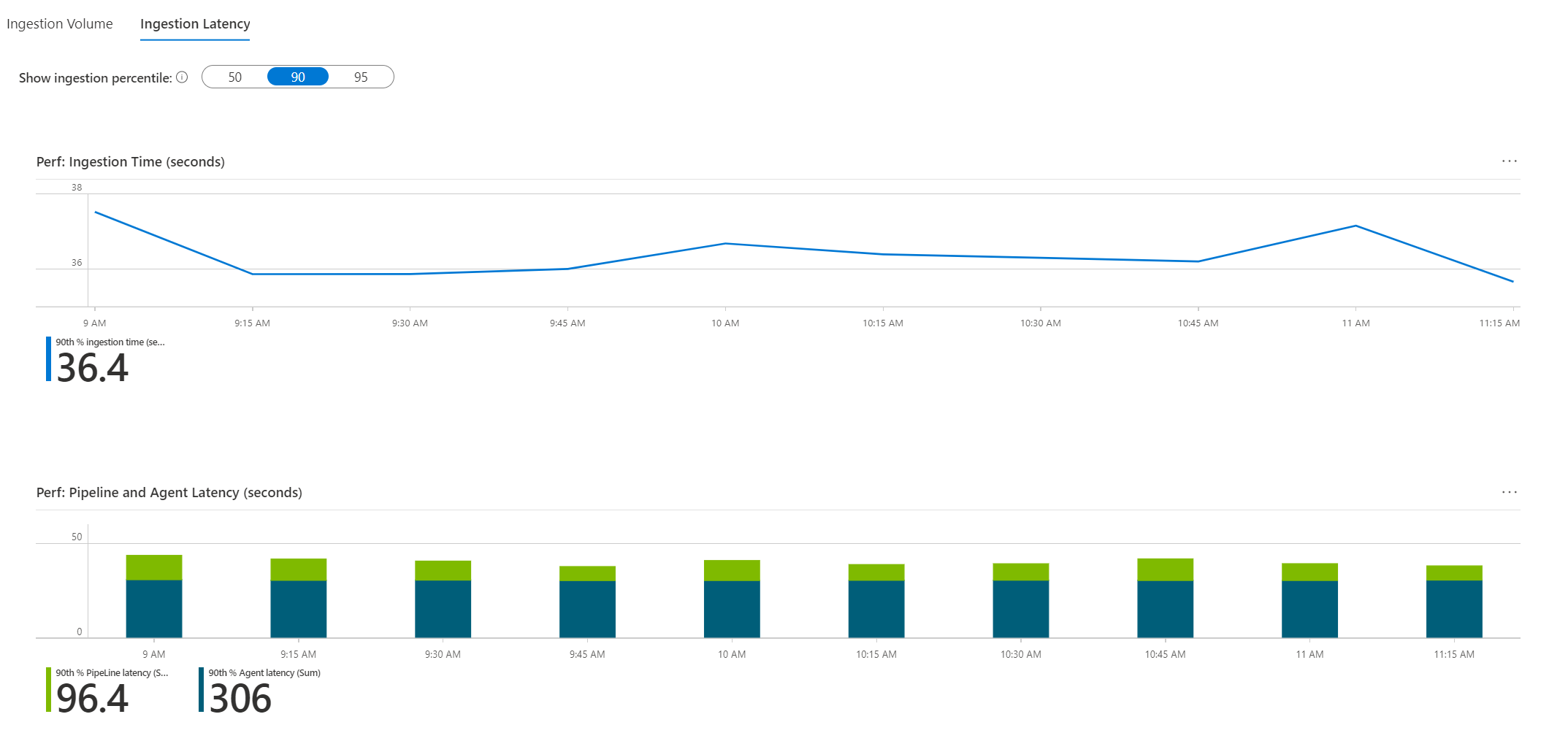
Ingestion latency: How much time ingestion took, analyzed for the 50th, 90th, or 95th percentiles of requests sent to this table. The top chart in this area depicts the total ingestion time of the requests for the selected percentile from end to end. It spans from the time the event occurred until it was ingested to the workspace.
The chart below it shows separately the latency of the agent, which is the time it took the agent to send the log to the workspace. The chart also shows the latency of the pipeline, which is the time it took the service to process the data and push it to the workspace.

Additional usage queries
The Additional Queries subtab exposes queries that run across all workspace tables (instead of relying on the usage metadata, which is refreshed hourly). Because the queries are much more extensive and less efficient, they don't run automatically. They can reveal interesting information about which resources send the most logs to the workspace and perhaps affect billing.

One such query is What Azure resources send most logs to this workspace (showing the top 50). In the demo workspace, you can clearly see that three Kubernetes clusters send far more data than all other resources combined. One cluster loads the workspace the most.

Health tab
This tab shows the workspace health state, when it was last reported, and operational errors and warnings retrieved from the _LogOperation table. For more information on the listed issues and mitigation steps, see Monitor health of a Log Analytics workspace in Azure Monitor.

Agents tab
This tab provides information on the agents that send logs to this workspace.

- Operation errors and warnings: These errors and warnings are related specifically to agents. They're grouped by the error/warning title to help you get a clearer view of different issues that might occur. They can be expanded to show the exact times and resources to which they refer. You can select Run query in Logs to query the
_LogOperationtable through the Logs experience to see the raw data and analyze it further. - Workspace agents: These agents are the ones that sent logs to the workspace during the selected time range. You can see the types and health state of the agents. Agents marked Healthy aren't necessarily working well. This designation only indicates that they sent a heartbeat during the last hour. A more detailed health state is described in the grid.
- Agents activity: This grid shows information on either all agents or healthy or unhealthy agents. Here too Healthy only indicates that the agent sent a heartbeat during the last hour. To understand its state better, review the trend shown in the grid. It shows how many heartbeats this agent sent over time. The true health state can only be inferred if you know how the monitored resource operates. For example, if a computer is intentionally shut down at particular times, you can expect the agent's heartbeats to appear intermittently, in a matching pattern.
Query Audit tab
Query auditing creates logs about the execution of queries on the workspace. If enabled, this data is beneficial to understanding and improving the performance, efficiency, and load for queries. To enable query auditing on your workspace or learn more about it, see Audit queries in Azure Monitor Logs.
Performance
This tab shows:
- Query duration: The 95th percentile and 50th percentile (median) duration in ms, over time.
- Number of rows returned: The 95th percentile and 50th percentile (median) of rows count, over time.
- The volume of data processed: The 95th percentile, 50th percentile, and the total of processed data in all requests, over time.
- Response codes: The distribution of response codes to all queries in the selected time range.
![Screenshot that shows the Query Audit tab Performance subtab.]](media/log-analytics-workspace-insights-overview/workspace-query-audit-performance.png#lightbox)
Slow and inefficient queries
The Slow & Inefficient Queries subtab shows two grids to help you identify slow and inefficient queries you might want to rethink. These queries shouldn't be used in dashboards or alerts because they'll create unneeded chronic load on your workspace.
- Most resource-intensive queries: The 10 most CPU-demanding queries, along with the volume of data processed (KB), the time range, and the text of each query.
- Slowest queries: The 10 slowest queries, along with the time range and text of each query.

Query users
The Users subtab shows user activity against this workspace:
- Queries by user: How many queries each user ran in the selected time range.
- Throttled users: Users that ran queries that were throttled because of over-querying the workspace.
Change Log tab
This tab shows configuration changes made on the workspace during the last 90 days regardless of the time range selected. It also shows who made the changes. It's intended to help you monitor who changes important workspace settings, such as data capping or workspace license.

Next steps
To learn the scenarios that workbooks are designed to support and how to author new and customize existing reports, see Create interactive reports with Azure Monitor workbooks.
Feedback
Coming soon: Throughout 2024 we will be phasing out GitHub Issues as the feedback mechanism for content and replacing it with a new feedback system. For more information see: https://aka.ms/ContentUserFeedback.
Submit and view feedback for