Note
Access to this page requires authorization. You can try signing in or changing directories.
Access to this page requires authorization. You can try changing directories.
Layer settings control how individual datasets render in Fabric Maps, including colors, labels, symbols, clustering, visibility, and data-driven styling. Changes affect only the selected layer and don't modify map-wide settings.
For settings that control the basemap, initial map view, map elements, interactive controls, and localization, see Configure map settings in Fabric Maps.
Prerequisites
- A workspace with a Microsoft Fabric-enabled capacity.
- A map that you have permission to edit and that contains at least one data layer.
Configure basemap settings
For map-wide settings such as style, initial view, map elements, controls, and localization, see Configure map settings in Fabric Maps. This article covers layer settings.
Configure layer settings
Layer settings control how the selected data layer is rendered. The available settings depend on the layer's geometry type and, for point geometry, the selected point layer type. Changes to layer settings affect only the selected layer and don't modify the basemap settings.
Fabric Maps automatically determines the geometry type from the data source. The supported geometry types are point, line, and polygon. Point layers can use one of three layer types: bubble, marker, or heatmap.
There are three groups of layer settings:
- Geometry type settings: Control the appearance and behavior of the selected point, line, or polygon layer.
- Data label settings: Control the text displayed for features in the selected layer.
- Visibility settings: Control when features appear and which properties are available in tooltips.
Note
GeoJSON multigeometries, such as MultiPoint, MultiLineString, and MultiPolygon, use the settings for their corresponding geometry family: point, line, or polygon.
Geometry type settings
Geometry type settings are specific to the geometry type automatically selected from the input data. The settings available in the Layer settings pane vary by geometry type.
Polygon settings
Polygon layers display areas such as boundaries, zones, or service areas. You can change the fill appearance and optionally apply data-driven colors or 3D extrusion.
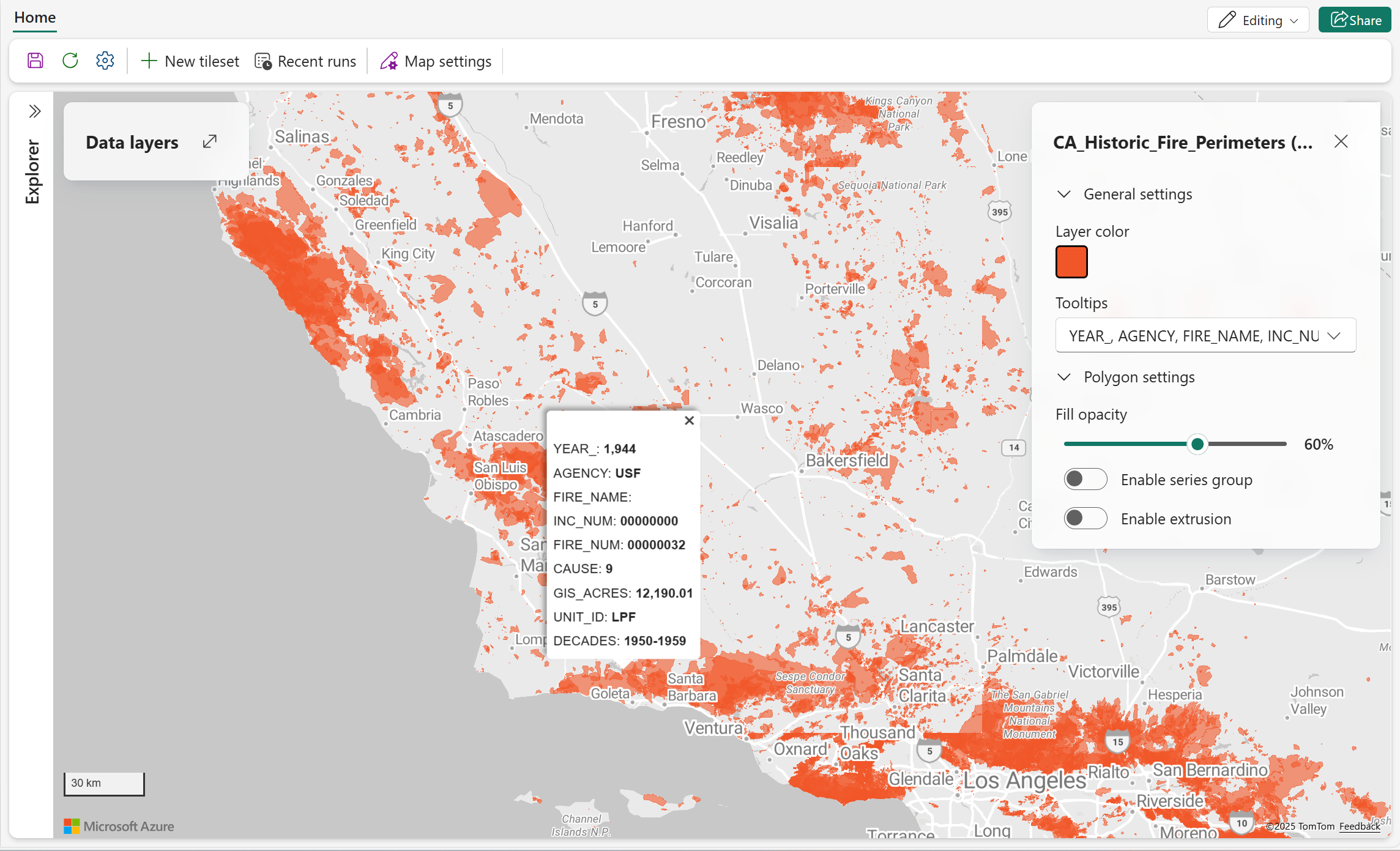
| Setting | Description |
|---|---|
| Fill color | Sets the fill color for polygon features. When Enable data-driven styling is off, select one color for all polygon features. When data-driven styling is enabled and a valid data field is selected in Color by, select a color palette or customize colors for the selected values. |
| Fill opacity | Sets the opacity of polygon features. Valid values: 0% (fully transparent) to 100% (fully opaque). |
| Enable data-driven styling | Enables color-based polygon styling using data values. Choose Category to assign colors to distinct values or Value range to apply colors across a numeric scale instead of using a single fill color. Default = off. For more information, see Data-driven styling for map layers. |
| Color by | Sets the data property whose values determine polygon color. Available when Enable data-driven styling is on. |
| Style by | Specifies how values in the Color by field are mapped to colors. Choose Category to assign a distinct color to each unique value, or Value range to map numeric values using a continuous color gradient. Available when a valid field is selected in Color by. |
| Choose a method | Specifies how numeric values are mapped to colors when Style by is set to Value range. Valid values: Gradient, which maps values across a continuous color range; and Steps, which groups values into discrete ranges with separate colors. Available when Style by is set to Value range. |
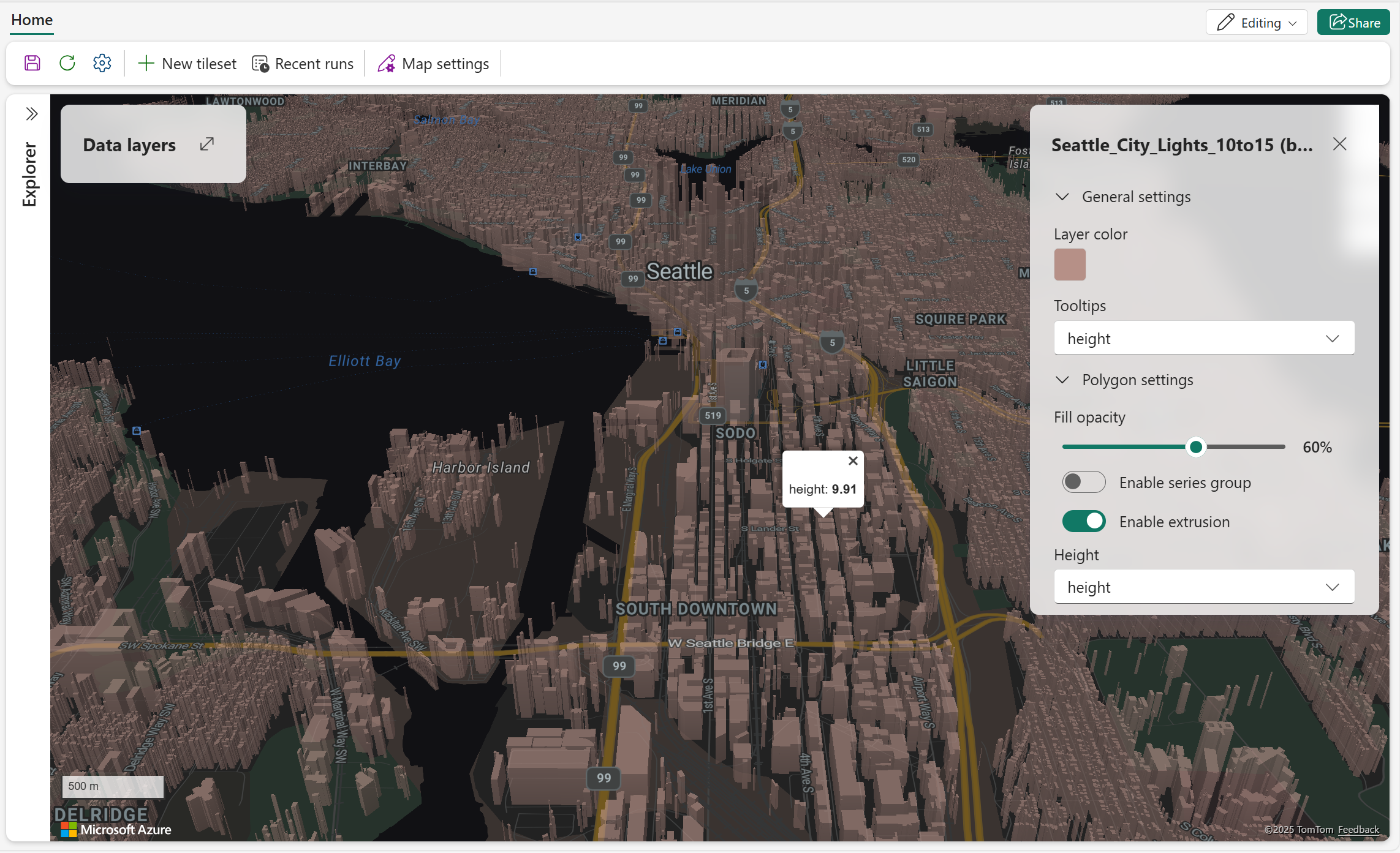
| Enable extrusion | Enables 3D polygon extrusion using a height source. Default = off. When enabled, Height and Use original height appear. For more information, see Enable extrusion. |
| Height | Sets the numeric data property used for extrusion height. Available when Enable extrusion is on. |
| Use original height | Uses the original height value from the data source for extrusion instead of a selected property. Available when Enable extrusion is on. |
Note
The Fill color setting appears first when data-driven styling is off. When data-driven styling is enabled, it appears after the data-driven styling settings and provides color palette or color-swatch options.
Enable extrusion
The following screenshot shows polygon features rendered with 3D extrusion. The extrusion height is based on the configured height source.
Line settings
Line layers display linear features such as roads, paths, routes, and boundaries.
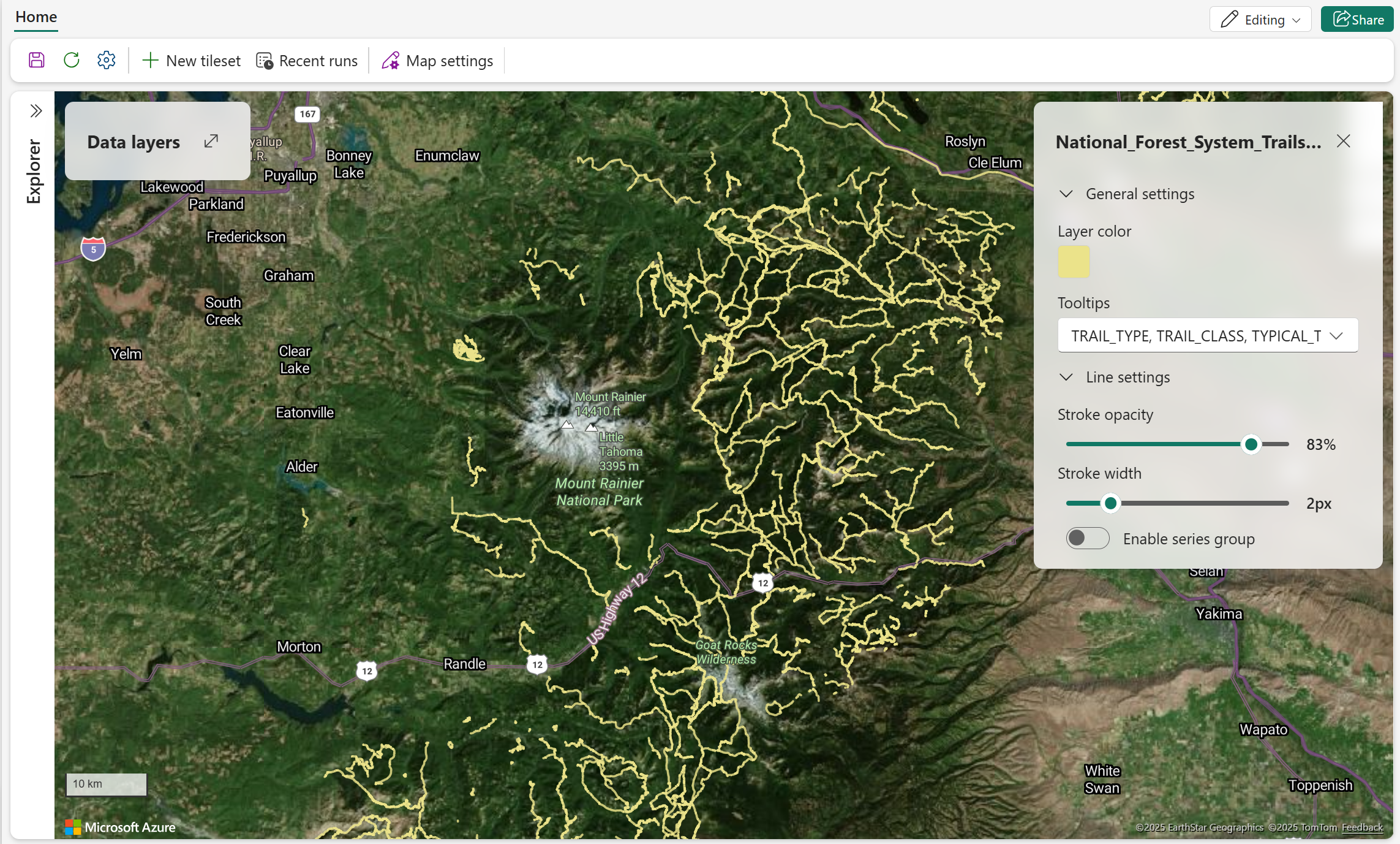
| Setting | Description |
|---|---|
| Stroke opacity | Sets the opacity of line features. Valid values: 1% to 100%. |
| Stroke width | Sets the width of line features in pixels. |
| Enable data-driven styling | Enables color-based line styling using data values. Choose Category to assign distinct colors to values or Value range to apply colors across a numeric scale instead of using a single line color. Default = off. For more information, see Data-driven styling for map layers. |
| Color by | Sets the data property whose values determine line color. Available when Enable data-driven styling is on. |
| Style by | Specifies how the numeric field selected in Color by is mapped to colors. Choose Category to assign distinct colors to values or Value range to map values across a continuous color range. Available when a numeric field is selected in Color by. |
| Choose a method | Specifies how numeric values are mapped to colors when Style by is set to Value range. Valid values: Gradient, which maps values across a continuous color range; and Steps, which groups values into discrete ranges with separate colors. Available when Style by is set to Value range. |
| Fill color | Sets the line color. When Enable data-driven styling is off, select one color for all line features. When data-driven styling is enabled and a valid data field is selected in Color by, select a color palette or customize colors for the selected values. |
Note
When categorical styling is enabled, up to 100 distinct values are assigned unique colors. Additional values are grouped as Others and displayed in gray.
Point settings
Point layers display individual locations or events. Select a point Layer type to choose how the point data is rendered:
- Bubble displays points as circles.
- Marker displays points as built-in icons or custom images.
- Heatmap displays point density using a color gradient.
Bubble layer
Bubble layers display points as circles. Use size, color, opacity, and clustering to show differences between locations or to reduce visual clutter.
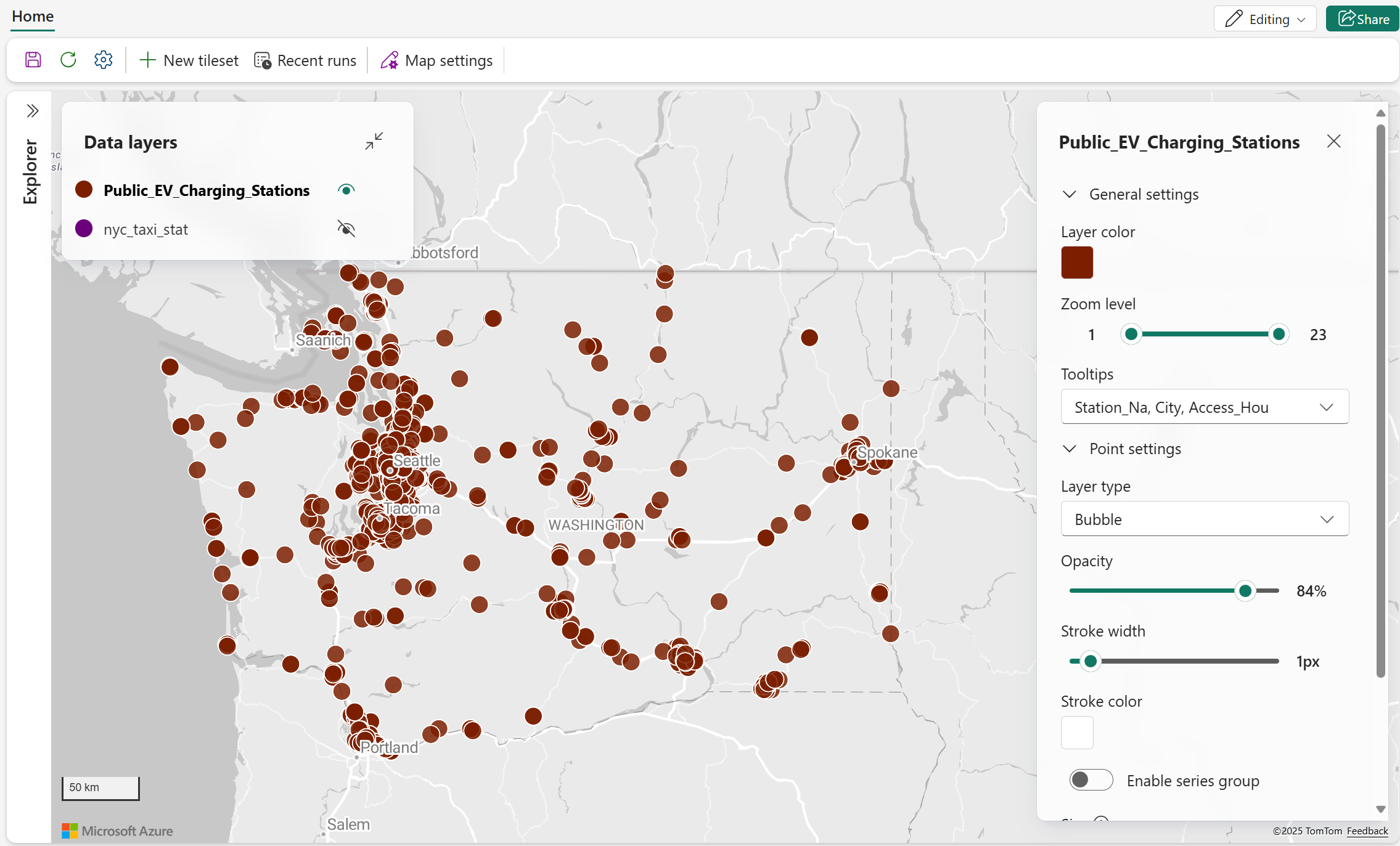
| Setting | Description |
|---|---|
| Fill color | Sets the fill color of bubble features. When Enable data-driven styling is off, select one color for all bubble features. When data-driven styling is enabled and a valid data field is selected in Color by, select a color palette or customize colors for the selected values. |
| Stroke color | Sets the border color of bubble features. |
| Stroke width | Sets the border width in pixels. |
| Opacity | Sets the opacity of bubble features. Valid values: 0% (fully transparent) to 100% (fully opaque). |
| Size | Sets how bubble size is determined: Fixed size or By data. |
| Fixed size | Sets one fixed bubble size for all points. Available when Size is set to Fixed size. |
| By data | Scales bubble size using a numeric data property. Available when Size is set to By data. |
| Enable data-driven styling | Enables bubble color styling by selected data values using either Category or Value range styling modes instead of one fixed bubble color. Default = off. For more information, see Data-driven styling for map layers. |
| Color by | Sets the data property whose values determine bubble color. Available when Enable data-driven styling is on. |
| Style by | Specifies how values in the Color by field are mapped to colors. Choose Category to assign a distinct color to each unique value, or Value range to map numeric values using a continuous color gradient. Available when a valid field is selected in Color by. |
| Choose a method | Specifies how numeric values are mapped to colors when Style by is set to Value range. Valid values: Gradient, which maps values across a continuous color range; and Steps, which groups values into discrete ranges with separate colors. Available when Style by is set to Value range. |
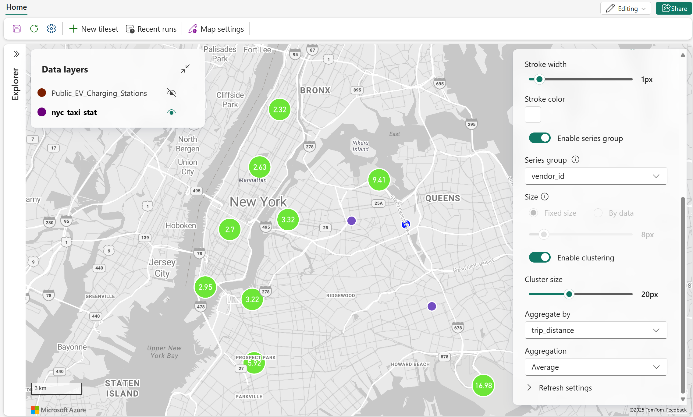
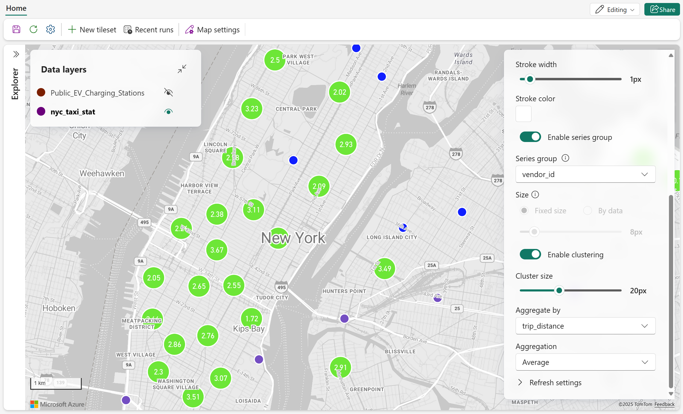
| Enable clustering | Groups nearby points into clusters to reduce visual clutter. Default = off. When enabled, Cluster size and Aggregate by appear. |
| Cluster size | Sets the size of clustered points. Available when Enable clustering is on. |
| Aggregate by | Sets the numeric data property used to summarize points in each cluster. Available when Enable clustering is on. |
Bubble clustering
The following screenshots show bubble points grouped into clusters. Zooming in reveals more granular clusters and individual points.
Marker layer
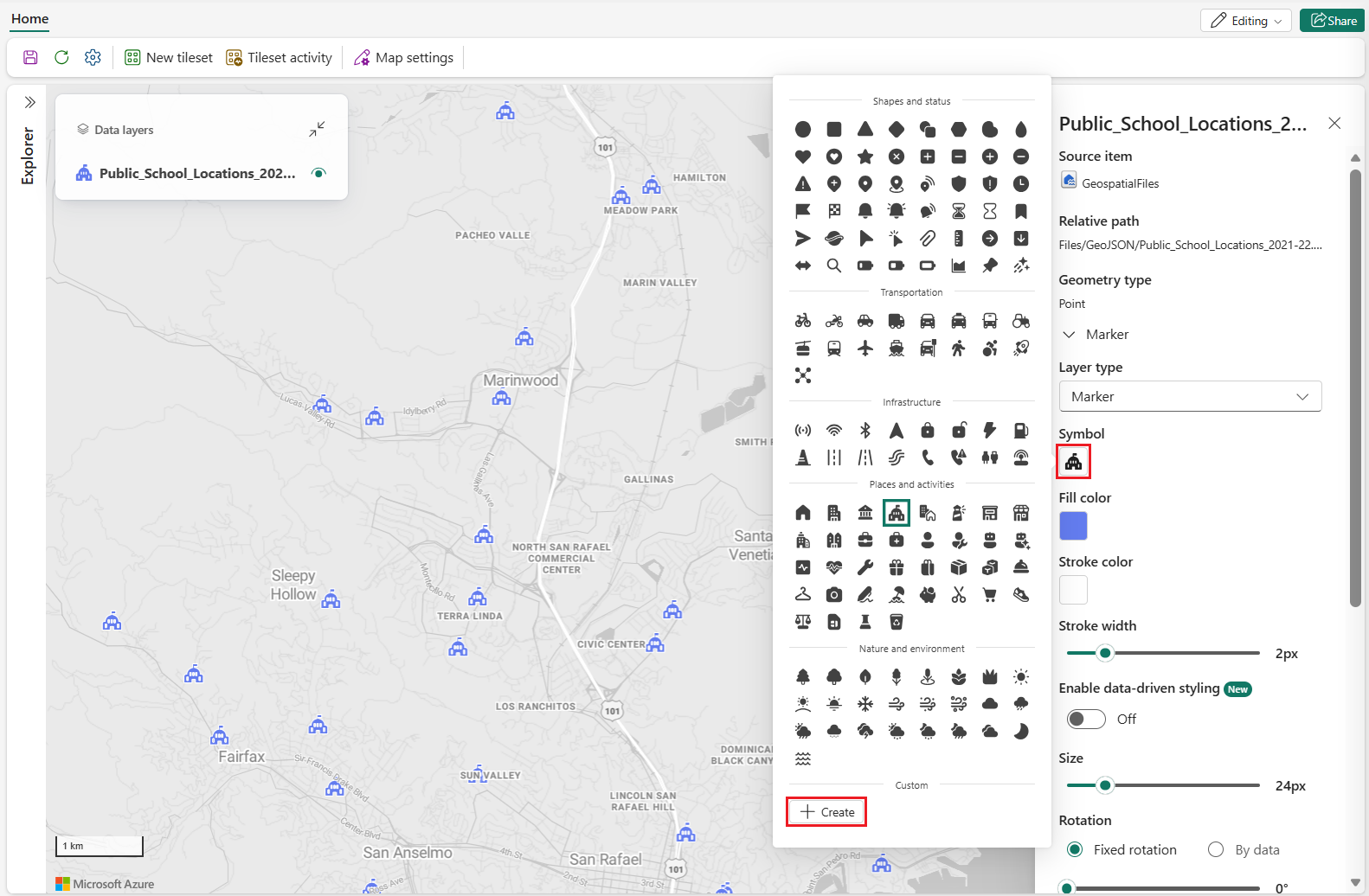
Marker layers display points as icons. You can use a built-in Fluent icon or a custom image stored in a lakehouse.

| Setting | Description |
|---|---|
| Symbol | Sets the icon used to represent each point. |
| Fill color | Sets the fill color of supported built-in symbols. When Enable data-driven styling is off, select one color for all supported symbols. When data-driven styling is enabled and a valid data field is selected in Color by, select a color palette or customize colors for the selected values. This setting might not apply to custom images. |
| Stroke color | Sets the border color of the marker. |
| Stroke width | Sets the border width in pixels. |
| Enable data-driven styling | Enables marker color styling by selected data values using either Category or Value range styling modes instead of one fixed marker color. Default = off. Custom images might not support data-driven color styling. For more information, see Data-driven styling for map layers. |
| Color by | Sets the data property whose values determine marker color. Available when Enable data-driven styling is on. |
| Style by | Specifies how values in the Color by field are mapped to colors. Choose Category to assign a distinct color to each unique value, or Value range to map numeric values using a continuous color gradient. Available when a valid field is selected in Color by. |
| Choose a method | Specifies how numeric values are mapped to colors when Style by is set to Value range. Valid values: Gradient, which maps values across a continuous color range; and Steps, which groups values into discrete ranges with separate colors. Available when Style by is set to Value range. |
| Size | Sets the marker size. |
| Rotation | Sets how marker rotation is determined: Fixed rotation or By data. |
| Fixed rotation | Sets one fixed marker rotation value. Available when Rotation is set to Fixed rotation. |
| By data | Sets marker rotation from a selected data property. Available when Rotation is set to By data. |
| Opacity | Sets the opacity of marker features. Valid values: 0% (fully transparent) to 100% (fully opaque). |
| Marker overlap | Enables or disables overlap between markers and other map elements. |
| Marker anchor | Sets which point on the icon is anchored to the feature's geographic position. |
| Rotation alignment to map | Sets whether the marker rotates with map orientation. |
| Pitch alignment to map | Sets whether the marker follows map pitch. |
| Enable clustering | Groups nearby points into clusters to reduce visual clutter. Default = off. When enabled, Cluster size and Aggregate by appear. |
| Cluster size | Sets the size of clustered markers. Available when Enable clustering is on. |
| Aggregate by | Sets the numeric data property used to summarize points in each cluster. Available when Enable clustering is on. |
Important
The built-in Airplane and Arrow marker icons are updated (as of August 2026) so that their default orientation at 0° rotation points north. This change aligns the marker artwork with the standard map rotation convention used by Fabric Maps.
If your map uses the Airplane or Arrow marker icons together with a rotation field or custom rotation values, the marker orientation might appear different after upgrading. Review and, if necessary, adjust any fixed rotation values or rotation logic to preserve the intended visual appearance.
This change only affects the built-in Airplane and Arrow marker icons. All other built-in marker icons are unaffected.
Custom markers
To use a custom image as a marker, browse the files in a lakehouse and select a supported image format such as SVG, PNG, or JPG. After you select the image, Fabric Maps uses it as the symbol for point data.
Tip
SVG works best for custom marker images that need to scale across zoom levels. SVG icons are vector-based and resize without losing sharpness, keeping markers crisp and readable at different sizes. PNG and JPG are raster formats and might appear blurry or pixelated when scaled up. Custom marker images must be 1 MB or smaller.
Heatmap layer
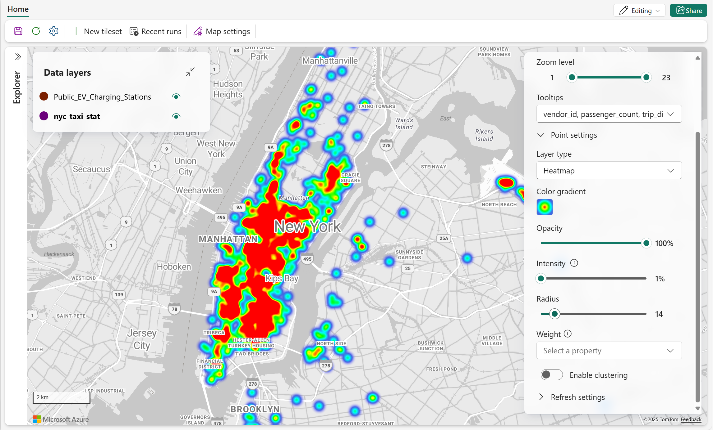
Heatmap layers use color gradients to show the density of point features. Use intensity, radius, and weight to control how each point contributes to the heatmap.
| Setting | Description |
|---|---|
| Color gradient | Sets the color gradient used to represent point density. Select one gradient for the layer to map low-to-high density values. |
| Opacity | Sets the opacity of the heatmap. |
| Intensity | Sets the multiplier applied to each point's weight. |
| Radius | Sets the pixel radius used to render each point's influence. |
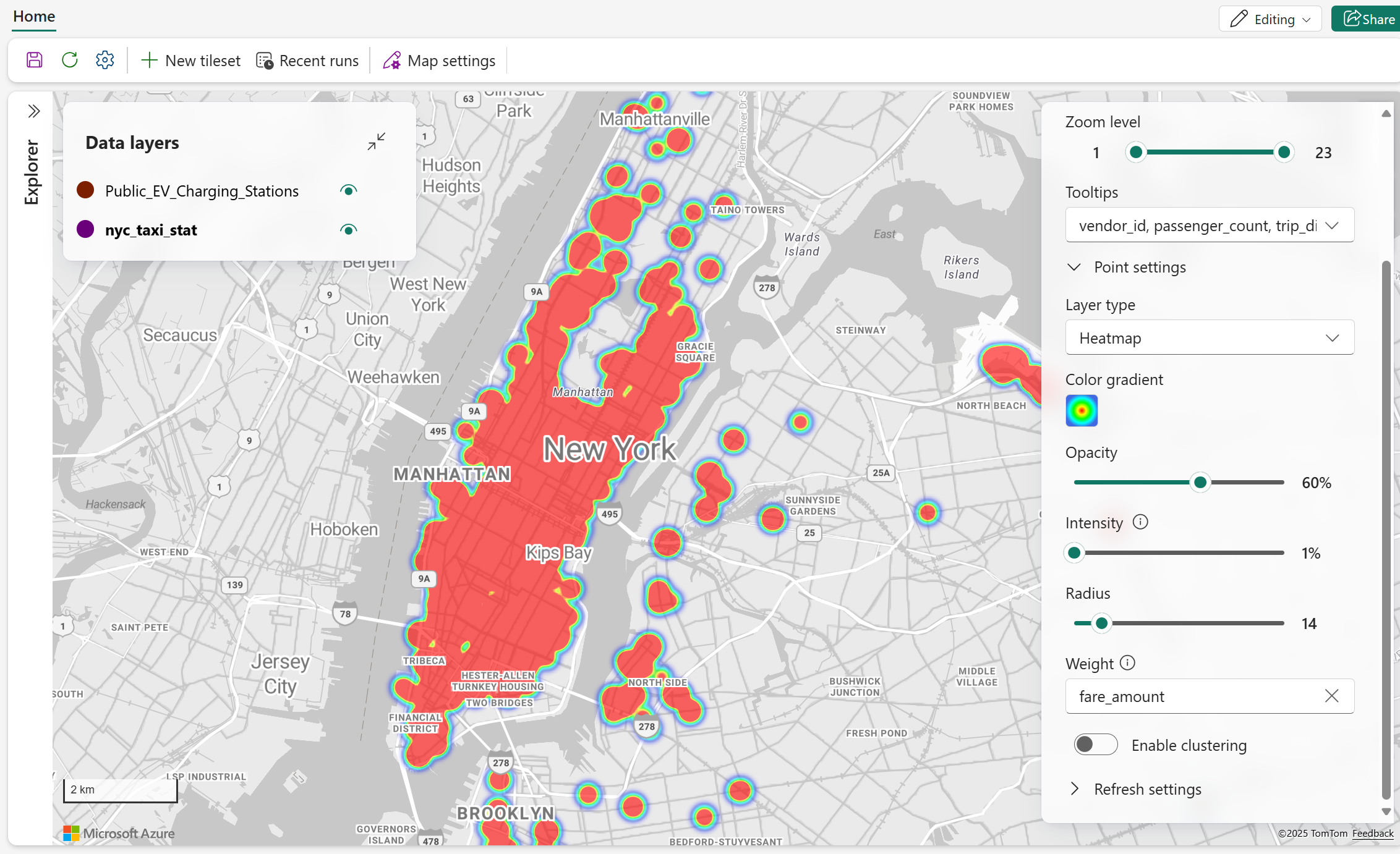
| Weight | Sets each point's contribution using a numeric data property. Default = 1 when no property is specified. |
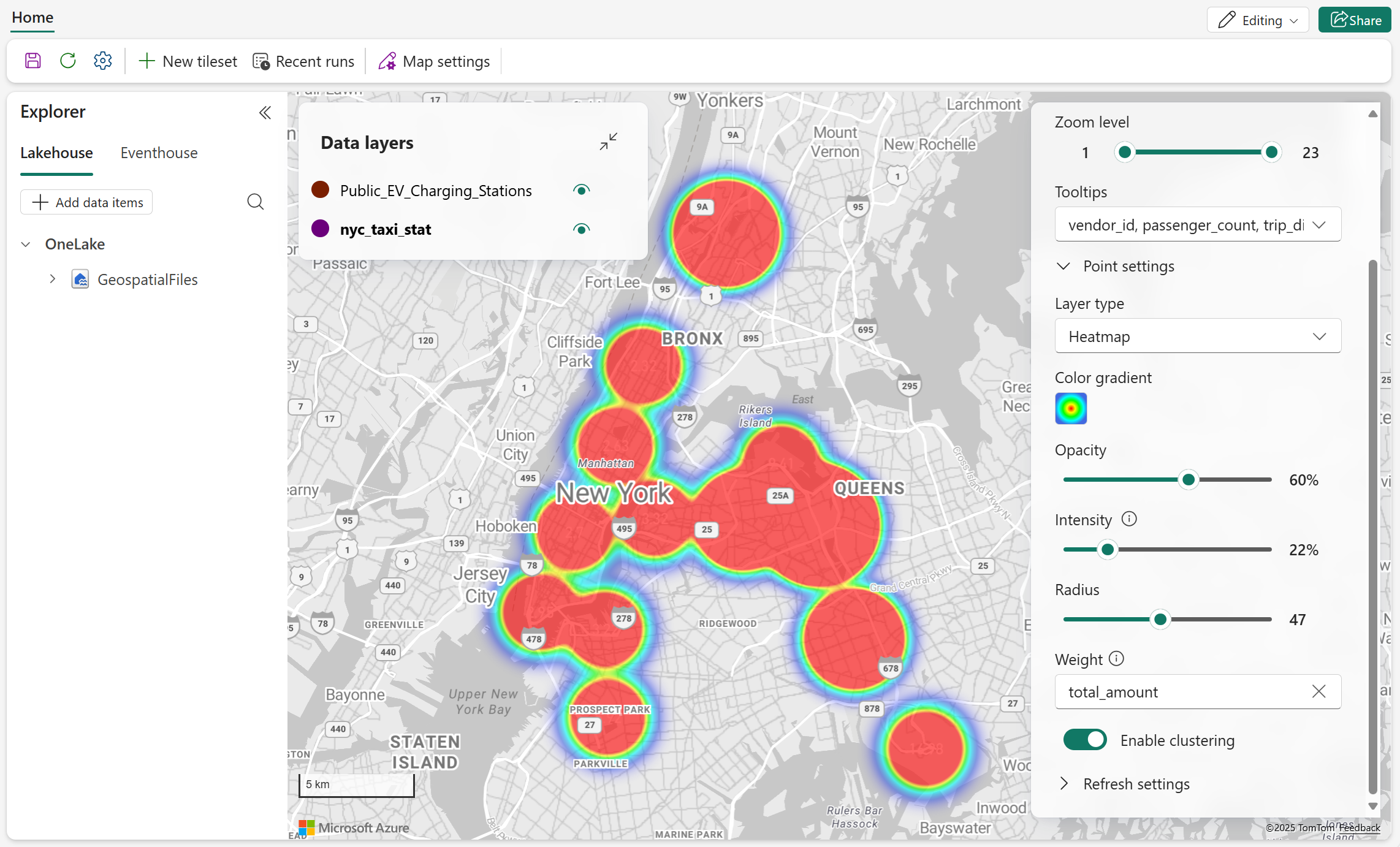
| Enable clustering | Groups nearby points into clusters to reduce visual clutter. Default = off. When enabled, Cluster size and Aggregate by appear. |
| Cluster size | Sets the size of clustered heatmap points. Available when Enable clustering is on. |
| Aggregate by | Sets the numeric data property used to summarize points in each cluster. Available when Enable clustering is on. |
Apply weight
The following screenshot shows a heatmap in which a numeric property contributes different amounts of intensity to each point.
Clustered heatmap
The following screenshot shows a clustered heatmap with adjusted radius and intensity settings.
Data label settings
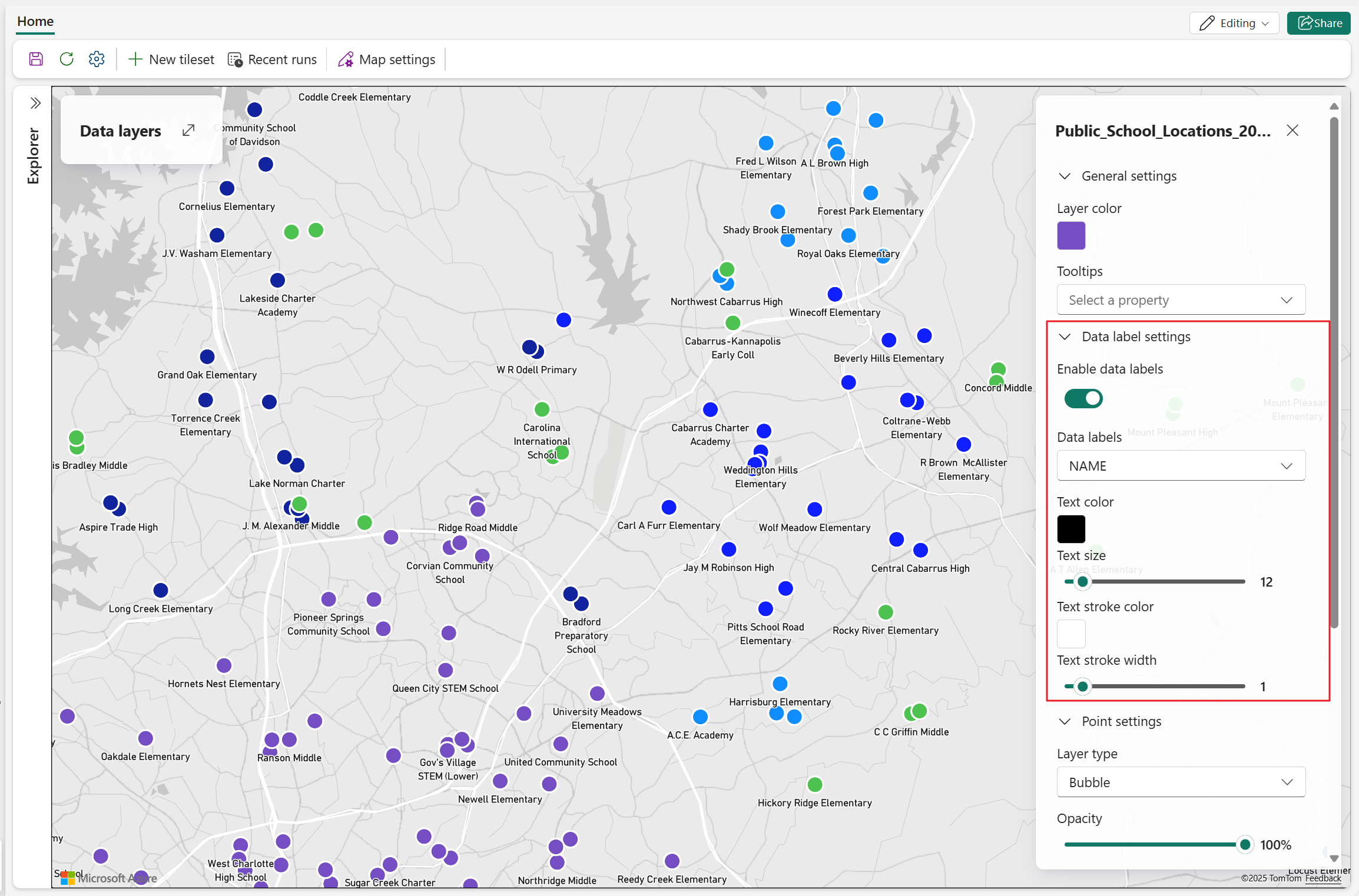
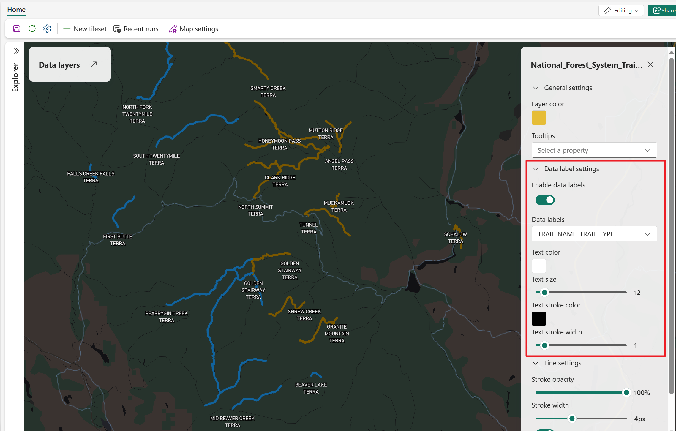
Data labels display text from a selected data property directly on the map. To display labels, turn on Enable data labels and then configure the label properties.
The following examples show data labels on point, line, and polygon layers.
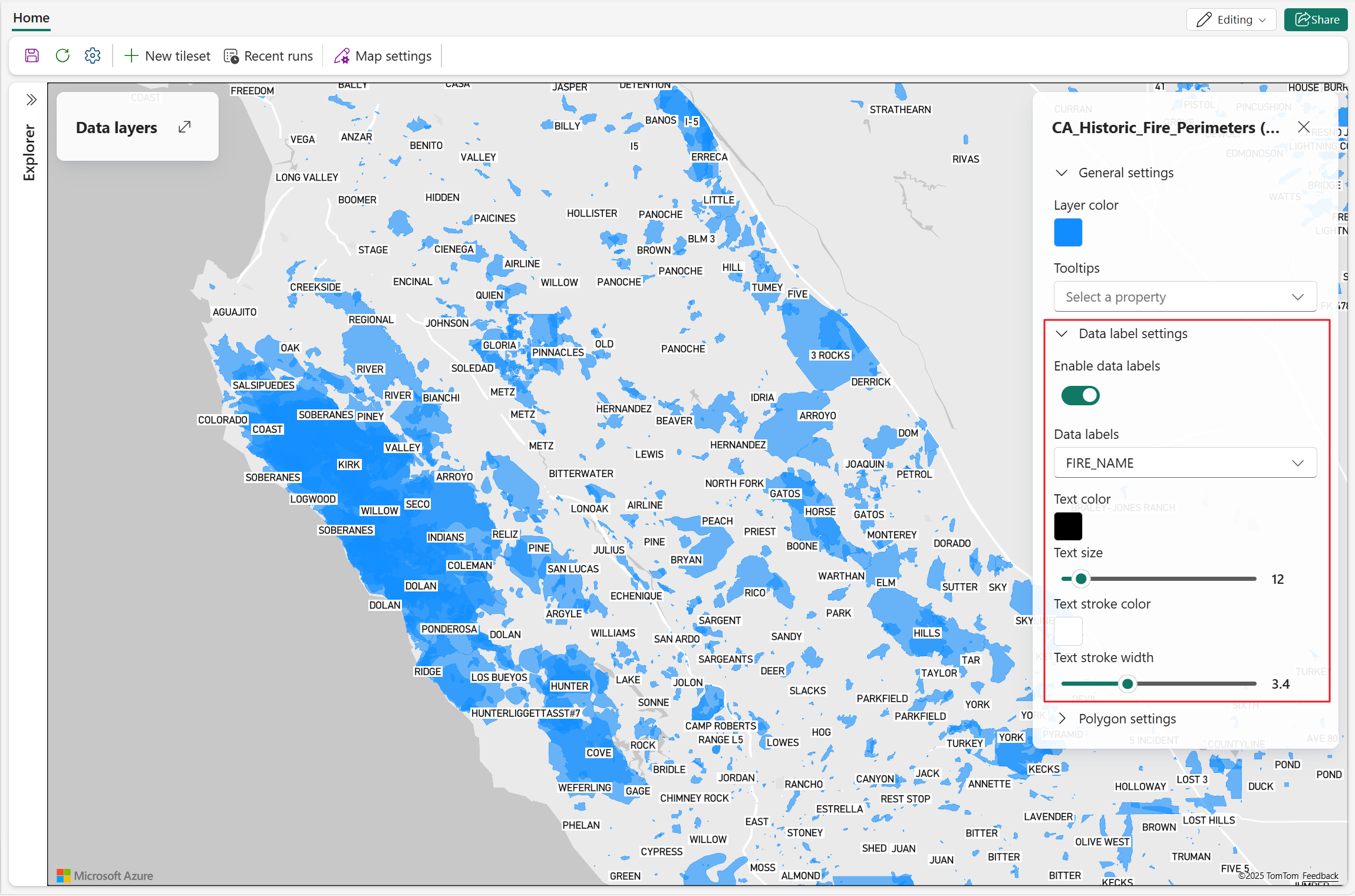
| Setting | Description |
|---|---|
| Enable data labels | Shows or hides data labels for the selected layer. When enabled, the remaining data-label settings appear. |
| Data labels | Sets the data property whose values appear as labels. Available when Enable data labels is on. |
| Font weight | Sets label weight. Valid values: Regular, Medium, Bold. Available when Enable data labels is on. |
| Text color | Sets the label text color. Available when Enable data labels is on. |
| Text size | Sets label text size. Valid values: 8 to 48. Default = 12. Available when Enable data labels is on. |
| Text stroke color | Sets the text outline color. Available when Enable data labels is on. |
| Text stroke width | Sets the text outline width. Valid values: 0 to 10. Default = 1. Available when Enable data labels is on. |
| Label position | Sets label position relative to the associated feature. For line layers, choose top, bottom, or center. For polygon layers, labels are centered by default. For point layers, choose top center, bottom center, top left, top right, bottom left, or bottom right. Available when Enable data labels is on. |
| Data label overlap | Sets whether labels can overlap map symbols. Available when Enable data labels is on. |
Visibility settings
Visibility settings control when a layer is displayed and which data properties are available when users hover over its features.
| Setting | Description |
|---|---|
| Zoom level | Sets the zoom range in which the layer is displayed. Data appears when zoom is greater than or equal to minZoom and less than maxZoom (for example, maxZoom 23 displays through zoom level 22; minZoom 0 displays from zoom level 0). Not supported when using PMTiles as the data source. |
| Tooltips | Sets which data properties are shown when a user hovers over a map feature. |
Data-driven styling for map layers
Data-driven styling lets you control how vector layers are colored based on property values in your dataset, instead of applying one fixed color to all features. This approach helps highlight patterns, trends, and outliers directly on the map.
Data-driven styling is supported for the following layer types:
In the Layer settings pane, configure data-driven color styling through:
- Color by: Selects the data property used for color mapping.
- Style by: Selects the styling mode (Category or Value range).
- Choose a method: Available when Style by is set to Value range and lets you choose Steps or Gradient.
| Styling mode | Description | Supported data types | Available methods | Typical use cases |
|---|---|---|---|---|
| Category | Assigns a distinct color to each unique value in the selected property and displays a discrete legend. | Text or categorical fields | Not applicable | Status values (for example, Active and Inactive), asset types, regions, ownership, or other discrete classifications. |
| Value range | Assigns colors based on numeric value intervals and displays a range-based legend. | Numeric fields | Steps or Gradient | Altitude, speed, temperature, utilization, risk score, and other continuous measures. |
Use data‑driven styling on a map layer
Open the map in Edit mode.
Select a vector data layer (line, polygon, bubble, or marker).
In the Layer settings pane, select Enable data‑driven styling.
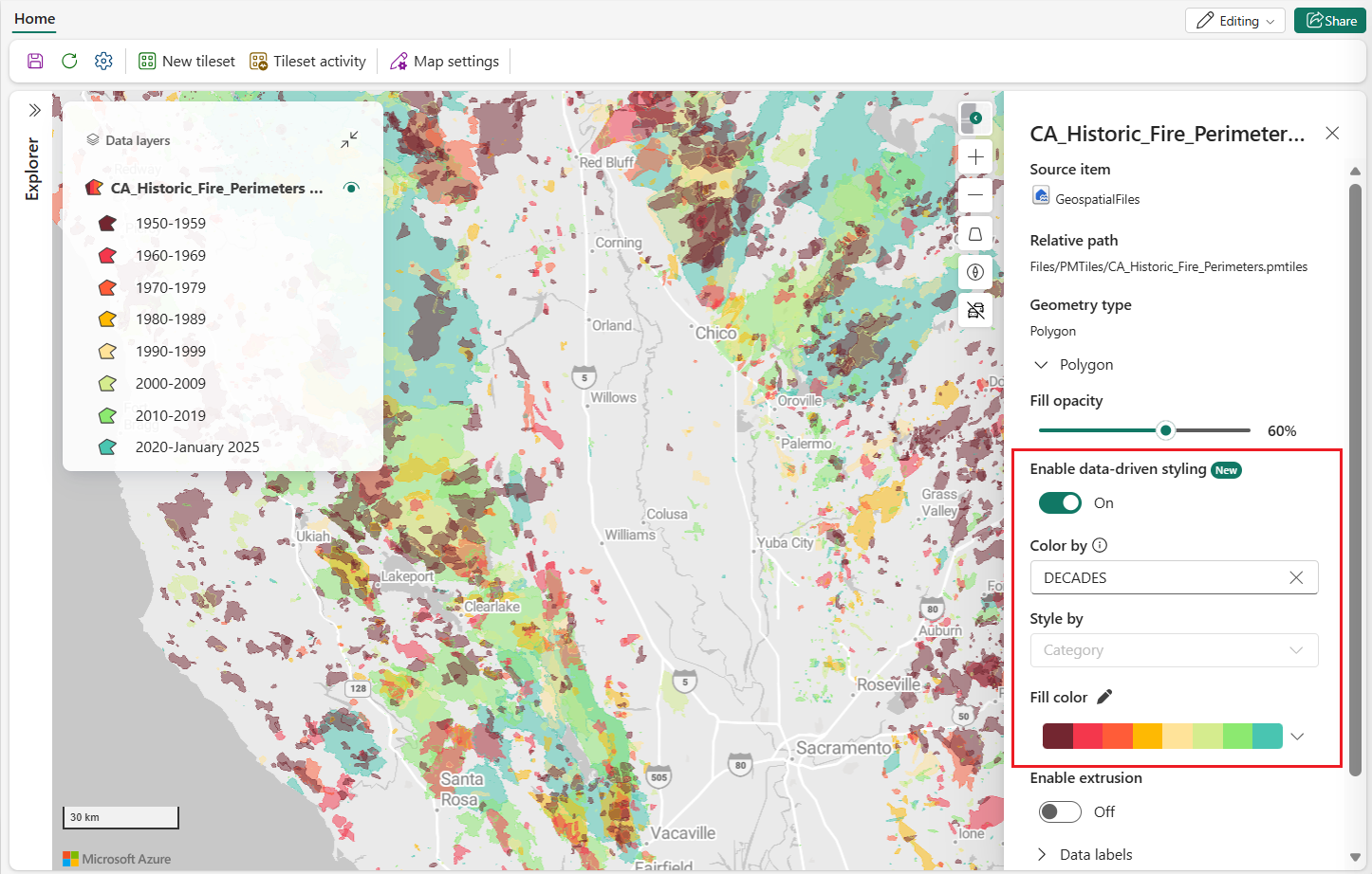
In Color by, select the property that drives color.
In Style by, select one of the following options:
- Category
- Value range
If you select Value range, in Choose a method, select either Steps or Gradient.
Configure value range methods
When you set Style by to Value range, use one of these methods:
- Steps: Divides the numeric domain into discrete buckets, where each bucket gets a distinct color. Use this method when you want explicit class breaks.
- Gradient: Applies a continuous color ramp across the numeric domain. Use this method when you want smooth visual transitions between low and high values.
Rotate markers by data field
Marker layers support data-driven rotation, which is useful for directional data such as heading, bearing, or wind direction.
- Select a Marker layer.
- In Rotation, select By data.
- In Rotation property, select a numeric field.
Use data values in the range 0 to 360 so markers rotate correctly.
Additional behavior and considerations
- The Data layer pane displays a color legend for both Category and Value range styles.
- For Category styling, the legend automatically collapses when more than 10 items are shown; select Show more to expand.
- For Category styling, the legend supports up to 100 categories. Additional values appear as Other.
- For marker layers, data-driven color styling is supported for built-in marker symbols, except when using gradient-based color styling. Custom marker images don't support data-driven color styling.
- Data-driven styling works with other layer features such as filters and labels. Due to a current limitation, legends for PMTiles-based layers don't update when filters are applied and continue to display values for the unfiltered dataset.