Note
Access to this page requires authorization. You can try signing in or changing directories.
Access to this page requires authorization. You can try changing directories.
Partners integrating the Verified on LinkedIn API must follow these branding and UX guidelines to ensure a consistent and trusted member experience.
This page explains the correct usage of the “Verify on LinkedIn” button, the “Verified on LinkedIn” badge, and the associated placement and design standards.
Note
Visual assets (buttons, badges, and icons) must only be used as provided by LinkedIn.
Partners may not alter these assets or create custom “verified” visuals that could mislead Members about verification sources or statuses.
Overview
The Verified on LinkedIn visual system represents trust and authenticity for LinkedIn members across partner experiences.
Proper implementation ensures the integrity of LinkedIn’s verification experience and reinforces credibility and security for end users.
Key Principles
- Always use the official button and badge assets provided by LinkedIn.
- Maintain sizing, color, and spacing to ensure visual consistency.
- Do not modify or recreate any verification icons, logos, or phrases.
- Do not misstate or overstate what Verified on LinkedIn means.
“Verify on LinkedIn” Button
The “Verify on LinkedIn” button is the primary call-to-action (CTA) for users to start the verification flow on LinkedIn.
It must link directly to the verificationUrl returned from the /verificationReport API.
Button Usage Rules
| Rule | Description |
|---|---|
| Purpose | Routes members to LinkedIn to complete identity or workplace verification. |
| Placement | Display in contexts where verification is required |
| State | Render only when the API response includes a valid verificationUrl. |
| Do not cache | Do not cache the URL — use the latest verificationUrl from each API response. |
| Label | Button text must remain “Verify on LinkedIn”. No modifications such as “LinkedIn Verify” or “Verify via LinkedIn”. |
Button Design

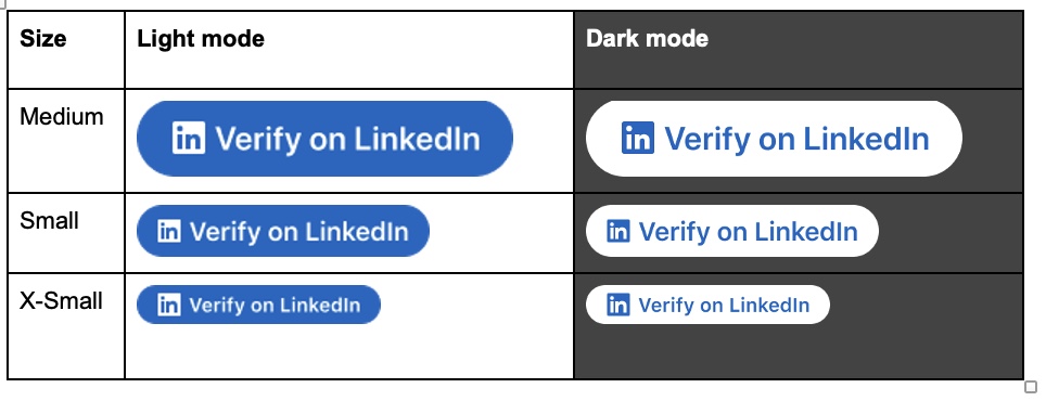
Sizing and color options
We want your team to utilize the best sizing of our "Verify on LinkedIn" button for your experience. However, we want to limit use of the button being too small or too large as it impacts the visual design aesthetic, impact, and brand perception. To ensure the main call to action is prominent and consistent across partner sites, we ask that the blue version be used and inverted white colors used in dark mode.
Interaction
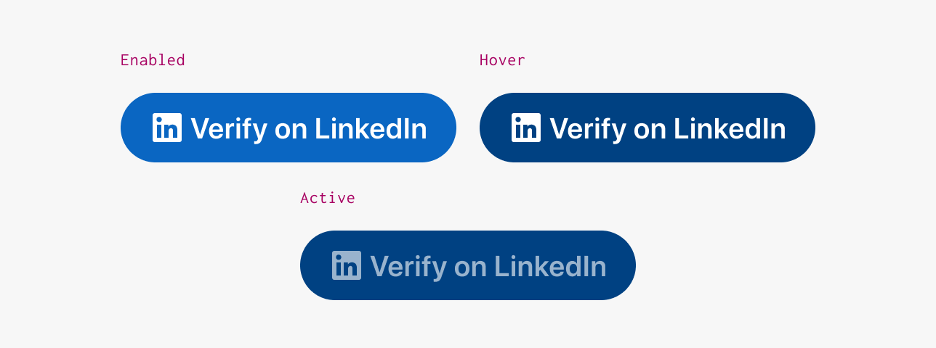
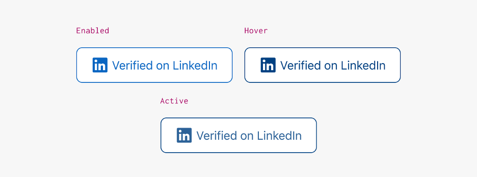
Use "button" states to suggest interaction. This includes the enabled, hover and active state.
Application Example

"Verified on LinkedIn" Badge
The "Verified on LinkedIn" badge is a visual signal confirming that a member has completed one or more verification types (Identity or Workplace) through LinkedIn.
When to Display
| Condition | Display the Badge? |
|---|---|
| At least one verification type (Identity or Workplace) is true. | Yes |
After verification completes (no verificationUrl returned). |
Yes |
| Member is unverified or verification data is missing. | No |
| Data is from cached or manually entered sources. | No |
Badge Design
Sizing and color options
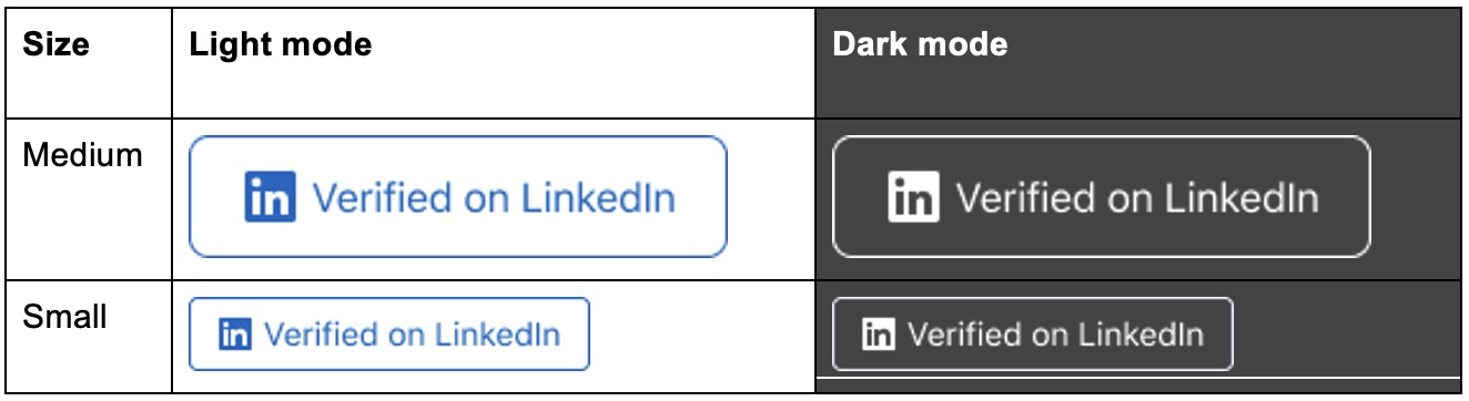
To maintain a consistent experience, the badge should adhere to recommended sizing guidelines. Avoid making it too small, which can reduce visibility and usability, or too large, which can disrupt the visual hierarchy and negatively impact brand perception. Proper sizing ensures the badge remains clear, functional, and aesthetically aligned with the overall design system.
Interaction
The badge acts as a clickable element that navigates directly to the user's LinkedIn profile, enabling quick access for others to view professional details. Use "button" states to suggest interaction. This includes the enabled, hover and active state.
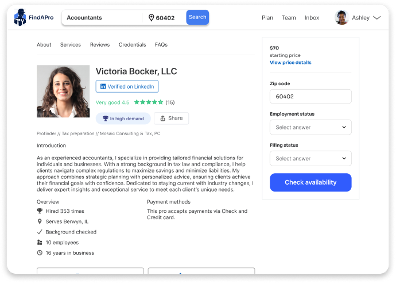
Application example:
Do's and Don'ts
Do
- Use official assets from LinkedIn's API documentation.
- Maintain proportional spacing and readable font sizes.
Don't
- Change text to "LinkedIn Verified", "LinkedIn Trusted", or any other non-approved language.
- Alter badge colors or replace icons.
- Show the badge before confirmation from API response.
- Combine with other third-party verification marks.
Example UX Flow
- Your app calls the
/verificationReportendpoint to check the member's current verification categories. - If the API response includes a
verificationUrl, display the "Verify on LinkedIn" button. - When the member clicks the button, they are redirected to LinkedIn to complete verification.
- After completion, LinkedIn redirects the member back to your app's registered redirect URL.
- Your app calls
/verificationReportagain to confirm the updated verification categories. - Once verified, display the "Verified on LinkedIn" badge in the appropriate location (for example, profile header or account summary).
Obtaining Design Assets
Official assets for the "Verify on LinkedIn" button and "Verified on LinkedIn" badge are available for partner use.
Have a design-related question? Check the Verified on LinkedIn FAQ, for usage clarifications and implementation tips.
Important:
Unauthorized reproduction or modification of LinkedIn marks is strictly prohibited.
All implementations must comply with LinkedIn Brand Guidelines and Partner Terms.
Next Steps
- Review the Verified on LinkedIn API to understand key API capabilities.
- Explore API Reference for implementation details.
- Stay up to date with Release Notes for new asset or schema updates.