Create a responsive slicer you can resize in Power BI
APPLIES TO:  Power BI Desktop
Power BI service
Power BI Desktop
Power BI service
Responsive slicers resize to fit any space on your report. With responsive slicers, you can resize them to different sizes and shapes, from horizontal tile to square to vertical, and the values in the slicer rearrange themselves as you do. In Power BI Desktop and in the Power BI service, you can make tile slicers and date/range slicers responsive. Date/range slicers also have improved touch areas, so it's easier to change them with a fingertip. You can make responsive slicers as small or as large as you want. They also resize automatically to fit well on reports in the Power BI service and also in the Power BI mobile apps.
Create a slicer
The first step to creating a dynamic slicer is to create a basic slicer.
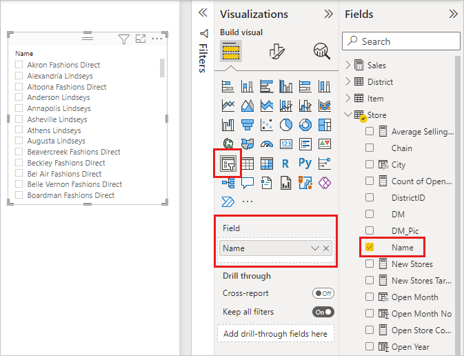
Select the Slicer icon
 in the Visualizations pane.
Drag the field you want to filter on to Field.
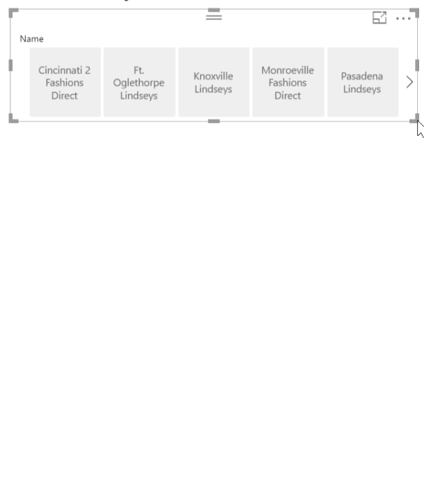
Convert to a tile slicer
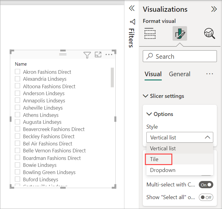
With the slicer selected, in the Visualizations pane, select the Format tab.
Expand the Slicer settings section, then for Style, select Tile.
You'll probably want to make it wider, to show more values.
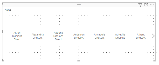
Make it responsive and experiment with it
This step is easy.
With the slicer selected, in the Visualizations pane, select the Format tab.
Under Properties, expand Advanced options, and then slide Responsive to On.
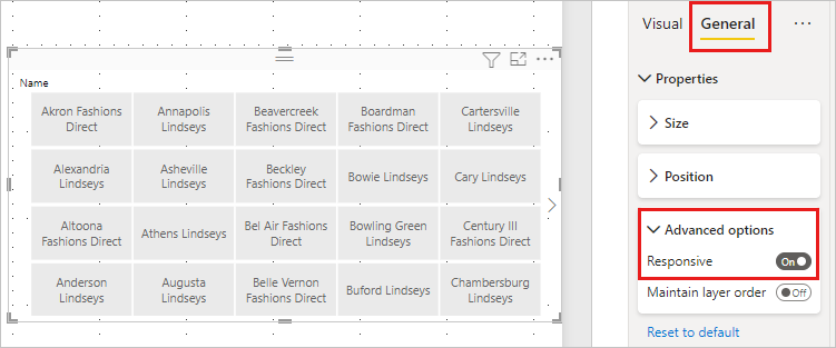
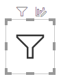
Now you can play with it. Drag the corners to make it short, tall, wide, and narrow. If you make it small enough, it becomes just a filter icon.
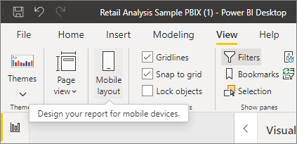
Add it to a phone report layout
In Power BI Desktop, you can create a phone layout for each page of a report. If a page has a phone layout, it displays on a mobile phone in portrait view. Otherwise, you need to view it in landscape view.
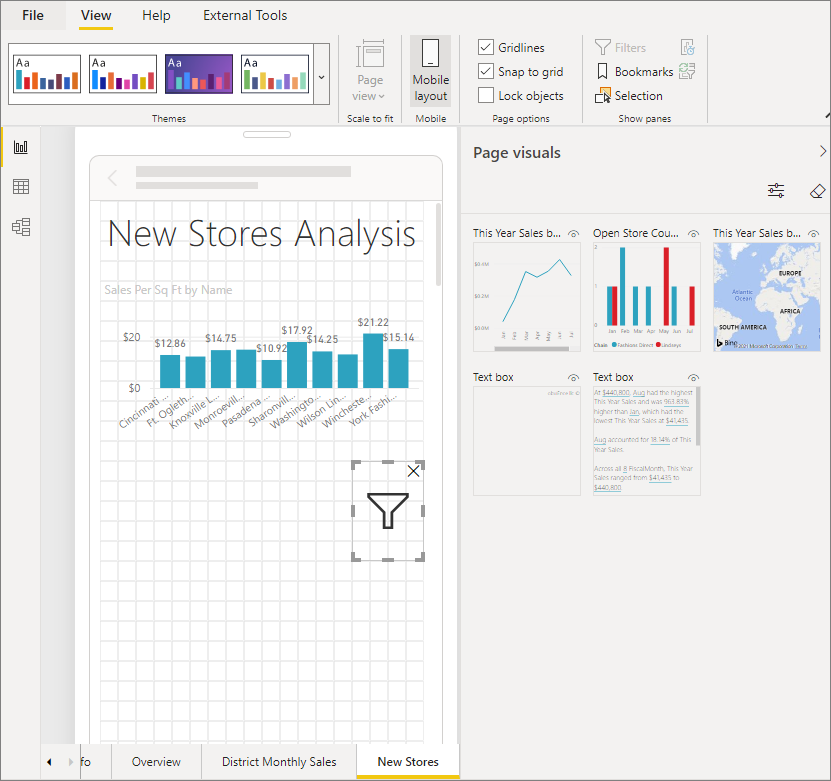
On the View menu, select Mobile layout.
Drag all the visuals you want in the phone report to the grid. When you drag the responsive slicer, make it the size you want--in this case, just a filter icon.
Read more about creating reports optimized for the Power BI mobile apps.
Make a time or range slicer responsive
You can follow the same steps to make a time or range slicer responsive. After you set Responsive to On, you notice a few things:
- Visuals optimize the order of input boxes depending on the size allowed on the canvas.
- Data-element display is optimized to make the slicer as usable as possible, based on the size it's allowed on the canvas.
- New round handlebars on the sliders optimize touch interactions.
- When a visual becomes too small to be useful, it becomes an icon representing the visual type in its place. To interact with it, just double-tap to open it in focus mode. This saves valuable space on the report page without losing the functionality.
Related content
- Slicers in Power BI
- More questions? Ask the Power BI Community
Feedback
Coming soon: Throughout 2024 we will be phasing out GitHub Issues as the feedback mechanism for content and replacing it with a new feedback system. For more information see: https://aka.ms/ContentUserFeedback.
Submit and view feedback for