Note
Access to this page requires authorization. You can try signing in or changing directories.
Access to this page requires authorization. You can try changing directories.
The Human Resources built-in sample contains a dashboard, report, and semantic model for a human resources department. In this sample, the human resources department has the same reporting model across different companies, even when they differ by industry or size. This sample looks at new hires, active employees, and employees who have left. It strives to uncover any trends in the hiring strategy. The main objectives are to understand:
- Who you hire
- Biases in your hiring strategy
- Trends in voluntary separations

This sample is part of a series that shows how you can use Power BI with business-oriented data, reports, and dashboards. The company obviEnce created this sample using real, anonymized data. The data is available in several formats: built-in sample in the Power BI service, .pbix Power BI Desktop file, or Excel workbook. See Samples for Power BI.
This tutorial explores the Human Resources built-in sample in the Power BI service. Because the report experience is similar in Power BI Desktop and in the service, you can also follow along by using the sample .pbix file in Power BI Desktop.
Before you can use the sample, get the sample in one of the following ways:
- Get the built-in sample in the service.
- Download the .pbix file.
- Download the Excel workbook.
Prerequisites
You don't need a Power BI license to explore the samples in Power BI Desktop. You just need a Fabric free license to explore the sample in the Power BI service, and save it to your My workspace.
Get the built-in sample in the Power BI service
Open the Power BI service (
app.powerbi.com), and select Learn in the left navigation.On the Learning center page, under Sample reports, scroll until you see the Human Resources Sample.
Select the sample. It opens in Reading mode.
Power BI imports the built-in sample, adding a new dashboard, report, and semantic model to your current workspace.

Select the dashboard to view the sample dashboard.
Get the .pbix file for this sample
Alternatively, you can download the Human Resources sample as a .pbix file, which is designed for use with Power BI Desktop.
After you open the file in Power BI Desktop, select File > Publish > Publish to Power BI or choose Publish in the Home ribbon.
In the Publish to Power BI dialog, choose a workspace and then Select.
In the Power BI service, in your workspace, scroll down to the IT Spend Analysis Sample report and select to open.
From the More options (...) menu, select Pin to a dashboard. Select New dashboard, enter a name, and choose Pin live.
The dashboard that you create this way isn't the same as the sample dashboard created by the built-in sample. You can still use Q&A in the dashboard to learn more about your data and make changes to your dashboard.
Get the Excel workbook for this sample
If you want to view the data source for this sample, it's also available as an Excel workbook. To see the raw data, enable the Data Analysis add-ins, and then select Power Pivot > Manage.
If you want to get and use the Excel file in the Power BI service, follow these steps:
Download the sample from Power BI Desktop samples. The file is called Human Resources Sample-no-PV.xlsx.
Open the file in Excel and then select File > Publish > Publish to Power BI.
Select a workspace, such as My workspace, and choose Export.
There are different ways to work with Excel files. For more information, see Explore the Excel samples in Excel.
In the Power BI service, the exported data appears as a semantic model in the selected workspace. Select More options (...) > Auto-create report.
Select Save, enter a name for your report, and then choose Save.
From the More options (...) menu, select Pin to a dashboard. Select New dashboard, enter a name, and choose Pin live.
The dashboard and report that you create this way aren't the same as the ones created by the built-in sample. You can still use Q&A in the dashboard to explore your data and make changes to your dashboard.
New hires
If you got the built-in report in the Power BI service or published the .pbix file from Power BI Desktop, you can see the report that comes with the sample. If you imported from Excel, your automatically generated report doesn't look as described.
Let's explore new hires first.
If you got the built-in sample in your workspace, select the Dashboards tab, and open the Human Resources Sample dashboard.
If you uploaded the .pbix file, skip the next step and open the New Hires page of the report in your workspace.
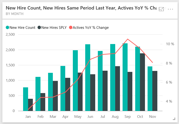
On the dashboard, select the New Hire Count, New Hires Same Period Last Year, Actives YoY % Change By Month tile.
The Human Resources Sample report opens to the New Hires page.
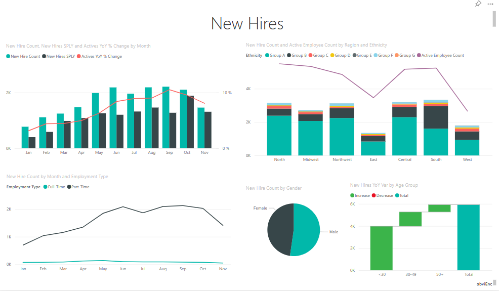
Look at these items of interest:
- The New Hire Count, New Hires SPLY and Actives YoY % Change by Month combo chart shows that you hired more people every month this year compared to last year. Significantly more people in some months.
- In the combo chart New Hire Count and Active Employee Count by Region and Ethnicity, notice that you're hiring fewer people in the East region.
- The New Hires YoY Var by Age Group waterfall chart shows you're hiring mainly younger people. This trend might be due to the mostly part-time nature of the jobs.
- The New Hire Count by Gender pie chart shows a roughly even split.
Can you find more insights? For example, a region where gender isn't evenly split.
Select different age groups and genders in the charts to explore the relationships between age, gender, region, and ethnicity group.
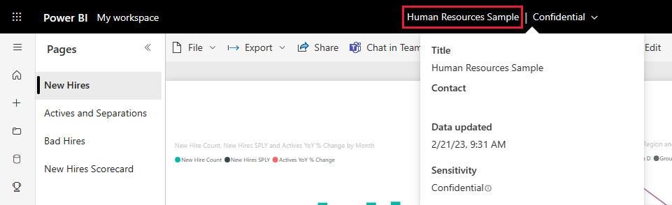
Select Human Resources Sample from the black Power BI header bar to see detailed information about the dashboard.


Compare currently active and former employees
Let's explore data for currently active employees and employees who no longer work for the company.
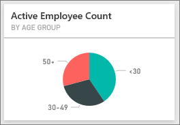
If you got the built-in sample in your workspace, in the dashboard, select the Active Employee Count by Age Group tile.
If you uploaded the .pbix file, open the Active Employees vs. Separations page of the report in your workspace.
The Human Resources Sample report opens to the Active Employees vs. Separations page.
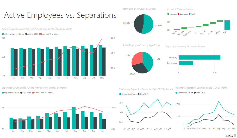
Look at these items of interest:
- The two combo charts on the left show the year-over-year change for active employees and employee separations. You have more active employees this year due to rapid hiring, but also more separations than last year.
- In August, you had more separations compared to other months. Select the different age groups, genders, or regions to see if you can find any outliers.
- Looking at the pie charts, you have an even split in our active employees by gender and age groups. Select different age groups to see how the gender split differs by age. Do you have an even split by gender in every age group?

Reasons for separation
Look at the report in Editing View. You can change the pie charts to show employee separations data instead of active employee data.
Select Edit in the upper-right corner.
Select the Active Employee Count by Age Group pie chart.
In Data, select Employees to expand the Employees table. Clear Active Employee Count to remove that field.
Select Separation Count in the Employees table to add it to the Values box in the Data area.
On the report canvas, select the Voluntary bar in the Separation Count by Separation Reason bar chart.
This bar highlights those employees who left voluntarily in the other visuals in the report.
Select the 50+ slice of the Separation Count by Age Group pie chart.
Look at the line chart in the lower-right corner. This chart is filtered to show voluntary separations.
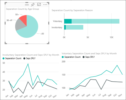
Notice the trend in the 50+ age group. During the latter part of the year, more employees over age 50 left voluntarily. This trend is an area to investigate further with more data.
You can also follow the same steps for the Active Employee Count by Gender pie chart, changing it to separations instead of active employees. Look at the voluntary separation data by gender to see if you find any other insights.
Select Human Resource Sample from the workspace to return to the dashboard. You can choose to save the changes you've made to the report.
Bad hires
The last area to explore is bad hires. Bad hires are defined as employees who didn't last for more than 60 days. You're hiring rapidly, but are you hiring good candidates?
Again, if you got the built-in sample in your workspace, in the dashboard, select the Bad Hires as % of Actives by Age Group dashboard tile. The report opens to tab three, Bad Hires.
If you uploaded the .pbix file, open the Bad Hires page of the report in your workspace.
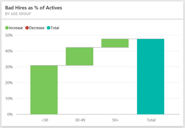
Select Northwest in the Region slicer on the left and select Male in the Bad Hire Count by Gender donut chart. Look at the other charts on the Bad Hires page. There are more male bad hires than females and many Group A bad hires.

If you look at the Bad Hire Count by Gender donut chart and select different regions in the Region slicer, you see that the East region is the only region with more female than male bad hires.
Select the name of the dashboard from the workspace return to the dashboard.

Ask a question in the dashboard Q&A box
No matter whether you downloaded the dashboard or created your own, you can use Q&A in the dashboard to discover other details in the data. Let's get more specific.
In the Q&A question box in the dashboard, you can ask a question about your data by using natural language. Q&A recognizes the words you type and figures out where in your semantic model to find the answer.
Select the Q&A question box. Even before you start typing, Q&A displays suggestions to help form your question.
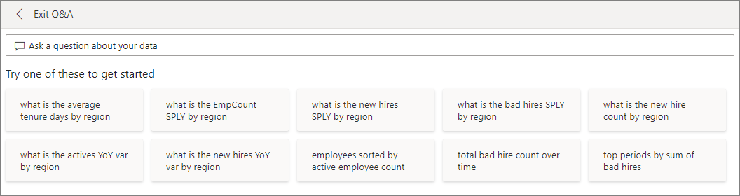
You can pick one of those suggestions, or enter: show age group, gender, and bad hires SPLY where region is East.

Most of the female bad hires are under 30.

Related content
This environment is a safe one to play in, because you can choose not to save your changes. But if you do save them, you can always return to the Learning center for a new copy of this sample.
We hope this tour has shown how Power BI dashboards, Q&A, and reports can provide insights into sample data. Now it's your turn. Connect to your own data. With Power BI, you can connect to a wide variety of data sources. To learn more, see Get started with the Power BI service.