Note
Access to this page requires authorization. You can try signing in or changing directories.
Access to this page requires authorization. You can try changing directories.
APPLIES TO: ![]() Power BI Desktop
Power BI Desktop ![]() Power BI service
Power BI service
This article describes how to create scatter chart visualizations in Power BI, which includes support for bubble charts and dot plot charts.
Scatter charts
Scatter charts display data along a horizontal (x) and vertical (y) axis. The chart reveals how numerical values along the two axes are related. When data intersects on the two axes, Power BI displays a data point.
You can analyze data points to identify relationships in your data. Data points are distributed evenly or unevenly across the horizontal axis depending on the chart data. You can set the number of data points up to a maximum of 10,000. Tooltips are available for all data points. The tooltip shows details for the data based on the data represented in the chart.
Bubble charts
Bubble charts expand on the concept of data points by representing two intersected values with a bubble. The bubble size represents a third data dimension that's useful for evaluation. While a scatter chart uses two axes, a bubble chart can support three data series where each series has different sets of values.
Dot plot charts
Dot plot charts also employ the features of scatter charts. In a scatter chart, you can adjust the independent scales of the axes to reveal more information about the grouped values. Dot plot charts expand on the capabilities of the scatter chart by allowing you to add categorical data on the horizontal axis. The visibility of the category information can help you quickly analyze your data and highlight important points. Your chart settings can reveal patterns in large sets of data, such as showing linear or nonlinear trends, clusters, and outliers.
These three visuals help to reveal relationships and patterns in your data. The chart visualizations can identify interesting information about your data that might not be readily apparent by just looking at the numerical values.
Scatter charts, bubble charts, and dot plot charts are useful for comparing large numbers of data points without regard to any specific time. The more data you include in your chart, the better the comparisons you can make.
When to use scatter, bubble, and dot plot charts
The following image showcases the different display options offered for these visuals.

Scatter charts work well in many scenarios:
- Show relationships between two numerical values.
- Plot two groups of numbers as one series of x and y coordinates.
- Display worksheet data with pairs or grouped sets of values.
- Show patterns in large sets of data.
- Compare large amounts of data points irrespective of time measurements.
- Convert horizontal axis into logarithmic scale.
- Substitute for line charts to enable changing horizontal axis scale.
You can use a bubble chart in many of the same scenarios as a scatter chart. Bubble charts are also useful when you want to:
- Visually emphasize value differences with variable bubble size.
- Support scenarios with three data series that each has sets of values.
- Present financial data in a visual rather than numerical form.
- Display data with quadrants.
Use cases for the dot plot chart are similar to the scenarios described for scatter and bubble charts. The primary advantage of dot plot charts is the ability to include categorical data along the horizontal axis.
Use a scatter chart example
To follow along with the examples in this article, create a calculated table with sample data in a blank Power BI Desktop report.
Open Power BI Desktop and create a new blank report.
Select Modeling > New table.
Paste the following DAX expression:
Sales Performance =
DATATABLE(
    "Region", STRING,
    "Product Category", STRING,
    "Marketing Spend", INTEGER,
    "Revenue", INTEGER,
    "Units Sold", INTEGER,
    "Customer Satisfaction", DOUBLE,
    {
        {"North", "Electronics", 45000, 280000, 1200, 4.5},
        {"North", "Clothing", 32000, 195000, 2800, 4.2},
        {"North", "Home & Garden", 28000, 165000, 1500, 4.0},
        {"North", "Sports", 18000, 98000, 900, 4.3},
        {"South", "Electronics", 52000, 310000, 1400, 4.6},
        {"South", "Clothing", 25000, 142000, 2200, 3.9},
        {"South", "Home & Garden", 35000, 210000, 1800, 4.4},
        {"South", "Sports", 22000, 125000, 1100, 4.1},
        {"East", "Electronics", 38000, 245000, 1050, 4.3},
        {"East", "Clothing", 42000, 268000, 3500, 4.5},
        {"East", "Home & Garden", 30000, 178000, 1650, 4.2},
        {"East", "Sports", 15000, 82000, 780, 3.8},
        {"West", "Electronics", 60000, 385000, 1650, 4.7},
        {"West", "Clothing", 28000, 158000, 2400, 4.0},
        {"West", "Home & Garden", 22000, 130000, 1200, 3.9},
        {"West", "Sports", 35000, 195000, 1450, 4.4}
    }
)
Press Enter to create the table.
Create a scatter chart
Create a scatter chart to explore the relationship between marketing spend and revenue across different regions.
In the Visualizations pane, select Scatter chart.
From the Data pane, drag these fields to the field wells:
- Marketing Spend to X Axis
- Revenue to Y Axis
- Region to Legend
Power BI creates data points where the marketing spend and revenue values intersect. The data point colors represent different regions, revealing how each region's marketing investment correlates with revenue.
The scatter chart shows a clear positive correlation between marketing spend and revenue. Notice how the West region (highest marketing spend) also generates the highest revenue, while the data points cluster in distinct regional groups.
Create a bubble chart
Transform your scatter chart into a bubble chart by adding a third data dimension that controls the size of each data point.
From the Data pane, drag Units Sold to the Size field well.
Power BI replaces each data point with a bubble. The bubble size is proportionate to the number of units sold for that data point.
Optionally, drag Product Category to the Legend field well to see how different product categories perform.
The bubble chart reveals that Clothing moves the most units (largest bubbles) despite not having the highest revenue, while Electronics generates high revenue with fewer units sold.
Adjust bubble size range
When you have a value in the Size field well, you can adjust how bubble sizes are calculated.
Select the paintbrush icon to open the Format pane.
Select Visual > Markers.
Change the Range scaling option:
- Auto: The default. Uses Magnitude mode for single-sign data, or Data Range mode when data includes both positive and negative values.
- Magnitude: Converts negative values to positive with the same magnitude. Bubbles scale from zero to the maximum magnitude.
- Data Range: Bubble sizes vary based on the actual data range. The smallest value shows the smallest bubble, the largest value shows the largest bubble.
Change the number of data points
In the Format pane, select General.
Under Properties > Advanced options, adjust the Number of data points value.
The maximum is 10,000. When approaching the maximum, test your chart output to ensure good performance.
Create a dot plot chart
Create a dot plot chart to compare customer satisfaction ratings across product categories, with each region shown as a separate data point.
In the Visualizations pane, select Scatter chart.
From the Data pane, drag these fields to the field wells:
- Product Category to X Axis
- Customer Satisfaction to Y Axis
- Region to Legend
When you add a categorical field to the X Axis instead of a numerical field, Power BI creates a dot plot chart. The category names appear along the horizontal axis, making it easy to compare values across categories.
The dot plot reveals that Electronics consistently achieves highest satisfaction across all regions, while Sports shows the most regional variation. You can quickly identify which categories and regions might need attention.
Format your chart
There are many display options available on the General and Visual sections of the Visualizations > Format visual pane. Take some time to explore the features.
Try changing the data point or bubble colors, axes labels, chart titles, background shading, and more.
To improve accessibility, consider adding marker shapes to each line.
To select the marker shape, expand Markers under Visual, choose Shape, and select a shape.
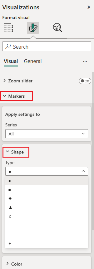
Change the marker shape to a diamond, triangle, or square.
Add analytics to your chart
Scatter charts support several analytics features through the Analytics pane in the Visualizations pane. You can add:
- Trend lines: Show overall direction of the data
- Constant lines: Add reference lines at specific X or Y axis values
- Min, Max, Average, and Median lines: Highlight statistical reference points
- Percentile lines: Show data distribution thresholds
- Symmetry shading: Reveal which axis measure a data point favors by shading the background symmetrically based on axis boundaries
For detailed instructions on using these features, see Use the Analytics pane in Power BI.
Considerations and troubleshooting
Review the following considerations for working with scatter charts in Power BI.
Charts with many data points
The maximum number of data points that you can display on any type of scatter chart is 10,000. When the number of data points approaches the maximum setting, it's a good practice to test your chart output to ensure good performance.
The load time for the chart visual increases as the number of data points increases. If you choose to publish a report with a data point limit set at the high end of the scale, you should test internet and mobile access to your report. Confirm the chart performance meets your users' expectations.
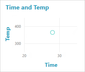
Charts with a single data point
Does your scatter chart have only one data point that aggregates all of the values on the x and y axes, as shown in the following image? Or does it aggregate all the values along a single horizontal or vertical line?
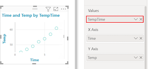
In this scenario, you can add a field to the Values option for the chart on the Visualizations > Build visual pane. The field instructs Power BI on how to group the values. The field must be unique for each point you want to plot. You can provide a row number or ID field. In the following example, we set the Values option to the RowNum ID field from the semantic model.

If your data doesn't include a specific row number or ID, you can create a field to concatenate your x and y values together. The field must be unique for each point you want to plot. In the following example, we set the Values option to a new field named TempTime to hold the concatenated values.
To create a new field, use the Power BI Desktop Query Editor to add an Index Column to your semantic model. Then add this column to your visual's Values option.
Related content
- Try high-density sampling in Power BI scatter charts.
- Review the visualizations overview in Power BI.
- For other questions, connect with the Microsoft Power BI Community.