Note
Access to this page requires authorization. You can try signing in or changing directories.
Access to this page requires authorization. You can try changing directories.
Xamarin.Forms Layouts are used to compose user-interface controls into visual structures.
The Layout and Layout<T> classes in Xamarin.Forms are specialized subtypes of views that act as containers for views and other layouts. The Layout class itself derives from View. A Layout derivative typically contains logic to set the position and size of child elements in Xamarin.Forms applications.
The classes that derive from Layout can be divided into two categories:
Layouts with Single Content
These classes derive from Layout, which defines Padding and IsClippedToBounds properties:
| Type | Description | Appearance |
|---|---|---|
ContentView |
ContentView contains a single child that is set with the Content property. The Content property can be set to any View derivative, including other Layout derivatives. ContentView is mostly used as a structural element and serves as a base class to Frame.API Documentation / Guide |
 C# code for this page / XAML page |
Frame |
The Frame class derives from ContentView and displays a border, or frame, around its child. The Frame class has a default Padding value of 20, and also defines BorderColor, CornerRadius, and HasShadow properties.API Documentation / Guide |
 C# code for this page / XAML page |
ScrollView |
ScrollView is capable of scrolling its contents. Set the Content property to a view or layout too large to fit on the screen. (The content of a ScrollView is very often a StackLayout.) Set the Orientation property to indicate if scrolling should be vertical, horizontal, or both.API Documentation / Guide |
 C# code for this page / XAML page |
TemplatedView |
TemplatedView displays content with a control template, and is the base class for ContentView.API Documentation / Guide |
 |
ContentPresenter |
ContentPresenter is a layout manager for templated views, used within a ControlTemplate to mark where the content that is to be presented appears.API Documentation / Guide |
 |
Layouts with Multiple Children
These classes derive from Layout<View>:
| Type | Description | Appearance |
|---|---|---|
StackLayout |
StackLayout positions child elements in a stack either horizontally or vertically based on the Orientation property. The Spacing property governs the spacing between the children, and has a default value of 6.API Documentation / Guide |
 C# code for this page / XAML page |
Grid |
Grid positions its child elements in a grid of rows and columns. A child's position is indicated using the attached properties Row, Column, RowSpan, and ColumnSpan.API Documentation / Guide |
 C# code for this page / XAML page |
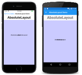
AbsoluteLayout |
AbsoluteLayout positions child elements at specific locations relative to its parent. A child's position is indicated using the attached properties LayoutBounds and LayoutFlags. An AbsoluteLayout is useful for animating the positions of views.API Documentation / Guide |
 C# code for this page / XAML page with code-behind |
RelativeLayout |
RelativeLayout positions child elements relative to the RelativeLayout itself or to their siblings. A child's position is indicated using the attached properties that are set to objects of type Constraint and BoundsConstraint.API Documentation / Guide |
 C# code for this page / XAML page |
FlexLayout |
FlexLayout is based on the CSS Flexible Box Layout Module, commonly known as flex layout or flex-box. FlexLayout defines six bindable properties and five attached bindable properties that allow children to be stacked or wrapped with many alignment and orientation options.API Documentation / Guide |
 C# code for this page / XAML page |
