Note
Access to this page requires authorization. You can try signing in or changing directories.
Access to this page requires authorization. You can try changing directories.
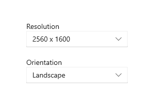
A label is the name or title of a control or a group of related controls.
Important APIs: Header property, TextBlock class
In XAML, many controls have a built-in Header property that you use to display the label. For controls that don't have a Header property, or to label groups of controls, you can use a TextBlock instead.

Recommendations
- Use a label to indicate to the user what they should enter into an adjacent control. You can also label a group of related controls, or display instructional text near a group of related controls.
- When labeling controls, write the label as a noun or a concise noun phrase, not as a sentence, and not as instructional text. Avoid colons or other punctuation.
- When you do have instructional text in a label, you can be more generous with text-string length and also use punctuation.
Get the sample code
Related topics
- Text controls
- TextBox.Header property
- PasswordBox.Header property
- ToggleSwitch.Header property
- DatePicker.Header property
- TimePicker.Header property
- Slider.Header property
- ComboBox.Header property
- RichEditBox.Header property
- TextBlock class
Collaborate with us on GitHub
The source for this content can be found on GitHub, where you can also create and review issues and pull requests. For more information, see our contributor guide.
Windows developer
