WPF - C# Desktop App - good way for layout, xaml

Markus Freitag 3,786 Reputation points
2020-07-29T13:34:27.607+00:00

Hello,

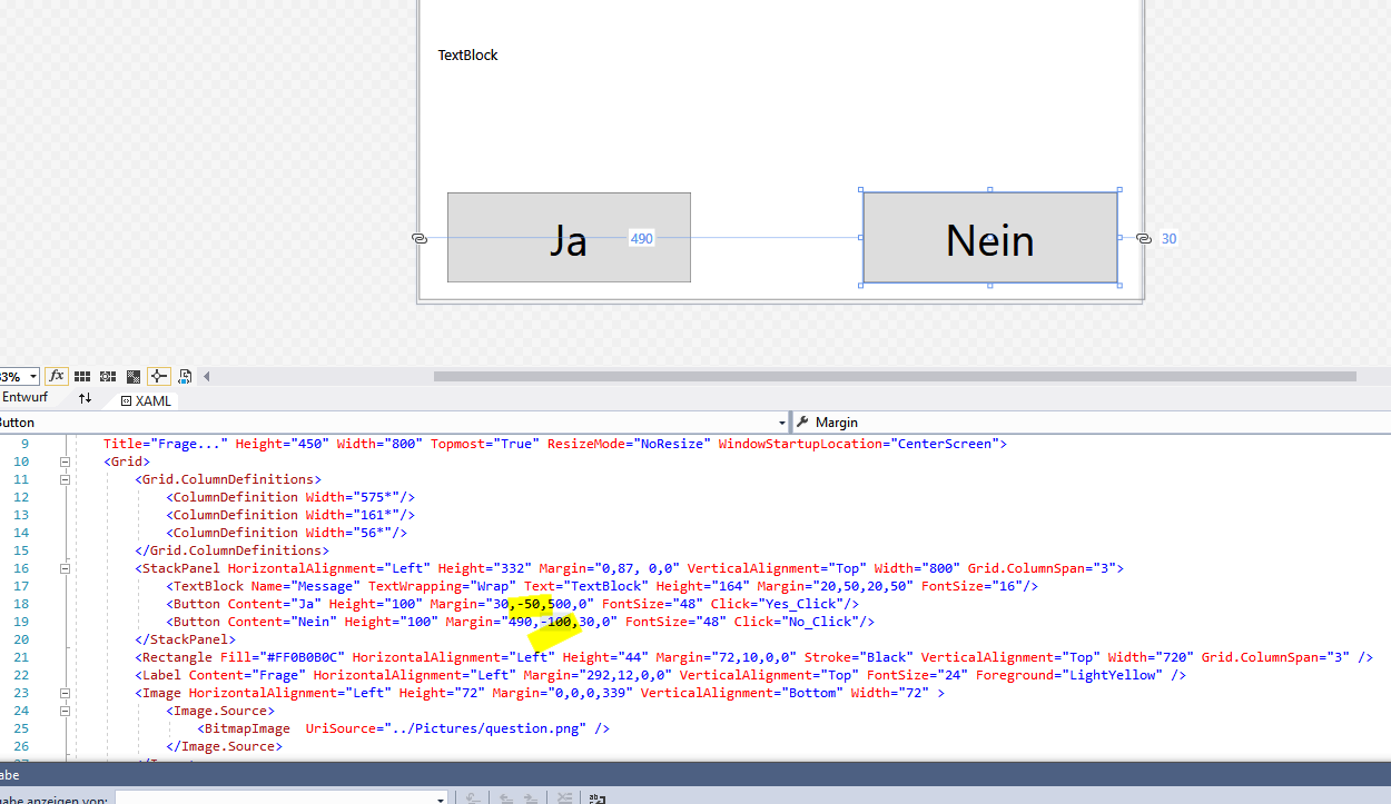
sometimes everything is moved, sometimes inexplicably.

Is there a short instruction somewhere, when to take what and how. TextBlock, Stackpanel.

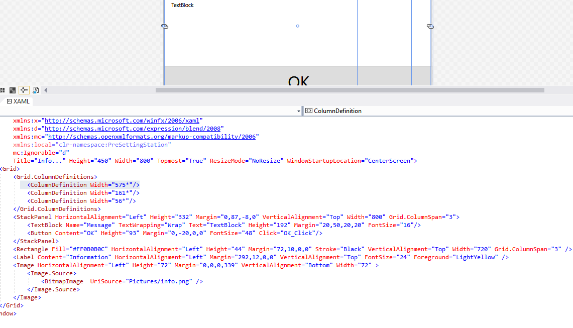
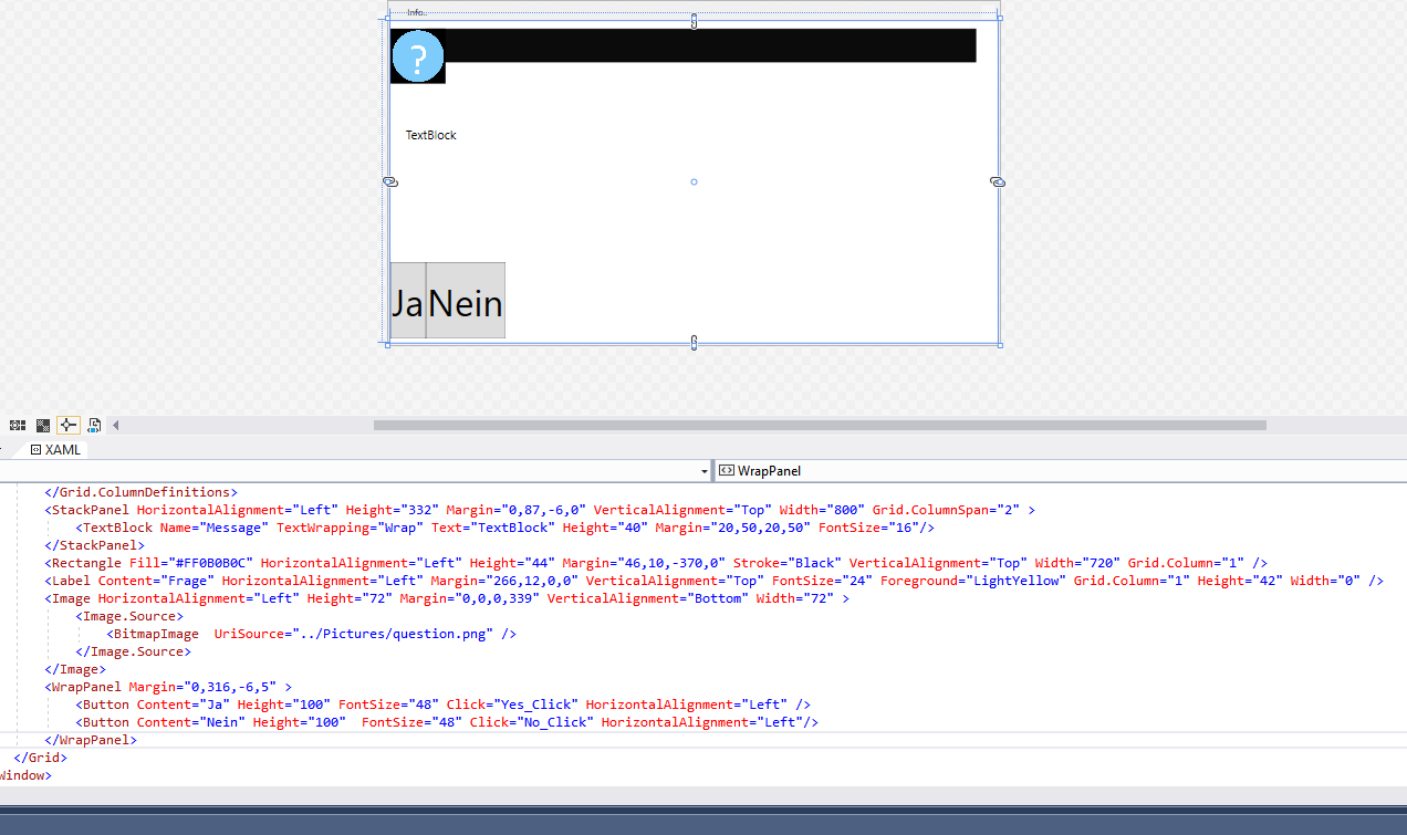
I created this dialog, all at once there were rows and columns in it, then the layout was no longer correct.
Do you have a good procedure?
14342-grid-columns-why.png

Windows Presentation Foundation
A part of the .NET Framework that provides a unified programming model for building line-of-business desktop applications on Windows.
2,783 questions
{count} votes

Accepted answer
  1. DaisyTian-1203 11,626 Reputation points
    2020-07-30T06:06:12.273+00:00

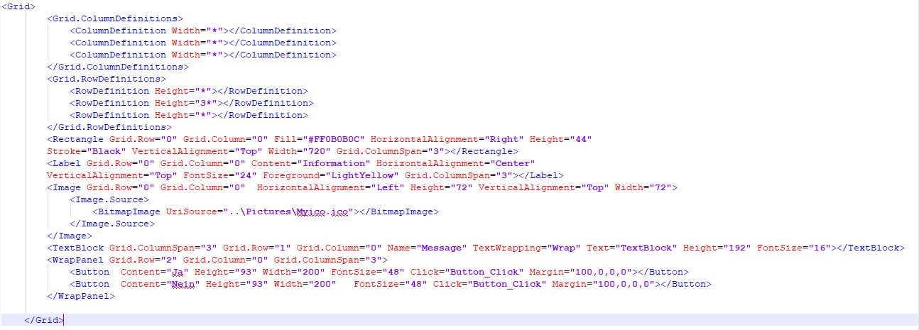
    It is not a good idea for you to directly use Margin to layout your layout, because Margin is positioned according to precise pixels, which is more suitable for layout adjustment. The four Numbers in Margin ="left,top,right,bottom". You should design your page layout well. I reorganized your XAML code based on the layout.
    Here is my code for your layout:
    14436-capture.png

    1 person found this answer helpful.

2 additional answers

Sort by: Most helpful
  1. Peter Fleischer (former MVP) 19,326 Reputation points
    2020-07-30T08:43:00.17+00:00

    Hi Markus,
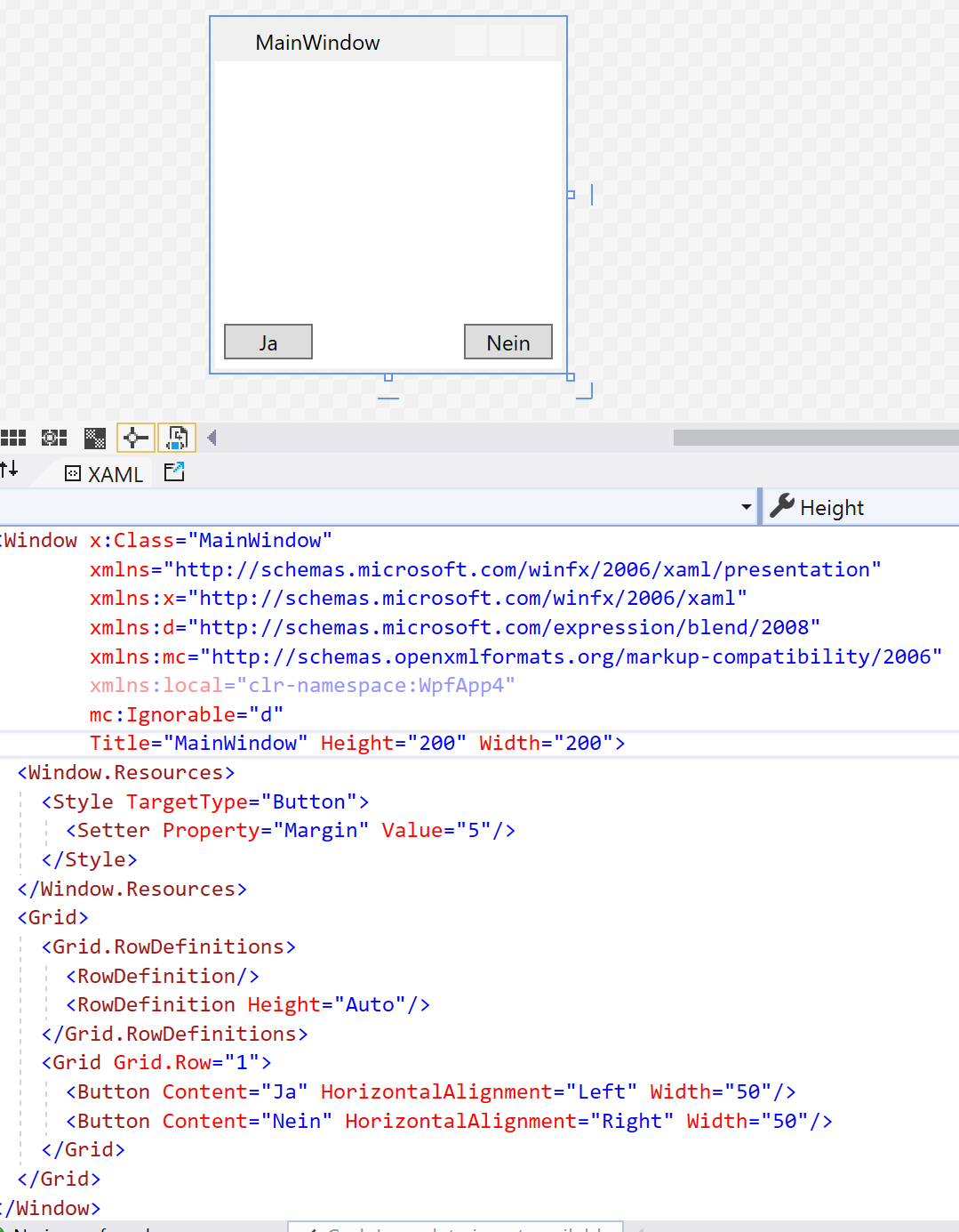
    to use different margins is not good idea. If you must change design in detail you can get many problems. The best way is to use margin only in styles.

    14438-x.png

    1 person found this answer helpful.

  2. Markus Freitag 3,786 Reputation points
    2020-07-30T05:13:52.067+00:00

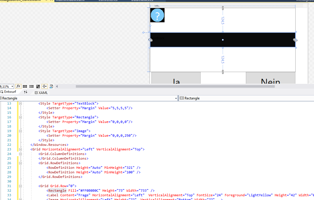
    14453--not-clear.png

    When I change this value margin="30,-50,500,0" F

    both button both buttons are moved. For whatever reason.

    0 comments No comments

Your answer

Answers can be marked as Accepted Answers by the question author, which helps users to know the answer solved the author's problem.