Construct 2 Tip #3: (Uniquely) Leveraging Sprite Animations
In Construct 2, or any game development platform, sprites are a key component and often used to animate movement of a player or other objects in the game, such as demonstrated by this tutorial.
When you edit the Animations property of a sprite, four independent windows appear and represent a tremendous opportunity to create interesting experiences and effects.

In this screen shot above(from Scirra’s Direction-based Sprite Animation tutorial), you see labeled
- The Animations Bar; there’s always a default one, but others can be added and invoked via actions in event scripts.
- The Properties Bar where you define the speed of the animation (number of frames shown per second) and whether it should loop, repeat or alternate playing forwards and backwards.
- The Animation Frames Bar which shows the images in the current animation. Here is where you can modify the order of frames and reorder, delete, or add frames to the animation.
- The Image Editor, where each animation frame can be edited individually to set the image points, collision polygon, and size in addition to the actual image itself.
That’s all rather straightforward, and through the generous number of tutorials and samples provided with Construct 2, it’s fairly easy to get your head around incorporating sprites in a game.
That said, in several applications that I’ve created with Construct 2, I’ve leveraged these sprite and animation capabilities in a few not-so-obvious ways, so I wanted to share those with you in the hopes it inspires some creative experiences of your own as you work on applications for the Windows Store. There are three separate examples I’ll cover, each used in an application now in the Windows Store.
Image Arrays
In my series of localized LetterMan games (Buchstaben-Bub, O Mensageiro, and AmigoAlfabeto) the objective is to collect objects beginning with each letter of the alphabet in the appropriate order. Although (for the English language version) I could have created 26 different sprites, one each for the letters A through Z, I opted instead to use only one sprite. That one sprite includes a single default animation, and the animation properties are set to a speed of 0 and to not repeat or loop.
To generate the falling objects, the event script creates a new instance of the single sprite every second and sets the animation frame property of that sprite to a random number between 0 and 25 (or more precisely: between the sequence number of the currently sought letter and number of letters in the target language’s alphabet). The script also leverages a variable called letter that maintains the sequence number of the current letter being sought.
When I localize the game to other languages, the majority of the game play is converted merely by importing another set of images ordered by the initial letter in the target language! The names of the objects, by the way, are contained in a single string with a | delimiter, and the same letter variable used to set the animation frame is used as an index into the string via the TokenAt system expression.
Graphical Timer
 In my Where in the World? geography matching game, I needed to have a timer but wanted to come up with a better experience than just some text that counted down.
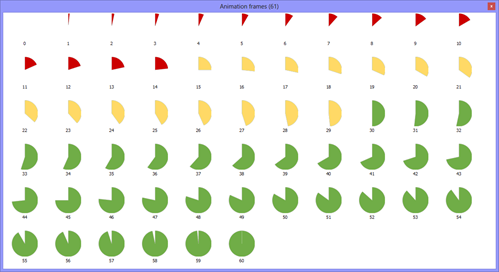
I opted for a clock metaphor (as you see circled) with the numerical value superimposed. As you might expect the “clock” is a single sprite with a series of animation frames, each representing a slightly different segment of a circle.
For this app, I opted for a 60-second timer, so there are sixty-one images, each one varying six degrees from its predecessor. And to add a bit more visual appeal, the images from 29 seconds to 15 seconds are in yellow, and those from 15 to 1 are in red. To create the images, I actually used Microsoft Excel’s graphing feature, and you can see the full animation strip below.

In the event script behind the layout, it’s a simple matter to set the animation frame property of the sprite to the number of seconds left in the game. But I went one step further. In the game you can challenge yourself to complete the board in 30 seconds or even 15 seconds as well. Since those values are factors of 60, with a simple bit of math (below), the same ‘clock’ works for each option.

Visual State Management
Voices of the 60s is hardly a game but it’s built with Construct 2! The app is a soundboard through which you can listen to six pivotal speeches and sound clips recorded in the 1960s. If you look carefully at the user interface, you can see that each photograph has a drop shadow and the currently running clip has a larger dark blue frame with a separate vertical element extending to the status bar of the app.
The drop shadow and the blue background are two separate images in the same sprite.

It’s difficult to discern in the screen shot, but the grey square and the blue square are different sizes. The grey square is he same size at the photographs, while the blue square is about 20 pixels larger in each dimension thus creating the frame effect.
The other significant difference between the two frames is the origin point, which determines how the sprite is placed given an x and y location. In the application screen shot, you can see that the grey background is offset to the right and bottom to create a drop shadow effect behind the photos, but the blue rectangle is on center with the photo (just behind and larger). There is no code in the event script to move the sprite, rather the origin point of the grey rectangle is just set to be several pixels off center. The event script merely needs to set the appropriate animation frame for each photo and the sprite will be rendered appropriately!