Microsoft.Common.TextBox UI element
The TextBox user-interface (UI) element can be used to add unformatted text. The element is a single-line input field, but supports multi-line input with the multiLine property.
UI sample
The TextBox element uses a single-line or multi-line text box.
Example of single-line text box.

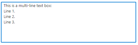
Example of multi-line text box.
Schema
{
  "name": "nameInstance",
  "type": "Microsoft.Common.TextBox",
  "label": "Name",
  "defaultValue": "contoso123",
  "toolTip": "Use only allowed characters",
  "placeholder": "",
  "multiLine": false,
  "constraints": {
    "required": true,
    "validations": [
      {
        "regex": "^[a-z0-9A-Z]{1,30}$",
        "message": "Only alphanumeric characters are allowed, and the value must be 1-30 characters long."
      },
      {
        "isValid": "[startsWith(steps('resourceConfig').nameInstance, 'contoso')]",
        "message": "Must start with 'contoso'."
      }
    ]
  },
  "visible": true
}
Sample output
"contoso123"
Remarks
- Use the
toolTipproperty to display text about the element when the mouse cursor is hovered over the information symbol. - The
placeholderproperty is help text that disappears when the user begins editing. If theplaceholderanddefaultValueare both defined, thedefaultValuetakes precedence and is shown. - The
multiLineproperty is boolean,trueorfalse. To use a multi-line text box, set the property totrue. If a multi-line text-box isn't needed, set the property tofalseor exclude the property. For new lines, JSON output shows\nfor the line feed. The multi-line text box accepts\rfor a carriage return (CR) and\nfor a line feed (LF). For example, a default value can include\r\nto specify carriage return and line feed (CRLF). - If
constraints.requiredis set totrue, then the text box must have a value to validate successfully. The default value isfalse. - The
validationsproperty is an array where you add conditions for checking the value provided in the text box. - The
regexproperty is a JavaScript regular expression pattern. If specified, the text box's value must match the pattern to validate successfully. The default value isnull. For more information about regex syntax, see Regular expression quick reference. - The
isValidproperty contains an expression that evaluates totrueorfalse. Within the expression, you define the condition that determines whether the text box is valid. - The
messageproperty is a string to display when the text box's value fails validation. - It's possible to specify a value for
regexwhenrequiredis set tofalse. In this scenario, a value isn't required for the text box to validate successfully. If one is specified, it must match the regular expression pattern.
Examples
The examples show how to use a single-line text box and a multi-line text box.
Single-line
The following example uses a text box with the Microsoft.Solutions.ArmApiControl control to check the availability of a resource name.
In this example, when you enter a storage account name and exit the text box, the control checks if the name is valid and if it's available. If the name is invalid or already exists, an error message is displayed. A storage account name that's valid and available is shown in the output.
{
  "$schema": "https://schema.management.azure.com/schemas/0.1.2-preview/CreateUIDefinition.MultiVm.json#",
  "handler": "Microsoft.Azure.CreateUIDef",
  "version": "0.1.2-preview",
  "parameters": {
    "basics": [
      {
        "name": "nameApi",
        "type": "Microsoft.Solutions.ArmApiControl",
        "request": {
          "method": "POST",
          "path": "[concat(subscription().id, '/providers/Microsoft.Storage/checkNameAvailability?api-version=2021-09-01')]",
          "body": {
            "name": "[basics('txtStorageName')]",
            "type": "Microsoft.Storage/storageAccounts"
          }
        }
      },
      {
        "name": "txtStorageName",
        "type": "Microsoft.Common.TextBox",
        "label": "Storage account name",
        "constraints": {
          "validations": [
            {
              "isValid": "[basics('nameApi').nameAvailable]",
              "message": "[basics('nameApi').message]"
            }
          ]
        }
      }
    ],
    "steps": [],
    "outputs": {
      "textBox": "[basics('txtStorageName')]"
    }
  }
}
Multi-line
This example uses the multiLine property to create a multi-line text box with placeholder text.
{
  "$schema": "https://schema.management.azure.com/schemas/0.1.2-preview/CreateUIDefinition.MultiVm.json#",
  "handler": "Microsoft.Azure.CreateUIDef",
  "version": "0.1.2-preview",
  "parameters": {
    "basics": [
      {
        "name": "demoTextBox",
        "type": "Microsoft.Common.TextBox",
        "label": "Multi-line text box",
        "defaultValue": "",
        "toolTip": "Use 1-60 alphanumeric characters, hyphens, spaces, periods, and colons.",
        "placeholder": "This is a multi-line text box:\nLine 1.\nLine 2.\nLine 3.",
        "multiLine": true,
        "constraints": {
          "required": true,
          "validations": [
            {
              "regex": "^[a-z0-9A-Z -.:\n]{1,60}$",
              "message": "Only 1-60 alphanumeric characters, hyphens, spaces, periods, and colons are allowed."
            }
          ]
        },
        "visible": true
      }
    ],
    "steps": [],
    "outputs": {
      "textBox": "[basics('demoTextBox')]"
    }
  }
}
Next steps
- For an introduction to creating UI definitions, see CreateUiDefinition.json for Azure managed application's create experience.
- For a description of common properties in UI elements, see CreateUiDefinition elements.
- To learn more about functions, see CreateUiDefinition functions.
Feedback
Coming soon: Throughout 2024 we will be phasing out GitHub Issues as the feedback mechanism for content and replacing it with a new feedback system. For more information see: https://aka.ms/ContentUserFeedback.
Submit and view feedback for