Manage opportunities using pipeline view
The opportunity pipeline view, formerly known as deal manager, helps you visualize, prioritize, and manage the opportunities in your pipeline. The charts in the view help you figure out which deals to follow up with next. The metrics help you determine the current status of deals in the pipeline, deals successfully closed, and deals lost, and their respective revenue.
Video: Opportunity pipeline view
Watch this short video to learn how the opportunity pipeline view helps sellers be more productive and efficient.
Tip
Images that include an icon that looks like this:  may be expanded to show more detail. Select the image to expand it. To close it, press the Esc key.
Open the opportunity pipeline view
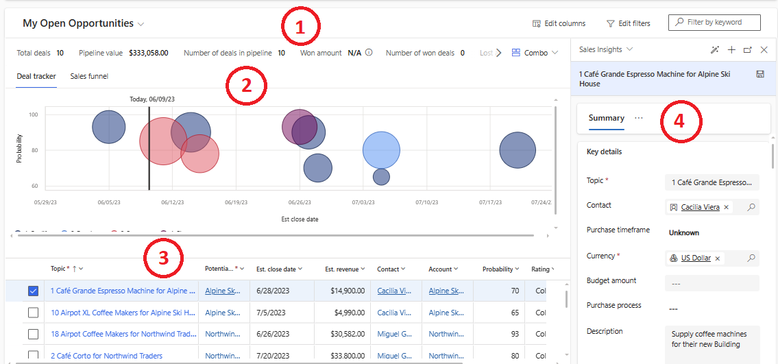
In the Sales Hub navigation panel, select Opportunities. If you don't see the opportunity pipeline view, select Show As, and then select Pipeline view.
Legend:
- Metrics: View the key metrics or KPIs that you want to track. Select a metric to view the underlying data.
- Charts: Get a visual representation of the pipeline.
- Editable grid: View a list of opportunities and edit them inline. Select any linked column to view and edit details in the side panel. Select the three-dot menu against an opportunity to perform common actions, such as closing the opportunity as won or lost, or reopening the opportunity.
- Side panel: View and quickly edit details of the linked record. You can also navigate from one object to another in the side panel. For example, while you're looking at the opportunity, you can select a contact to view their details, quickly make updates, and then return to the opportunity.
You can personalize the opportunity pipeline view to add, remove, resize, hide, rearrange, and sort the columns in the editable grid. You can also customize the side panel and select the metrics you want to track.
Group and aggregate opportunities
If your administrator has enabled the grouping and aggregation feature, you can group and aggregate opportunities in the pipeline view.
To group opportunities by a column, select the column header and then select Group by. The grouped column is displayed at the beginning of the grid. To remove the grouping, select the column header and then select Ungroup. Learn more about grouping.
To aggregate opportunities by a numerical column, select the column header and then select Totals > function, where function can be sum, average, minimum, or maximum. The aggregated value is displayed at the bottom of the grid. To remove the aggregation, select the column header and then select Totals > None. Learn more about aggregating data.
Understand the opportunity pipeline charts
Bubble chart: Ask your administrator to customize the bubble chart if you want to change the data you see. By default, the bubble chart shows the following information:
- x-axis: Displays the opportunity score if you have Sales Insights; otherwise, it displays the deal probability.
- y-axis: Displays the close date. This is a smart column that displays the actual close date or estimated close date, depending on whether the opportunity is closed.
- Size of the bubble: Displays revenue. This is a smart column that displays the actual revenue or estimated revenue, depending on whether the opportunity is closed.
- Color of the bubble: Indicates the opportunity grade if you have Sales Insights; otherwise, it displays the pipeline phase.
Sales funnel chart: Displays a funnel based on the sum of estimated revenues across different pipeline phases. Ask your administrator to customize the funnel chart if you want to change the data you see.
The funnel chart can display up to 50,000 records. You can apply filters to reduce the number of records in the chart.
Note
If you've associated different stages of the business process flow to multiple entities, the pipeline phases shown in the bubble and funnel charts will only be based on the stages associated with the opportunity entity. For example, if you've associated only the qualify and develop stages with the opportunity entity, the charts display data only for these two stages, when the chart is segmented by pipeline phases.
Can't find the feature in your app?
There are a few possibilities:
- You don't have the necessary license to use this feature. Check out the comparison table and the licensing guide to see which features are available with your license.
- You don't have the necessary security role to use this feature.
- To configure or setup a feature, you need to have the Administration and customization roles
- To use sales-related features, you need to have the Primary sales roles
- Some tasks require specific Functional roles.
- Your administrator hasn't turned on the feature.
- Your organization is using a custom app. Check with your administrator for exact steps. The steps described in this article are specific to the out-of-the-box Sales Hub and Sales Professional apps.
Related information
Where is the deal manager workspace?
Personalize the opportunity pipeline view
