Note
Access to this page requires authorization. You can try signing in or changing directories.
Access to this page requires authorization. You can try changing directories.
Use data labels when your add-in needs to show values directly on a chart. This article shows how to create a sample chart, turn on labels for a series, format label text and shape, add leader lines, and create callouts. If you need help creating the underlying chart first, see Create and customize charts with the Excel JavaScript API. For Excel UI steps instead of Office Add-in code, see Add or remove data labels in a chart.
Create the sample chart
In Script Lab or a sample add-in, run the following setup function. This function creates the Sample worksheet, populates a table, and adds the Bicycle Part Production chart that the rest of this article uses.
async function setup() {
    await Excel.run(async (context) => {
        const existingSheet = context.workbook.worksheets.getItemOrNullObject("Sample");
        await context.sync();

        if (!existingSheet.isNullObject) {
            existingSheet.delete();
            await context.sync();
        }

        const sheet = context.workbook.worksheets.add("Sample");

        const salesTable = sheet.tables.add("A1:E1", true);
        salesTable.name = "SalesTable";

        salesTable.getHeaderRowRange().values = [["Product", "Qtr1", "Qtr2", "Qtr3", "Qtr4"]];

        salesTable.rows.add(null, [
            ["Frames", 5000, 7000, 6544, 5377],
            ["Saddles", 400, 323, 276, 1451],
            ["Brake levers", 9000, 8766, 8456, 9812],
            ["Chains", 1550, 1088, 692, 2553],
            ["Mirrors", 225, 600, 923, 344],
            ["Spokes", 6005, 7634, 4589, 8765]
        ]);

        sheet.activate();
        await createChart(context);
    });
}

async function createChart(context: Excel.RequestContext) {
    const worksheet = context.workbook.worksheets.getItem("Sample");
    const chart = worksheet.charts.add(
        Excel.ChartType.lineMarkers,
        worksheet.getRange("A1:E7"),
        Excel.ChartSeriesBy.rows
    );

    chart.axes.categoryAxis.setCategoryNames(worksheet.getRange("B1:E1"));
    chart.name = "PartChart";

    // Place the chart below the sample data.
    chart.top = 125;
    chart.left = 5;
    chart.height = 300;
    chart.width = 450;

    chart.title.text = "Bicycle Part Production";
    chart.legend.position = "Bottom";

    await context.sync();
}
After the code runs, the worksheet contains a line chart. You add the data labels next.
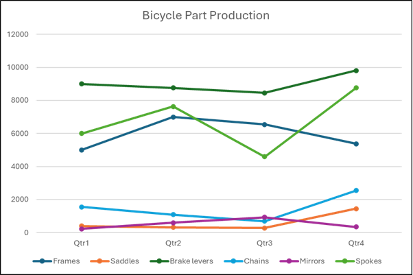
Add data labels
Start by turning on data labels for the chart series that you want to highlight. This example gets the Spokes series, enables its labels, and positions them above each data point.
async function addDataLabels() {
    await Excel.run(async (context) => {
        const worksheet = context.workbook.worksheets.getActiveWorksheet();
        const chart = worksheet.charts.getItem("PartChart");
        const series = chart.series.getItemAt(5);

        series.hasDataLabels = true;
        series.dataLabels.position = Excel.ChartDataLabelPosition.top;

        await context.sync();
    });
}
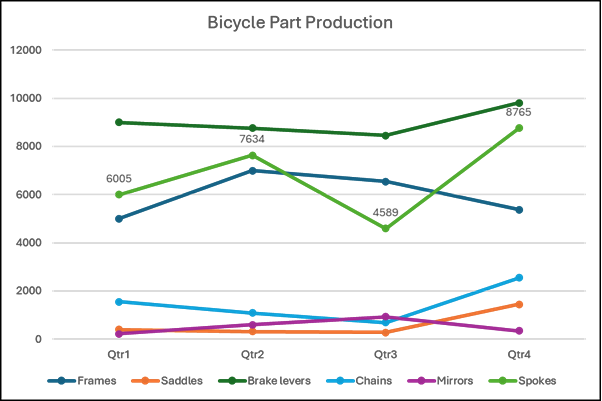
The chart now shows a label for each point in the Spokes series.
Format label shape and text
You can customize data labels in several ways:
- Set
geometricShapeTypeto change the label shape. - Use
setWidthandsetHeightto resize labels. - Set
textto replace the displayed value with custom text. - Use
formatto change the label's border, fill, and font.
Resize labels and set custom text
This example changes the Spokes data labels to cube shapes, resizes them, and replaces the third label with custom text.
await Excel.run(async (context) => {
    const worksheet = context.workbook.worksheets.getActiveWorksheet();
    const chart = worksheet.charts.getItem("PartChart");
    const series = chart.series.getItemAt(5);

    series.dataLabels.geometricShapeType = Excel.GeometricShapeType.cube;
    series.points.load("count");
    await context.sync();

    const pointCount = series.points.count;

    for (let i = 0; i < pointCount; i++) {
        const label = series.points.getItemAt(i).dataLabel;
        label.setWidth(60);
        label.setHeight(30);
        label.format.font.size = 12;
    }

    const thirdLabel = series.points.getItemAt(2).dataLabel;
    thirdLabel.setWidth(80);
    thirdLabel.setHeight(50);
    thirdLabel.text = "Spokes Qtr3: 4589 ↓";

    await context.sync();
});
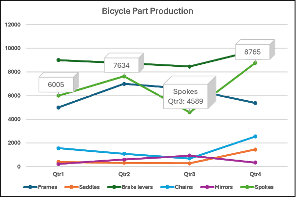
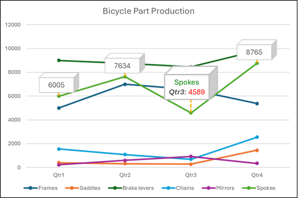
In the following screenshot, the chart includes custom-sized labels for Spokes and custom text for the third data point.
Format part of a label
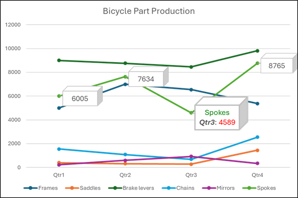
If you want to emphasize only part of a label, use the getSubstring method. The following example updates the border, highlights Qtr3, colors Spokes green, colors 4589 red, and moves the label upward.
await Excel.run(async (context) => {
    const worksheet = context.workbook.worksheets.getActiveWorksheet();
    const chart = worksheet.charts.getItem("PartChart");
    const series = chart.series.getItemAt(5);
    const label = series.points.getItemAt(2).dataLabel;

    label.load();
    await context.sync();

    label.format.border.weight = 2;
    label.getSubstring(7, 4).font.bold = true;
    label.getSubstring(7, 4).font.italic = true;
    label.getSubstring(0, 6).font.color = "green";
    label.getSubstring(12).font.color = "red";
    label.top = label.top - 15;

    await context.sync();
});
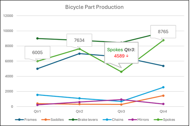
Format leader lines
Leader lines help readers connect a data label to its data point when the label sits away from the series. This example turns on leader lines for the Spokes series and formats them as orange dotted lines.
await Excel.run(async (context) => {
    const worksheet = context.workbook.worksheets.getActiveWorksheet();
    const chart = worksheet.charts.getItem("PartChart");
    const series = chart.series.getItemAt(5);

    series.showLeaderLines = true;
    await context.sync();

    series.dataLabels.leaderLines.format.line.lineStyle = Excel.ChartLineStyle.dot;
    series.dataLabels.leaderLines.format.line.color = "orange";
    series.dataLabels.leaderLines.format.line.weight = 2;

    await context.sync();
});
Create callouts
Use a callout when you want a label to point to a data value while leaving more room around the series itself. The following example changes the series labels to Excel.GeometricShapeType.wedgeRectCallout and turns off leader lines so the chart doesn't show two indicators for the same label.
await Excel.run(async (context) => {
    const worksheet = context.workbook.worksheets.getActiveWorksheet();
    const chart = worksheet.charts.getItem("PartChart");
    const series = chart.series.getItemAt(5);

    series.dataLabels.geometricShapeType = Excel.GeometricShapeType.wedgeRectCallout;
    series.showLeaderLines = false;

    await context.sync();
});

You can also move the callout anchor. This example repositions the anchor for the third Spokes label.
await Excel.run(async (context) => {
    const worksheet = context.workbook.worksheets.getActiveWorksheet();
    const chart = worksheet.charts.getItem("PartChart");
    const series = chart.series.getItemAt(5);
    const label = series.points.getItemAt(2).dataLabel;

    label.load();
    await context.sync();

    const anchor = label.getTailAnchor();
    anchor.load();
    await context.sync();

    anchor.top = anchor.top - 10;
    anchor.left = 40;

    await context.sync();
});
This screenshot shows the anchor for the third data label moved up and left from the original data point.
See also
Collaborate with us on GitHub
The source for this content can be found on GitHub, where you can also create and review issues and pull requests. For more information, see our contributor guide.
Office Add-ins