Use modern themes
Users of model-driven apps with the modern, refreshed look for model-driven apps enabled experience updated styling aligned to the Microsoft Fluent 2 design system. Because this modern refreshed look comes with a new theming system, classic theming isn't honored; however, makers can modify the colors used by the app header for users who have enabled the modern, refreshed look. In this article, you learn about the styling overrides available with the modern, refreshed look and how to implement them for your organization.
Note
- Modern themes currently only support customizing the app header. Other customizations like customizing the business process flow control aren't available.
- For modern themes to work the model-driven app must be using the New look. More information: Modern, refreshed look for model-driven apps
Modify the app header colors
With the modern, refreshed look enabled in the app, makers can modify the colors used by the app header to align with their organizational branding. To accomplish this, you encapsulate the desired colors into an XML resource, use an app setting to point to this web resource, and then verify the color changes match expectation.
Note
This functionality is available in build 9.2.23094 or later version.
Overview of the XML resource to use for app header colors
The first step to modifying the app header styling is to create an XML file with your various color selections. Later, you create an XML web resource with one or more of the following attributes defined inside an AppHeaderColors tag.
Background– The background color of the app header. This element must be defined for any changes to take effect.Foreground– The text color of the app header. If this isn't specified, the system attempts to calculate an appropriate color that has sufficient contrast to the provided background color.BackgroundHover– The background color of buttons on the app header when they're hovered over. If no value is specified, the system calculates a color based on the background color.ForegroundHover– The text color of buttons on the app header when they're hovered over. If no value is specified, the system attempts to calculate an appropriate color that has sufficient contrast to the backgroundHover color.BackgroundPressed– The background color of buttons on the app header when they're pressed. The defaulting logic is the same as backgroundHover.ForegroundPressed– The text color of buttons on the app header when they're pressed. The defaulting logic is the same as foregroundHover.BackgroundSelected– The background color of buttons on the app header when they're selected. The defaulting logic is the same as backgroundHover.ForegroundSelected– The text color of buttons on the app header when they're selected. The defaulting logic is the same as backgroundHover.
Example XML for a modern theme
As an example, this XML specifies a green background color for the app header with white text, with darker background colors for the various button interaction states. For optimal usability, we recommend specifying different color values for each state.
<AppHeaderColors
  background="#12783F"
  foreground="#FFFFFF"
  backgroundHover="#165A31"
  foregroundHover="#FFFFFF"
  backgroundPressed="#0F1C12"
  foregroundPressed="#FFFFFF"
  backgroundSelected="#153D23"
  foregroundSelected="#FFFFFF"
/>
Create the web resource
- Using a text or XML editor, save the XML that is used to create the web resource. Example XML for a modern theme
- Sign into Power Apps.
- Select Solutions on the left navigation pane, and then create a New solution.
- Select New > More > Web resource.
- In the New web resource property pane, enter the following values:
- Display name: Enter a display name, such as XML for modern theming.
- Name. Enter the unique name for the web resource.
- Type: Data (XML)
- Select Choose file, browse to, and then select the XML file you created earlier with the theme.
- Select Save. You publish this customization with the steps in the next section.
Apply custom app header colors to apps in your environment
After you select your colors and create the web resource, follow these steps to enable this app header styling for all the apps in your environment that have the New look enabled.
- In the solution you used to create the web resource, select Add existing > More > Setting.
- Type Override in the Search box, select Override app header color, select Next, and then select Add.
- In the solution, select Override app header color, and then select Edit on the command bar.
- On the right Edit Override app header color properties pane, select Setting environment value and enter the unique name of your web resource you created earlier. Make sure to add the publisher prefix for the web resource and don't include quotes. For example, the name might appear as contoso_xmlfor-modern-theme as in this example.
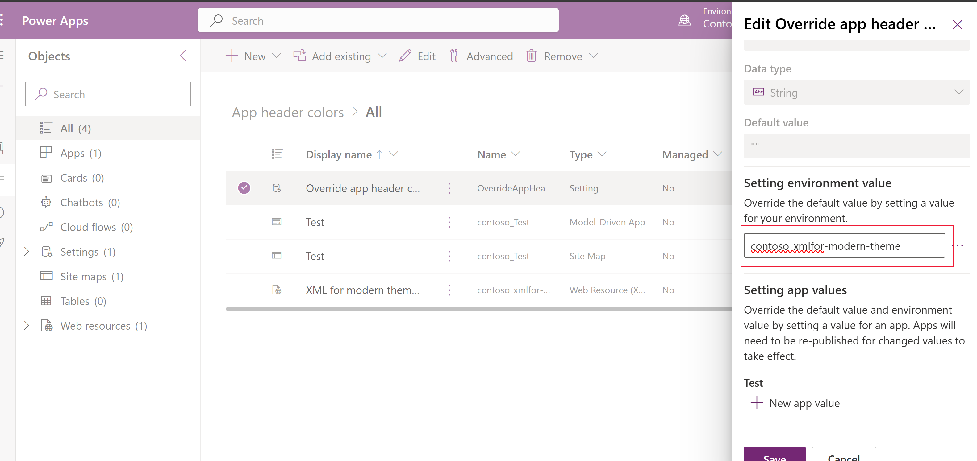
- Select Save.
- Select Publish all customizations on the command bar. (This command appears when no components in the solution are selected).

With the example colors, the app header should look like this when you play the app (you might need to refresh the browser tab).

Verifying new app header colors
After publishing your new app header colors, you'll want to validate the app header visuals, including all the button states, to ensure everything appears as you expect and there are sufficient contrast ratios for accessibility. You should verify the following color choices:
- The desired colors are shown for the app header at rest and for each button interaction state.
- There's a minimum of a 4.5:1 contrast ratio between foreground and background colors for the rest state and each button interaction state.
See also
Feedback
Coming soon: Throughout 2024 we will be phasing out GitHub Issues as the feedback mechanism for content and replacing it with a new feedback system. For more information see: https://aka.ms/ContentUserFeedback.
Submit and view feedback for