Note
Access to this page requires authorization. You can try signing in or changing directories.
Access to this page requires authorization. You can try changing directories.
Applies to:  Canvas apps
Model-driven apps
Canvas apps
Model-driven apps
Moves input focus to a specific control.
Description
The SetFocus function gives a control the input focus. The user's keystrokes are then received by that control, allowing them to type into a text input control or use the Enter key to select a button. The user can also use the Tab key, touch, mouse, or other gesture to move the input focus themselves. Tab key behavior is governed by the TabIndex property.
Use the SetFocus function to set the focus when (each with an example below):
- a newly exposed or enabled input control, to guide the user in what comes next and for faster data entry.
- a form is validated, to focus and display the offending input control for quick resolution.
- a screen is displayed, to focus the first input control with the OnVisible property of the Screen.
The control with focus may be visually different based on the FocusedBorderColor and FocusedBorderThickness properties.
Limitations
SetFocus can only be used with:
You cannot set the focus to controls that are within a Gallery control, Edit form control, or Component. SetFocus can be used with a control in a scrollable screen.
You cannot set the focus to controls that are within a Container control.
You can only set the focus to controls on the same screen as the formula containing the SetFocus call.
Attempting to set the focus to a control that has its DisplayMode property set to Disabled has no effect. Focus will remain where it was previously.
On Apple iOS, the soft keyboard will only be displayed automatically if SetFocus was initiated by a direct user action. For example, invoking from a button's OnSelect property will display the soft keyboard while invoking from a screen's OnVisible will not.
You can use SetFocus only in behavior formulas.
Syntax
SetFocus( Control )
- Control – Required. The control to give the input focus.
Examples
Focus on a newly exposed or enabled input control
Many shopping carts allow the customer to use the shipping address as the billing address, alleviating the need to enter the same information twice. If a different billing address is desired, the billing address text input boxes are enabled, and it is helpful to guide the customer to these newly enabled controls for faster data entry.
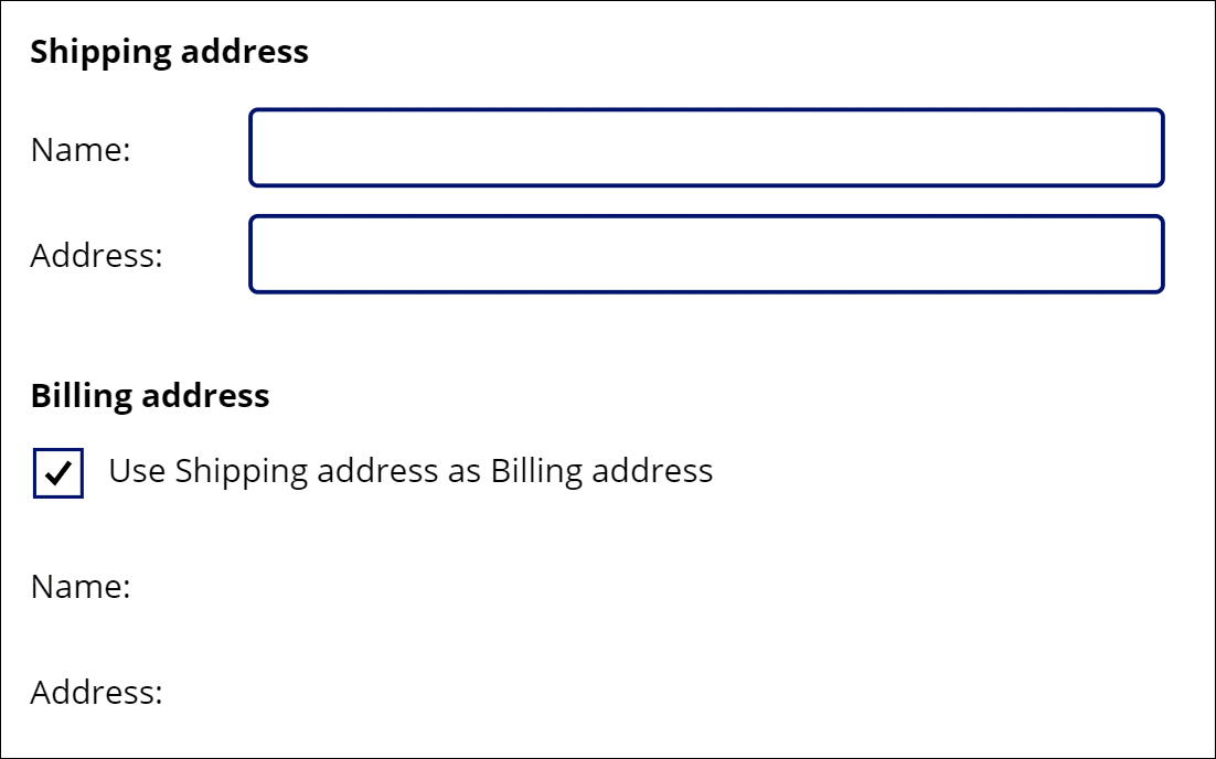
There are many formulas in play here, but the one that moves the focus is on the OnUncheck property of the Check box control:
SetFocus( BillingName )
The Tab key can also be used to move focus quickly from one field to another. To better illustrate, the Tab key was not used in the animation.
To create this example:
- Create a new app.
- Add Label controls with the text "Shipping address", "Name:", "Address:", "Billing Address", "Name:", and "Address:" and position them as shown in the animation.
- Add a Text Input control and rename it ShippingName.
- Add a Text Input control and rename it ShippingAddress.
- Add a Check box control and rename it SyncAddresses.
- Set the Text property of this control to the formula
"Use Shipping address as Billing address". - Add a Text Input control and rename it BillingName.
- Set the Default property on this control to the formula
ShippingName. - Set the DisplayMode property on this control to the formula
If( SyncAddresses.Value, DisplayMode.View, DisplayMode.Edit ). This will automatically enable or disable this control based on the state of the check box control. - Add a Text Input control and rename it BillingAddress.
- Set the Default property on this control to the formula
ShippingAddress. - Set the DisplayMode property on this control to the formula
If( SyncAddresses.Value, DisplayMode.View, DisplayMode.Edit ). This will automatically enable or disable this control based on the state of the check box control. - Set the Default property of the check box to the formula
true. This will default the Billing address to use the same value as the Shipping address. - Set the OnCheck property of the check box to the formula
Reset( BillingName ); Reset( BillingAddress ). If the user chooses to sync Shipping and Billing addresses, this will clear any user input in the Billing address fields allowing the Default properties on each to pull the values from the corresponding Shipping address fields. - Set the OnUncheck property of the check box to the formula
SetFocus( BillingName ). If the user chooses to have a different billing address, this will move the focus to the first control in the Billing address. The controls will have already been enabled due to their DisplayMode properties.
Focus on validation issues
Note
Although this example appears to be an Edit form control, unfortunately SetFocus is not yet supported by that control. Instead, this example uses a scrollable screen to host the input controls.
When validating a form, it can be helpful to not only display a message if there is a problem but to also take the user to the field that is offending. It can be particularly helpful if the field in question is scrolled off the screen and not visible.
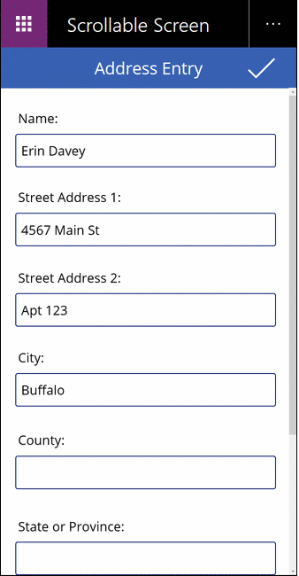
In this animation, the validation button is repeatedly pressed until all the fields have been filled in properly. Note that the mouse pointer doesn't move down from the top of the screen. Instead the SetFocus function hsa moved the input focus to the control that requires attention with this formula:
If( IsBlank( Name ),
        Notify( "Name requires a value", Error ); SetFocus( Name ),
    IsBlank( Street1 ),
        Notify( "Street Address 1 requires a value", Error ); SetFocus( Street1 ),
    IsBlank( Street2 ),
        Notify( "Street Address 2 requires a value", Error ); SetFocus( Street2 ),
    IsBlank( City ),
        Notify( "City requires a value", Error ); SetFocus( City ),
    IsBlank( County ),
        Notify( "County requires a value", Error ); SetFocus( County ),
    IsBlank( StateProvince ),
        Notify( "State or Province requires a value", Error ); SetFocus( StateProvince ),
    IsBlank( PostalCode ),
        Notify( "Postal Code requires a value", Error ); SetFocus( PostalCode ),
    IsBlank( Phone ),
        Notify( "Contact Phone requires a value", Error ); SetFocus( Phone ),
    Notify( "Form is Complete", Success )
)
To create this example:
- Create a new, blank phone app.
- From the Insert menu, select New screen, and then select Scrollable.
- In the center section of the screen, add Text input controls and name them Name, Street1, Street2, City, County, StateProvince, PostalCode, and Phone. Add Label controls above each one to identify the fields. You may need to resize the section if it is not long enough to fit all the controls.
- Add a checkmark Icon control at the top of the screen, above the scrollable section.
- Set the OnSelect property of the icon control to the formula
If( IsBlank( ...given above.
Focus when displaying a screen
Note
Although this example appears to be an Edit form control, unfortunately SetFocus is not yet supported by that control. Instead, this example uses a scrollable screen to host the input controls.
Similar to exposing an input control, when displaying a data entry screen it is helpful to focus the first input control for faster data entry.
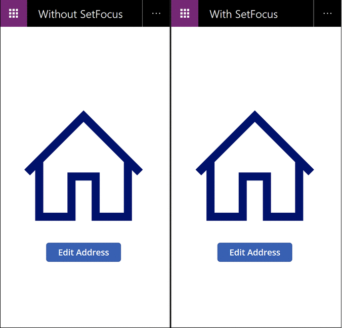
In this animation, the data entry screen on the left is not using SetFocus. Upon display no input control has focus, requiring the user to tab, touch, mouse, or use another means to focus the Name field before a value can be typed into it.
On the right we have exactly the same app with the OnVisible property of the data entry screen set to this formula:
SetFocus( Name )
This sets the focus to the Name field automatically. The user can begin typing and tabbing between fields immediately with no prior action required.
To create this example:
- Create the "Focus on validation issues" app above.
- On this screen, set the OnVisible property to the formula
SetFocus( Name ). - Add a second screen.
- Add a Button control.
- Set the OnSelect property of this control to the formula
Navigate( Screen1 ). - Preview the app from this screen. Press the button. The OnVisible formula will be evaluated and the Name field will automatically be in focus.