Note
Access to this page requires authorization. You can try signing in or changing directories.
Access to this page requires authorization. You can try changing directories.
Now ask the assistant to create the page. Name the WinUI controls you want so it doesn't substitute a control from another UI framework.
Ask for the XAML
Use this prompt:
Create MainPage.xaml for TaskTally.

- Use a TextBox with a visible Header and an Add task Button.
- Use ListView for the task collection. Don't wrap it in ScrollViewer.
- In each row, use a CheckBox, task title, and delete Button.
- Use InfoBar for save and error status.
- Use x:Bind and specify Mode for every binding that changes.
- For TextBox.Text, use Mode=TwoWay and
  UpdateSourceTrigger=PropertyChanged.
- Add accessible names and tooltips for icon-only commands.
- Add an empty state.
- At widths below 640 effective pixels, move the Add task button
  below the TextBox and stretch it.
- Use theme resources instead of hard-coded colors.
- Build and fix all XAML compiler and analyzer warnings.
Inspect these details in the generated XAML.
Data entry
<TextBox
    x:Name="NewTaskTextBox"
    Header="New task"
    PlaceholderText="For example, review the generated XAML"
    Text="{x:Bind ViewModel.NewTaskTitle, Mode=TwoWay,
                  UpdateSourceTrigger=PropertyChanged}" />
<Button
    x:Name="AddTaskButton"
    Grid.Column="1"
    VerticalAlignment="Bottom"
    AutomationProperties.Name="Add task"
    Command="{x:Bind ViewModel.AddTaskCommand}"
    Content="Add task" />
The visible Header means the input doesn't rely on placeholder text as its only label. UpdateSourceTrigger=PropertyChanged updates the view model as the user types, so the command can enable immediately.
Task collection
Define a typed data template:
<DataTemplate x:Key="TaskTemplate" x:DataType="models:TaskItem">
<Grid Padding="8" ColumnSpacing="12">
<Grid.ColumnDefinitions>
<ColumnDefinition Width="Auto" />
<ColumnDefinition Width="*" />
<ColumnDefinition Width="Auto" />
</Grid.ColumnDefinitions>
<CheckBox
VerticalAlignment="Center"
AutomationProperties.Name="{x:Bind Title}"
Click="TaskCheckBox_Click"
IsChecked="{x:Bind IsComplete, Mode=TwoWay}" />
<TextBlock
Grid.Column="1"
VerticalAlignment="Center"
Text="{x:Bind Title}" />
<Button
Grid.Column="2"
VerticalAlignment="Center"
AutomationProperties.Name="{x:Bind local:MainPage.DeleteTaskName(Title),
Mode=OneWay}"
Click="DeleteButton_Click"
DataContext="{x:Bind}"
ToolTipService.ToolTip="Delete task">
<FontIcon Glyph="" />
</Button>
</Grid>
</DataTemplate>
Use a static function to include the task title in the delete button's automation name, so a screen reader can distinguish between rows:
public static string DeleteTaskName(string title) => $"Delete {title}";
Then bind the collection:
<ListView
    AutomationProperties.Name="Tasks"
    ItemTemplate="{StaticResource TaskTemplate}"
    ItemsSource="{x:Bind ViewModel.Tasks, Mode=OneWay}"
    SelectionMode="None" />
ListView provides scrolling and UI virtualization. Wrapping it in a ScrollViewer interferes with both.
Learn more: ListView and GridView and Data binding with XAML.
Status and empty state
Use InfoBar for a nonblocking status message:
<InfoBar
    IsClosable="True"
    IsOpen="{x:Bind ViewModel.IsStatusOpen, Mode=TwoWay}"
    Message="{x:Bind ViewModel.StatusMessage, Mode=OneWay}"
    Severity="{x:Bind local:MainPage.StatusSeverity(ViewModel.HasError),
                      Mode=OneWay}" />
Use a static function to convert the empty-state Boolean to Visibility without adding a converter class:
public static Visibility BoolToVisibility(bool value) =>
    value ? Visibility.Visible : Visibility.Collapsed;

public static InfoBarSeverity StatusSeverity(bool hasError) =>
    hasError ? InfoBarSeverity.Error : InfoBarSeverity.Success;
<TextBlock
    HorizontalAlignment="Center"
    VerticalAlignment="Center"
    Text="Add a task to get started."
    Visibility="{x:Bind local:MainPage.BoolToVisibility(ViewModel.HasNoTasks),
                        Mode=OneWay}" />
Run the app before adding data and confirm that the empty state is clear and the Add task button is disabled:
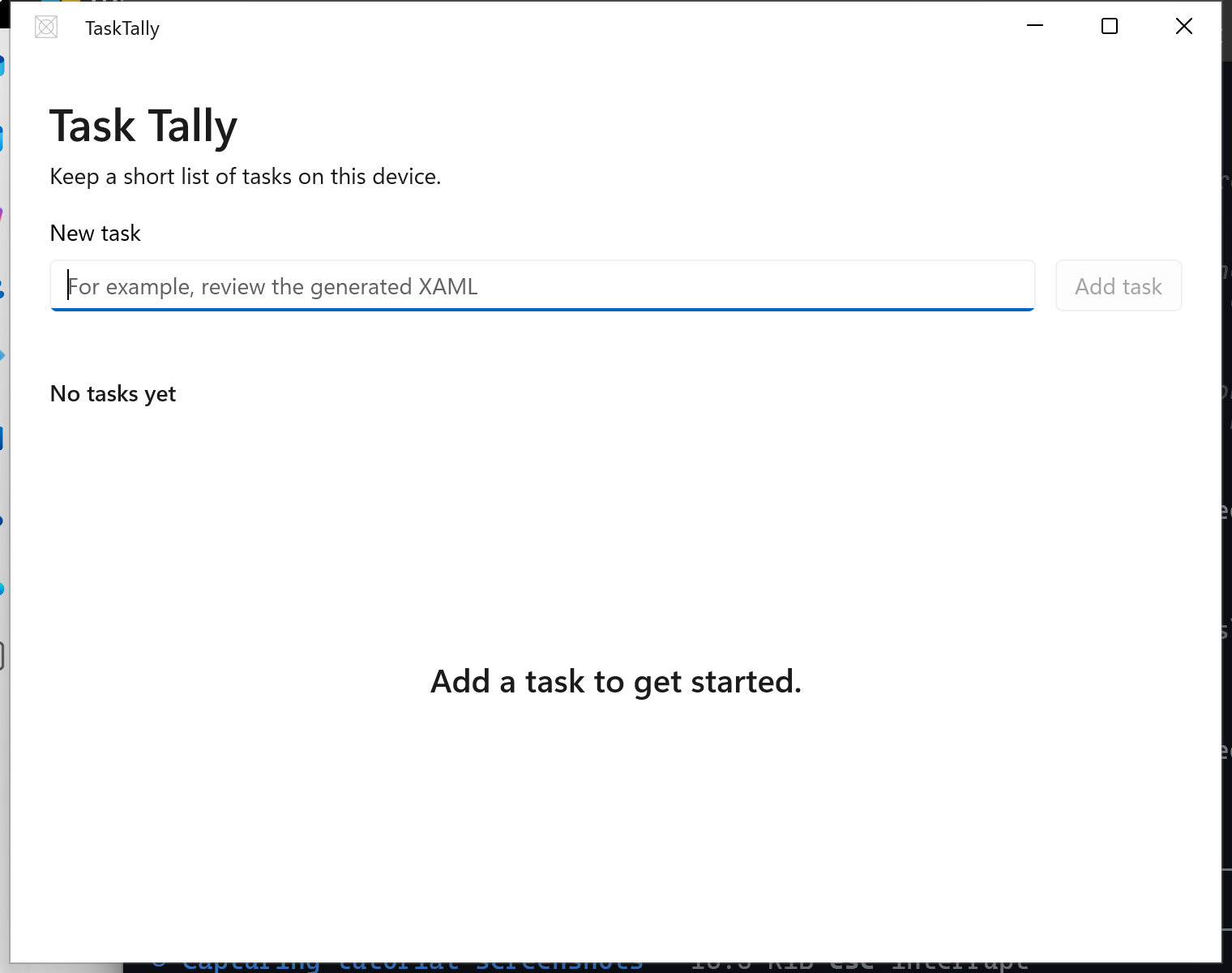
Adaptive layout
Use visual states to move the button below the input:
<VisualStateManager.VisualStateGroups>
    <VisualStateGroup>
        <VisualState x:Name="Narrow">
            <VisualState.StateTriggers>
                <AdaptiveTrigger MinWindowWidth="0" />
            </VisualState.StateTriggers>
            <VisualState.Setters>
                <Setter Target="AddTaskButton.(Grid.Row)" Value="1" />
                <Setter Target="AddTaskButton.(Grid.Column)" Value="0" />
                <Setter Target="AddTaskButton.HorizontalAlignment" Value="Stretch" />
            </VisualState.Setters>
        </VisualState>
        <VisualState x:Name="Standard">
            <VisualState.StateTriggers>
                <AdaptiveTrigger MinWindowWidth="640" />
            </VisualState.StateTriggers>
        </VisualState>
    </VisualStateGroup>
</VisualStateManager.VisualStateGroups>
Resize the running app across the breakpoint. A responsive claim in a prompt isn't evidence that the layout works.
Learn more: Responsive layouts with XAML.
Connect view-specific events
The page loads persisted data once and delegates task changes to the view model:
public sealed partial class MainPage : Page
{
    public MainPageViewModel ViewModel { get; } = new();

    public MainPage()
    {
        InitializeComponent();
        Loaded += MainPage_Loaded;
    }

    private async void MainPage_Loaded(object sender, RoutedEventArgs e)
    {
        Loaded -= MainPage_Loaded;
        await ViewModel.InitializeAsync();
        NewTaskTextBox.Focus(FocusState.Programmatic);
    }

    private async void TaskCheckBox_Click(object sender, RoutedEventArgs e)
    {
        await ViewModel.TaskCompletionChangedAsync();
    }

    private async void DeleteButton_Click(object sender, RoutedEventArgs e)
    {
        if (sender is Button { DataContext: TaskItem task })
        {
            await ViewModel.DeleteTaskCommand.ExecuteAsync(task);
        }
    }
}
Event handlers with an async void return type are appropriate here because XAML events require void. Other asynchronous methods in the app return Task.
Build and run
Build the app, launch it through its package, and test every acceptance criterion that is now implemented:
- Add a task with the mouse.
- Add a task using only the keyboard.
- Complete and delete a task.
- Close and restart the app to verify persistence.
- Resize the window below and above 640 effective pixels.
- Switch between light, dark, and a contrast theme.
Collaborate with us on GitHub
The source for this content can be found on GitHub, where you can also create and review issues and pull requests. For more information, see our contributor guide.

Windows developer