WinUI 2.6
WinUI 2.6 is the June 2021 release of WinUI for UWP applications (and desktop applications using XAML Islands).
Note
For more information on building Windows desktop and UWP apps with the latest version of WinUI 3, see WinUI 3.
WinUI is hosted on GitHub where we encourage you to file bug reports, feature requests and community code contributions.
All stable releases (and prereleases) are available for download from our GitHub release page or from our NuGet page.
WinUI packages can be added to Visual Studio projects through the NuGet package manager. For more information, see Getting started with WinUI 2.
New or updated features for WinUI 2.6 include:
Mica
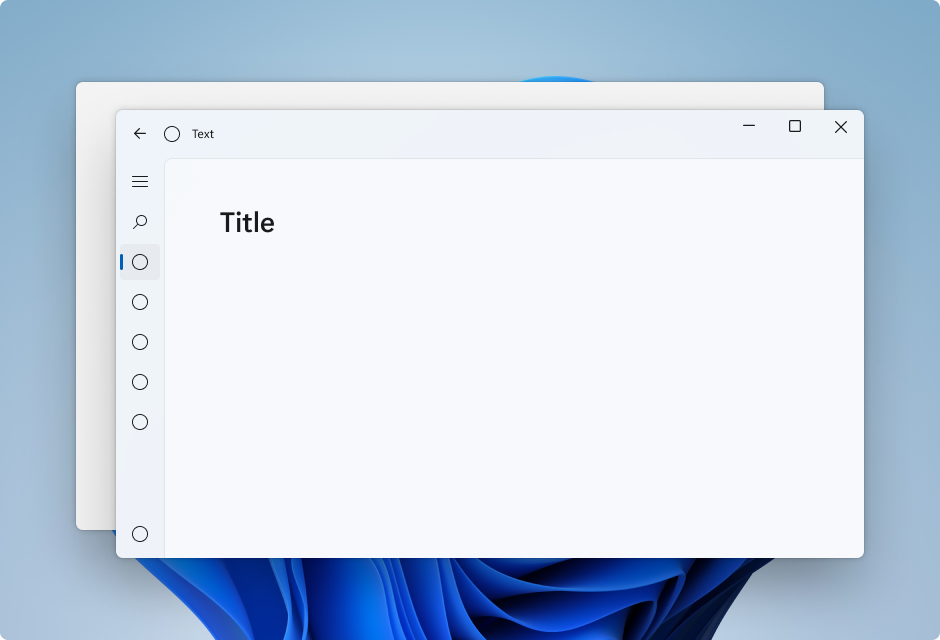
Mica is a new material that incorporates theme and desktop wallpaper to paint the background of long-lived windows such as apps and settings. You can apply Mica to your application backdrop to delight users and create visual hierarchy, aiding productivity, by increasing clarity about which window is in focus. Mica is specifically designed for app performance as it only samples the desktop wallpaper once to create its visualization.

Expander
The Expander control is composed of a header of primary content that is always visible, paired with a toggle button used to show or hide an expandable content area containing secondary content related to the header.
As the user expands or collapses the content area, adjacent UI elements are shifted and adjusted to accommodate the content area. The content area of the expander does not overlay those elements.
This animated example shows an Expander in the default state with just basic text in the content area.

You can use complex, interactive UI in the content area of the Expander, including nested Expander controls as shown here.

BreadcrumbBar
A BreadcrumbBar is a hierarchical navigation element that provides a direct path of links to pages or folders leading to the user's current location. It is often used near the top of a page in situations where the user's navigation trail (in a file system or menu system) needs to be persistently visible and provide the user with the ability to quickly go back to a previous location.
This animated example shows a BreadcrumbBar in the default state with eight levels of navigation depth.

If the app is resized so that there is not enough space to show all levels in the BreadcrumbBar, the control automatically collapses, substituting an ellipsis for the leftmost nodes. Clicking the ellipsis opens a flyout menu that displays the collapsed nodes in hierarchical order, as shown here.

ImageIcon
ImageIcon adds support for using an Image control as an icon in your application UI.
The following image file formats are supported:
- Bitmap (BMP)
- Graphics Interchange Format (GIF)
- Joint Photographic Experts Group (JPEG)
- Portable Network Graphics (PNG)
- JPEG XR (WDP)
- Tagged Image File Format (TIFF)
AnimatedIcon
An AnimatedIcon control plays animated images in response to user interaction and visual state changes, such as when a user hovers over a button or clicks it.
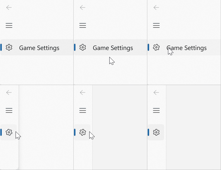
This animated example shows an AnimatedIcon added to a NavigationViewItem control.

Defining an animation requires that you create, or obtain, a Lottie file for the icon you want to add (custom animations can be created with Adobe AfterEffects and rendered with the Lottie-Windows library) and run that file through LottieGen. LottieGen generates code for a C++/WinRT class that you can then instantiate and use with an AnimatedIcon.
PipsPager
The PipsPager control helps users navigate within linearly paginated content using a configurable collection of glyphs, each of which represents a single "page" within a potentially limitless range. The glyphs highlight the current page, and indicate the availability of both preceding and succeeding pages. The control relies on current context and does not support explicit page numbering or a non-linear organization.
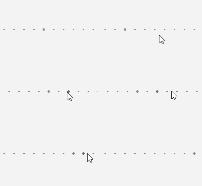
This example shows a PipsPager in the default state with five visible pips, oriented horizontally, with the first pip selected.

If the content consists of a large number of pages, you can set the number of visible, interactive pips. If the number of pages exceeds the number of visible pips, the pips automatically scroll in order to center the selected page in the control.
This animated example shows a PipsPager with horizontally scrolling pips for a large item collection.

Visual style updates
Most WinUI controls now support the latest Windows 11 styles.
A new versioning system has also been introduced that lets you revert to the previous control styles. However, we strongly encourage using the new styles, if possible, as they align with the current design direction of Windows.
SplitButton styles for CommandBar
A new SplitButtonCommandBarStyle provides the ability to apply the look and feel of an AppBarButton to a SplitButton control.
Samples
Tip
For more info, design guidance, and code examples, see Design and code Windows apps.
The WinUI 3 Gallery and WinUI 2 Gallery apps include interactive examples of most WinUI 3 and WinUI 2 controls, features, and functionality.
If installed already, open them by clicking the following links: WinUI 3 Gallery or WinUI 2 Gallery.
If they are not installed, you can download the WinUI 3 Gallery and the WinUI 2 Gallery from the Microsoft Store.
You can also get the source code for both from GitHub (use the main branch for WinUI 3 and the winui2 branch for WinUI 2).
Other updates
- See our Notable Changes list for many of the GitHub issues addressed in this release.
- Check out the Figma design toolkit for the WinUI 2.6 control and layout templates.
Windows developer
