Note
Access to this page requires authorization. You can try signing in or changing directories.
Access to this page requires authorization. You can try changing directories.
APPLIES TO: ![]() Power BI Desktop
Power BI Desktop ![]() Power BI service
Power BI service
This article shows how to customize the X-axis and Y-axis of your visuals. Not all visuals have axes—pie charts, for example, don't have them. Customization options also vary by visual type. This article covers the most common options in the Format visual pane.
Value axis vs. category axis
Most chart types have two axes: one for values (numbers) and one for categories (text or dates). Which axis shows values or categories depends on the chart type:
| Chart type | X-axis | Y-axis |
|---|---|---|
| Column, line, area, combo, ribbon, waterfall | Categories | Values |
| Bar | Values | Categories |
| Scatter (with numeric X) | Values | Values |
| Scatter (with categorical X) | Categories | Values |
Some options, like Range settings, apply only to value axes. The preceding table shows which axis is the value axis for each chart type.
Sample data
To follow along with the examples in this article, create a calculated table with sample data in a blank Power BI Desktop report.
Open Power BI Desktop and create a new blank report.
Select Modeling > New table.
Paste the following DAX expression:
Monthly Sales =
VAR _Year = YEAR(TODAY())
VAR _Data =
{
    (DATE(_Year, 1, 1), 52000, 48000),
    (DATE(_Year, 2, 1), 47000, 51000),
    (DATE(_Year, 3, 1), 63000, 58000),
    (DATE(_Year, 4, 1), 55000, 52000),
    (DATE(_Year, 5, 1), 71000, 65000),
    (DATE(_Year, 6, 1), 68000, 62000),
    (DATE(_Year, 7, 1), 74000, 70000),
    (DATE(_Year, 8, 1), 69000, 73000),
    (DATE(_Year, 9, 1), 61000, 59000),
    (DATE(_Year, 10, 1), 78000, 72000)
}
RETURN
SELECTCOLUMNS(
    _Data,
    "Month", [Value1],
    "This Year", [Value2],
    "Last Year", [Value3]
)
Press Enter to create the table.
Create a visualization
- From the Visualizations pane, select the stacked column chart icon.
- From the Data pane, drag Month to the X-axis field well.
- Drag This Year and Last Year to the Y-axis field well.
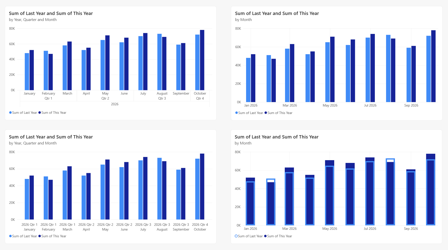
Now you can customize your axes. Power BI provides many options for formatting your visualization.
Customize axis labels
Axis labels show the values or categories along each axis.
Select Format (the paint brush icon) in the Visualizations pane.
Expand X-axis or Y-axis.
Adjust these settings:
- Font family: Change the typeface
- Color: Set the label color
- Text size: Adjust the font size
- Display units: For value axes, choose Thousands, Millions, or Auto
To hide labels, toggle Values to Off. Hiding labels frees up space for data.
Multiple fields and hierarchies on an axis
Add multiple fields or a hierarchy to a category axis for more detailed groupings.
Add multiple fields
Drag more fields to the axis field well to create a hierarchy. For example, add Year and Month to the X-axis to show months grouped by year.
Auto date/time hierarchy
When you add a date field to an axis, Power BI creates a date/time hierarchy with Year, Quarter, Month, and Day levels. This hierarchy lets you drill down through dates.
To use actual date values instead:
- Right-click the date field in the axis field well.
- Select the field name (for example, Month) instead of Date Hierarchy.
This selection switches to a continuous or categorical date axis, depending on your axis type setting.
Concatenate labels
With multiple fields on an axis, you control how labels display:
- Off (default): Labels appear in separate rows for each level. Users can drill down through the hierarchy.
- On: Labels combine into a single line, such as "2026 January". This option takes less space.
To change this setting:
- In the Format visual pane, expand the category axis section.
- Toggle Concatenate labels to On or Off.
Use concatenation for a compact display. Turn it off to show hierarchy levels or enable drill-down.
Continuous vs. categorical axis
Axes can be continuous or categorical. The axis type affects how data displays and whether scrolling is available.
- Continuous: Shows data on a smooth scale without gaps. All data fits without scrolling. Continuous is the default for numbers and dates.
- Categorical: Shows each value as a separate category. A scrollbar appears if content doesn't fit. Text fields always use this type.
To change the axis type for numeric or date fields:
- In the Format visual pane, expand the axis section.
- Change Type to Continuous or Categorical.
Text fields are always categorical.
Logarithmic scale
Use a logarithmic scale when your data spans several orders of magnitude.
- In the Format visual pane, expand the axis section.
- Expand Range.
- Toggle Logarithmic to On.
Note
Logarithmic scales require all values to be either positive or negative. You can't mix positive and negative values, and zero values aren't supported.
Customize axis range
For value axes, set the minimum and maximum values to adjust the chart scale.
In the Format visual pane, expand the value axis section.
Expand Range.
Set custom values:
- Minimum: Where the axis starts
- Maximum: Where the axis ends
Power BI calculates intervals based on your range. To reset, clear the fields or select Revert to default.
Note
Power BI determines interval spacing automatically. You can't set a specific interval, but you can influence label density by adjusting the minimum and maximum values.
Customize gridlines
Gridlines help readers trace values across the chart.
In the Format visual pane, expand the axis section.
Expand Gridlines.
Adjust these settings:
- Color: Change the gridline color
- Width: Adjust line thickness
- Toggle gridlines On or Off
Customize bar and column layout
For clustered bar and column charts, customize spacing and overlap in the Columns or Bars section of the Format visual pane.
Spacing options
- Category spacing: Space between each cluster. Increase to separate clusters, or decrease to fit more data.
- Series spacing: Space between bars or columns within each cluster.
Overlap for direct comparison
Enable Overlap series to stack bars or columns on top of each other instead of side by side. This layout is useful for comparing values directly, such as comparing this year to last year.
When using overlap:
- Transparency: Make the front series semi-transparent so the series behind remains visible.
- Border: Add borders to distinguish overlapping series when colors are similar.
Dual Y-axes
Combo charts support two Y-axes with different scales. Dual axes let you compare measures with different value ranges.
When you add a line value to a combo chart, Power BI creates a secondary Y-axis. Format each axis separately under Y-axis (Column) and Y-axis (Line).
Axis titles
Axis titles help readers understand what each axis represents.
In the Format visual pane, expand X-axis or Y-axis.
Expand Title and toggle it to On.
Customize the title:
- Title text: Enter a custom title (defaults to the field name)
- Title color: Set the text color
- Title size: Adjust the font size
- Style: Show the title only, units only, or both
For simple charts, you might not need axis titles. For complex charts like dual-axis combos, titles clarify what each axis measures.
Invert the y-axis
For line, bar, column, area, and combo charts, you can invert the y-axis, putting positive values going down and negative values going up.
- In the Format visual pane, select Visual. Expand the Y-axis section, expand the Range section, and move the Invert range slider to On.
Data labels vs. value axis
Data labels display values directly on each data point. Use them instead of a value axis for a cleaner design, or use both for maximum clarity.
To enable data labels:
- In the Format visual pane, select Visual.
- Expand Data labels and set to On.
Adding data labels might shift the axis range to make space. This shift can affect your chart's proportions.
Considerations and limitations
- Power BI chooses tick intervals automatically based on your data range. You can't set a specific interval, but adjusting the minimum and maximum values affects label density.
- Date values are localized based on your system or browser locale.
Related content
More questions? Try the Power BI Community