Create key performance indicator (KPI) visualizations
APPLIES TO: ![]() Power BI Desktop
Power BI Desktop ![]() Power BI service
Power BI service
A Key Performance Indicator (KPI) is a visual cue that communicates the amount of progress made toward a measurable goal. For more about KPIs, see Key Performance Indicators (KPIs) in PowerPivot.
When to use a KPI
KPIs are a great choice:
To measure progress. Answers the question, "What am I ahead or behind on?"
To measure distance to a goal. Answers the question, "How far ahead or behind am I?"
KPI requirements
A designer bases a KPI visual on a specific measure. The intention of the KPI is to help you evaluate the current value and status of a metric against a defined target. A KPI visual requires a base measure that evaluates to a value, a target measure or value, and a threshold or goal.
A KPI semantic model needs to contain goal values for a KPI. If your semantic model doesn't contain goal values, you can create them by adding an Excel sheet with goals to your data model or PBIX file.
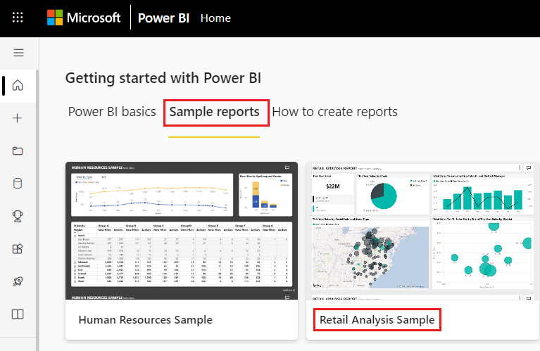
To follow along, use the Retail Analysis sample PBIX file.
From the upper left section of the menubar, select File > Open report.
Find your copy of the Retail Analysis Sample PBIX file.
Open the Retail Analysis Sample PBIX file in report view.
 .
.Select
 to add a new page.
Note
Sharing your report with a Power BI colleague requires that you both have individual Power BI Pro licenses or that the report is saved in Premium capacity.
How to create a KPI
In this example, you create a KPI that measures the progress you made toward a sales goal.
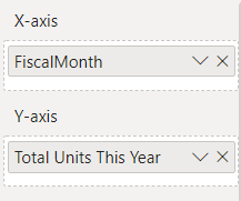
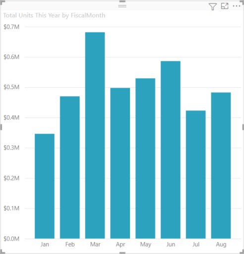
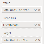
From the Fields pane, select Sales > Total Units This Year. This value is the indicator.
Add Time > FiscalMonth. This value represents the trend.
In the upper-right corner of the visual, select the More options ellipsis (...) and select Sort axis > FiscalMonth.
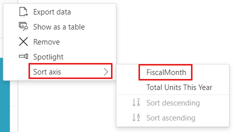
Select the ellipsis again and choose Sort axis > Sort ascending.
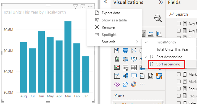
Check that Power BI sorts the columns in ascending order by FiscalMonth.
Important
Once you convert the visualization to a KPI, there's no option to sort. You must sort the visualization now, if desired.
Once you sort the KPI correctly, your visual looks like this:
Convert the visual to a KPI by selecting the KPI icon from the Visualization pane.
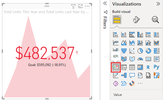
To add a goal, drag Total Units Last Year to the Target field.
Optionally, format the KPI by selecting the paint brush icon to open the Format visual pane.
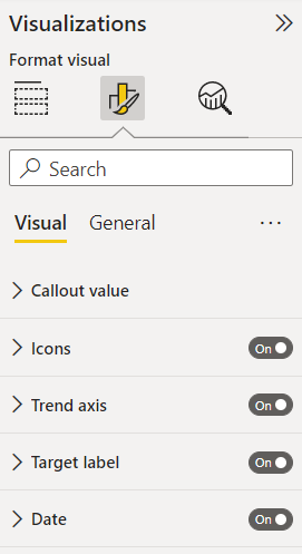
Callout value - controls the indicator's display units, decimal places, and text formatting.
Icons - when set to On, the visual shows small icons next to the value, a green checkmark for an increasing value, and a red exclamation point for a decreasing value. The value's direction is set by Trend axis.
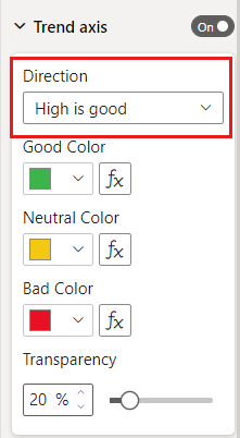
Trend axis - when set to On, the visual shows the trend axis as the background of the KPI visual. People consider some KPIs better for higher values and consider some better for lower values. For example, earnings versus wait time. Typically a higher value of earnings is better versus a higher value of wait time. For this report, select Direction > High is good. Optionally, change the color settings.
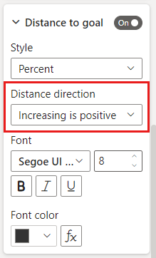
Target label - when set to On, the visual shows the value's label. Distance to goal sets the style and direction of the distance from the goal.
Date - when set to On, the visual shows the date. Optionally, change the font, and its style and color.
KPIs are also available on your mobile devices. It gives you the option to be always connected to your business's heartbeat.
Considerations and troubleshooting
- If your KPI doesn't look like the example, it may be because you didn't sort by FiscalMonth. KPIs don't have a sort option. Start again and sort by FiscalMonth before you convert your visualization to a KPI.
- In general, if your KPI doesn't display a trend axis, make sure that the column in the Value well is continuous and doesn't include a null value.
Related content
More questions? Try the Power BI Community.