Configure views overview
This video discusses how to configure views for model-driven apps.
You can configure views via the View designer accessed by selecting Views from the Data experiences pane in the Tables dashboard.

The View designer gives you an interface very similar to the Form designer, where the table columns appear in a panel on the left side of the screen. On the right side is a Properties panel. You can add sorting and filtering options, as well as name/re-name and input a description for your view.

You can resize columns in the view designer, and you can reorder them by drag and drop. Each column has its own properties, viewable by selecting the column and then Edit properties. You can also sort and filter your views from the column header options.

Three types of views available are:
- Personal view - individually created and only visible to the person creating that view, unless they share the view with others.
- System view - special views the application depends on, which exist for system tables or are automatically created when you create custom tables. They're only editable by system admins or system customizers.
- Public view - general purpose views that are customizable. All app users have access to this kind of view, when a creator makes them available, through the view selector. You can add public views to subgrids in a form or as a list in a dashboard.
Create and edit public views
Some public views exist by default for system tables and for any custom table. When you create a new custom table, you have a combination of public (active and inactive views of your table) and system views (including the four system views).
Additionally, users can create custom public views. Users can also delete any custom public views they've created in an un-managed solution. However, any system-defined public views can't be deleted.
You can use the following technique to create/edit a public view within your model-driven app.
From the Power Apps maker portal, select the Solution where your app resides. Then select your app.
Note
You cannot create/edit a view within a managed solution. Ensure that the app you want to create/edit a view is not in a managed solution (In your Solutions table, look for the column with the header Managed and select one with a value of No.)
Your app opens in the app editor. From the Pages panel on the left side of the screen look for the table that you want to create/manage a view in and select it. Immediately, you see the table name expand with forms and views menu options displayed below the table name.
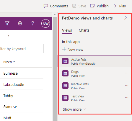
Select the Views option below the table name. Notice that the Views properties panel on the right side of your screen shows all of the public views of this table that are currently in this app. Notice that one of your views is the Default view, and that is the one displaying on the designer canvas.
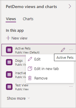
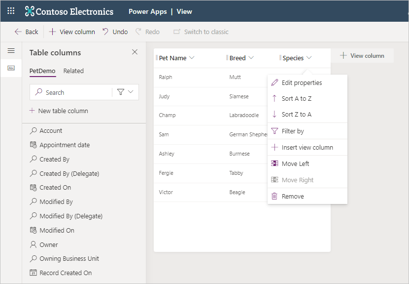
As you hover over the existing tables, you notice an edit icon appearing next to the ellipsis, and selecting it takes you to the view editor. Also, selecting the ellipsis allows you to see other options to manage views. Edit opens the view in your current browser tab, Edit in a new tab opens the view in a new tab, and Remove deletes the view.
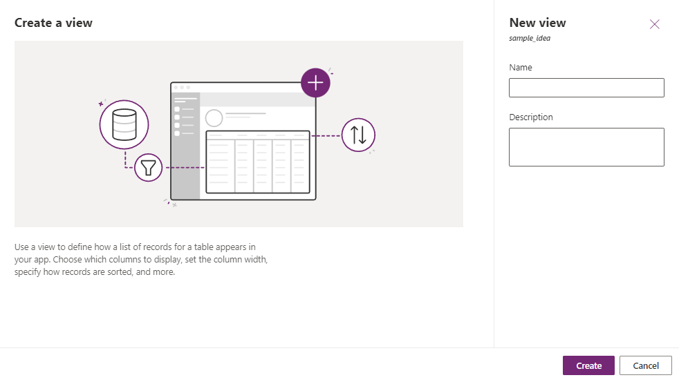
Since the view editor is the same whether you're selecting an existing view or creating a new one, Let's create a new one. Select + New View inside your Views pane. In the popup window for the new view, add a name and then select Create.
Notice that your view uses the same data table, and your new view shows the primary name column. In the Table columns pane on the left side of the screen, you can select columns to add to your view just by clicking on them. You can also select the + View column button in the table header within the view canvas. Drag and drop functionality changes column positions within the header row of your view. Go ahead and add a couple of columns into your view so you can see how it functions. If you don't like your selection, there's an Undo button in the command ribbon or you can select the column name in the header to see some options including Remove. In the example here, we've added Breed and Species. We have also selected Species to show you the different options available for this column.
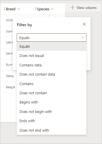
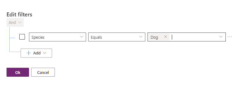
To filter your view, you can select any of the columns in your view. In the dropdown menu, you see Filter by about halfway down the list. Select a column you wish to filter your view by and then select Filter by. Notice that a popup appears with two dropdown options for your filter. The top dropdown gives you a menu of conditional choices such as Equals, Contains and Begins with.
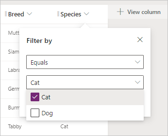
The second dropdown provides you with the opportunity to choose a value from the selected column to use in your filter condition. You notice a checkbox next to each value, so you can select the one to use in your filter condition. Then select the Apply button (below the column value field) to record the filter.
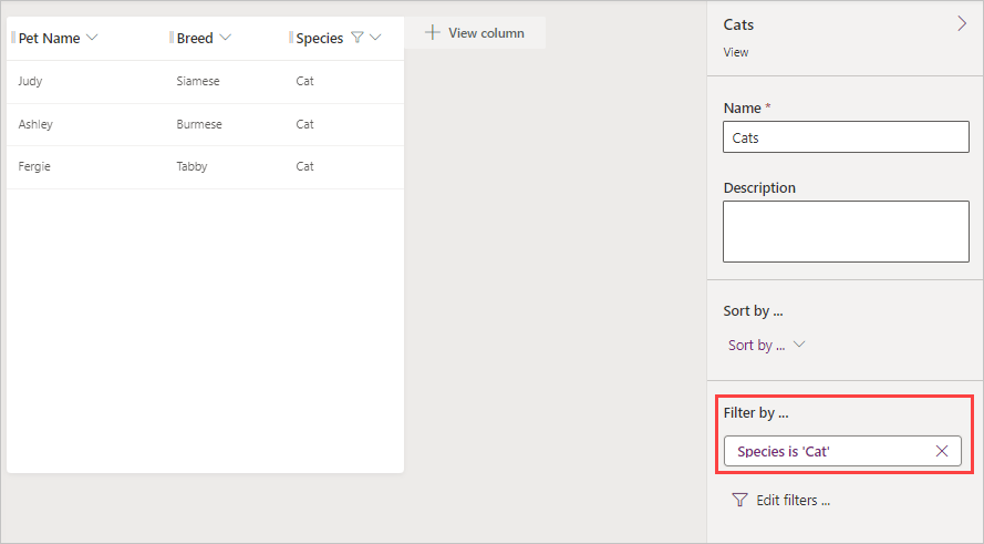
After you apply your filter, the view in your view canvas will re-render with the new filter applied. Also, in your view properties pane on the right side of the screen, you see Filter by... with your filter condition listed under it.
You can have multiple filters in your view, and you can even apply them to the same column. You can add more filters by employing the same method we demonstrated previously (in selecting the column header). Or you can select the Edit filters... from the properties pane to add other conditions window. When you select the Edit filters... option, a popup window appears where you can add other conditions to filter your view.
When you're satisfied with your view, select Publish from the top right of the command ribbon. Publish saves the view and makes it available for other users in your organization.


Edit system views
System views for your table aren't immediately shown in the view selector, and you can't use them in sublists in a form or as a list in a dashboard. You can't delete or deactivate these views.
You can find and explore these views in your app by selecting the Show more from your Views property pane on the right side of the screen.

Notice how all four system views appear in the list. Remember, if you're a system administrator, you can edit these views just like you would a Public view. Just follow the steps for editing a public view.
Configure the grid control
The Power Apps grid control allows users to view, open, and edit records from views and subgrids. In addition to inline editing, the control provides other capabilities. Capabilities include:
- A data browsing experience via infinite scrolling, allowing users to scroll indefinitely through data until they find the records they're interested in.
- An ability to customize the visual appearance of columns for specific needs.
To add the grid control to views for a table, select Solutions from the Power Apps maker portal. You can look for and select your solution under Solutions. A good place to start is the Default Solution, if you don't have a solution already built.

Inside of the Solution you see a view of the Objects that are part of the solution. These objects include Apps, Chatbots, Choices, Cloud flows, Dashboards, Site maps, and Tables. To begin using the grid control, we need to find an app that is in your solution. You can quickly sort your Objects by selecting Apps to display all of the apps that are part of the solution.
Note
If you do not have a model-driven app in your solution, you can get to the Forms editor from your list of Dataverse Tables and select the Forms option from the Tables dashboard view for your table.
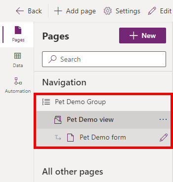
Once you've selected your app, we need to get to the form editor for your model-driven app. When your app opens, you see the home screen of your app in the canvas area. On the left side of your screen is a Pages panel with the names of any tables that are connected to your app. Select the table name to expand it. In the example here, we selected our Pet Demo group, and we're going to select Pet Demo form.

On the right side of your screen is a panel showing the forms already part of this app. When you hover your mouse over the name of your form you see an Edit pencil appear (if you don't see that, you can select the ellipsis next to the form name). Select the icon to edit your form.

This action opens up the form editor for the selected table. In your form edit canvas, select the area of the canvas where you wish to place a grid control. Then select the Components menu from the left navigation rail (or Component from the command bar) and expand the Grid option. (Alternatively, you can input grid in the search field at the top of the panel.) Select Power Apps grid control.
In the pop-up pane, you can select the table you want to link to this control. There are other options you can pick, such as the View or Layout. If you scroll all the way down the pane, you can select which device this component appears on including Web, Mobile and Tablet. When you're satisfied with your choices, select Done.
Your new grid appears on the form canvas. See how the properties pane appears to the right of your form canvas, with numerous customizable options. Once you're satisfied with the settings, you can Save and publish to record the changes.

To return to your model-driven app, you can select Back from the top left of the command ribbon.