Configure charts overview
Charts provide an interactive view of data. This video provides an overview of charts.
To create or configure a chart for your table by using Power Apps, you can use the following steps:
From the Power Apps maker portal, select Tables.
Select the table where you wish to create the view. Ideally you want to pick a table that already has data in it.
From the Tables dashboard for your selected table, look in the Data experiences pane and select Charts.
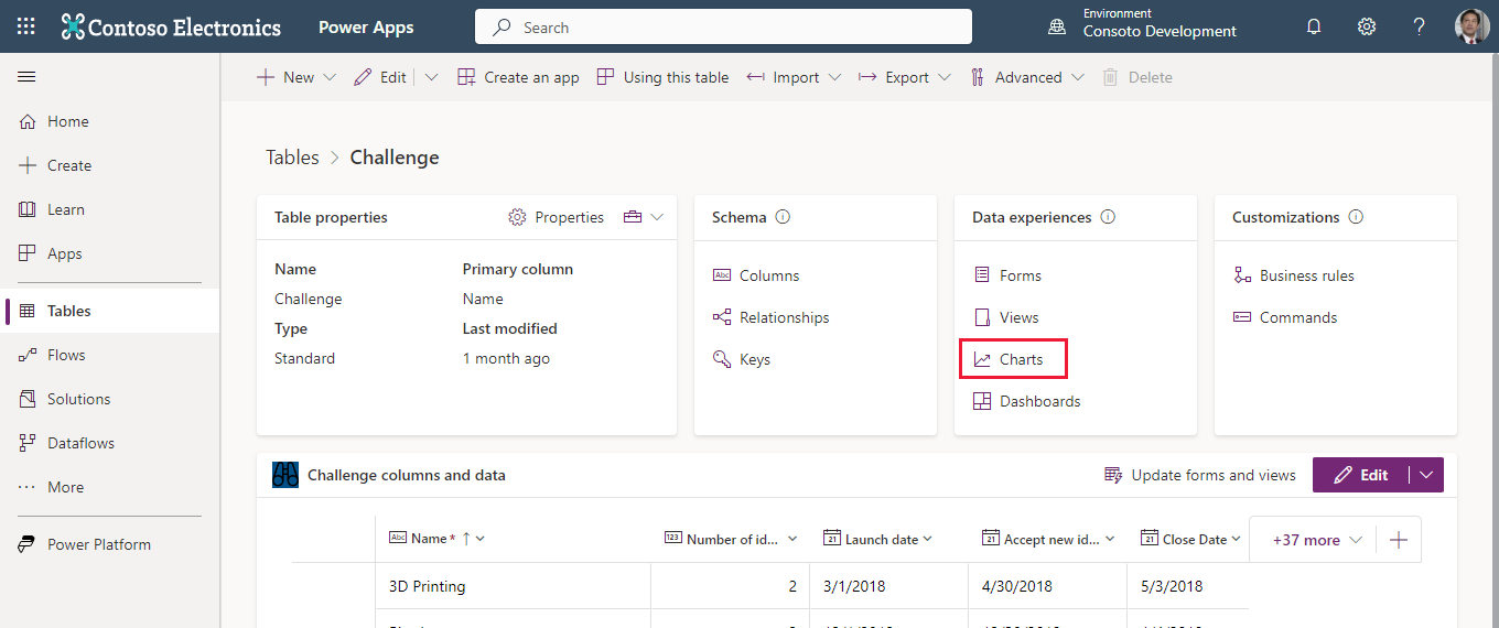
From the list of charts, you can select any existing chart (that you have access to) or choose + New chart from the command bar.
Either option opens a chart editor in a separate browser tab. (Refer to the next image for the following steps.)
You can name the chart and pick the type of chart to display.
Under Legend Entries (series) you can select the data you wish to graph along with how you wish to itemize that data: Average, Count:All, Count:Non-empty, Max, Min or Sum.
Under Horizontal (Category) Axis Labels you can select a complementary field for your data.
If you have data in your table, as you select your Legend Entries and Horizontal Axis Labels, you can see a preview of your table in the viewer under your Chart Title.
You can also (optionally) add a description for your chart.
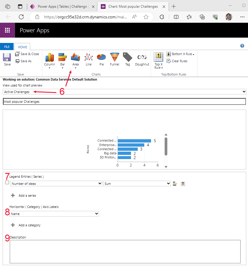
Once you're satisfied with your chart, select Save & Close to close the chart editor and return to your charts list.


Using this technique, you can create charts that you can display in your model-driven app. As you create charts you can then add them to a dashboard.
Dashboards
Dashboards are used to show several areas of an application in a single display. Watch the video for an overview of dashboards.
Interactive dashboards are a one-stop workplace for app users to view real-time information and take action. They're fully configurable, security-role based, and deliver workload information from multiple inputs. Interactive dashboard users don't need to page through the application looking for a particular row; they can act on it directly from the dashboard.
Dashboard types
The interactive experience dashboards come in two forms: multi-stream and single-stream. Additionally, multi-stream dashboards can be home page or table-specific dashboards. The table-specific dashboards are configured in a different part of the user interface and partially preloaded with the table-specific configuration information.
Multi-stream dashboards
Multi-stream dashboards display data in real-time over multiple streams. There's no limit on how many streams you can configure on the dashboard. The data in a stream can be based on a single table, but each stream can be based on a different table.
In the multi-stream dashboard, you see a row of visual filters at the top with data streams below them. You also have the ability to hide your visual filters by toggling the Hide Visual Filter option from the screen header.

Multi-stream dashboards also provide a tile view, which you can toggle by selecting the Switch to Tile View button on the command bar. This option toggles stream data into being displayed as interactive summary tiles that display the count of rows within each stream. The button Switch to Stream View is what the toggle looks like on the tile view.

The tiles contain interactive charts that are referred to as Visual Filters. These charts display counts of relevant rows, and you can filter data contained within the dashboard by selecting different values contained within the charts.
Single-stream dashboards
Single-stream dashboards display data in real time over a single stream based on a table view, with the visual filters already applied. They enable a more detailed view of a given table, and as such are good for monitoring smaller but more complex data. This dashboard type always displays tiles and places them on the right side of the screen.

Interactive tiles
Interactive tiles are useful for providing summarized insights about your data. Using interactive tiles, you can:
Show aggregated view of data across queues/views
Select tile to drill to underlying rows
The content of each tile represents the count of the number of rows within that given stream. Hovering over the "View" text shows you from which view the tile's stream is being pulled. Selecting a tile produces a flyout of the rows contained in the stream, which you're able to navigate to by selecting a given row.

Configuring interactive dashboard columns
To configure your dashboard, from the Model-driven app editor. Select Dashboards and select the dashboard that you want to modify. This takes you to the dashboard editor.
Within the dashboard editor, you can adjust the properties of any element by selecting the element and then selecting Edit Component in the command bar. A Set Properties pop-up enables you to tweak your component's properties.

If you wish to add an already created dashboard to your app, from the Model-driven app editor screen, select + Add page from the command bar. Then from the Add page pop-up window select Dashboard and then Next. The Add dashboard page allows selection of the dashboard you wish to add.

Composing custom interactive dashboards
To compose a dashboard, you need to select Solutions from the maker portal home screen. Select your solution and then the Objects tab. From the + New drop-down in the command bar, select Dashboard, and then select from one of the options regarding the number of columns or Power BI embedded.

The Dashboard: New screen appears in a separate browser tab. The layout matches the option you selected previously, but all of the sections are blank with a series of icons enabling you to insert a chart, list, assistant, Iframe or Web Resource. You can also insert items from the command bar.

Selecting Insert Chart from the icons causes the Add Component dialog window to appear. You can select it to add interactive charts to your dashboard. You can select the record, view and chart that you want to depict, and a preview appears on the right of the window.

Similarly, selecting Insert list presents the Add Component menu with options to select which list to add to your dashboard. Insert assistant is only available for one tile in your dashboard. Insert IFRAME gives you a dialog window to add an IFRAME and Insert Web Resource prompts a dialog window to add a web resource.
Once you're finished editing your dashboard, you can save and close it to go back to your app edit screen where you can insert your new dashboard into the app.
Explore data with the data exploration agent
The data exploration agent brings AI-powered Copilot capabilities to model-driven apps, allowing users to analyze and visualize data directly from views without leaving the app. Users can:
- Find, filter, and sort data using natural language prompts
- Generate interactive charts from tabular data instantly
- Personalize visualizations to highlight trends and relationships
- Save AI-generated charts for future reference
For example, a user can type a prompt like "Orders processed by location as a bar chart" or "Visualize high priority cases by origin" to quickly create a visualization without manual configuration steps.
For more information, see Explore data on a grid page.