


Events
Power BI DataViz World Championships
14 Feb, 4 pm - 31 Mar, 4 pm
With 4 chances to enter, you could win a conference package and make it to the LIVE Grand Finale in Las Vegas
Learn moreThis browser is no longer supported.
Upgrade to Microsoft Edge to take advantage of the latest features, security updates, and technical support.
APPLIES TO: ![]() Power BI Desktop
Power BI Desktop ![]() Power BI service
Power BI service
The report canvas in Power BI Desktop and the Power BI service provides gridlines that let you neatly align visuals on a report page. You can use snap-to-grid and smart guides so the visuals in your report look clean, aligned, and evenly spaced.
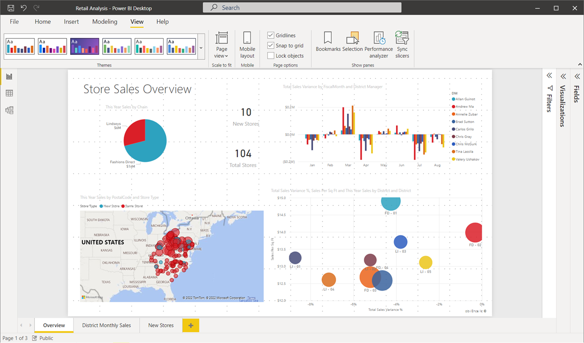
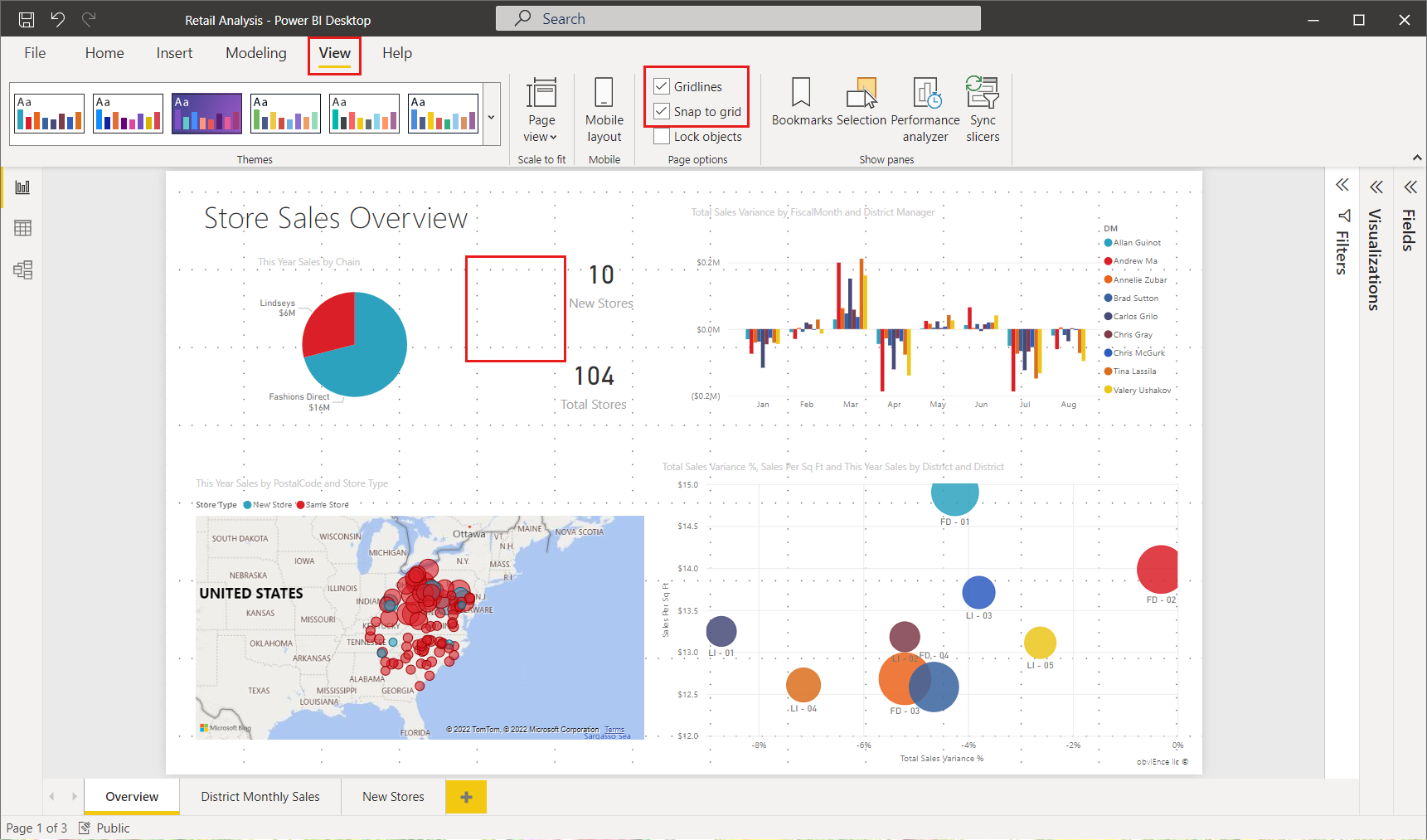
To enable gridlines and snap-to-grid, select the View menu, then enable the checkboxes for Show gridlines and Snap objects to grid. You can select one or both options; they operate independently. In addition, you can turn on Show smart guides, which provide relative guidelines when moving a visual or group of visuals.
Note
If Show gridlines and Snap objects to grid are disabled, connect to any data source and they become enabled.
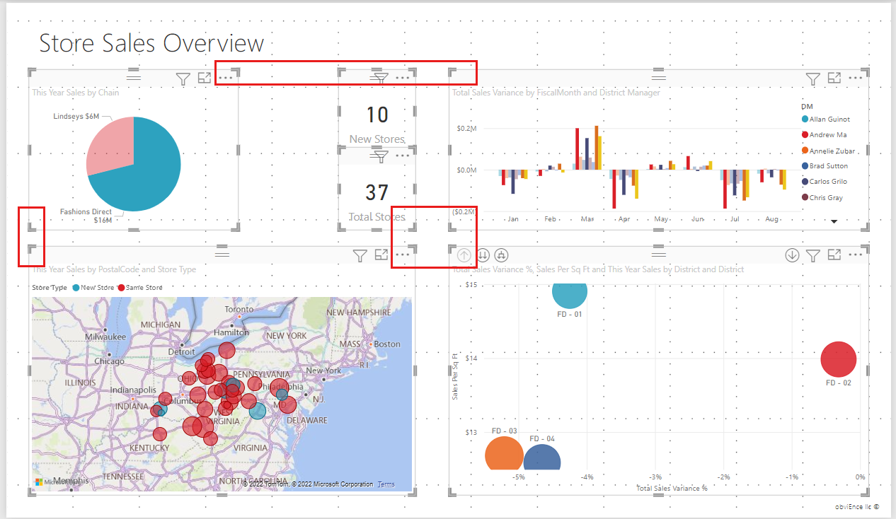
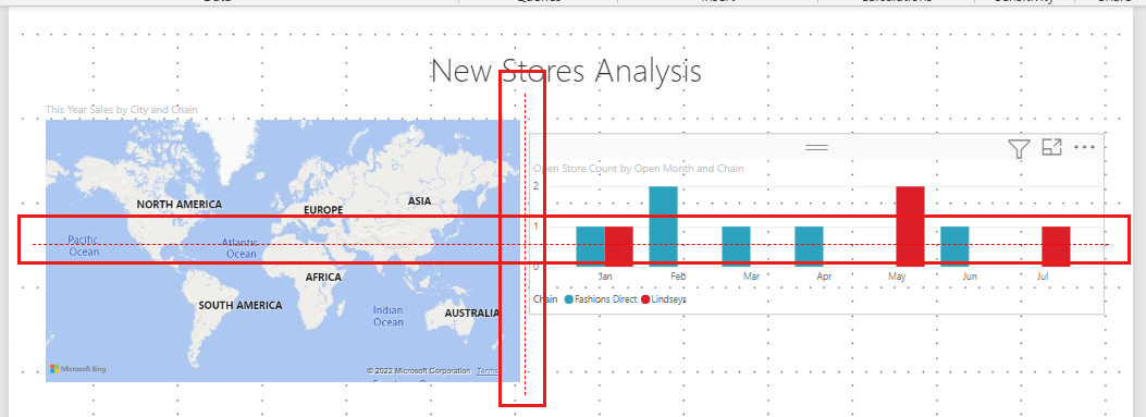
Gridlines are visible guides that help you align your visuals. When you're trying to determine whether two (or more) visuals are aligned horizontally or vertically, use the gridlines to determine whether their borders align.
Use Ctrl+Click to select more than one visual at a time, which displays all selected visuals' borders and shows whether the visuals are properly aligned.
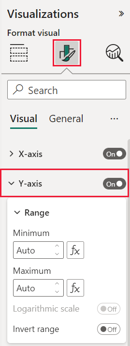
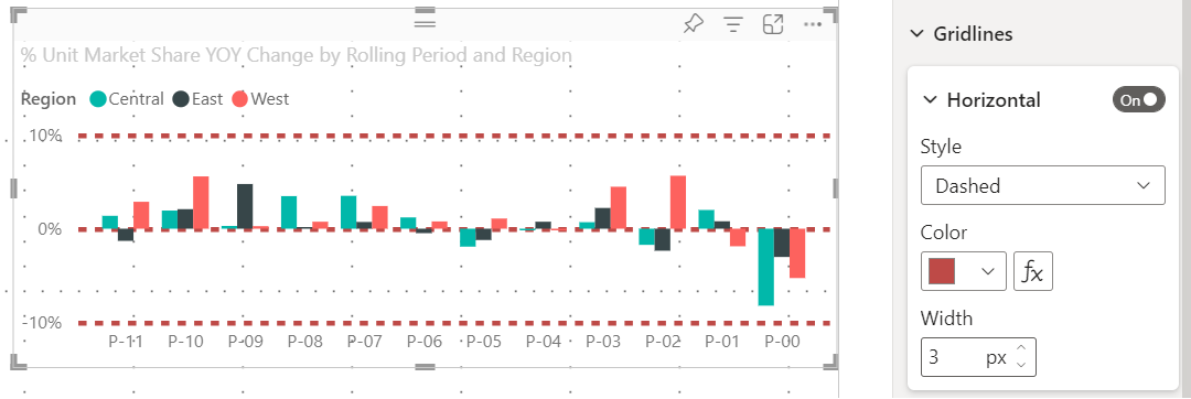
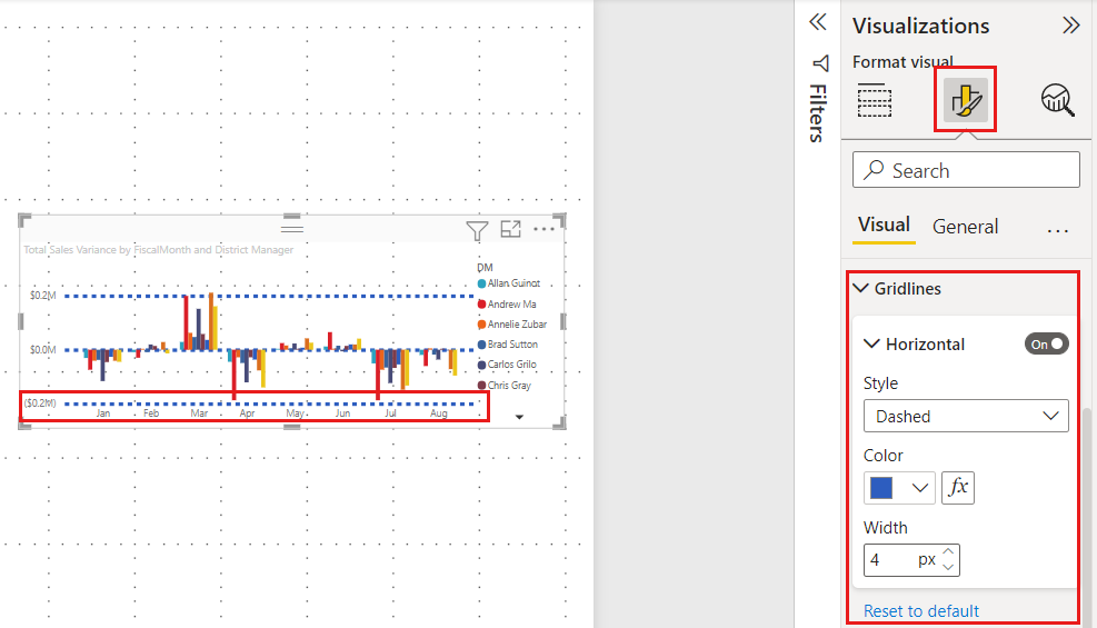
In Power BI, there are also gridlines inside visuals that provide visible guides for comparing data points and values. You can manage the gridlines within visuals using the X axis or Y axis card (as appropriate based on visual type) found in the Format section of the Visualizations pane. You can manage the following elements of gridlines within a visual:
Modifying certain elements of gridlines can be especially useful in reports where dark backgrounds are used for visuals. The following images show the Gridlines section in the Y axis card.
With a visual selected, scroll to the Gridlines setting and set it to On. Then change the settings as desired.
When you enable Snap objects to grid, all visuals on the Power BI canvas that you move (or resize) are automatically aligned to the nearest grid axis, making it much easier to ensure two or more visuals align to the same horizontal or vertical location or size.
For example, this visual is in between gridlines.
After moving this visual, it's aligned with the grid.
That's all there is to using gridlines and snap-to-grid to ensure the visuals in your reports are neatly aligned.
Smart guides are visible guides that help you align your visuals relative to another visual. These lines appear when a selected visual or group of visuals is moved. When a smart guide appears, you can stop moving the visual, and it will be aligned to a neighboring visual. Smart guides appear for the center, sides, top, and bottom of the selected visual, with respect to a nearby visual.
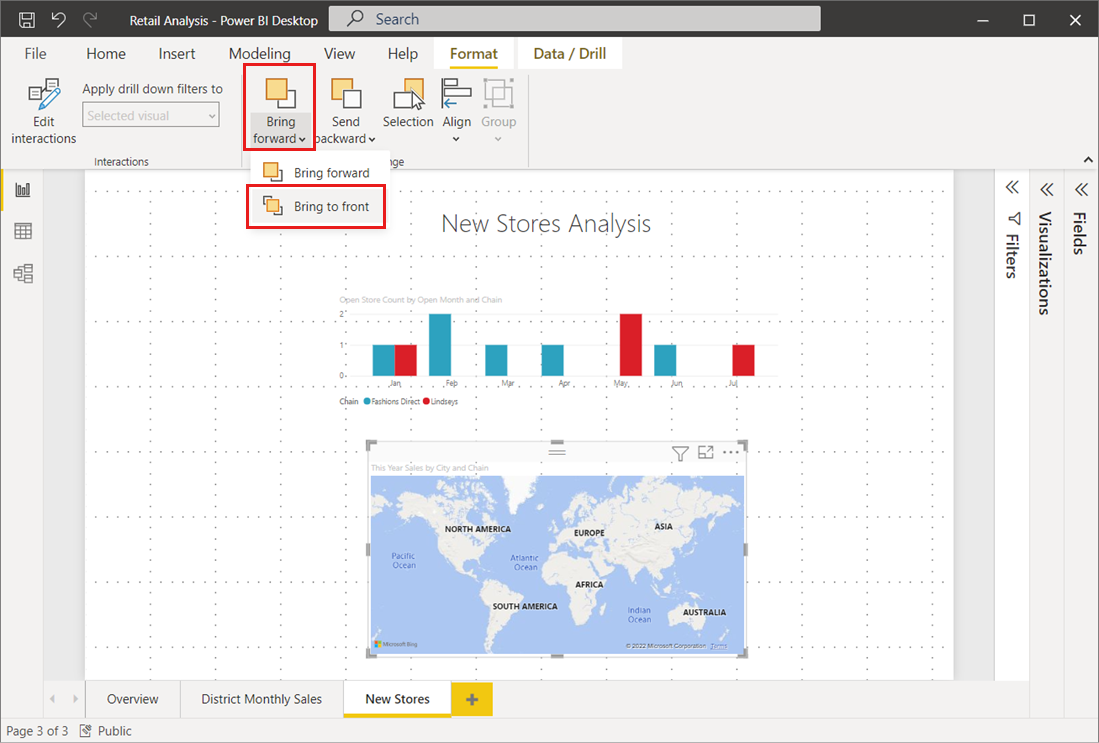
You can manage the front-to-back order of visuals in a report, often referred to as the z-order of elements. This feature lets you overlap visuals in any way you want, then adjust the front-to-back order of each one.
You can set the z-order of your visuals using the Bring forward and Send backward menus, found in the Format ribbon. The Format ribbon appears when you select one or more visuals on the page. For example, to bring one or more selected visuals to the front-most (top) layer, select Bring to front.
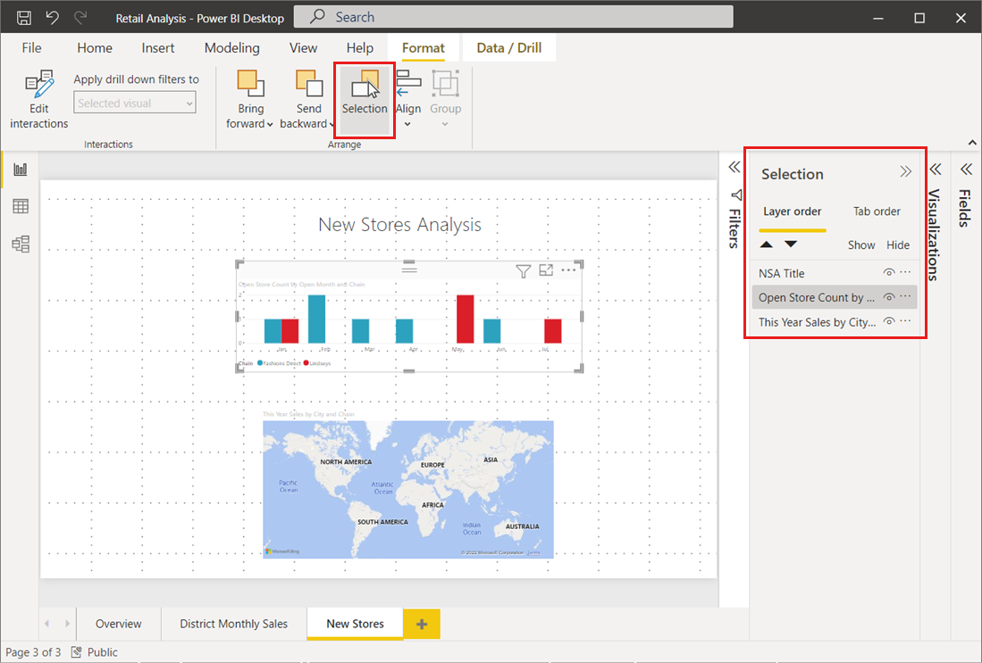
You can also set the z-order of your visuals using the Selection pane. On the Format ribbon, select Selection pane. In the Selection pane, you set the z-order using the Layer order tab.
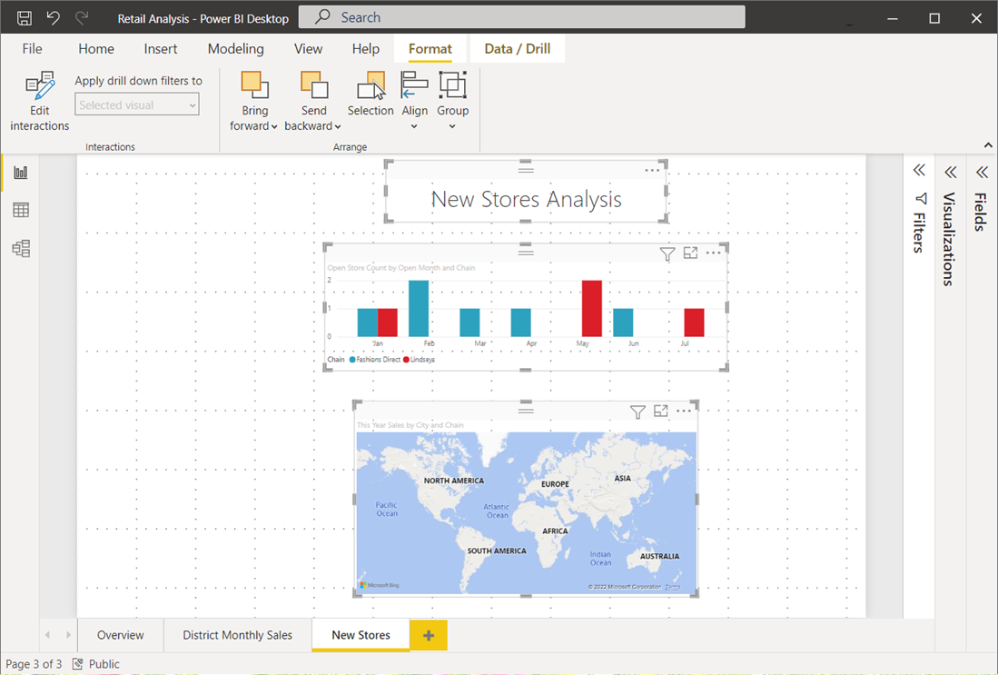
In Power BI Desktop, the Format ribbon lets you align or evenly distribute selected visuals on the canvas, which ensures your visuals appear on the page in the alignment that looks and works best.
The Align menu aligns a single selected visual to the edge (or center) of the report canvas. When two or more visuals are selected, they're aligned together using the existing boundaries of the visuals.
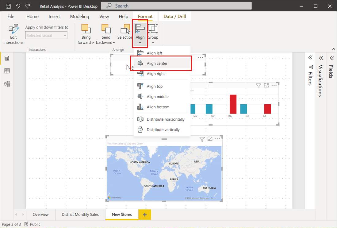
For example, if you select three visuals and choose the Align center option, the visuals then align to the center of all selected visuals.
You can also distribute your visuals evenly across the report canvas, either vertically or horizontally. Just select more than one visual, and then select Distribute horizontally or Distribute vertically from the Align menu of the Format ribbon.
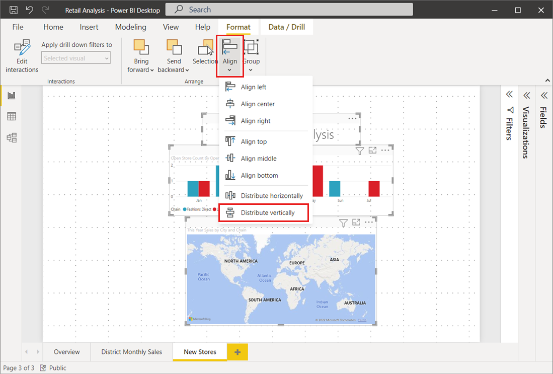
For example, if you select three visuals and choose the Distribute vertically option, the visuals then distribute evenly on the report canvas.
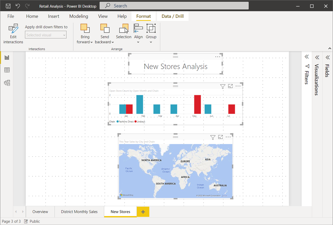
With a few selections from these gridlines, alignment, and distribution tools, your reports will look just how you want them to.
Events
Power BI DataViz World Championships
14 Feb, 4 pm - 31 Mar, 4 pm
With 4 chances to enter, you could win a conference package and make it to the LIVE Grand Finale in Las Vegas
Learn moreTraining
Module
Use visuals in Power BI - Training
Create and customize visuals to present data in compelling and insightful ways.
Certification
Microsoft Certified: Power BI Data Analyst Associate - Certifications
Demonstrate methods and best practices that align with business and technical requirements for modeling, visualizing, and analyzing data with Microsoft Power BI.
Documentation
Add text, shapes, and smart narrative visuals to reports - Power BI
Learn how to add and create text boxes, shapes, and smart narrative visuals to reports in Power BI Desktop or the Power BI service.
Table visualizations in Power BI reports and dashboards - Power BI
Learn how to work with table visualizations in Power BI reports and dashboards, including how to resize column widths.
Tips and tricks for formatting in reports - Power BI
Learn tips and tricks for formatting in Power BI reports.