

Events
Power BI DataViz World Championships
14 Feb, 4 pm - 31 Mar, 4 pm
With 4 chances to enter, you could win a conference package and make it to the LIVE Grand Finale in Las Vegas
Learn moreThis browser is no longer supported.
Upgrade to Microsoft Edge to take advantage of the latest features, security updates, and technical support.
APPLIES TO: ![]() Power BI Desktop
Power BI Desktop ![]() Power BI service
Power BI service
You can create ribbon charts to visualize data and quickly discover which data category has the highest rank (largest value). A ribbon illustrates how the value of a data category changes over a visualized time period. The ribbon connects the category values across the time continuum so you can easily see when there's an increase or decrease. When the ribbon is large, it means the category value is larger at that time than at other periods within the continuum.
A ribbon chart combines ribbons for multiple categories into a single view. This visualization lets you see how a given category ranks throughout the span of the chart's X-axis (usually the timeline) compared to other categories.
Ribbon charts are effective at showing how rank can change. The ribbon for the highest rank (value) is always displayed on top of the other ribbons for each time period. The following image illustrates this visualization:

Note
If you want to share your report with a colleague, you both need to have individual Power BI Pro licenses. If both parties don't have individual Power BI Pro licenses, the report needs to be saved in Premium capacity to enable sharing. For more information, see sharing reports.
Review the following prerequisites for using ribbon charts in Power BI Desktop or the Power BI service.
This tutorial uses the Retail Analysis Sample PBIX file.
Download the Retail Analysis Sample PBIX file to your desktop.
In Power BI Desktop, select File > Open report.
Browse to and select the Retail Analysis Sample PBIX file, and then select Open.
The Retail Analysis Sample PBIX file opens in report view. 
At the bottom, select the green plus symbol  to add a new page to the report.
The following steps create a ribbon chart to illustrate the rank for categories in This Year Sales data for every month.
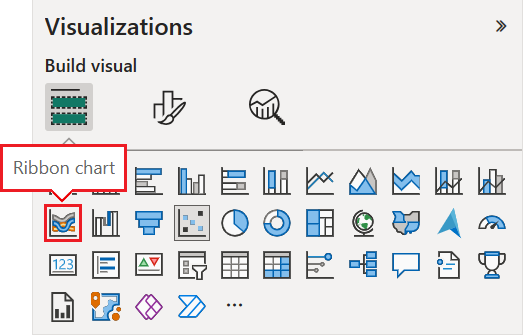
To create a ribbon chart, select Ribbon chart on the Visualizations pane.
Select the sample data to use for the X-axis, Legend, and Y-axis in the chart.
On the Data pane, expand Store and select OpenDate. Under OpenDate, make sure the Data Hierarchy checkbox is selected.
On the Visualizations pane, for the chart X-axis, make sure only the Month and Day fields are listed under OpenDate.
The sample semantic model contains data for one year only, so we can remove the Year and Quarter data from the X-axis.
On the Data pane, expand Sales, expand This Year Sales, and then select the Value checkbox.
On the Data pane, expand Item and select the Category checkbox.
The following image shows the selected fields in the Data pane and the modified fields in the Visualizations pane for the ribbon chart.

The new ribbon chart shows the rank for This Year Sales for every month:

Notice how the ribbons reveal how rank changes over time. For example, the rank of the Home category moves from second to fifth place from February to March during the year.
You can modify the presentation of a ribbon chart with the configuration options in the Format section of the Visualizations pane. The formatting options for ribbon charts are similar to the options for a stacked column chart. There are a few formatting options that are specific to ribbons.

Here are some of the formatting options you can adjust for the ribbon chart:
Because the ribbon chart doesn't have Y-axis labels, you might want to add data labels. In the Format section, select Data labels.

Set formatting options for your data labels. In this example, we set the text color to white and display units to thousands.

Events
Power BI DataViz World Championships
14 Feb, 4 pm - 31 Mar, 4 pm
With 4 chances to enter, you could win a conference package and make it to the LIVE Grand Finale in Las Vegas
Learn moreTraining
Module
Data visualization and reports in Power BI - Online workshop - Training
Work through exercises to learn about data visualization and reports in Power BI.
Certification
Microsoft Certified: Power BI Data Analyst Associate - Certifications
Demonstrate methods and best practices that align with business and technical requirements for modeling, visualizing, and analyzing data with Microsoft Power BI.
Documentation
Treemaps in Power BI - Power BI
Learn how to create and configure treemaps in the Power BI service and Power BI Desktop.
Create and use funnel charts in Power BI - Power BI
Learn how to work with Funnel charts in Power BI Desktop and the Power BI service.
Waterfall charts in Power BI - Power BI
Learn how to create and configure waterfall charts in the Power BI service and Power BI Desktop.