Add visuals to a Power BI report (part 1)
APPLIES TO: ![]() Power BI Desktop
Power BI Desktop ![]() Power BI service
Power BI service
This article provides a quick introduction to creating a visualization in a report. For more advanced information, see part 2 of this article.
Prerequisites
This tutorial uses the Sales and Marketing Sample.
Download the sample PBIX file to your desktop.
In Power BI Desktop, select File > Open report.
Browse to and select the Sales and Marketing Sample PBIX file, and then select Open.
The Sales and Marketing Sample PBIX file opens in report view.

At the bottom, select the green plus symbol
 to add a new page to the report.

Note
If you want to share your report with a colleague, you both need to have individual Power BI Pro licenses or the report needs to be saved in Premium capacity. For more information, see Share a filtered Power BI report.
Add visualizations to the report
In this section, you create a visualization by selecting a field from the Data pane.
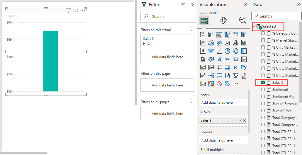
Start with a numeric field like SalesFact > Sales $. Power BI creates a column chart that has a single column:
Or start with a field like Product > Category. Power BI creates a table and adds that field to the Columns section:

Or select the Filled map button and then select a geography field, like Geo > City. Power BI and Bing Maps create a map visualization:


Change the type of visualization
In this section, you create a visualization and then change its type.
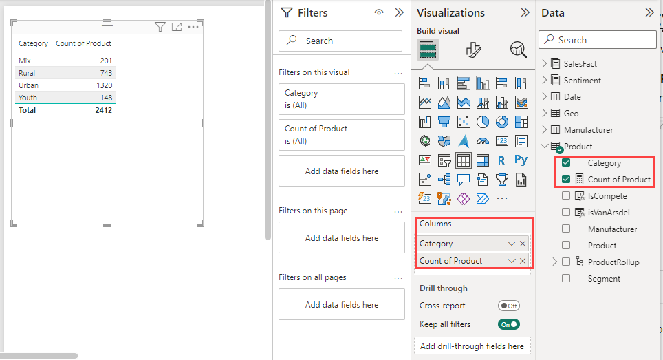
On a new page, select Product > Category and then Product > Count of Product to add both fields to the Columns section:
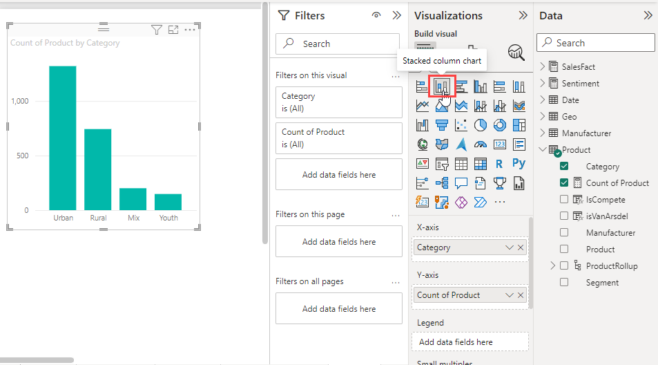
Change the visualization to a column chart by selecting the Stacked column chart button on the Visualizations pane:
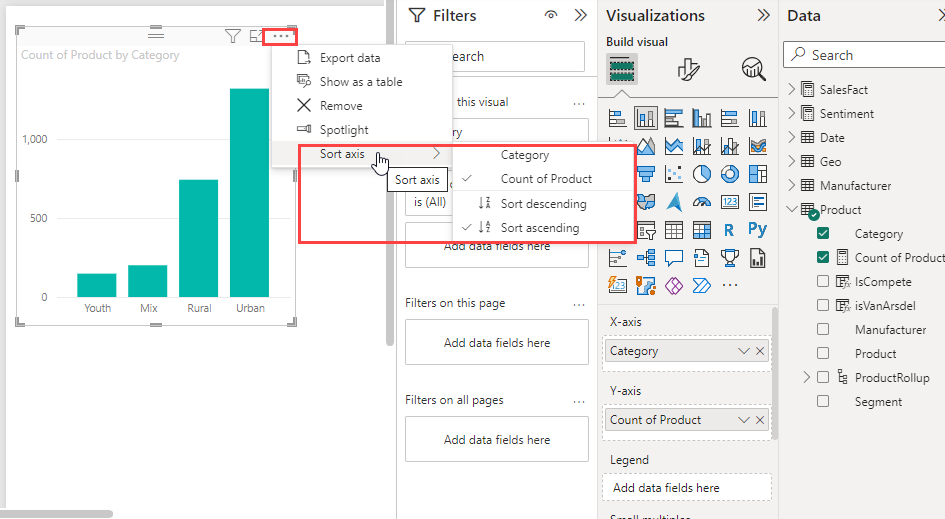
To change the way the visual is sorted, select More options (...) and then Sort axis on the chart. Use the menu options to change the direction of the sort axis (ascending or descending) or to change the column that's being sorted on: