Note
Access to this page requires authorization. You can try signing in or changing directories.
Access to this page requires authorization. You can try changing directories.
Microsoft Sentinel workbooks let SOC teams visualize and monitor security data directly from the data lake. Analysts use KQL (Kusto Query Language) to query the lake without duplicating or transforming data. Select Sentinel data lake as the data source in a workbook to run the same queries used for investigations and hunting. Then render results as interactive charts and tables for monitoring and reporting. This approach keeps analytics consistent across queries, supports longer data retention, and scales with high-volume historical data. These capabilities make workbooks ideal for threat hunting, trend analysis, and executive dashboards.
This article walks you through the process of creating workbooks for using Microsoft Sentinel data lake as the data source. For more information on using workbooks with Sentinel, see Visualize and monitor your data by using workbooks in Microsoft Sentinel.
Query performance matters because workbook visuals can autorefresh and run many times. Add time filters, summarize results, and project only the columns you need. These steps prevent queries from scanning too much historical data. Well-scoped queries keep dashboards fast while still using long-term data for analysis.
Create a workbook with Microsoft Sentinel data lake as the data source
Follow these steps to create a workbook that uses Microsoft Sentinel data lake as its data source:
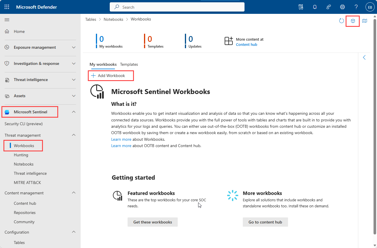
In the Defender portal, go to Microsoft Sentinel > Threat management > Workbooks.
Select the cube icon in the top right corner to select the workspaces you want to store your workbooks.
Select Add workbook.
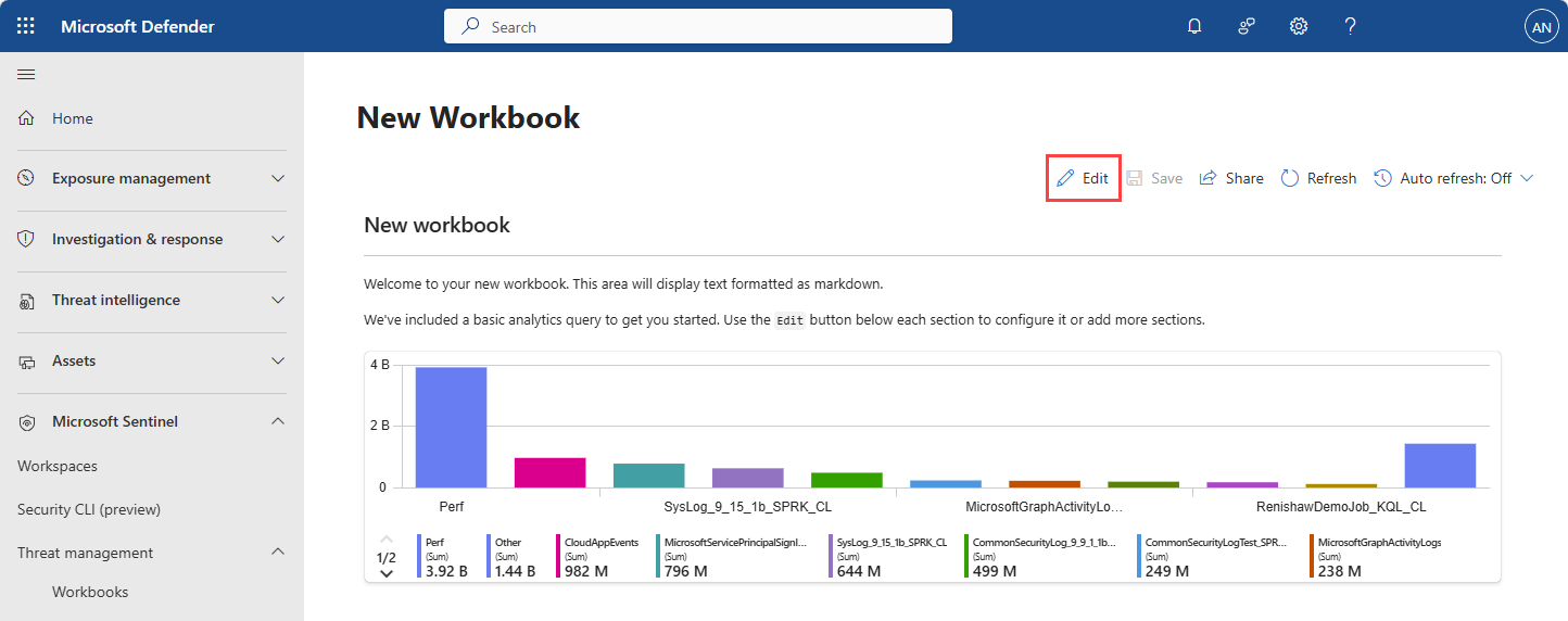
A new workbook opens with a basic query and a par chart visual.
Select the Edit.
Under the chart, select Add, and then select Add data source and visualization.
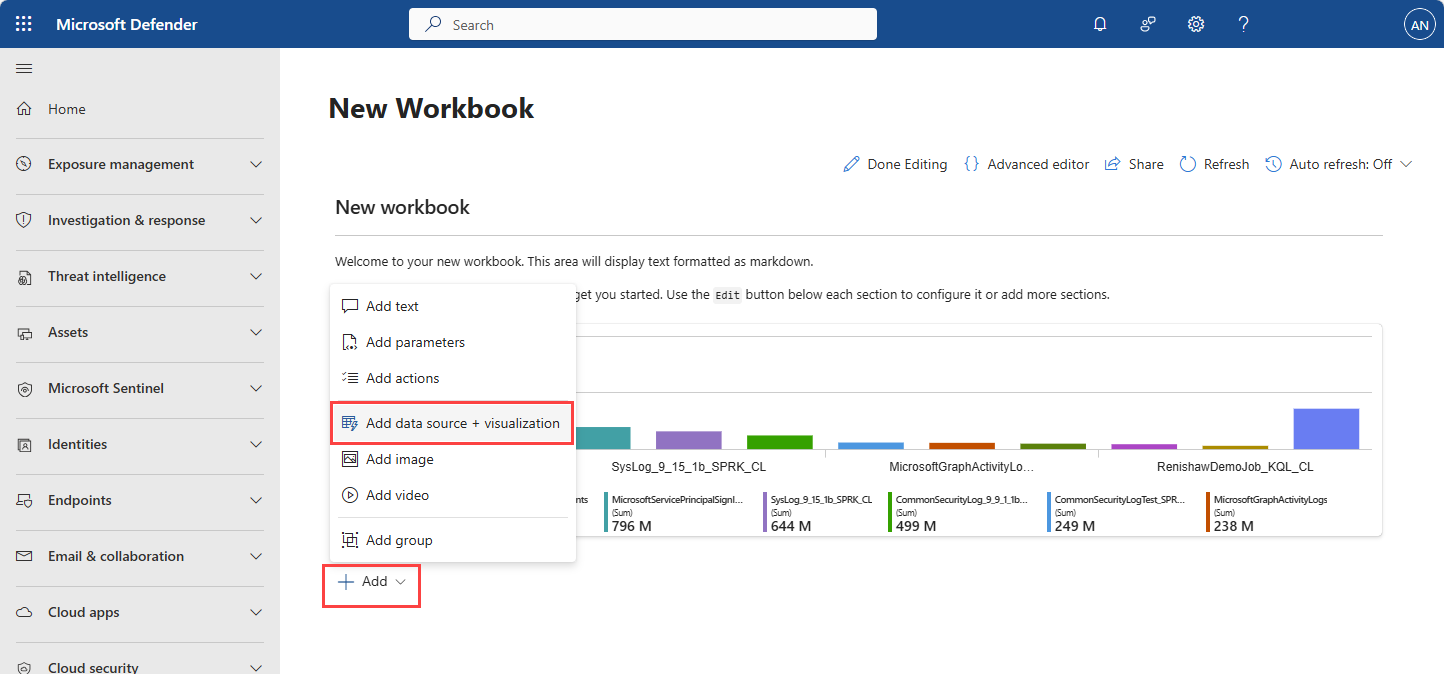
Select Sentinel data lake as the data source.
Select the workspace containing your SignInLogs table in the data lake.
Paste the following KQL into the query editor:
AWSCloudTrail
| where isnotempty(ErrorCode)
| summarize FailedEvents = count()
    by bin(TimeGenerated, 1h), SourceIpAddress, UserIdentityPrincipalid
| where FailedEvents > 3
| summarize FailedEvents = sum(FailedEvents) by UserIdentityPrincipalid
| top 10 by FailedEvents
Under Visualization select Bar chart.
Select Run query to visualize the results.
Select Done editing to exit edit mode and view your visual.
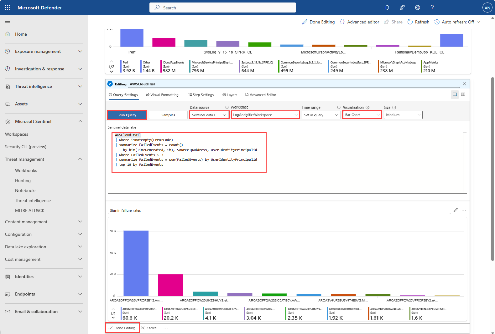
This visual shows the top 10 AWS principal identities with the most failed API calls in AWSCloudTrail logs. Failed events are counted and filtered to show identities with repeated errors. Use this chart to spot suspicious or misconfigured identities that produce unusual failure patterns.
Note
The Visualization type Set by query isn't supported.
Relative time ranges such as
> ago(10d)work for up to 90 days. Absolute time ranges follow your data retention policy.On the workbook page, select Done editing.
Select Save to save the workbook to your library, giving your workbook a name and location.
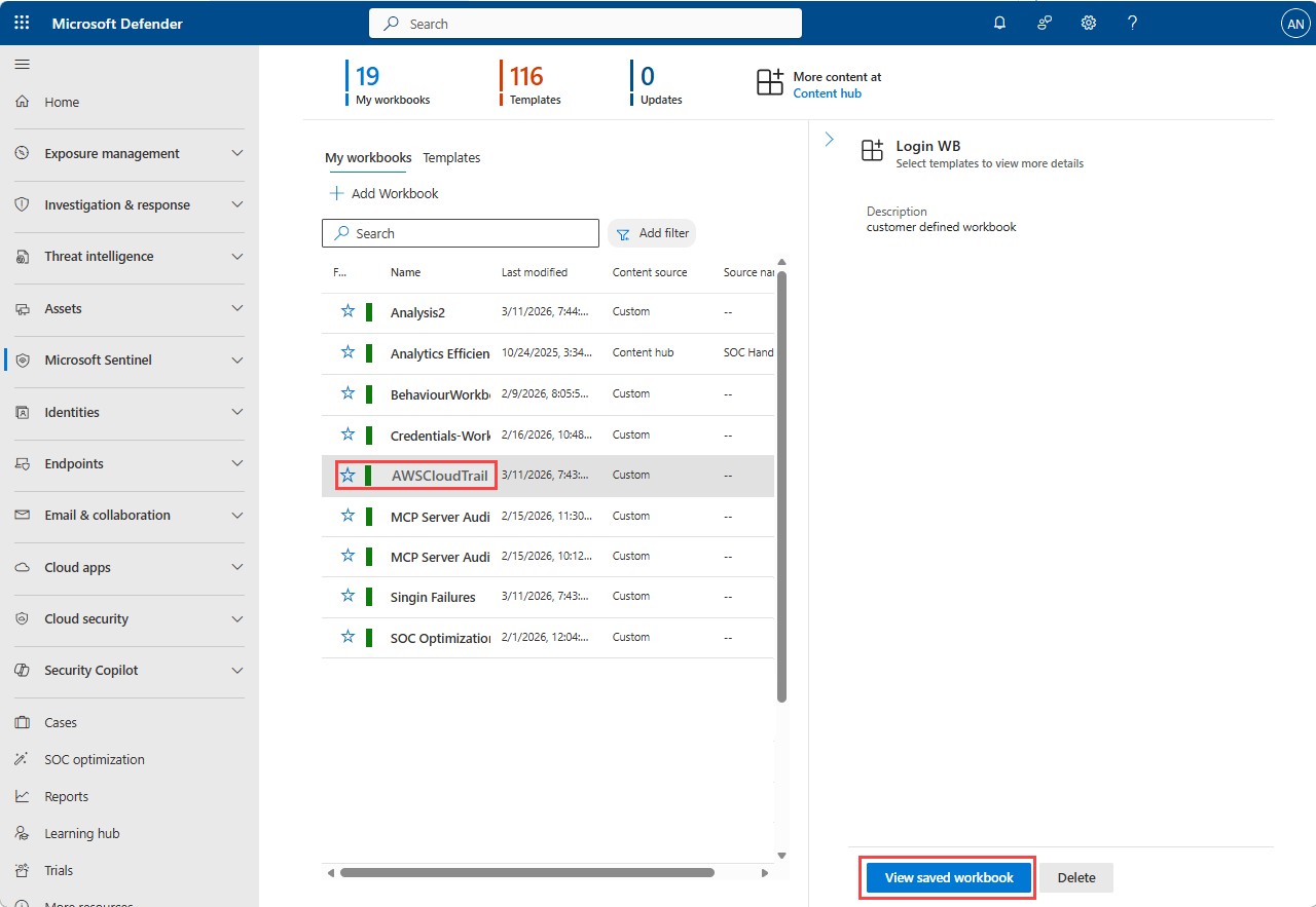
You can view your saved workbook in the list of workbooks, and select it to view the visualizations you created. You can also edit the workbook at any time to update the queries or visuals.