Create SharePoint integrated canvas apps from scratch to view, edit, add, and delete items in a list created using Microsoft Lists
In this scenario article, you'll learn how to create an app with SharePoint form functionality from scratch. The app will demonstrate how to view, edit, add, and delete list items using a canvas app without visiting a SharePoint site.
Note
For more details about different scenarios working with SharePoint forms and additional examples, go to SharePoint scenarios overview.
Prerequisites
- You must have access to a SharePoint site to create a list and list items.
- You must be knowledgeable about creating and setting up lists.
Scenario details
The purpose of this scenario is to demonstrate how to create a canvas app from scratch to work with a list. At the end of this example demo, you'll be able to do the following tasks from inside the canvas app without the need to access the list or its item:
- View all items from the list.
- Search for items in a list based on text value of a specific column.
- Select a list item.
- Edit a list item.
- Create a new list item.
- Delete a list item.
The scenario is a basic illustration of the canvas app capabilities when integrated with SharePoint. To enhance the layout with improved design or additional screens, go to the following articles:
Important
The example in this scenario creates a sample app to view, edit, add, and delete list items. You can change the approach to customize the app differently based on your choices or business objective. When you customize your app with custom names for controls, be sure to use the correct control names in the formula when following the steps in this example.
Example
This scenario example walks you through the steps to create an app and connect it to a list to view, edit, add, and delete list items.
Step 1 – Create a list using Microsoft Lists
Create a list with columns and list items. In this scenario, we've used a list with the following columns and list items:

Note
Both columns are Single line of text.
Step 2 – Create a blank canvas app
Create a blank canvas app.
Step 3 – Connect app to SharePoint
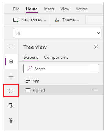
Select Data sources from the left pane.

Select SharePoint data source. You can also search for the name in the search box.

Select Add a connection.

Select a connection type. You can connect to SharePoint Online or an on-premises SharePoint site with a data gateway when configured. This scenario connects to a SharePoint Online site.

Select the SharePoint site having the list you created earlier.

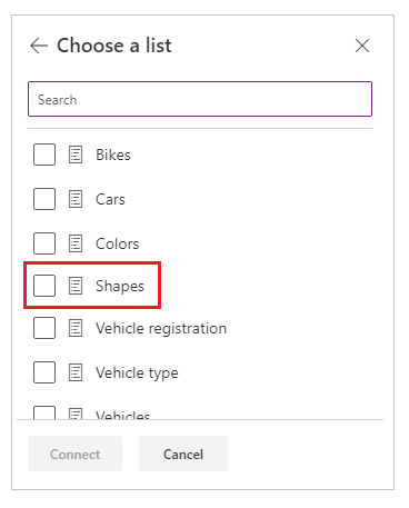
Select the list that you created. This scenario uses a list named Shapes.

Select Connect. The data source is added to the app.

Step 4 – Add data table to view list items
Select + (insert) from the left pane.

Expand Layout.
Select Data table.

Select the data source as your SharePoint connection.

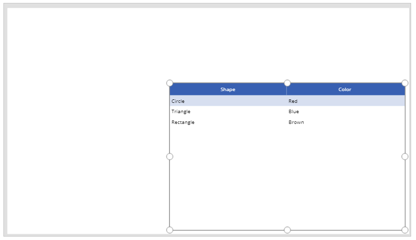
Move the data table to the lower-right inside the screen to make space for additional components.

Step 5 – Add the capability to search and select item
Insert a Text input control to the canvas, and move it below the drop-down list.

Update the search box Default property to the value Search by shape.

Insert a List box control to the canvas, and move it below the text input control added in the previous step.

From the right side of the Studio screen, set the Items property of the list box control to the Shapes list for this example.

Set the Value property for the list box control to Shape instead of Color for this example.

Update the Items property of the list box added in the previous step to the following formula:
Filter([@Shapes], StartsWith(Shape, TextInput1.Text))
The formula contains following functions:
- Filter() – Used in this formula to filter items in the list box based on the defined parameters.
[@Shapes]in this function defines which data source to filter. - StartsWith() – Used in this formula to filter the list items based on the Shape column that start with the characters entered in the TextInput1 control added earlier.
- Filter() – Used in this formula to filter items in the list box based on the defined parameters.
Step 6 – Add the capability to edit item
Insert the Edit form control.

From the right side of the Studio screen, set the Data source property for the edit form control to Shapes.

Select Edit fields for the edit form control and remove any other fields such as Attachments, if present.

Ensure the Shape and Color fields are present. If not, add them using Add field.

Rearrange the screen layout to ensure the Edit form control is visible and doesn't overlay with other controls.

Set the OnSelect property of the list box control to the following function:
Set(TextSelected,1)
The Set() function sets a new variable named TextSelected to the value of 1 when a value in the list box is selected. The TextSelected variable is used in this scenario as a flag to control the actions and behavior of add, edit, and delete capabilities as you'll see in the following sections.
Set the Item property of the edit form control to the following formula:
If(TextSelected=1,ListBox1.Selected,DataTable1.Selected)
The If() function checks first if the value of the variable TextSelected is 1 or not. If it is, the edit form shows the selected item from the list box. If not, the edit form shows the selected item from the data table.
Insert a button.

From the right side of the Studio screen, set the Text property of the button added in the previous step to Save.

Set the OnSelect property of the Save button to the following formula:
SubmitForm(Form1);
Set(TextSelected,0)
The formula contains following functions:
- SubmitForm() – Used in this formula to submit the edit form and save the values to list.
- Set() – Resets the TextSelected variable back to o so that a new item can be selected from the list box.
Insert Text label control.

Update the Text property for the Text label control added in the previous step to To edit value(s) for an item, select from the table, or search.

Rearrange the controls on the screen to order the edit controls.

Step 7 – Add the capability to add item
Insert a button.
Rearrange the controls on the screen to ensure the button is visible.
Update the Text property of the button added in the previous step to Add.
Set the OnSelect property of the Add button to the following function:
NewForm(Form1)
The NewForm() function clears the edit form control added on the form named Form1 so that you can add a new list item.
Step 8 – Add the capability to delete item
Insert a button.
Move the button added in the previous step below the Save button.
Update the Text property of the button added in the previous step to Delete.
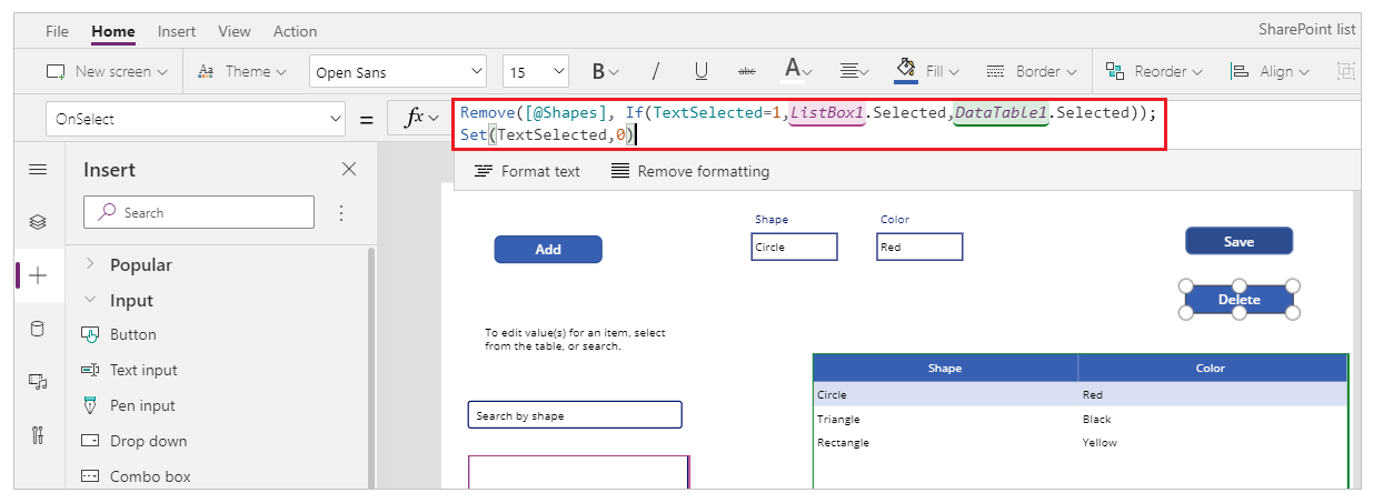
Set the OnSelect property of the Delete button to the following formula:
Remove([@Shapes], If(TextSelected=1,ListBox1.Selected,DataTable1.Selected));
Set(TextSelected,0)
The formula contains following functions:
- Remove() – Used in this formula to delete the selected list item.
- If() – Checks first if the value of the variable TextSelected is 1 or not. If it is, the Delete button deletes the item selected from the list box. If not, the Delete button deletes the item selected from the data table control.
- Set() – Resets the TextSelected variable back to o so that a new item can be selected from the list box.
Now that you have all the app components configured, ensure the screen looks like the following example:

Step 9 – Save the app
Now that the app has view, edit, add, and delete capability added, save the app.
Select the File menu.
Select Save.
When saving for the first time, the Save option takes you to Save as. Select Save to save the app to the cloud.

Close Power Apps Studio.
Step 10 – Test the app
Go to Power Apps.
Select Apps.
Select the app created.

Test the app components.

Tip
You can quickly preview the behavior of a component using the keyboard key Alt and a mouse left-click when editing the app inside Power Apps Studio.
For example, instead of selecting Preview the app from the upper right, or F5 from the keyboard that runs the app in preview, keep the Alt key on the keyboard pressed, and then select a row from the data table to change the edit form control to the selected row as if the app is running in preview.

In addition, keep the Alt key pressed on the keyboard and you can continue to run the preview inside Power Apps Studio. For example, selecting multiple components for different actions or checks.
Next steps
If you edit the app, you must publish the changes for others to see.
Once the app is ready to use, share the app.