How visuals cross-filter each other in a Power BI report
APPLIES TO: ![]() Power BI service for business users
Power BI service for business users ![]() Power BI service for designers & developers
Power BI service for designers & developers ![]() Power BI Desktop
Power BI Desktop ![]() Requires Pro or Premium license
Requires Pro or Premium license
One of the great features of Power BI is the way all visuals on a report page are interconnected. If you select a data point on one of the visuals, all the other visuals on the page that contain the same data change based on your selection.
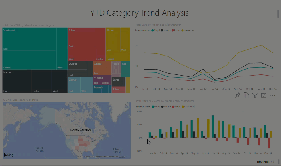
How visuals interact with each other
By default, selecting a data point in one visual on a report page will cross-filter or cross-highlight the other visuals on the page. The report designer sets how the visuals on a page interact. Designers have options to turn visual interactions on and off, and to change the default cross-filtering, cross-highlighting, and drilling behavior.
If you haven't encountered hierarchies or drilling yet, you can learn all about them by reading Drill down in Power BI.
Cross-filter and cross-highlight
Cross-filtering and cross-highlighting can be useful to identify how one value in your data contributes to another. The terms cross-filter and cross-highlight are used to distinguish the behavior described here from what happens when you use the Filters pane to filter and highlight visuals.
The following report pages show examples of cross-filtering and cross-highlighting. The Total Category Volume by Segment bar chart has two values, Moderation and Convenience.

In the following example, Moderation is selected.
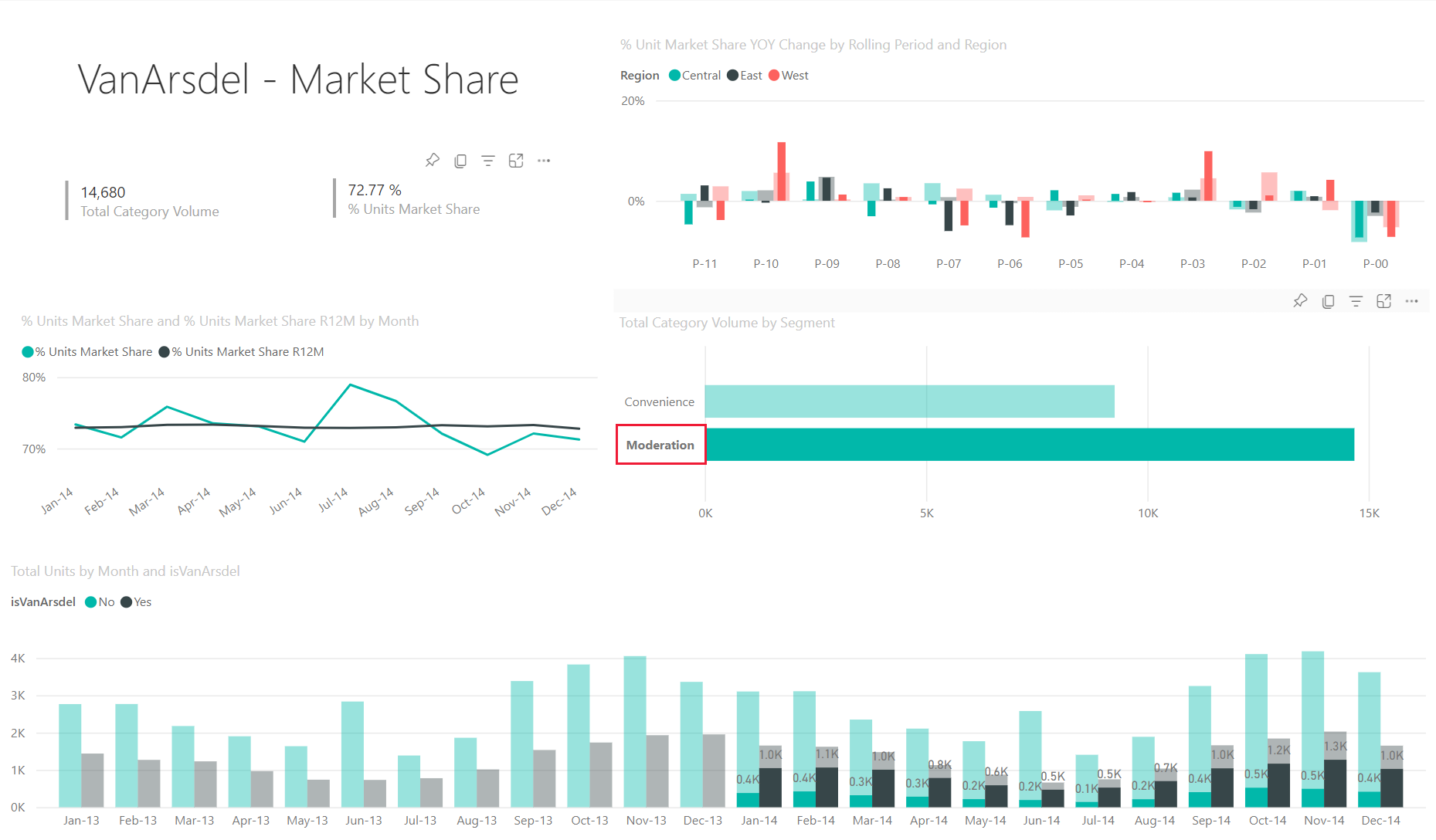
Because Moderation is selected on the bar chart:
Cross-filtering removes data that doesn't apply. Selecting Moderation in the bar chart cross-filters the line chart. The line chart now only displays data points for the Moderation segment.
Cross-highlighting retains all the original data points but dims the portion that doesn't apply to your selection. Selecting Moderation in the bar chart cross-highlights the column chart. The column chart dims all the data that applies to the Convenience segment and highlights all the data that applies to the Moderation segment.
Considerations and troubleshooting
If your report has a visual that supports drilling, by default, drilling one visual has no effect on the other visuals on the report page. However, the report designer can change this behavior, so check your drillable visuals to see if drilling filters other visuals has been enabled by the report designer.
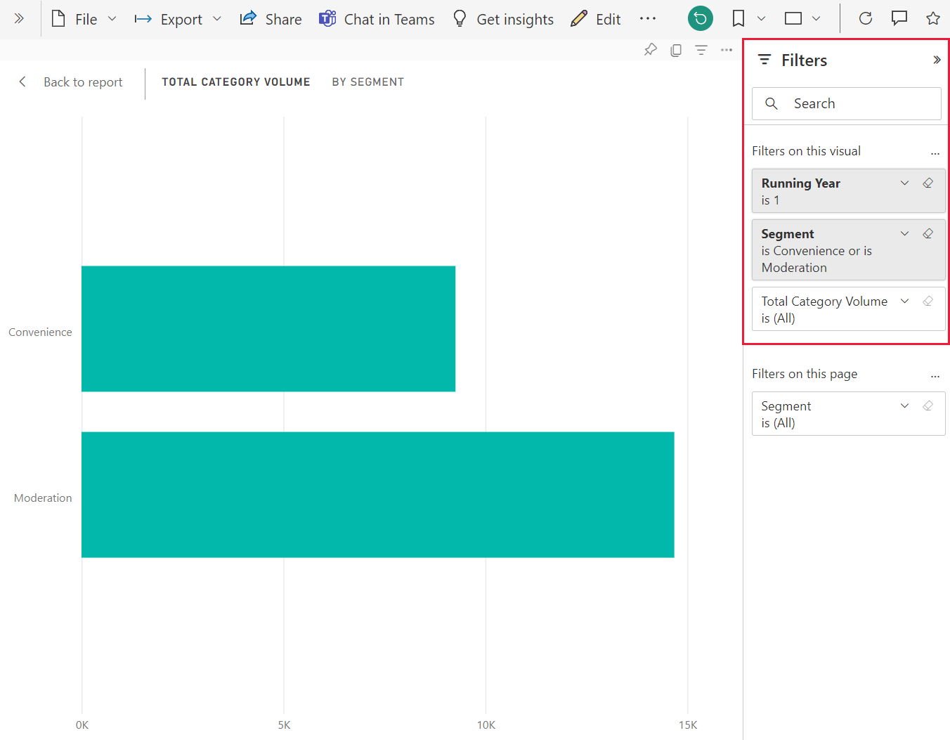
Visual-level filters are retained when cross-filtering and cross-highlighting other visuals on the report page. So, if VisualA has visual-level filters applied by the report designer or by you, and you use VisualA to interact with VisualB, visual-level filters from VisualA will be applied to VisualB.
If the tables have no hierarchical relationships, slicing up the measures (often referred as complex slicers) might result in an error. If you have access to the logs, you'll see the message "Measures are not allowed with complex slicers unless they have a filter context change". To avoid this situation, don't use complex slicers or remodel the relationships to get the desired output.