Note
Access to this page requires authorization. You can try signing in or changing directories.
Access to this page requires authorization. You can try changing directories.
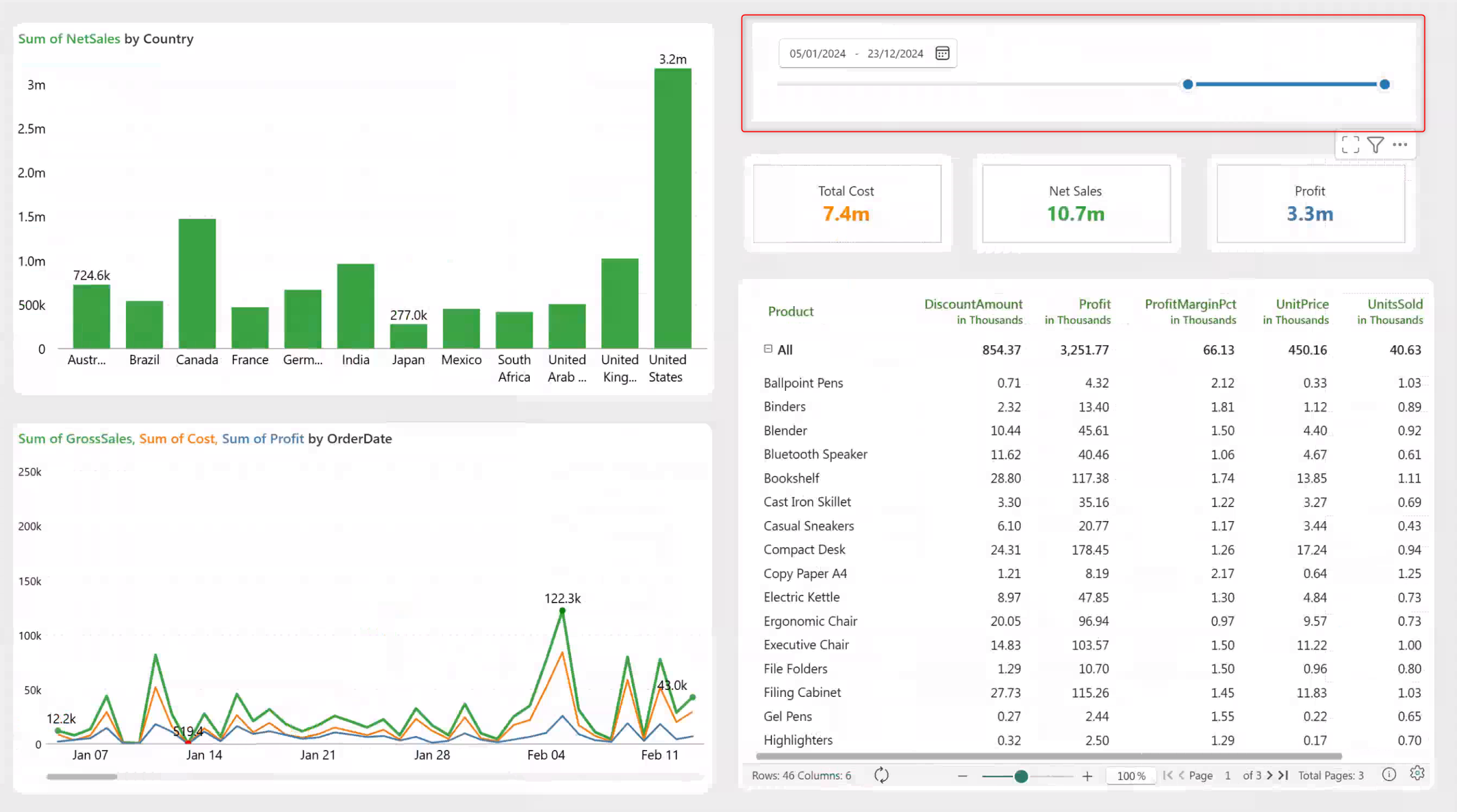
Intelligence sheets provide a no-code, end-to-end reporting experience that brings all your data visualization needs together on a single platform. Use intelligence sheets to build reports, create dashboards, and run ad hoc analysis directly on top of your semantic models or planning sheets. Intelligence sheets include a visualization library of more than 100 chart types, including advanced visualizations such as marimekko, boxplot, waterfalls, and radar/polar charts. This article guides you through creating your first intelligence sheet.
Import data to visualize
Intelligence sheets let you transform data from planning sheets, semantic models, and file-based sources such as Excel and Parquet files into interactive reports and dashboards. Create visualizations such as charts, tables, matrices, KPI cards, and filters to analyze performance, monitor key metrics, and share insights across your organization.
Import data from a semantic model
Import an existing semantic model to create reports based on curated business data. By connecting to a semantic model, you can use predefined measures, relationships, and calculations. You can build reports and visualizations without modeling the data yourself.
Tip
You can also import a semantic model after creating an intelligence sheet. In the Data pane, select + Add and import the semantic model.
To connect to a semantic model, select Semantic Model from the Get data section of the landing page.
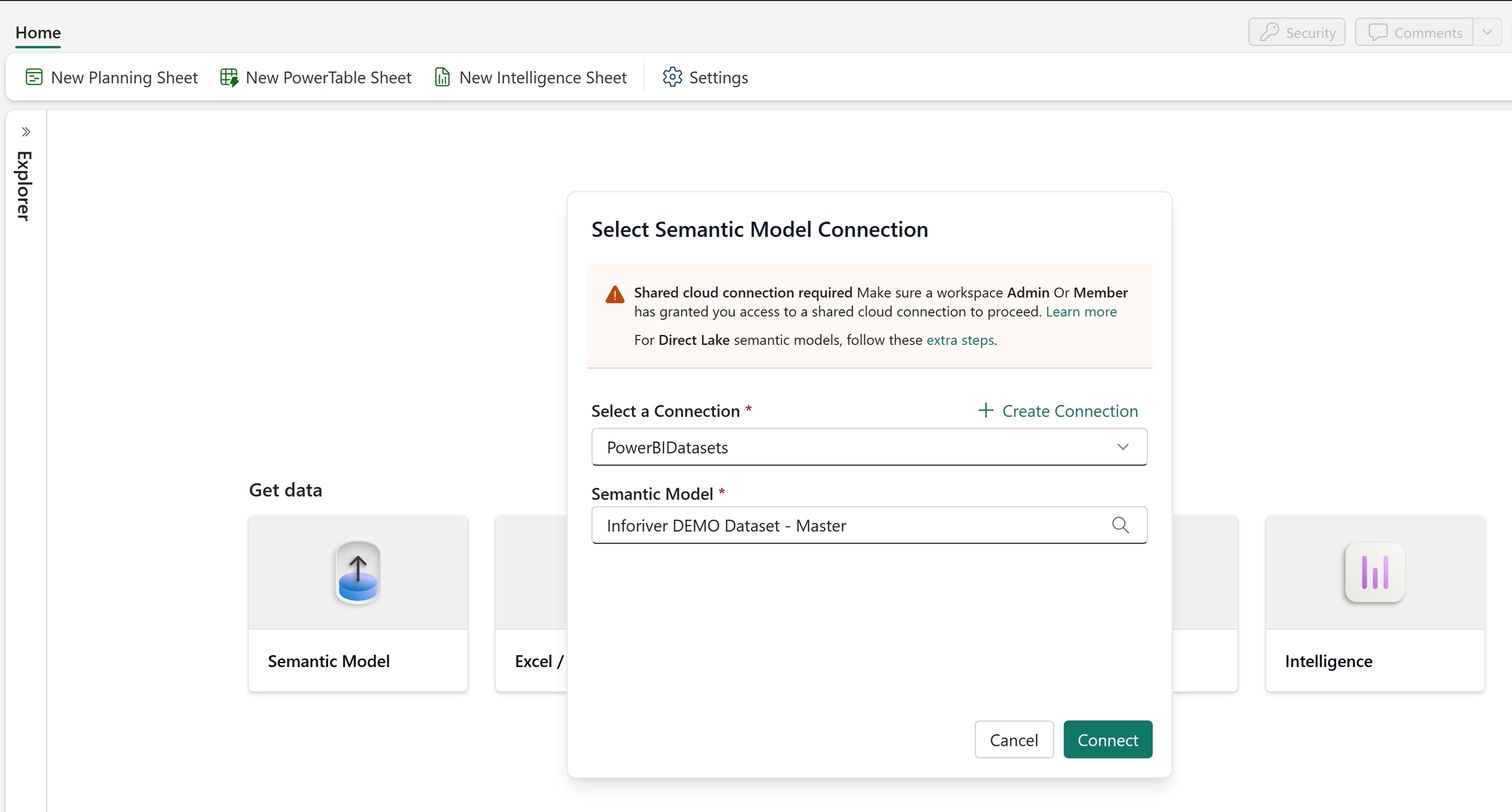
Select the semantic model connection.
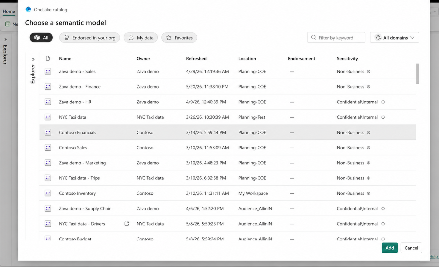
Select the semantic model.
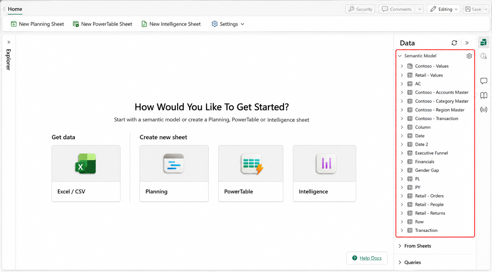
The semantic model appears in the intelligence sheet.
Import data from Excel and CSV files
Import Excel and CSV files to create interactive reports and visualizations from existing business data. You can analyze trends, monitor key metrics, and share insights through charts, tables, matrices, and dashboards without a direct connection to a database or semantic model. Business users can create reports and dashboards directly from familiar file formats, reducing dependency on IT teams.
In the landing page, select Excel/CSV and upload the file.
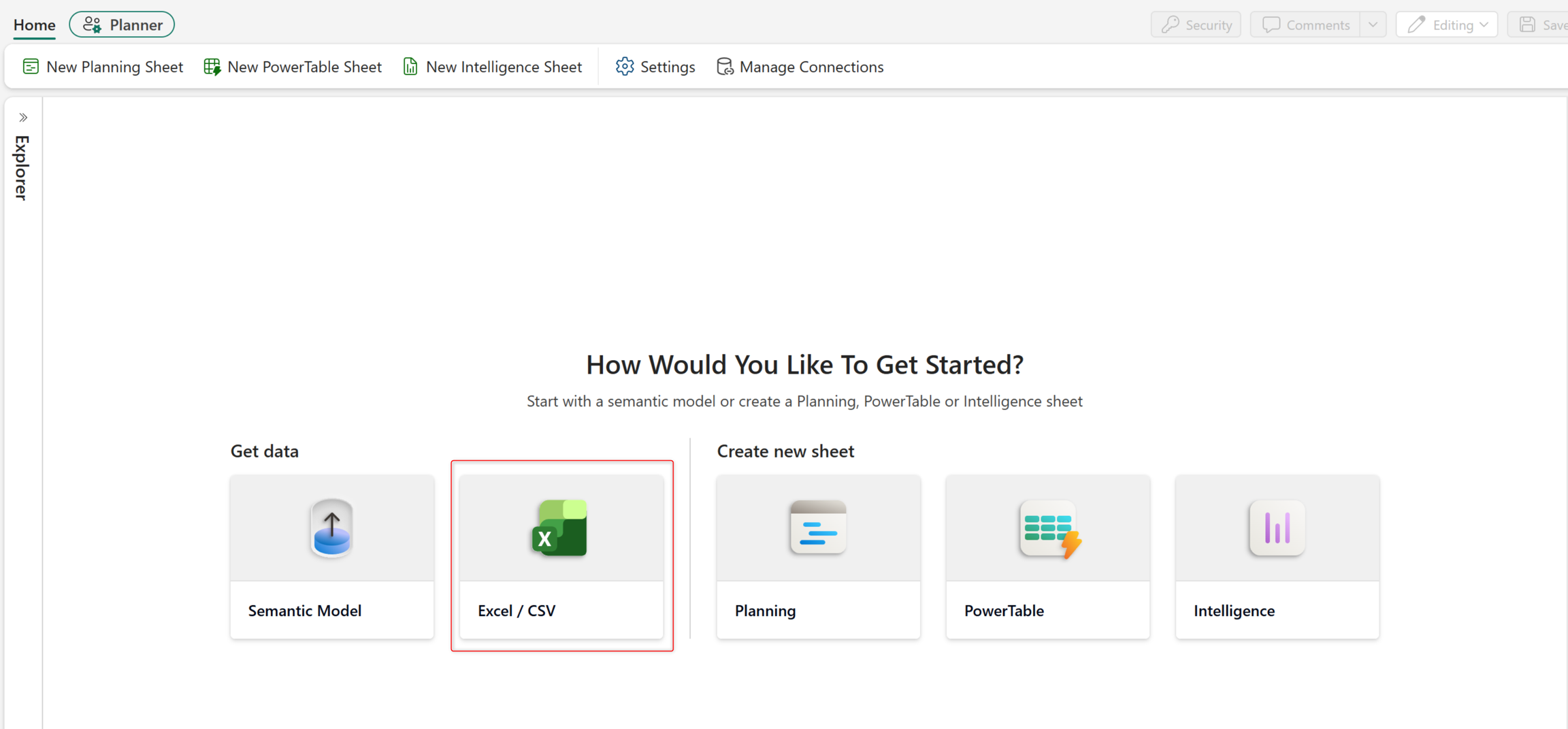
Alternatively, after creating an intelligence sheet, follow these steps.
Expand the Queries section in the Data pane.
Select Add, and then select the upload format (Excel or CSV).
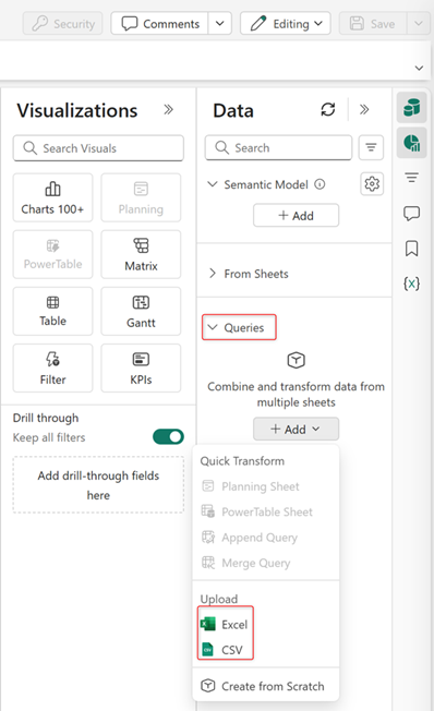
Select the file for upload. For Excel sources, select the sheet to import. Select Create.
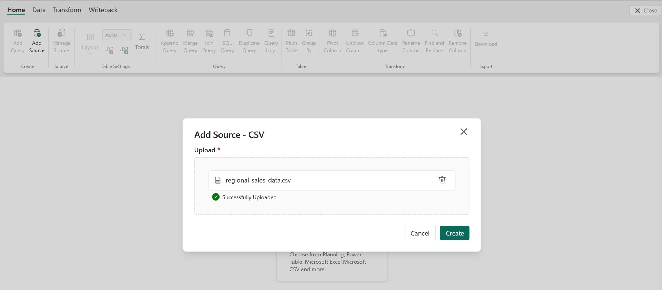
After you add the source, select Close in the top-right corner to exit Infobridge. To learn more about Infobridge and its applications, see data integration with bridges.
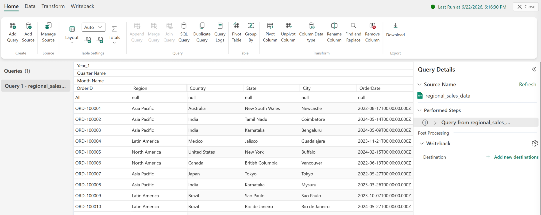
The dimensions and measures appear in the Queries section of the Data pane. Map them to an intelligence sheet component such as a chart or matrix for visualization and reporting.
Create an intelligence sheet
Create an intelligence sheet to visualize and analyze your data by using a variety of report elements, including charts, KPI cards, tables, matrices, and filters.
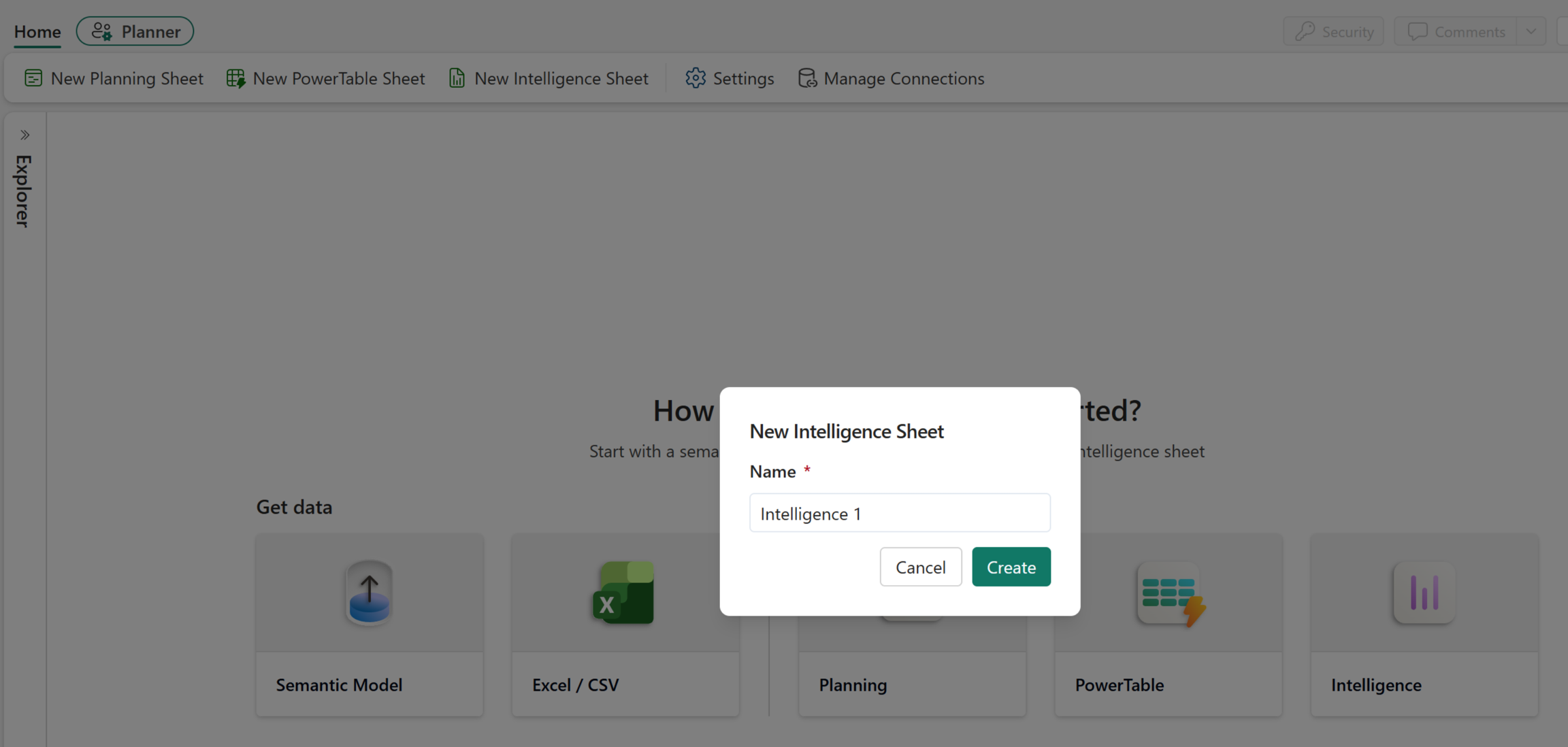
Select New Intelligence Sheet or select the intelligence sheet icon from the landing page.
Select the icons on the right side of the canvas to open the Data and Visualizations panes.
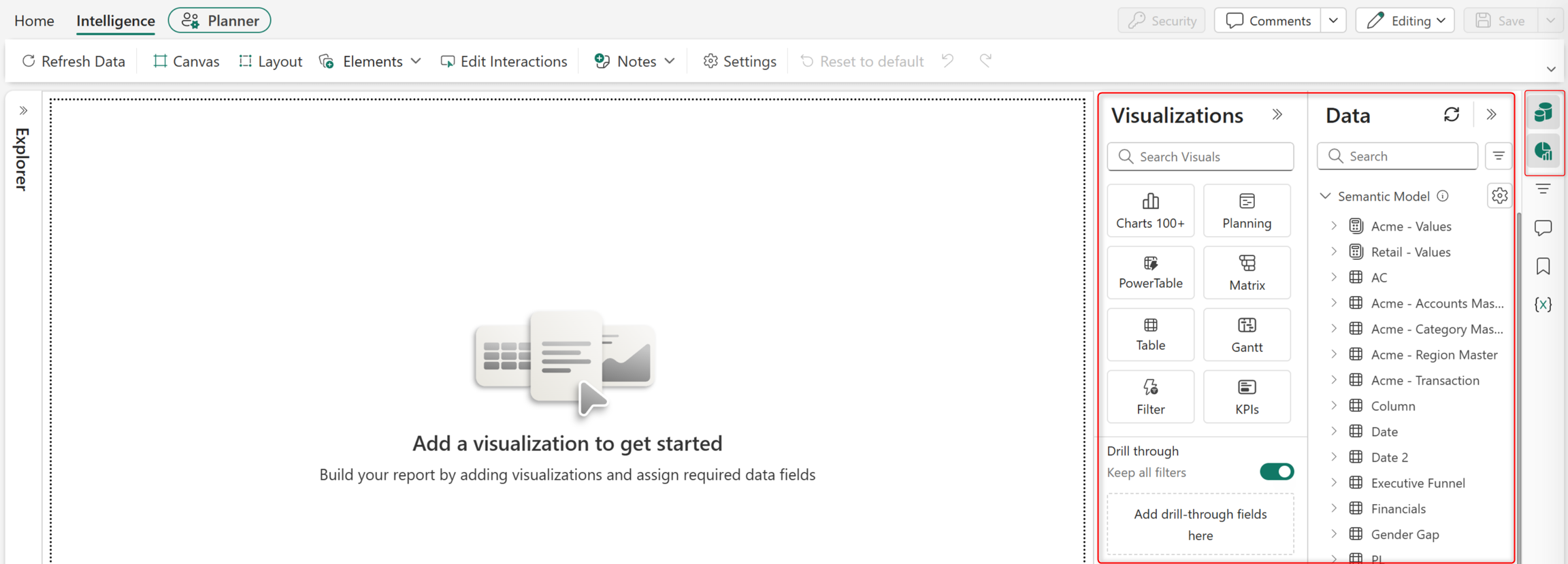
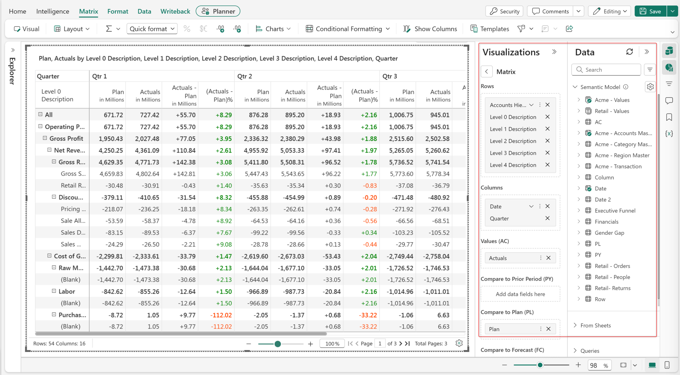
Select a data presentation format (such as Gantt, Matrix, KPI, or Chart) from the Visualizations pane.
Each type of visualization has specific data wells. Drag and drop measures and dimensions into the data wells to display them on the canvas.
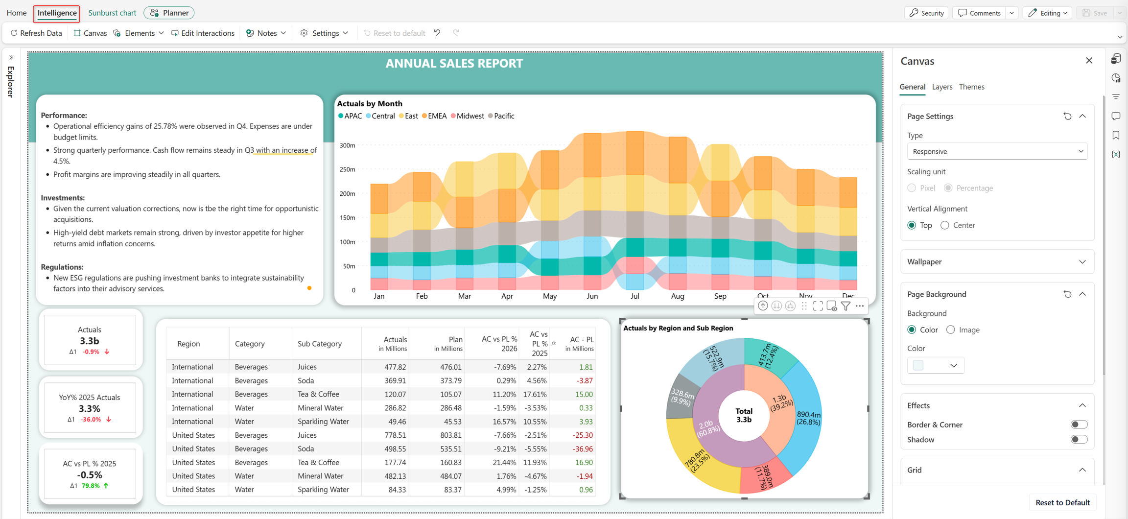
Use the intelligence toolbar for canvas-level customizations such as setting backgrounds, changing themes, and configuring element interactions.
Add charts to visualize data
The intelligence sheet includes a library of more than 100 visualization types to support a wide range of reporting scenarios. Choose from standard charts and advanced visualizations, such as marimekko, box plot, waterfall, radar, and polar charts. Storytelling visuals include slope graphs, lollipop charts, dumbbell charts, and dot plots.
Some chart types require specific field mappings to render. For example, marimekko charts require measures for both height and width; hierarchical charts such as treemap and sunburst require one or more hierarchical dimensions; and gauge charts require actual and target measures.
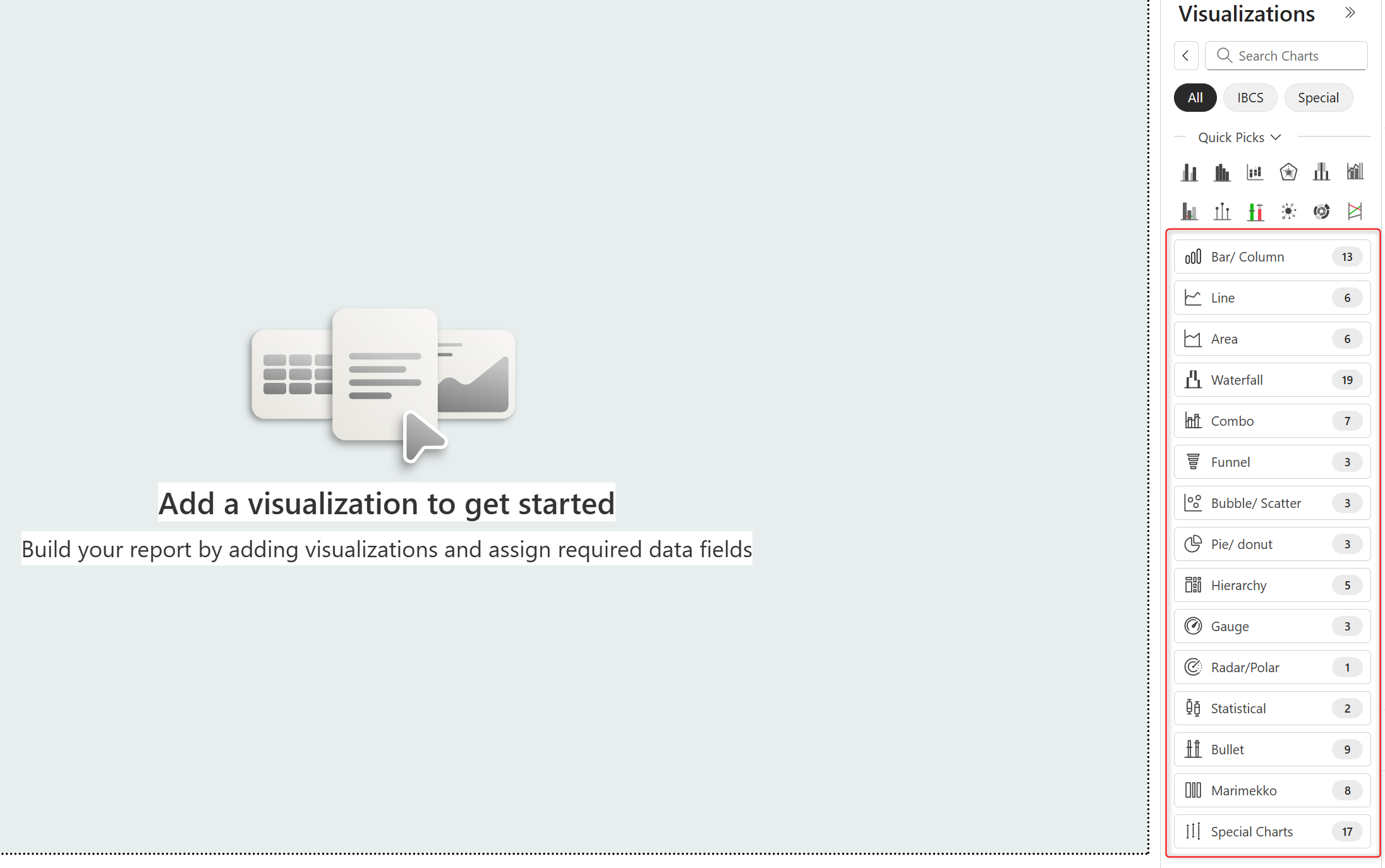
Select the Charts 100+ visual to add a chart.
Choose the chart type from the Visualizations pane based on your requirement.
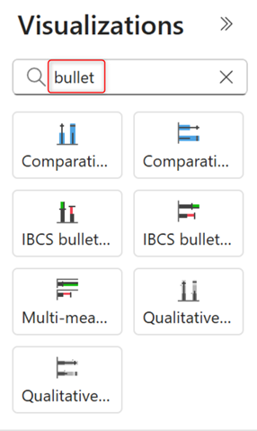
When you know the chart type, enter its name in the search box. For example, type line, waterfall, boxplot, or mekko to view all available variations of that chart type.
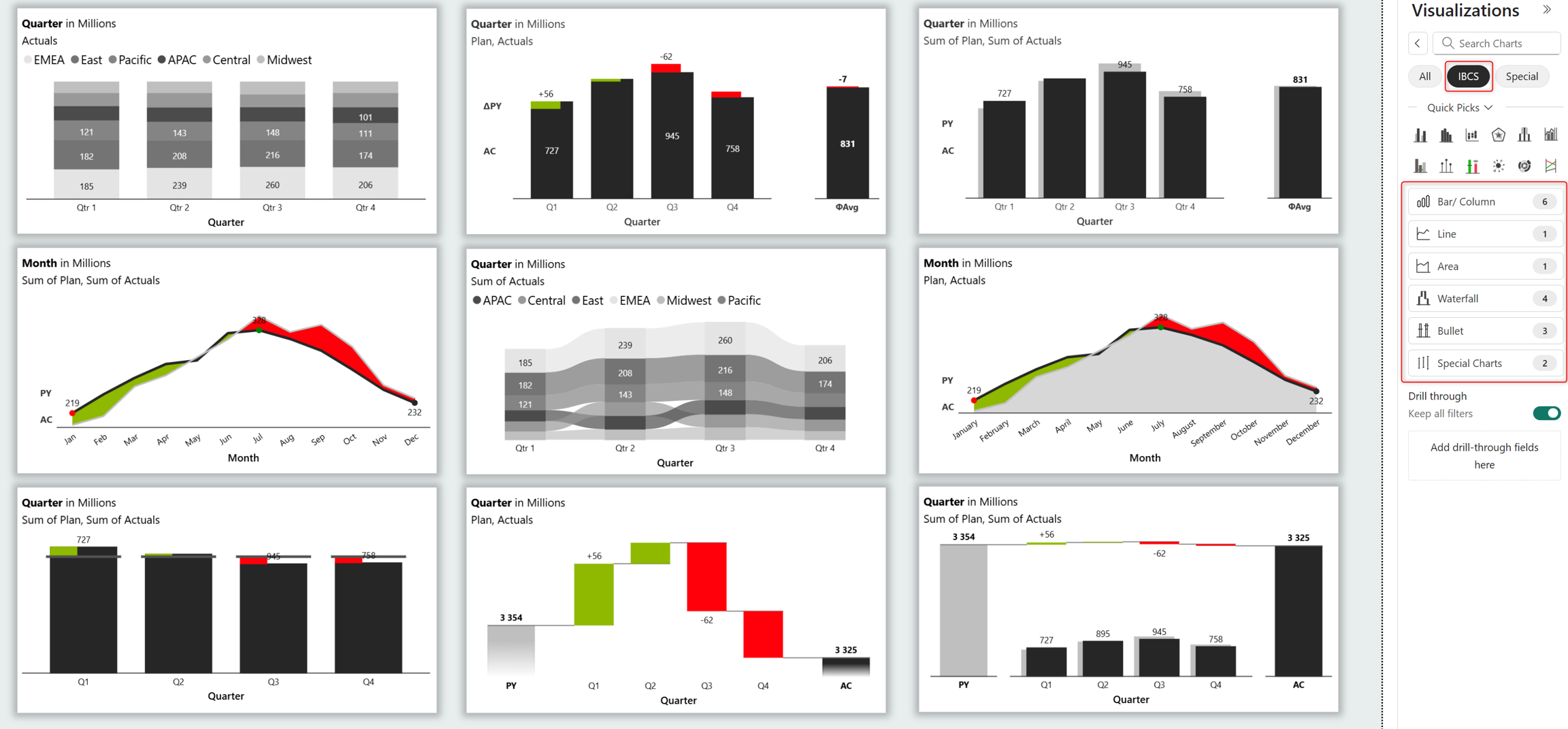
Prebuilt International Business Communication Standards (IBCS) charts reduce design effort while ensuring visual consistency and adherence to IBCS reporting standards. Select IBCS and choose a chart type such as waterfall, integrated variance, stacked bar, bullet, line/area, and more.
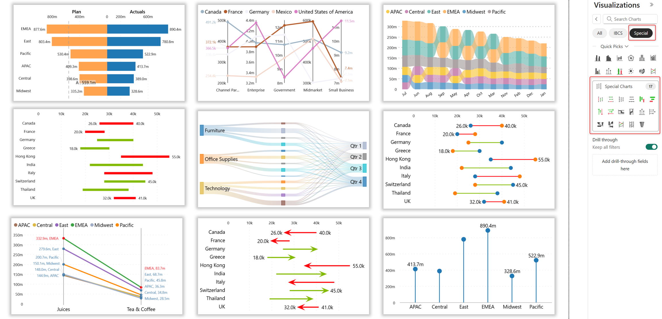
Storytelling charts make complex data more engaging and easier to understand. Select Special to plot storytelling charts like range plots, tornado, sankey, ribbon, and slope graphs.
Drag and drop dimensions and measures from the Data pane to the appropriate data well in the Visualizations pane. The chart appears on the canvas.
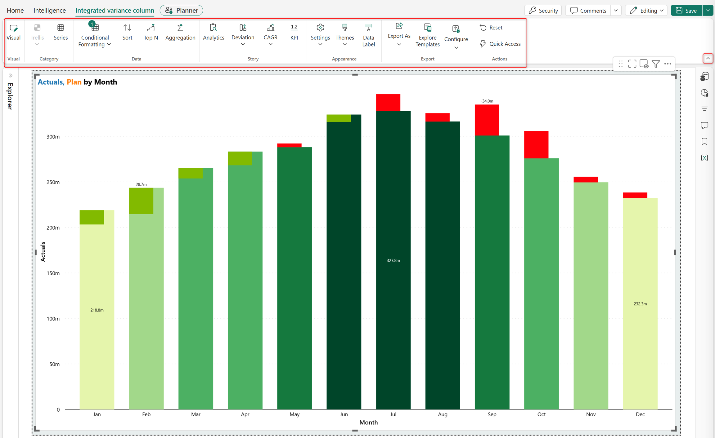
Each chart type has a dedicated toolbar for advanced customization, sorting, ranking, and deviation.
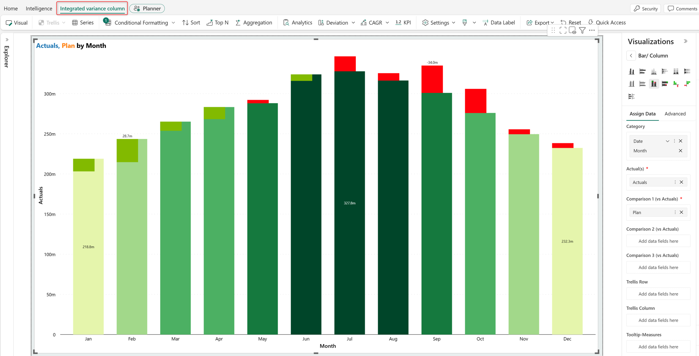
Select the caret icon to expand and collapse the toolbar.
Highlight metrics with KPI cards
Add KPI cards to highlight critical metrics and trends in your dashboard. Use cards to quickly monitor performance and track business goals.
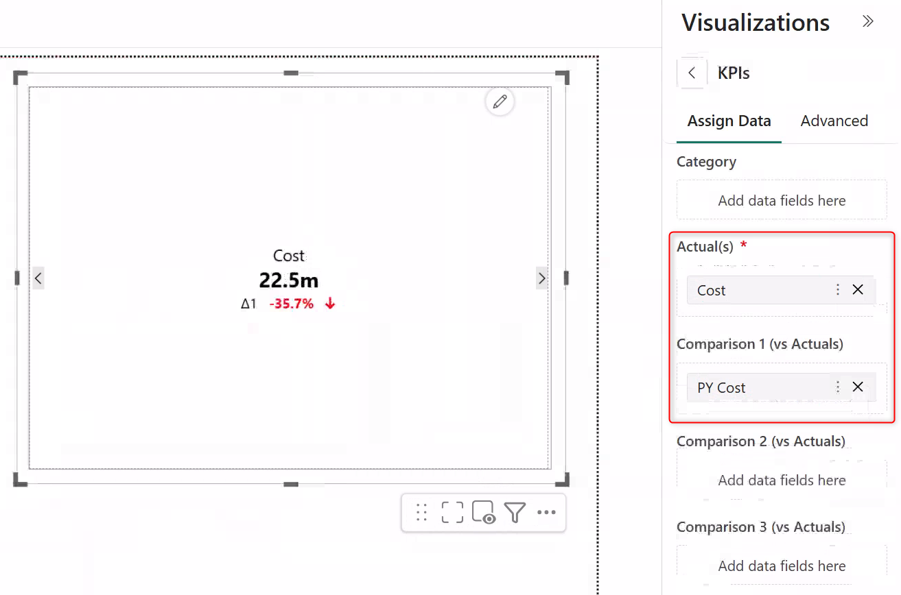
Select KPIs from the Visualizations pane.
Assign the metric to display to the Actual(s) data well.
To display the variance between different metrics, assign other measures to the Comparison data well.
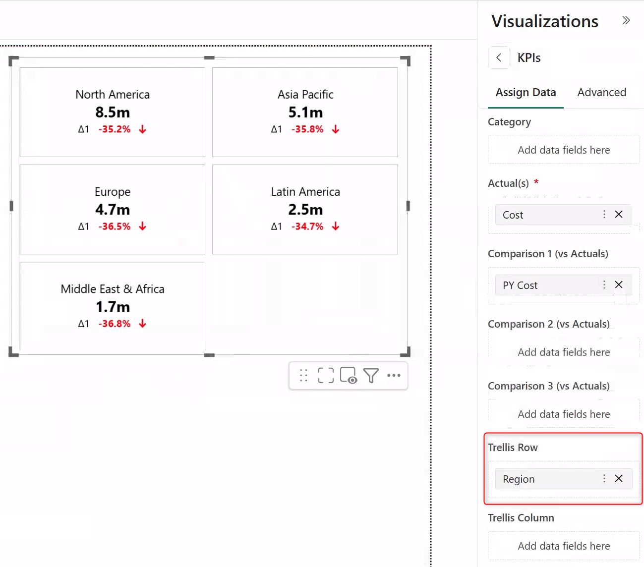
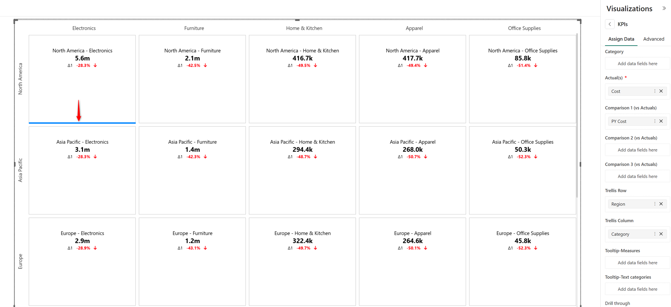
Assign Trellis Row dimensions to split a metric based on specific dimension categories. This example shows the overall cost distribution across different regions.
Assign a dimension to the Trellis Column data well to split a metric based on another set of dimension categories.
Hover over a card and drag the blue line to resize it.
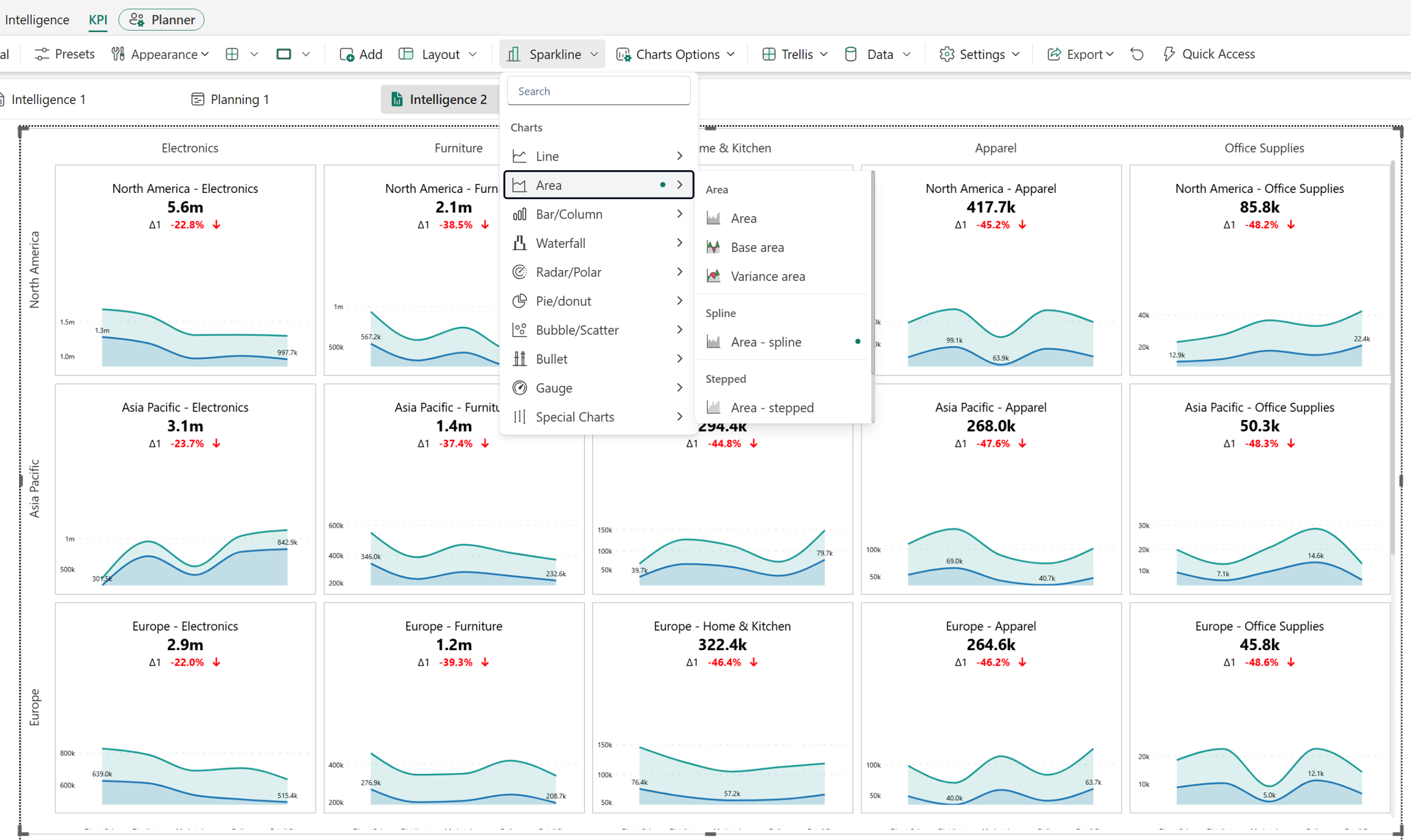
Insert inline charts to visualize KPI metrics. Before inserting a chart, assign the axis dimension to the Category data well.
In the KPI ribbon, select Sparkline and choose the chart type.
Apply filters for interactive analysis
Use filters to narrow data and focus on the information that matters most. Intelligence sheets offer a range of filter types to meet your data exploration needs. When you apply a filter, it applies to all the components in your dashboard.
To add a dashboard filter, select Filter from the Visualizations pane.
Assign the filtering dimension to the Category data well.
The intelligence sheet automatically creates the filter type best suited to the dimensional data. In this example, the intelligence sheet inserts a date slider.
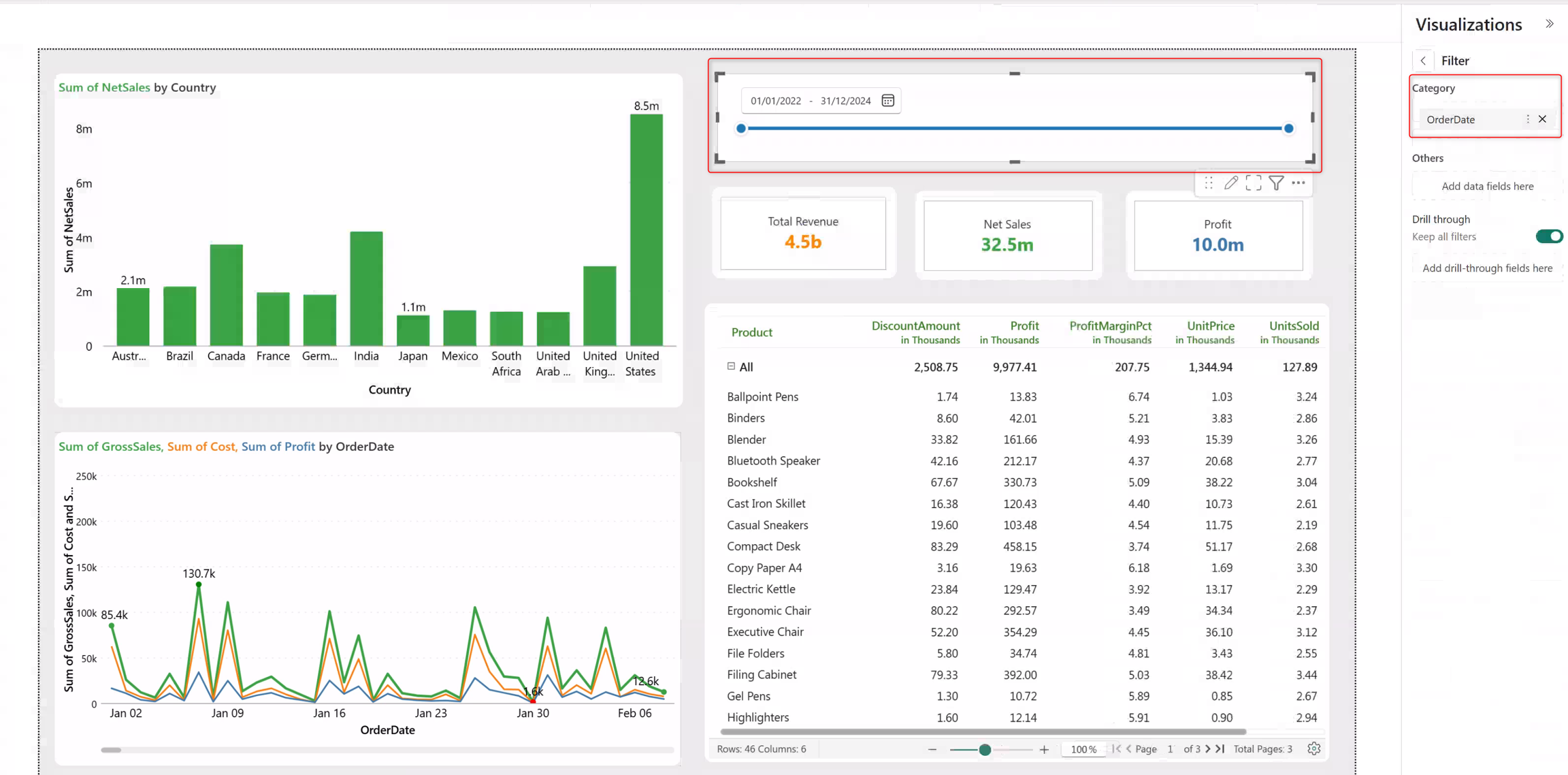
Apply filters to refine dashboard results and gain targeted insights. Dashboard elements such as charts, KPI cards, and tables respond to filter changes.