Windows Presentation Foundation
A part of the .NET Framework that provides a unified programming model for building line-of-business desktop applications on Windows.
2,710 questions
This browser is no longer supported.
Upgrade to Microsoft Edge to take advantage of the latest features, security updates, and technical support.
' cx='32' cy='32' r='32' /%3E%3Ctext x='50%25' y='55%25' dominant-baseline='middle' text-anchor='middle' fill='%23FFF' %3ELS%3C/text%3E%3C/svg%3E)
When the treeview loses focus the highlight of the selected item disappears . How to keep the highlight?

Hi Lloyd,
you can use Style with Trigger to show selected node when TreeView hasn't focus:
<Window x:Class="WpfApp1.Window87"
        xmlns="http://schemas.microsoft.com/winfx/2006/xaml/presentation"
        xmlns:x="http://schemas.microsoft.com/winfx/2006/xaml"
        xmlns:d="http://schemas.microsoft.com/expression/blend/2008"
        xmlns:mc="http://schemas.openxmlformats.org/markup-compatibility/2006"
        xmlns:local="clr-namespace:WpfApp87"
        mc:Ignorable="d"
        Title="No Hide Selection" Height="450" Width="800">
  <Window.DataContext>
    <local:ViewModel/>
  </Window.DataContext>
  <Grid>
    <Grid.ColumnDefinitions>
      <ColumnDefinition/>
      <ColumnDefinition/>
    </Grid.ColumnDefinitions>
    <TreeView ItemsSource="{Binding View}">
      <TreeView.Resources>
        <HierarchicalDataTemplate ItemsSource="{Binding SubNodes}" DataType="{x:Type local:Data}">
          <TextBlock Text="{Binding Info}"/>
        </HierarchicalDataTemplate>
      </TreeView.Resources>
      <TreeView.ItemContainerStyle>
        <Style TargetType="{x:Type TreeViewItem}">
          <!-- Style for the selected item -->
          <Setter Property="BorderThickness" Value="3"/>
          <Style.Triggers>
            <!-- Selected and has focus -->
            <Trigger Property="IsSelected" Value="True">
              <Setter Property="BorderBrush" Value="Red"/>
            </Trigger>
            <!-- Selected but does not have the focus -->
            <MultiTrigger>
              <MultiTrigger.Conditions>
                <Condition Property="IsSelected" Value="True"/>
                <Condition Property="IsSelectionActive" Value="False"/>
              </MultiTrigger.Conditions>
              <Setter Property="BorderBrush" Value="Red"/>
            </MultiTrigger>
          </Style.Triggers>
          <Style.Resources>
            <Style TargetType="Border">
              <Setter Property="CornerRadius" Value="2"/>
            </Style>
          </Style.Resources>
        </Style>
      </TreeView.ItemContainerStyle>
    </TreeView>
    <TextBox Grid.Column="1" Text="demo"/>
  </Grid>
</Window>

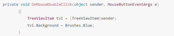
You can set EventSetter for TreeViewItem to set its background when it is selected.
 <Window.Resources>
            <Style TargetType="{x:Type TreeViewItem}">
                <EventSetter Event="MouseDoubleClick" Handler="OnMouseDoubleClick"/>
            </Style>
        </Window.Resources>
Set the background with:
If the response is helpful, please click "Accept Answer" and upvote it.
Note: Please follow the steps in our documentation to enable e-mail notifications if you want to receive the related email notification for this thread.
And when the Treeview loses focus what do I do? That was my question.
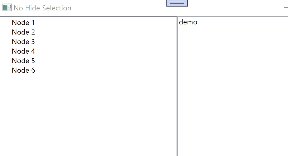
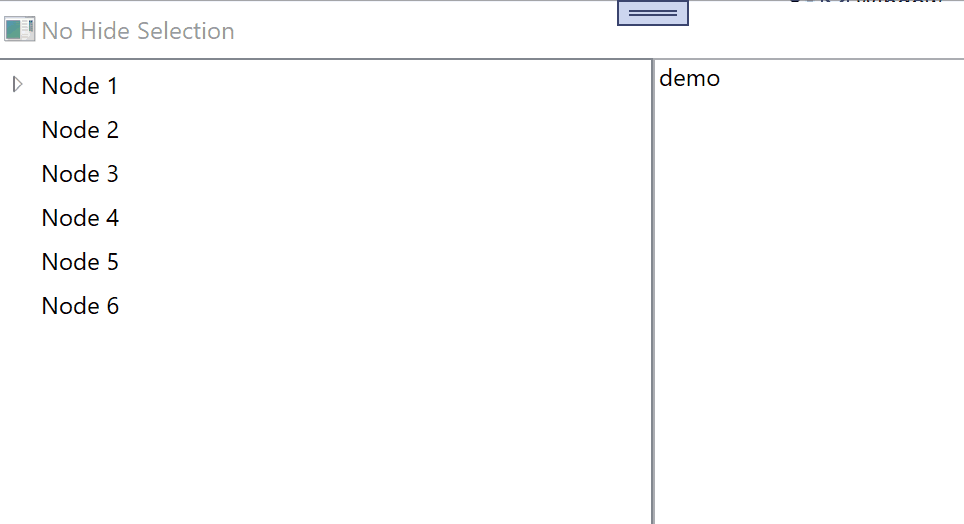
@Lloyd Sheen The result picture is like below shown, is it what you want to implement? If it is not, please tell me more what you want to implement.

The question was "if the TREEVIEW (not the item)" loses focus.
Hi Lloyd,
see my demo! If you select right TextBox TreeView lost focus.
This is great. It works, a question though. Is it possible to show the highlight as in the standard TreeviewItem so that it remains coloured blue when it is selected regardless of whether the TreeView is in focus.
Hi Lloyd,
use following Style:
  <TreeView.ItemContainerStyle>
    <Style TargetType="TreeViewItem">
      <Setter Property="Template">
        <Setter.Value>
          <ControlTemplate TargetType="TreeViewItem">
            <Grid>
              <Grid.ColumnDefinitions>
                <ColumnDefinition Width="Auto" MinWidth="19" />
                <ColumnDefinition Width="Auto" />
                <ColumnDefinition Width="*" />
              </Grid.ColumnDefinitions>
              <Grid.RowDefinitions>
                <RowDefinition Height="Auto" />
                <RowDefinition/>
              </Grid.RowDefinitions>
              <ToggleButton IsChecked="{Binding IsExpanded, RelativeSource={RelativeSource TemplatedParent}}"
                                          ClickMode="Press"
                                          Name="Expander">
                <ToggleButton.Style>
                  <Style TargetType="ToggleButton">
                    <Style.Resources>
                      <ResourceDictionary />
                    </Style.Resources>
                    <Setter Property="UIElement.Focusable" Value="False"/>
                    <Setter Property="FrameworkElement.Width" Value="16"/>
                    <Setter Property="FrameworkElement.Height" Value="16"/>
                    <Setter Property="Control.Template">
                      <Setter.Value>
                        <ControlTemplate TargetType="ToggleButton">
                          <Border Padding="5,5,5,5"
                                                            Background="#00FFFFFF"
                                                            Width="16"
                                                            Height="16">
                            <Path Fill="#FFFFFFFF"
                                                              Stroke="#FF818181"
                                                              Name="ExpandPath">
                              <Path.Data>
                                <PathGeometry Figures="M0,0L0,6L6,0z" />
                              </Path.Data>
                              <Path.RenderTransform>
                                <RotateTransform Angle="135" CenterX="3" CenterY="3" />
                              </Path.RenderTransform>
                            </Path>
                          </Border>
                          <ControlTemplate.Triggers>
                            <Trigger Property="ToggleButton.IsChecked" Value="True">
                              <Setter Property="UIElement.RenderTransform" TargetName="ExpandPath">
                                <Setter.Value>
                                  <RotateTransform Angle="180" CenterX="3" CenterY="3" />
                                </Setter.Value>
                              </Setter>
                              <Setter Property="Shape.Fill" TargetName="ExpandPath">
                                <Setter.Value>
                                  <SolidColorBrush>#FF595959</SolidColorBrush>
                                </Setter.Value>
                              </Setter>
                              <Setter Property="Shape.Stroke" TargetName="ExpandPath">
                                <Setter.Value>
                                  <SolidColorBrush>#FF262626</SolidColorBrush>
                                </Setter.Value>
                              </Setter>
                            </Trigger>
                            <Trigger Property="UIElement.IsMouseOver" Value="True">
                              <Setter Property="Shape.Stroke" TargetName="ExpandPath">
                                <Setter.Value>
                                  <SolidColorBrush>#FF27C7F7</SolidColorBrush>
                                </Setter.Value>
                              </Setter>
                              <Setter Property="Shape.Fill" TargetName="ExpandPath">
                                <Setter.Value>
                                  <SolidColorBrush>#FFCCEEFB</SolidColorBrush>
                                </Setter.Value>
                              </Setter>
                            </Trigger>
                            <MultiTrigger>
                              <MultiTrigger.Conditions>
                                <Condition Property="UIElement.IsMouseOver" Value="True"/>
                                <Condition Property="ToggleButton.IsChecked" Value="True"/>
                              </MultiTrigger.Conditions>
                              <Setter Property="Shape.Stroke" TargetName="ExpandPath">
                                <Setter.Value>
                                  <SolidColorBrush>#FF1CC4F7</SolidColorBrush>
                                </Setter.Value>
                              </Setter>
                              <Setter Property="Shape.Fill" TargetName="ExpandPath">
                                <Setter.Value>
                                  <SolidColorBrush>#FF82DFFB</SolidColorBrush>
                                </Setter.Value>
                              </Setter>
                            </MultiTrigger>
                          </ControlTemplate.Triggers>
                        </ControlTemplate>
                      </Setter.Value>
                    </Setter>
                  </Style>
                </ToggleButton.Style>
              </ToggleButton>
              <Border BorderThickness="{TemplateBinding Border.BorderThickness}"
                                    Padding="{TemplateBinding Control.Padding}"
                                    BorderBrush="{TemplateBinding Border.BorderBrush}"
                                    Background="{TemplateBinding Panel.Background}"
                                    Name="Bd"
                                    SnapsToDevicePixels="True"
                                    Grid.Column="1">
                <ContentPresenter Content="{TemplateBinding HeaderedContentControl.Header}"
                                                  ContentTemplate="{TemplateBinding HeaderedContentControl.HeaderTemplate}"
                                                  ContentStringFormat="{TemplateBinding HeaderedItemsControl.HeaderStringFormat}"
                                                  ContentSource="Header"
                                                  Name="PART_Header"
                                                  HorizontalAlignment="{TemplateBinding Control.HorizontalContentAlignment}"
                                                  SnapsToDevicePixels="{TemplateBinding UIElement.SnapsToDevicePixels}" />
              </Border>
              <ItemsPresenter Name="ItemsHost"
                                            Grid.Column="1"
                                            Grid.Row="1"
                                            Grid.ColumnSpan="2" />
            </Grid>
            <ControlTemplate.Triggers>
              <Trigger Property="TreeViewItem.IsExpanded" Value="False">
                <Setter Property="UIElement.Visibility" TargetName="ItemsHost" Value="Collapsed"/>
              </Trigger>
              <Trigger Property="ItemsControl.HasItems" Value="False">
                <Setter Property="UIElement.Visibility" TargetName="Expander" Value="Hidden"/>
              </Trigger>
              <Trigger Property="TreeViewItem.IsSelected" Value="True">
                <Setter Property="Panel.Background" TargetName="Bd">
                  <Setter.Value>
                    <DynamicResource ResourceKey="{x:Static SystemColors.HighlightBrushKey}" />
                  </Setter.Value>
                </Setter>
                <Setter Property="TextElement.Foreground">
                  <Setter.Value>
                    <DynamicResource ResourceKey="{x:Static SystemColors.HighlightTextBrushKey}" />
                  </Setter.Value>
                </Setter>
              </Trigger>
              <Trigger Property="UIElement.IsEnabled" Value="False">
                <Setter Property="TextElement.Foreground">
                  <Setter.Value>
                    <DynamicResource ResourceKey="{x:Static SystemColors.GrayTextBrushKey}" />
                  </Setter.Value>
                </Setter>
              </Trigger>
            </ControlTemplate.Triggers>
          </ControlTemplate>
        </Setter.Value>
      </Setter>
    </Style>
  </TreeView.ItemContainerStyle>