Visualize processes
The process map is a powerful tool that can help you visualize and analyze your business processes. It provides a graphical representation of how your processes are performed, making it easier to identify areas for improvement.
Process map
You can access the process map by selecting the Analytics > Process tab. From there, you can see a detailed view of your processes, including each step in the process and how they are connected. The process map can help you identify inefficiencies or bottlenecks in your processes, allowing you to make improvements that can save time and resources.
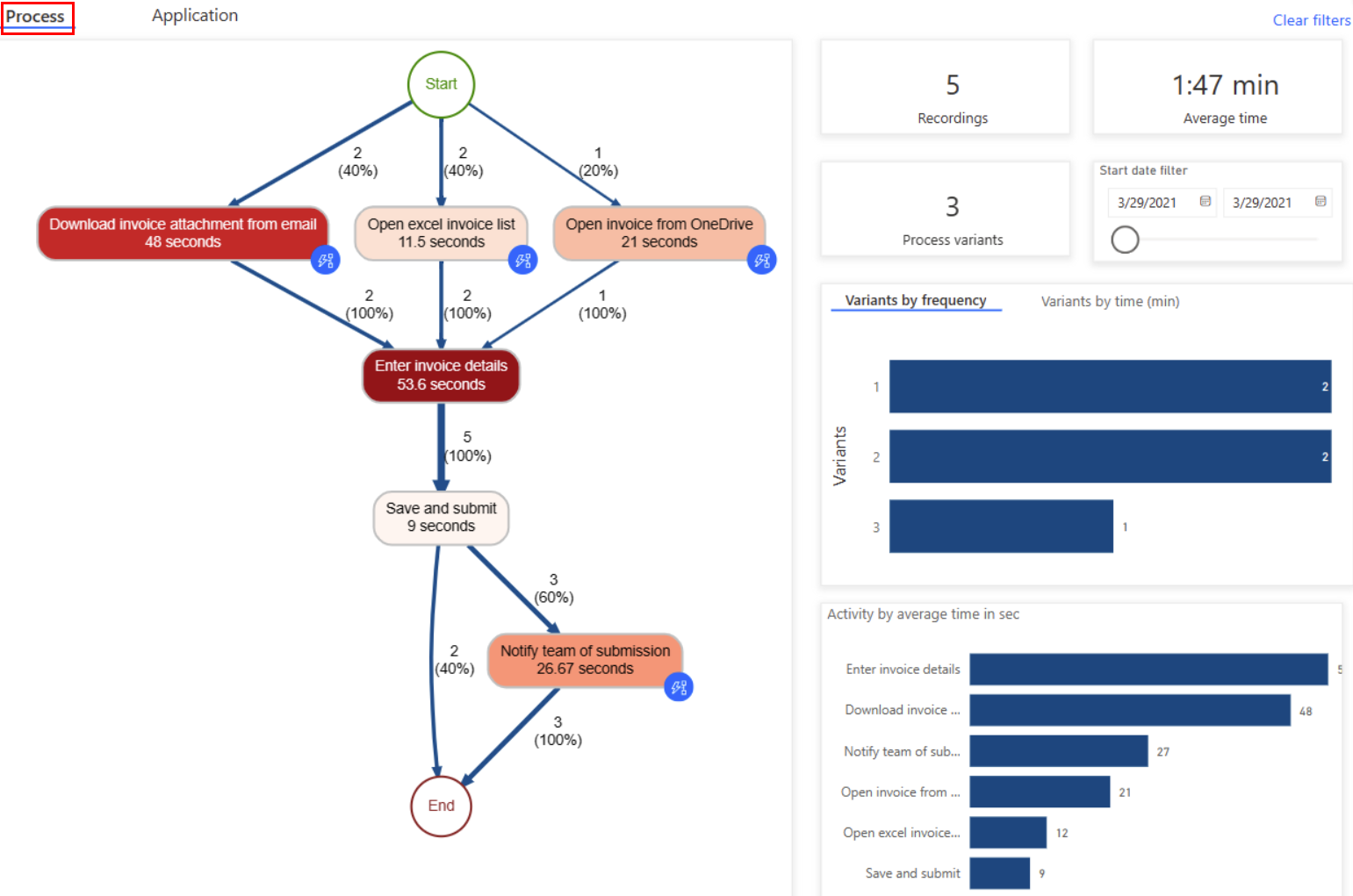
Activities are tasks or actions that form a business process, and they can be performed by humans or machines. In the process map, activities are represented as nodes and transitions between them as edges, with each sequence having a start and an end.
The process map displays different combinations of activities as separate process variants. Each process variant is a unique sequence of activities from the start to the end of the process. Each variant differs from the others by at least one activity. The process map provides metrics such as the frequency of activities and throughput time for each variant. Frequency indicates the total number of recordings/cases that pass through an activity, while throughput time is the time between the first and last event of a case.
There are various filters available for you to drill down into the process:
Variant selector: You can activate this filter by selecting one or multiple bars in the Variants bar graph. It allows you to select one variant or a set of process variants to visualize in your process map.
Recording selector: You can activiate this filter by clicking one or multiple bars in the Recording by time bar graph. It allows you to select one recording or a set of recordings to visualize in your process map.
Start date filter: Allows you to see the process visualization in a particular period.
Furthermore, there are specific metrics provided as key performance indicators that can help you gain a better understanding of your process. These metrics are discussed in more detail below.
Process KPIs
Number (#) of recordings: This KPI displays the total number of recordings of the same process that were submitted to analyze the process. The more recordings available, the more insights can be gained. For instance, if you only provide a few recordings of a process that has multiple paths to completion, you may not gain insights into all the possible process variations.
Number of variants: This KPI indicates the number of paths a process could take. For example, if a process has one additional activity, it would be counted as one more variant of the process.
Average time: This KPI displays the average time taken to complete a process across all the recordings associated with the process. It is a crucial data point for process mining because examining the duration of a process can reveal any bottlenecks.
Process map visualizations
Variants by frequency: Displays how frequently a specific process path was followed by the process.
Variants by time: Shows the average time spent to finish the process per variant.
Activity by average time: Displays the average time taken for each activity. A quick glance at this visual can help identify the most time-consuming activities of a process.
Recordings by time: Displays the time taken for each recording in a process.
Start date: Shows you Shows you the date range for the analytics and process maps shown in the report.
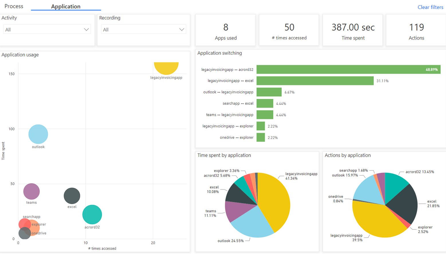
Application analytics
Application analytics allow you to gain more insights from recordings by understanding application usage. This report informs you about:
The top apps used.
Access patterns and what apps are used together.
App insights for each activity or recording.
Application analytics KPIs
Apps used: The total number of apps used in a process.
Number (#) of times accessed: The number of app accesses. Times accessed is when an app comes back into focus.
Time spent: The amount of time spent using apps. This doesn't count time spent when not focused on an app—for example, desktop.
Actions: The count of actions within apps.
Application analytics visualizations
- Application usage: This scatter plot shows the time spent and times accessed for each app used, with the size of the circles representing how many recordings use that app. The goal of this plot is to understand usage patterns. Some apps may be used frequently but only for short periods, indicating the recorder is jumping back and forth between this application and others. Other applications may be used for a longer period of time, and the process relies heavily on actions occurring within that application, without requiring extensive of other applications.
The size of the circles in the scatter plot indicates the frequency of usage of each application across all recordings. Applications that are used in most or all recordings have larger circles. This information can be helpful in identifying essential applications in a process that may require optimization or automation to improve overall efficiency.
Application switching: This bar chart is used to display the frequency of pairs of applications used together. It complements the application usage scatter plot by providing additional information on what two applications are most frequently used in conjunction. The insights gained from this chart can help identify any data transfers or manual input between these applications, which is important to consider when optimizing or automating the process.
Time spent by application: This is a pie chart that is used to represent the distribution of time spent on each application. This visual provides a clear understanding of which applications are being utilized the most in terms of time spent on them.
Actions by application: This is a pie chart that is hows the distribution of actions performed on each application. This visual helps identify which applications have the most actions or manual inputs, providing insight into areas that may require further optimization or automation.
See also
Feedback
Coming soon: Throughout 2024 we will be phasing out GitHub Issues as the feedback mechanism for content and replacing it with a new feedback system. For more information see: https://aka.ms/ContentUserFeedback.
Submit and view feedback for