Resource qualifiers and visualization options
This topic explains how to define resources that will be used only when some qualifier values are matched. A simple example is a language-qualified string resource. A string resource can be defined as the default, with other alternative resources defined to be used for additional languages. All resource types can be qualified, including the layout itself.
Resource qualifier options
Resource qualifier options can be accessed by clicking the ellipsis icon to the right of the Landscape mode button:
This dialog presents pull-down menus for the following resource qualifiers:
Language – Displays available language resources and offers an option to add new language/region resources.
UI Mode – Lists display modes (such as Car Dock and Desk Dock) as well as layout directions.
Each of these pull-down menus opens new dialog boxes where you can select and configure resource qualifiers (as explained next).
Language
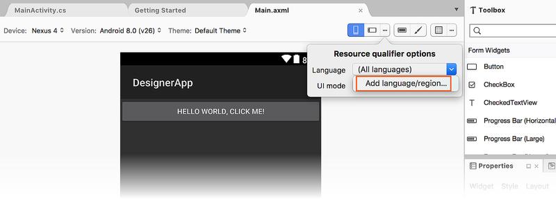
The Language pull-down menu lists only those languages that have resources defined (or All languages, which is the default). However, there is also an Add language/region... option that allows you to add a new language to the list:
When you click Add language/region..., the Select Language dialog opens to display drop-down lists of available languages and regions:

In this example, we have chosen fr (French) for the language and BE (Belgium) for the regional dialect of French. Note that the Region field is optional because many languages can be specified without regard for specific regions. When the Language pull-down menu is opened again, it displays the newly-added language/region resource:

Note that if you add a new language but you do not create new resources for it, the added language will no longer be shown the next time you open the project.
UI Mode
When you click the UI Mode pull-down menu, a list of modes is displayed, such as Normal, Car Dock, Desk Dock, Television, Appliance, and Watch:
Below this list are the night modes Not Night and Night, followed by the layout directions Left to Right and Right to Left (for information about Left to Right and Right to Left options, see LayoutDirection). The last items in the Resource Qualifier Options dialog are the Round screens (for use with Android Wear) or Not Round screens. For information about round and non-round screens, see Layouts. For more information about Android UI modes, see UiModeManager.
Action Bar settings
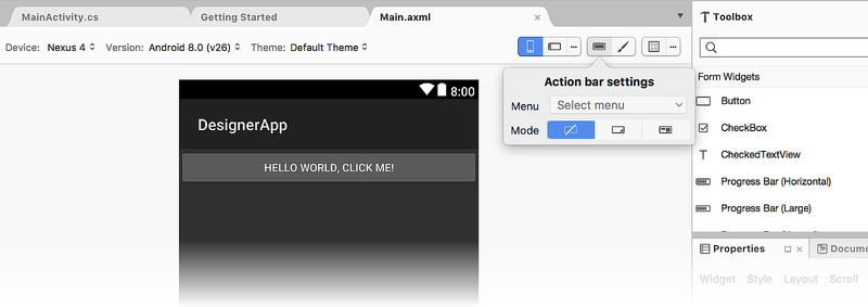
The Action bar settings icon is available to the left of the paintbrush (Theme Editor) icon:

This icon opens a dialog popover that provides a way to select from one of three Action Bar modes:
Standard – Consists of either a logo or an icon and title text with an optional subtitle.
List – List navigation mode. Instead of static title text, this mode presents a list menu for navigation within the activity (that is, it can be presented to the user as a dropdown list).
Tabs – Tab navigation mode. Instead of static title text, this mode presents a series of tabs for navigation within the activity.
Themes
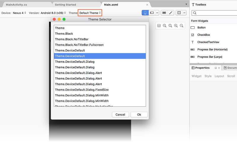
The Theme drop-down menu displays all of the themes defined in the project. Selecting More Themes opens a dialog with a list of all themes available from the installed Android SDK, as shown below:
When a theme is selected, the Design Surface is updated to show the effect of the new theme. Note that this change is made permanent only if the OK button is clicked in the Theme dialog. Once a theme has been selected, it will be included in the Theme drop-down menu as shown below:

Android version
The Android Version selector sets the Android version that is used to render the layout in the Designer. The selector displays all versions that are compatible with the target framework version of the project:

The target framework version can be set in the project's settings under Properties > Application > Compile using Android version. For more information about target framework version, see Understanding Android API Levels.
The set of widgets available in the toolbox is determined by the target framework version of the project. This is also true for the properties available in the Properties Window. The available list of widgets is not determined by the value selected in the Version selector of the toolbar. For example, if you set the target version of the project to Android 4.4, you can still select Android 6.0 in the toolbar version selector to see what the project looks like in Android 6.0, but you won't be able to add widgets that are specific to Android 6.0 – you will still be limited to the widgets that are available in Android 4.4.
For more information about resource types, see Android Resources.


