Actions in the user interface
This article provides guidelines for organizing actions when creating, extending, and customizing pages in Business Central. The guidelines follow the principles and precedence of Microsoft 365 applications, such as Outlook, with the primary goal of providing a familiar and efficient command presentation to the Business Central users.
Pages and actions
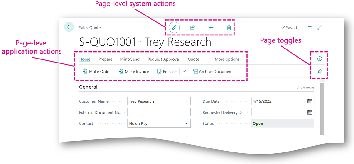
Pages make up the user interface in Business Central and frame the activities and tasks that users have, supported by the actions defined in the pages. Almost all pages present a combination of system actions, which are the common actions that are found on many pages, such as Edit, View, and Delete, and application actions, which are unique actions defined and developed for each page, such as Post on document pages.
With the desktop user interface to Business Central, actions are available to the user in several places on a page. An action's placement reflects its scope and importance among the total set of actions. Most important are the actions in the action bar appearing prominently at the top of a page, close to the page title. Here, the action bar combines system actions, application actions, and the various toggles for panes and panels, such as the Factbox pane, to form the command presentation for the page-level.

Page-level actions
Page-level actions are the actions in a page whose scope and effect the user understands in relation to what the whole page stands for. For example, with a document page that is a sales invoice, the scope of the Post action is the whole document, making that a page-level action. A page-level action may allow or expect the user to make a selection in the page that sets or limits the scope of the action, such as when the Post action in a list assumes the user has selected an invoice to Post.
Part-level actions
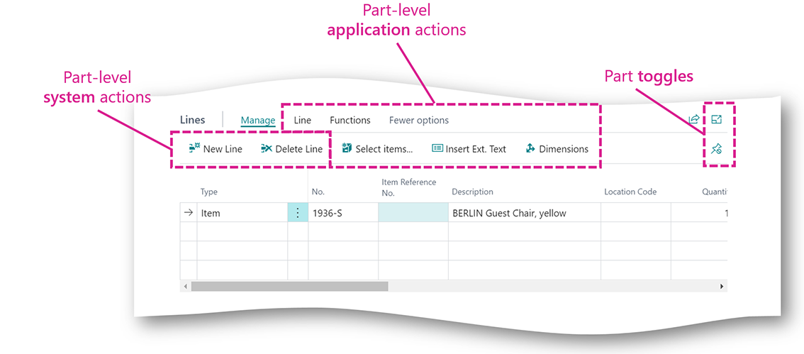
In addition to actions at the page-level, each part on a page may have specific actions available to the user for managing and working with that part. For example, the Lines section on a document has both system and application actions whose scope the user understands to be exclusively the document lines and which appears to the user within the Lines section. Similarly, Factboxes can define actions specific to their functionality that the user reaches in an action menu on the Factbox.

Application action guidelines
Achieving a great user experience starts with organizing the page-level actions to suit users’ needs and expectations. Consider the tasks that users have with the page, the type of page you place actions in, and the total set of actions in the page. In the following, we describe these considerations in more detail.
Consider the tasks that users have on a page
The most important question when planning and developing application actions for a page is “what is the user achieving in this page, and how can the page’s actions support that best?” Next, as you answer that question and start placing actions on the page to support a task, give prominence to actions that typically start or end the task in the user’s understanding. On the other hand, actions that users generally need for a task only in certain cases can be given a less prominent placement.
Consider the type of page you place actions on
Business Central has a set of page types that are well suited to support the range of tasks that business users have. Knowing the Business Central page types and their recommended uses is important to place application actions where users expect it and in a way that is consistent with how similar actions appear in other pages.
Check out the section about Business Central Page Types and Layouts to learn about the concepts that the Action Bar guidelines build upon.
Consider the total set of actions on a page
Each action in a page is sharing users’ attention with all the actions on the page. When there’s just a few actions on a page, it usually works well to place those actions together at the same level, and without grouping them. When the number of actions in a page goes up, grouping them in a natural way for the user gets increasingly important.
Solve distractions, not discoverability
As you lay out actions on a page, making the right set of actions appear prominent is important to increase the likelihood that users discover them. In cases where users have difficulty discovering the right action on a page, consider solving this by removing the distraction that less important actions may be causing. For example, if possible, by placing the less important actions in a separate group, so the actions you want to emphasize stand out more.
Common application actions and groups
Some application actions and action groups repeat on several pages in Business Central, such as Statistics, Post, and many more. While these actions and groups have an individual implementation on each page they appear, they bear the same caption and icon across pages. This helps users understand the commonality of these actions and makes them recognizable across pages in a way equal to that of system actions, such as Share and Bookmark.
Business Central defines several common actions and action groups as part of the standard application functionality. In addition, extensions and apps define custom actions and groups to support their functionality. To support users as they learn and use common application actions, it's important that actions named similarly also behave similarly. Furthermore, having a consistent placement of common actions in certain groups in the action bar makes it efficient for users to remember and find the actions.
When you add custom application actions to Business Central, consider the established common action and action groups. A custom action that complements existing common actions should have a caption and placement that makes it easy for Business Central users to reuse their knowledge about the existing actions. If you're adding custom actions that work differently from the existing common actions, then avoid using captions and placement that suggest a similarity that isn't there.
Split button groups
It's possible to show an action group as a split button to get better discoverability and one-click access to the first action in the group. Show an action group as a split button when the actions in the group are connected by the effect they have. For example, a split button is relevant to consider for a group with the actions Correct, Cancel, and Create corrective credit memo, since these three actions achieve variants of the same result, as the user sees it.
Don't use split buttons for action groups with actions that the user isn't perceiving as related.
For more information about split button groups, see Split buttons for actions.
See also
Page Types and Layouts
Actions in AL
Adding Actions to a Page
How to Promote Actions
Organizing Promoted Actions
Common Promoted Action Groups
Action Bar Improvements
Behavioral Changes for Promoted Actions
Pages with Action Bar Improvements