View 3D content or images in mixed reality
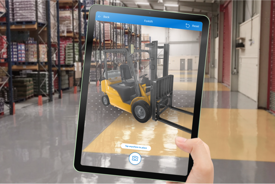
Use the View in MR control to place a 3D model of an object or an image in a real-world space. For instance, preview a painting on a wall before you hang it, or see whether a 3D virtual bookcase will fit where you intend it to go.
What if you don't have a 3D model of the object? Load an image of the object and set its dimensions to the object's size. The control applies the image as the face of a virtual cube of the desired size. Place this stand-in for the 3D model in your space.
The View in MR control adds a button to your app. When a user selects the button, the app overlays a selected 3D model (in .glb, .stl, or .obj file formats) or image (in .jpg or .png file formats) on the device camera feed.
You can also take photos using the View in MR control and upload them to OneDrive.
Important
Your 3D content must be in the .glb, .stl, or .obj file formats. You can convert your existing 3D models into the .glb file format from a variety of 3D formats. 3D content compressed with Draco compression Draco is not supported.
Tip
Make sure your 3D models are optimized for use with Power Apps to minimize load times.
The mixed-reality (MR) controls work best in well-lit environments with flat-textured surfaces. Tracking is better on LIDAR-enabled devices.
The MR controls in Power Apps use Babylon and Babylon React Native. Mixed reality content that works in the Babylon sandbox should work in Power Apps through this shared MR platform. If your content works in Babylon but not in Power Apps, ask a question in the Power Apps Community Forum. (Tag it with "mixed reality.")
Add a View in MR button to an app screen
With your app open for editing in Power Apps Studio:
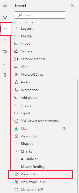
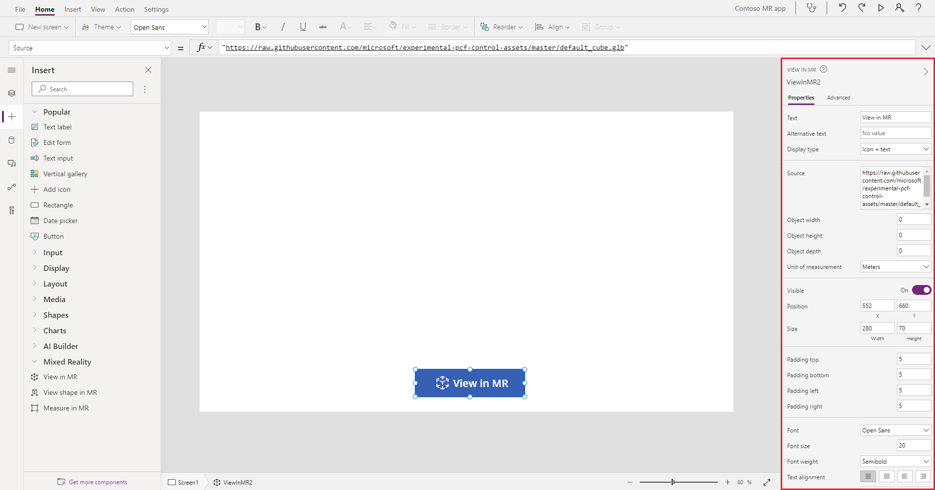
Open the Insert tab and expand Mixed Reality.
Select View in MR to place the control in the app screen, or drag the control to the screen to position it more precisely.
The control is a button that's labeled with an icon of a cube and the text View in MR. Change the label and hide the icon if you like in the Text and Display type properties.
View different models in a single session
The View in MR control displays one media file by default. To view different media files selected through a media gallery during the MR experience, use the control's Items advanced property. This property creates a table that lists media files the user can choose from in the mixed reality experience.
When you use the Items property, you need to set a value for the following additional advanced properties to map the columns of your table:
| Property | Description |
|---|---|
| ItemsSource (required) | Specifies which column in Items identifies the 3D model or image to show in the mixed reality view. See Connect 3D models to Power Apps to learn more about bringing models into Power Apps. |
| ItemsLabel | Specifies which column in Items contains the label to show in the media gallery. The Alternative text property is used for items that don't have a label specified. |
| ItemsThumbnail | Specifies which column in Items identifies the thumbnail to show in the media gallery. A default thumbnail is provided for items that don't have one specified. |
| ItemsObjectWidth, ItemsObjectHeight, ItemsObjectDepth | Specifies an explicit size for each media item in the table. Object width, Object height, and Object depth are used for items that don't have a specific size. |
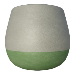
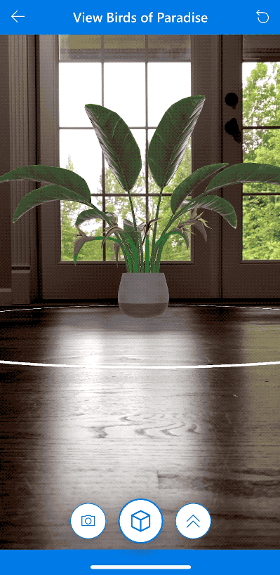
To test it, let's create a media gallery that shows three different plants in a room setting. Our Items table looks like this:
With your app open for editing in Power Apps Studio:
Open the Insert tab and expand Mixed Reality.
Select View in MR to place the control in the app screen, or drag the control to the screen to position it more precisely.
On the Advanced properties tab, select the Items property and type or paste the following code:
Table(
{
label: "Birds of Paradise",
source: "https://raw.githubusercontent.com/microsoft/experimental-pcf-control-assets/master/bird_of_paradise_blue.glb",
thumbnail: "https://raw.githubusercontent.com/microsoft/experimental-pcf-control-assets/master/bird_of_paradise_blue.png"
},
{
label: "Fiddle Leaf Fig",
source: "https://raw.githubusercontent.com/microsoft/experimental-pcf-control-assets/master/flf_orange.glb",
thumbnail: "https://raw.githubusercontent.com/microsoft/experimental-pcf-control-assets/master/flf_orange.png"
},
{
label: "Small Palm Tree",
source: "https://raw.githubusercontent.com/microsoft/experimental-pcf-control-assets/master/palm_green.glb",
thumbnail: "https://raw.githubusercontent.com/microsoft/experimental-pcf-control-assets/master/palm_green.png"
}
)
Set the ItemsLabel property to
"label".Set the ItemsSource property to
"source".Set the ItemsThumbnail property to
"thumbnail".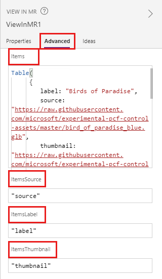
Note
The Items property is set to your data source which can be a collection, from a connector, or a hardcoded table like in this example. The ItemsSource, ItemsLabel, and ItemsThumbnail properties are set to the column names of that data source within quotation marks.
- Save and publish the app, then open it on your mobile device to try it out.
How objects are scaled if you resize them
If you don't specify dimensions when you place a model, the View in MR control follows the dimensions given in the object file. You can resize the model by entering a value other than 0 in one or more of the control's width, height, and depth properties (Object width, Object height, and Object depth). How the model is scaled depends on how many dimensions you change.
If all dimensions are 0 (the default), the model's size is left as it's set in the object file.
If one dimension is set, the model is scaled equally based on the changed dimension, similar to setting "keep aspect ratio" when you resize an image.
If two dimensions are set, the model scales to the two given dimensions and an average of the first two.
For example, say you have a model that is 12 m high, 6 m wide, and 3 m deep. You set the View in MR control's properties as follows: Object height: 24, Object width: 9, Object depth: 0 (unchanged). The height increases by a factor of 2, and the width increases by a factor of 1.5. The increase in height and width is averaged to find the factor by which the depth should be increased: 2 + 1.5 = 3.5 / 2 = 1.75. The final dimensions of the model are Object height 24, Object width 9, and Object depth 5.25 (3 x 1.75).If all three dimensions are set, the model's size is changed to what you specified.
Note
If the measurements don't adhere to the original aspect ratio, the model could be squashed or distorted when it's viewed in MR.
Properties
Change the View in MR button's behavior and appearance using properties. Some properties are only available on the Advanced tab.
| Property | Description | Type | Location |
|---|---|---|---|
| Text | Sets the button label text. | String | Properties; Advanced: Text |
| Alternative text | Specifies the text to be displayed if the model can't load or if the user hovers over the model. | String | Properties; Advanced: AltText |
| Display type | Determines whether the button label shows an icon of a cube, text, or both. | Drop-down selection | Properties; Advanced: DisplayType |
| Source | Identifies the data source (.glb, .stl, or .obj file) to display. | Not applicable | Properties; Advanced: Source |
| Sources List (Items) | Data source (table) that lists multiple media files to view in a single mixed reality session. | Table | Properties; Advanced: Items |
| Object width | Sets the width of the model. | Integer | Properties; Advanced: ObjectWidth |
| Object height | Sets the height of the model. | Integer | Properties; Advanced: ObjectHeight |
| Object depth | Sets the depth of the model. | Integer | Properties; Advanced: ObjectDepth |
| Unit of measurement | Sets the measurement unit used for the model's width, height, and depth. | List | Properties; Advanced: Units |
| Enable shadows | Determines whether shadows are used to enhance the 3D effect when the model is shown. | Boolean | Properties; Advanced: EnableShadows |
| Enable marker detection | Determines whether marker detection will be used to determine model position and rotation. See Use marker detection with mixed reality controls | Boolean | Properties; Advanced: EnableMarkerDetection |
| Visible | Shows or hides the button. | Boolean | Properties; Advanced: Visible |
| Position | Places the upper-left corner of the button at the screen coordinates specified in x and y. | Floating point number | Properties; Advanced: X, Y |
| Size | Determines the size of the button using the pixel values provided in Width and Height. | Integer | Properties; Advanced: Width, Height |
| Padding top | Sets the distance between the button label text and the top of the button. | Floating point number | Properties; Advanced: PaddingTop |
| Padding bottom | Sets the distance between the button label text and the bottom of the button. | Floating point number | Properties; Advanced: PaddingBottom |
| Padding left | Sets the distance between the button label text and the left edge of the button. | Floating point number | Properties; Advanced: PaddingLeft |
| Padding right | Sets the distance between the button label text and the right edge of the button. | Floating point number | Properties; Advanced: PaddingRight |
| Font | Sets the name of the family of fonts used for the button label text. | List | Properties; Advanced: Font |
| Font size | Sets the size of the button label text. | Floating point number | Properties; Advanced: FontSize |
| Font weight | Sets the weight of the button label text, either Bold, Lighter, Normal, or Semibold. | List | Properties; Advanced: FontWeight |
| Text alignment | Sets the horizontal alignment of the label text in the button, either Center, Justify, Left, or Right. | Not applicable | Properties; Advanced: TextAlignment |
| Vertical alignment | Sets the vertical alignment of the label text in the button, either Bottom, Middle, or Top. | List | Properties; Advanced: VerticalAlign |
| Font style | Sets the style of the button label text, either Italic, Underline, Strikethrough, or none. | Not applicable | Properties; Advanced: Italic, Underline, Strikethrough |
| Border radius | Determines the corner radius of the button border. | Floating point number | Properties; Advanced: BorderRadius |
| Color | Sets the colors of the button label text and the button background. | Not applicable | Properties; Advanced: FillColor, TextColor |
| Border | Determines the style, width, and color of the button border. | Not applicable | Properties; Advanced: BorderStyle, BorderThickness, BorderFillColor |
| Disabled | Turns off the button but leaves it visible. | Boolean | Properties; Advanced: Disabled |
| Disabled color | Sets the colors of the button label text, the button background, and the button border if DisplayMode is Disabled. | Not applicable | Properties; Advanced: DisabledContentColor, DisabledFillColor, DisabledBorderColor |
| Pressed color | Sets the colors of the button label text, the button background, and the button border when the user selects the button. | Not applicable | Properties; Advanced: PressedContentColor, PressedFillColor, PressedBorderColor |
| Hover color | Sets the colors of the button label text, the button background, and the button border when the user hovers the mouse pointer over it. | Not applicable | Properties; Advanced: HoverContentColor, HoverFillColor, HoverBorderColor |
| OnMixedRealitySelect | Behavior that is triggered when user selects the button to launch into the mixed reality experience. | Defined action | Advanced |
| OnChange | Behavior that is triggered when any property on the button is changed. | Defined action | Advanced |
| Tooltip | Determines the text to display when the user hovers over the button. | String | Advanced |
| ContentLanguage | Determines the display language of the button label, if it's different from the language used in the app. | String | Advanced |
| DisplayMode | Determines whether the button allows user input (Edit), only displays data (View), or is disabled (Disabled). | Enum | Advanced |
| TabIndex | Specifies the order the button is selected if the user navigates the app using the Tab key. | Integer | Properties; Advanced: TabIndex |
Output properties
Your app can make use of more properties when a user interacts with the View in MR control. These are known as output properties. You can use output properties in other controls or to customize the app experience.
| Property | Description | Type |
|---|---|---|
| Photos | Collects the photos captured during the mixed reality session. You can upload the mixed-reality photos to OneDrive and show them in a gallery. | Not applicable |
Other mixed reality controls
- View 3D content with the 3D object control.
- Measure distance, area, and volume with the Measure in mixed reality control.
- Create and view predefined 3D shapes with the View shape in mixed reality control
- Paint 3D lines or draw 3D arrows to specify an area or asset in your environment with the Markup in MR control.