Tab properties for model-driven app forms overview
This article describes the classic form editor. We recommend that you u se the modern form designer to add and edit tabs for your model-driven app forms. More information: Add, configure, move, or delete tabs on a form
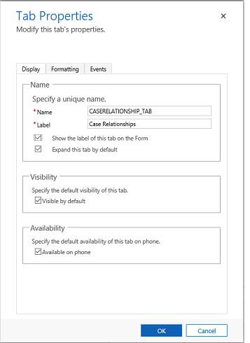
These are the properties available to configure when using a tab on a form using the classic form designer. The following table shows properties that you can set for tabs on the form:
| Tab | Property | Description |
|---|---|---|
| Display | Name | Required: The unique name for the tab that is used when referencing it in scripts. The name can contain only alphanumeric characters and underscores. |
| Label | Required: The localizable label for the tab visible to users. | |
| Show the label of this tab on the Form | When the label is displayed people can select it to toggle whether the tab is expanded or collapsed. Choose whether you want to show the label. | |
| Expand this tab by default | The tab state can toggle between expanded or collapsed using form scripts or by people selecting the label. Choose the default state for the tab. | |
| Visible by default | Showing the tab is optional and can be controlled using scripts. Choose whether to make the tab visible. More information: Visibility options | |
| Availability | Choose if you want the tab to be available on the phone. | |
| Formatting | Layout | Tabs may have up to three columns. Use these options to set the number of tabs and what percentage of the total width they should fill. |
| Events | Form Libraries | Specify any JavaScript web resources that will be used in the tab TabStateChange event handler. |
| Event Handlers | Configure the functions from the libraries that should be called for the tab TabStateChange event. More information: Configure Event Handlers |

Next steps
Feedback
Coming soon: Throughout 2024 we will be phasing out GitHub Issues as the feedback mechanism for content and replacing it with a new feedback system. For more information see: https://aka.ms/ContentUserFeedback.
Submit and view feedback for